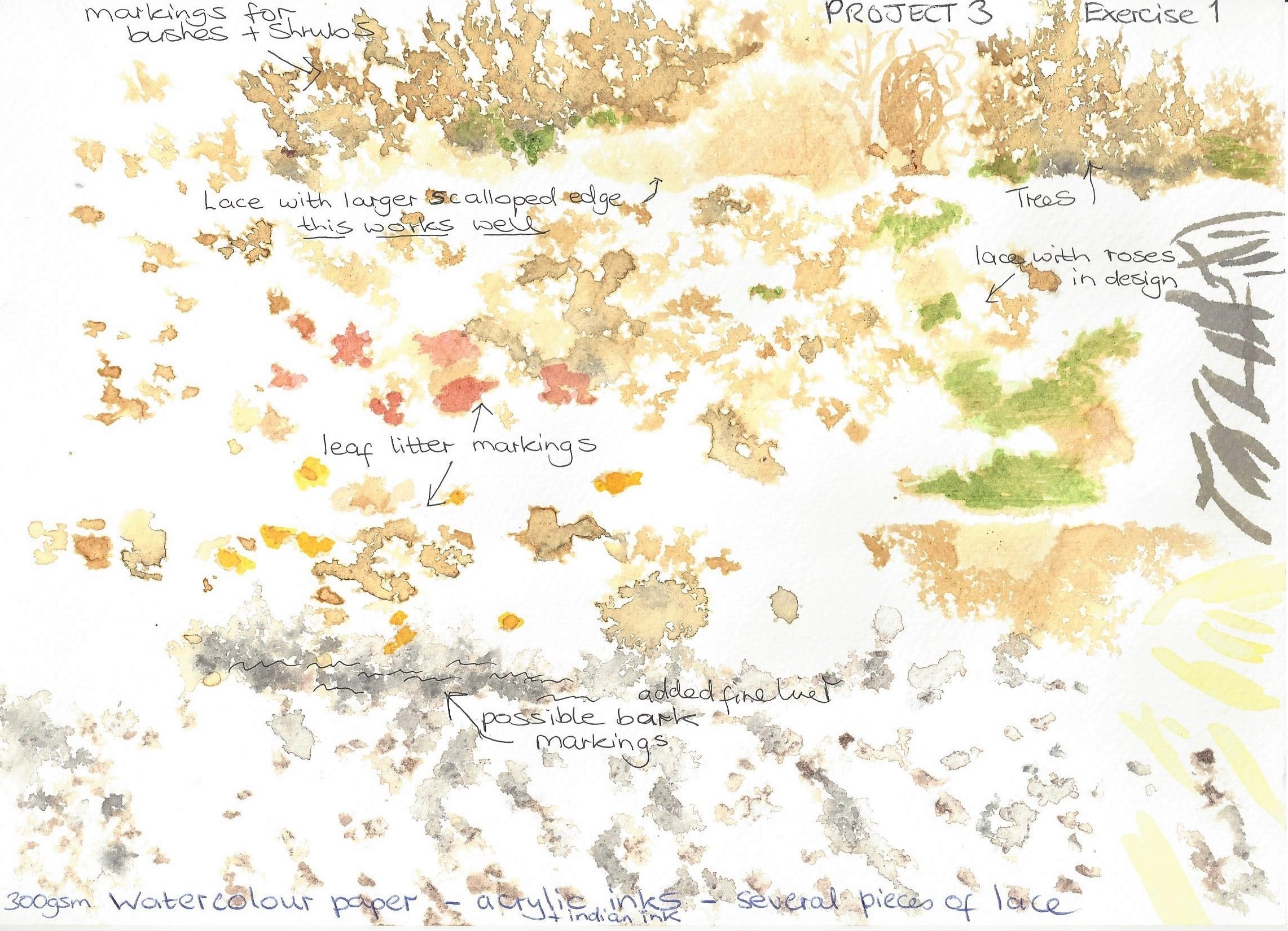
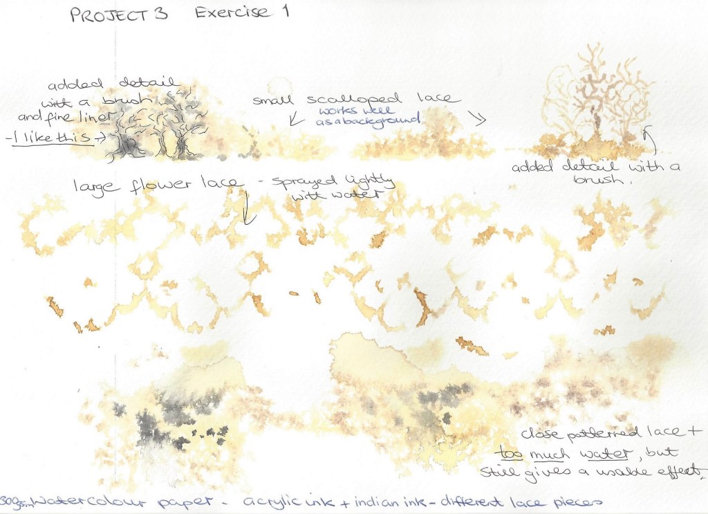
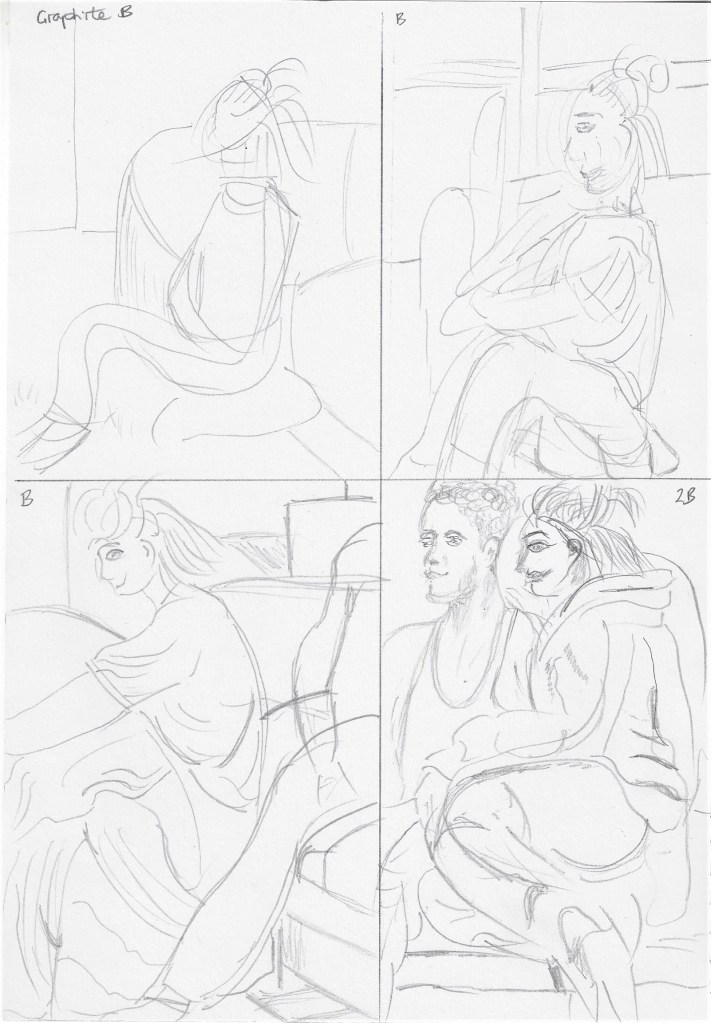
Mark making experiments – I attended a study day in Oxford where the artist Katy Taylor talked about her work and demonstrated a technique used in her textile work . Below is a sample of what I did in her workshop which I thoroughly enjoyed and can see how I could incorporate this into my artwork. We place pieces of open lace onto watercolour paper and then sprayed over with water lightly, the lace was then carefully removed and whilst still wet we dropped Indian ink into small areas around the page. I like the effect a lot , it could be used for landscape – trees, plants, paths, sky etc.
These are my own experiments following the workshop.
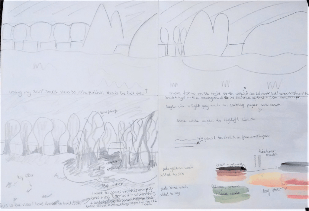
Preparing for a larger drawing- I reviewed some of my preparatory drawings from project 2 and selected from the 360 degree studies a sketch to develop into a further drawing. Below is the planning for this :
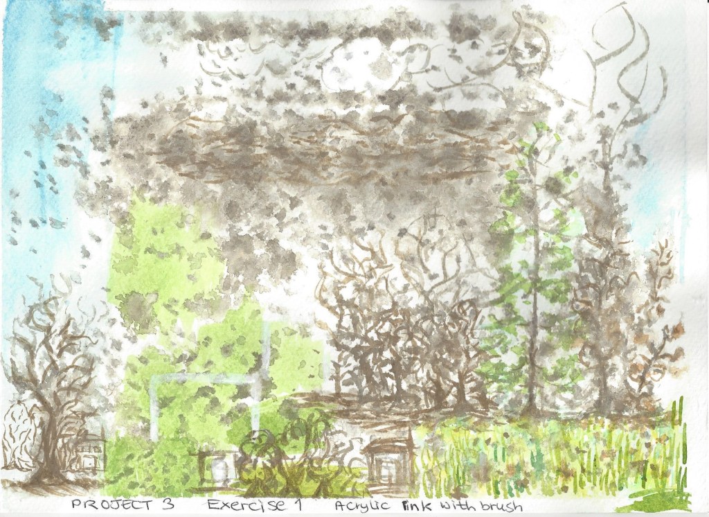
Planning for the compositionFinal drawing – I wanted to focus on the colour of leaf litter and the group of trees in the middle of an urban environment. I wanted to use the middle distance group of trees to lead the eye from the middle tallest tree, then along to the right of the picture and then to the half hidden buildings in the background. I stared with a background wash of diluted grey acrylic ink, when dry I used a 4b pencil to sketch the shapes of the buildings and outlines of the trees. I then added colour with acrylic ink , some wet on wet so that the colours blended in part.
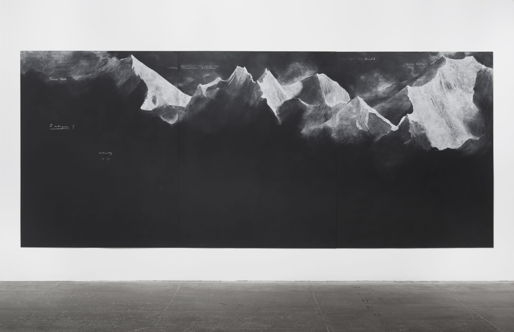
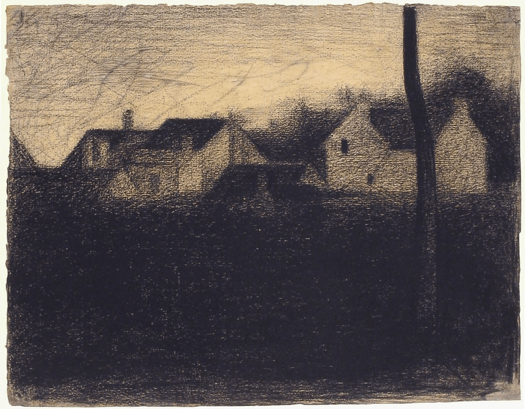
Research point – Similarities – differences Looking at contemporary artists and who work with landscape and a range of viewpoints and comparing their approaches with those of earlier artists. Tacita Dean has some drawings on blackboard which look very dramatic and atmospheric as also does Seurat’s Landscape with houses below, both use light and dark to contrast and create depth. The most obvious difference between them is the viewpoint, Tacita’s mountains are immense and almost overwhelming. Seurat’s is more focused on what most people see around us.
Fig.18 Fatigues 2012 chalk on blackboard – Tacita DeanFig.19 Landscape with houses 1881-1882 Georges Seurat
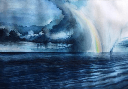
Fig.20 2019 Whilst researching for contemporary landscape artists I came across Adem Potas who is based in Istanbul. This painting is done in watercolour (it does not have a title or date that I can find.)
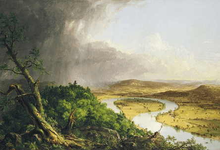
The skies here are particularly dramatic and portray a sense of power and fast changing beauty similar to Thomas Cole’s painting below of the sky after a thunderstorm. Both artists use light and dark contrasts and reflection to take our eye around the paintings. There is also the similar use of aerial perspective – Adem paints the distant clouds on the left in a light tone and smaller shapes, Thomas depicts the distant hills in pale violet with not much detail.
Fig.21 View from Mount Holyoke, Northampton, massachusetts, Thomas Cole, after a thunderstorm – The oxbow (1836)The difference between them is Adem paints in a more impressionist style whilst Thomas paints in a naturalistic way, almost like a photograph of the view. Both these paintings capture the thrilling and striking nature of the sky.
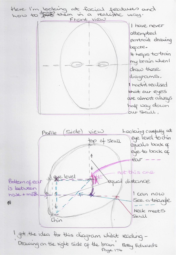
Fig.11 (Edwards 1999:174)Fig. 12 ( Barber 2002:p.45) I copied a sketch by Henry Carr who used hatching to show tone. Copying from the masters really helps as I am limited in technical drawing skills for figure work. I do enjoy working like this and look forward to a time when I am more confident in sketching heads and features.Soft pastels on pastel paper copied from a found picture of unknown source.Hb pencil on paper. The jaw here is too square to look like me5 minute study of my self, in pencil on the back of an envelope. This jaw and nose are too long.My head in 4b and Hb pencil on cartridge paper. I actually coudn’t work out why the eyes looked so ‘starey’ then I read the exercise again I noticed the sentence about the shadows in the eye sockets either side of the nose. So I re-worked on this sketch as belowSo when going back to rework the sketch I realised I had forgotten to draw any eyelids which would also give the eyes that over-staring look. After adding eyelids I put some shadows in the eye sockets and some cross-hatching on the neck. I also changed the iris and made it smaller and altered the pupil to make it look in a different direction. I have added some hatching to the lips as well so they don’t look so flat. The 4b pencil works well for showing the darker tones , I did some rubbing in to create some variation of tone without hard edges.Colour plan for the self portrait below –For this one I chose coloured pencils on A4 pastel support. The coloured pencils flow well on this paper and also do not saturate the paper thus leaving some of the colour of the paper showing as it has a ‘tooth’. This one is more of a likeness although the eyes are too close together. This is a good angle with my gaze looking away.Fig.13 La Pittura (1638-1639) I came across this self-portrait of a female artist called Artemisia Gentileschi .I like the strong ,determined look on her face and the way the light tones contrast with the dark tones of her hair, dress and room.Fig.14 Squid (1978) I like this portrait because of the different media used – Pencil, ball point pen, brush, black ink, grey wash, coloured crayon, watercolour and body colour. It’s a mix I would consider experimenting with.Fig.15 Always felt so alone (2018) by the artist Phang Gung Fook, IMAGE numberAPQ5977743TitleI Always Felt So Alone, 2018, (oil on canvas)Creator AbigailLocationPrivate CollectionMediumoil on canvasDimensions150x100 cmsCreditI Always Felt So Alone, 2018, (oil on canvas), Phang Gung Fook, Abigail / Private Collection / Bridgeman ImagesFig.16 No(t)here 3 (2002) This image by the artist Julie Brixey-Williams is a photograph with photographic dye.Whilst not typically a self portrait it is a photo of the artist and then she has used dyes to create a figure drawing . It caught my eye as the quick white lines are so simple yet effective in depicting what is happening – telling the story of the artist moving and dancing.
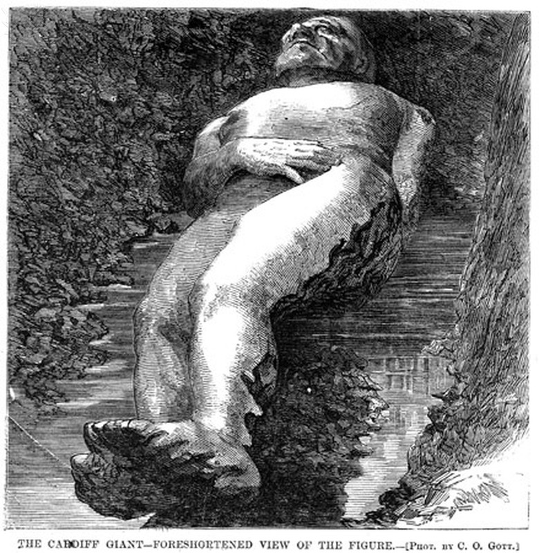
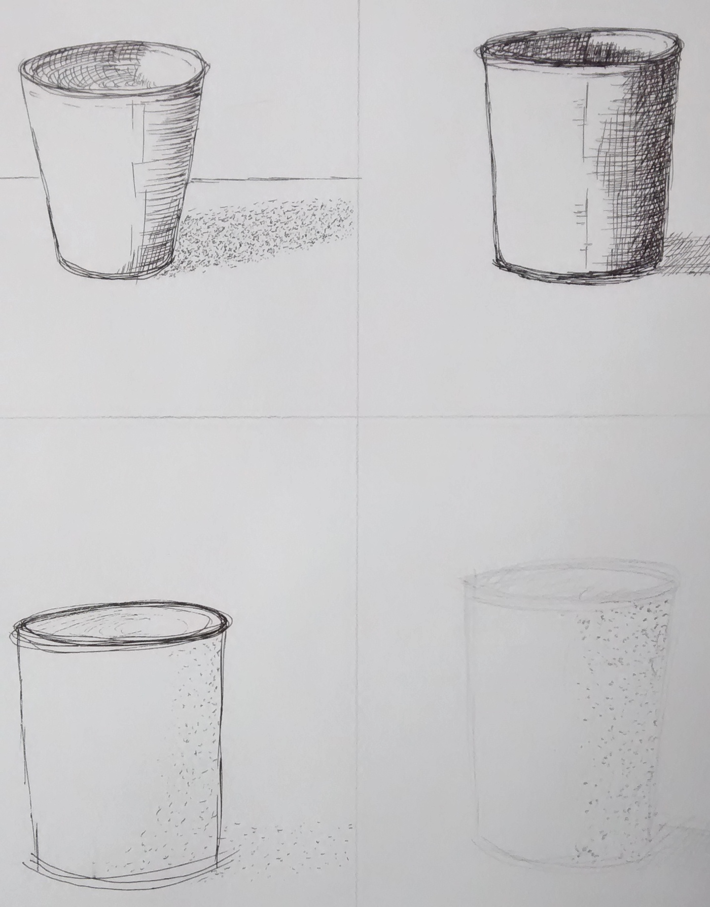
Following feedback from the tutor I am looking again at project 2 exercise 2 – ‘foreshortening’ . I looked at the image below which clearly shows the feet and legs seeming large compared to the rest of the body which is further from our view.
CARDIFF GIANT, 1869. – ‘The Cardiff Giant – Foreshortened view of the figure.’ The Cardiff Giant, one of the most famous hoaxes in American history, was a 10-foot-tall stone man ‘discovered’ on the Newell farm at Cardiff, New York, on 16 October 1869. Wood engraving from a contemporary, American, newspaper.. [Fine Art]. Encyclopædia Britannica ImageQuest. Retrieved 19 May 2020, from https://quest.eb.com/search/140_1669526/1/140_1669526/citeI copied this from a book by the artist Barrington Barber, the hand and foot on our left come forward and appear larger than the right side.Again, a copy I drew from Barrington Barber, here the forearms and hands are drawn larger than the lower body as this is what we see when looking from one end along the subjectHere I have drawn myself in front of a mirror and my feet look larger because they are nearer to the viewer
Illustrations
Fig.11 Edwards, B (1999) The New Drawing on the right side of the brain. (2nd edition): Canada: Penguin Putnam Inc. p174
Fig.12 Carr , H (c.1894 – 1970) Drawing. In: Barber, B (2002) Advanced drawing skills.[Drawing] London: Arcturus Publishing limited. p45
Fig.13 Gentilescgi, A (1637) Painting. In: Wilkes,A (2018) Great paintings. [painting]London: Dorling Kindersley p.97
As recommended by my tutor I have re-worked the final drawing for part 5.
It appears that after preparing several experiments and preliminary drawings in my first attempt I then moved slightly off course from my initial idea of observing patterns in vegetables close-up, and my final drawing became more of a ‘Still life’ composition.
I have now revisited the practice sketches/thumbnails and used these as a notes for the final piece. I have also found inspiration from looking at the work of carol Sowden who is an environmental artist and in this particular body of work she focuses on the patterns of leaves – encouraging us to see the beauty in our everyday surroundings her drawings show a meticulous method of depicting natures markmaking – http://www.carolsowden.com/needleprick-drawing-skeletal-leaf.html
Thumbnails –
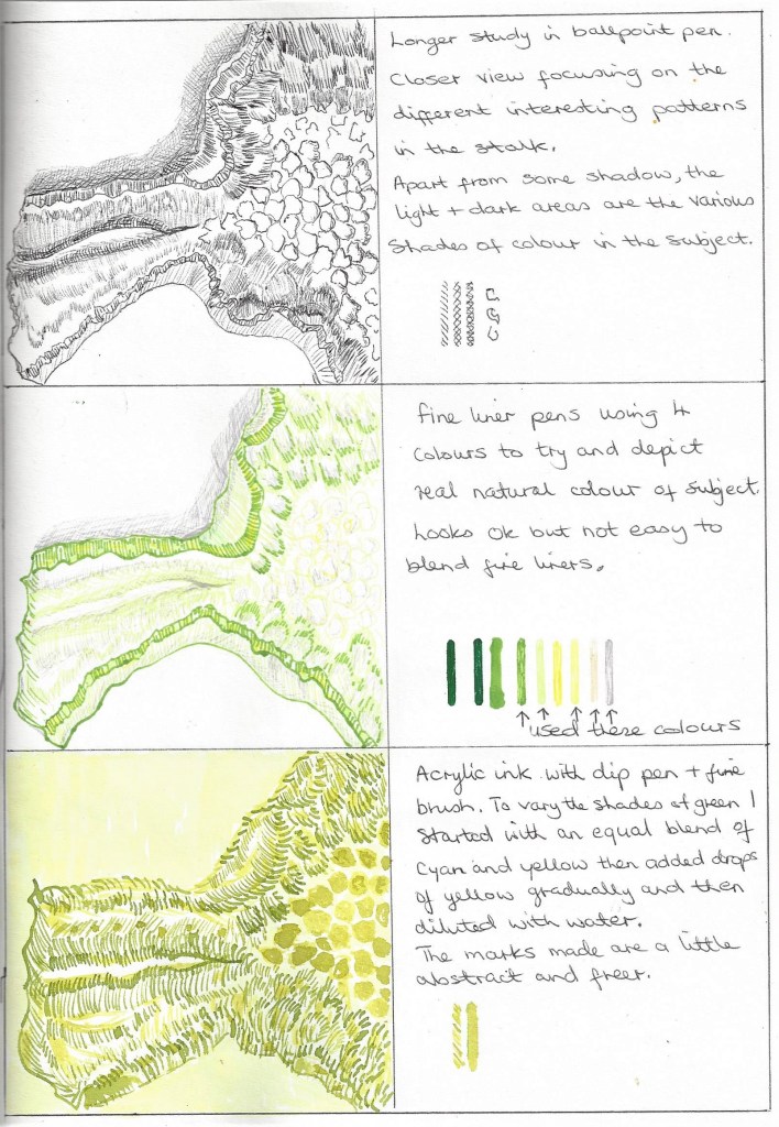
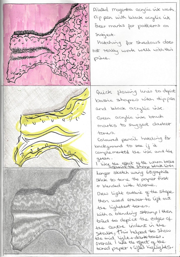
Pastel drawing on A4 pastel paper– I built up the layers gradually, using the side of the pastel, blending each layer with tissue. Then added marks with the tip of the pastel crayon at the end.Pastel drawing on A3 black paper – this view of the subject reminds me of a map/piece of land with rivulets and crevices. I want to use a close up view similar to this but maybe from a different angle.Close up of the above pastel drawing showing marks made with the side and the tip of the pastel crayon.On A4 drawing paper in my sketchbook using several weights of waterproof fine liner pens. – Testing out whether to use black and white or colour. The black ink is effective in outlining the many different patterns and marks and gives a bold, crisp look. Here I used fine liners which has a more controlled feel when drawing. I chose the thicker pens for the shadow side and gradually lightened the marks towards the right of the drawing to depict the light falling on the subject.
In this drawing the coloured inks are vibrant and have a looser style as I used dip pen and brush. I like the uneven brush strokes for the background but I think it would look better in a different colour as it is too similar to the colour of the main subject which prevents it from standing out on the page.
The last 2 drawings have helped me to decide that I will use fine liner ink pens and dip pens with acrylic ink. I have also chosen to use a stick to draw some of the lines and marks to help me keep the drawing loose and not too controlled. I am going to use A3 Bristol board paper as this holds the ink well and absorbs any wetter areas when ink is diluted. I want to frame the drawing close -up in portrait orientation as I think this suits the subject best as it shows that the area of my interest is in the stalk. I started with a light pencil sketch for the basic shape and then mixed various shades of green to yellow inks sometimes adding only 1 drop at a time to lighten or darken the shade. I began with the shadow area on the left with the darkest, heaviest lines drawn with a stick and dip pen.
In the zoomed images above it can be seen that I have used scribbling, hatching, speckling with a toothbrush, drops on ink splashed onto the page, brushwork, dip pen, stick and fine liner.
In this close up it is seen that the scribbling in between the green lines goes from dark to light to show the direction of the light on the subject.
On A3 heavy drawing paper using graphite, acrylic inks and fine liner pens with stick, dip pen and brush. I am pleased with the final outcome although I wonder if I should have darkened the shadow on the left. Using various shades of green to yellow bring a fresh,crisp feel to the drawing.
Research – Still life genre from 16th century to present day.
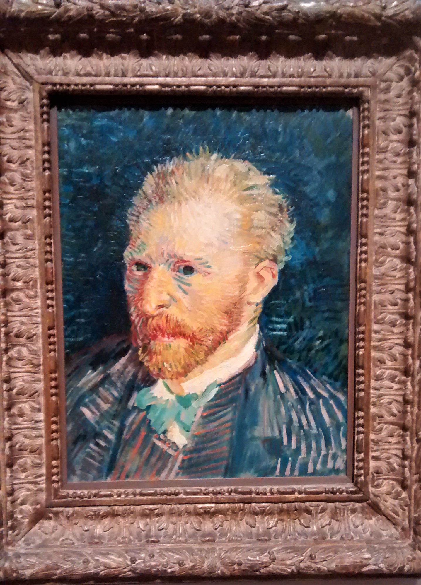
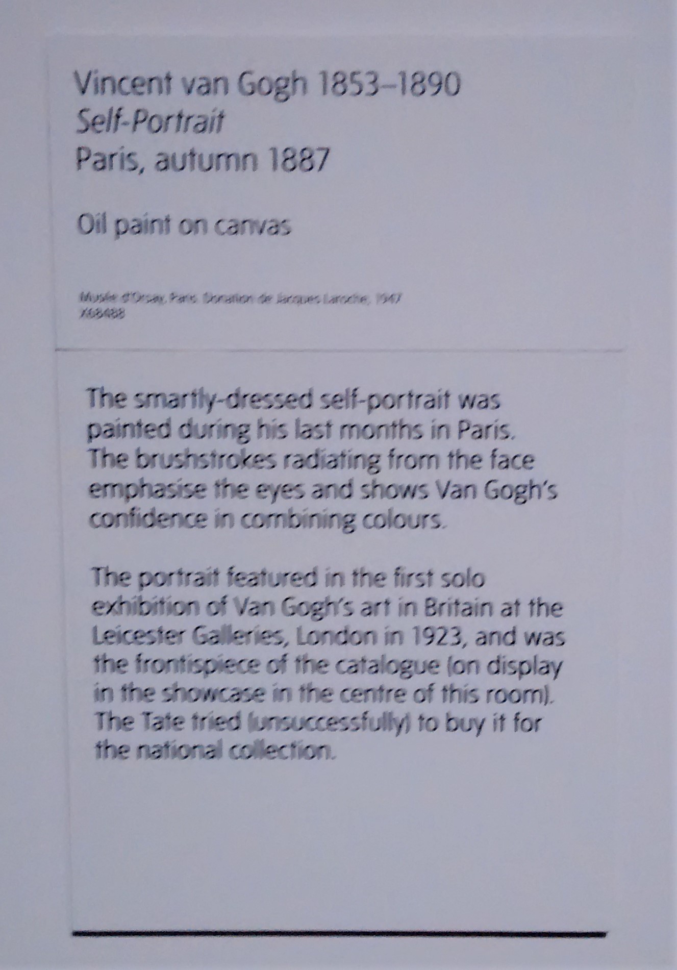
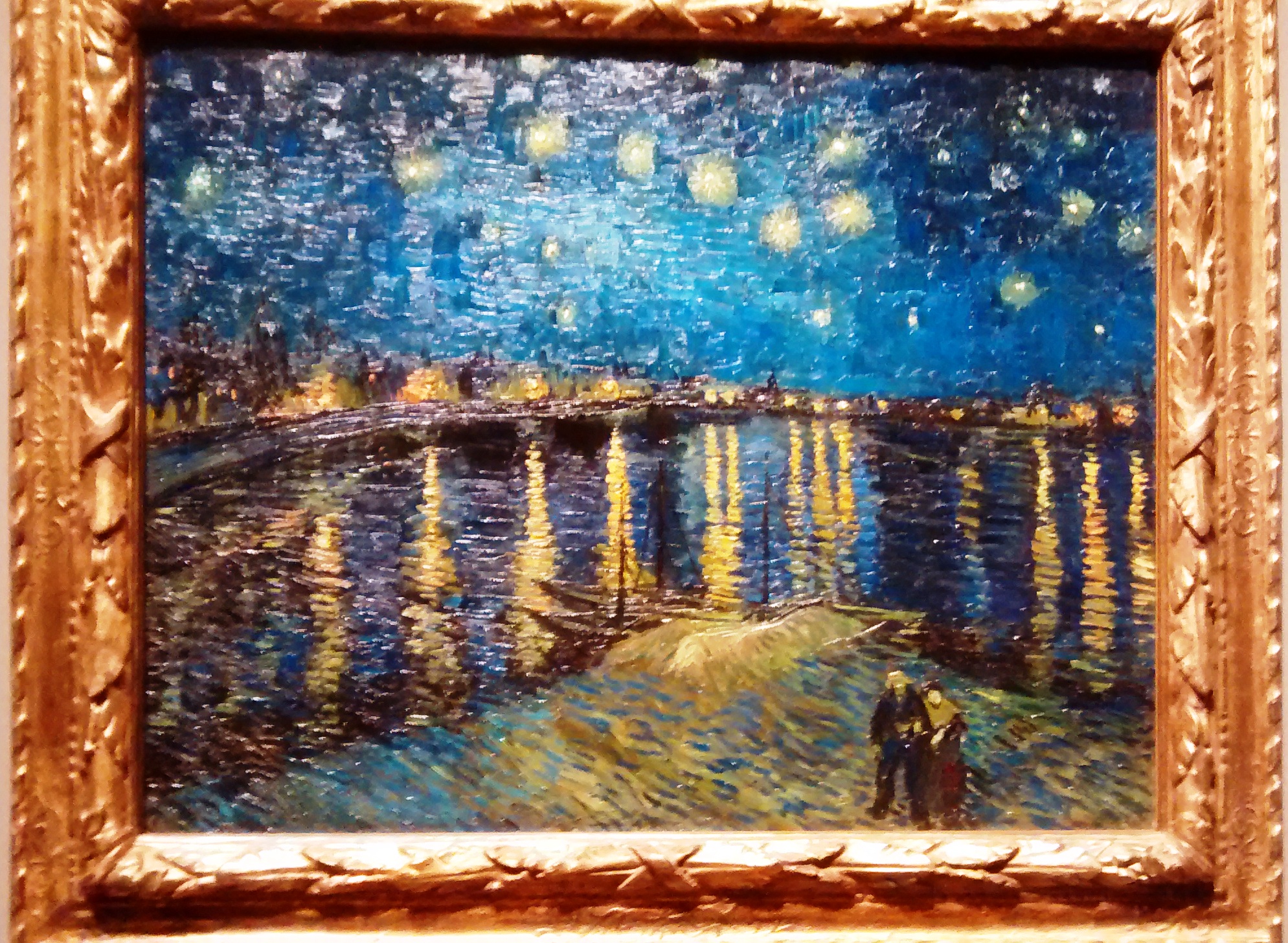
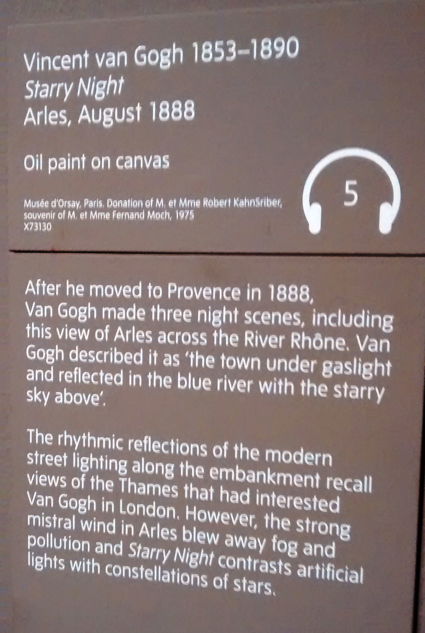
What a joy to be able to see the Van Gogh exhibition at Tate Britain this summer. Went together with our local art group and had a wonderful time – my first time visiting the Tate Gallery – will certainly go again!
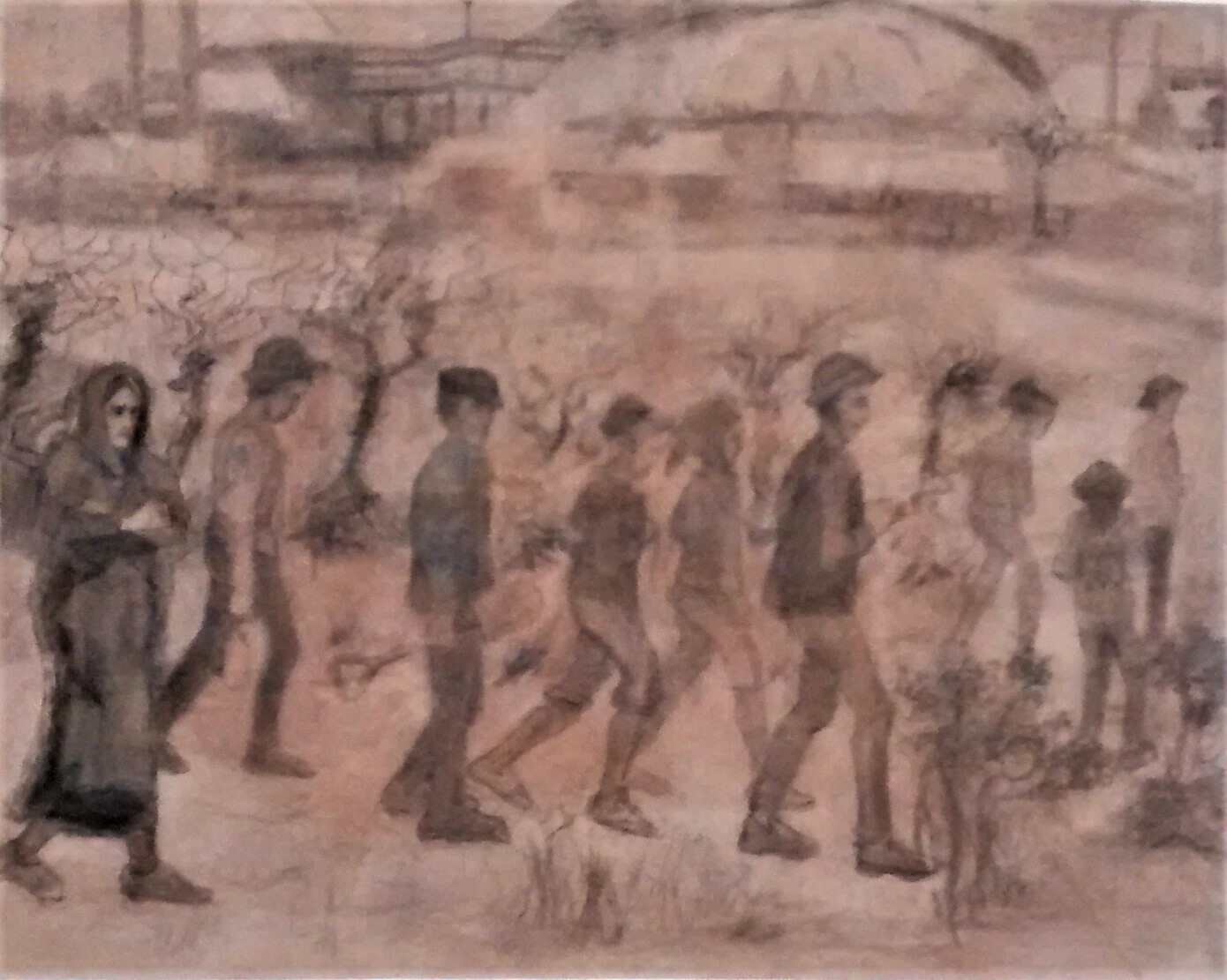
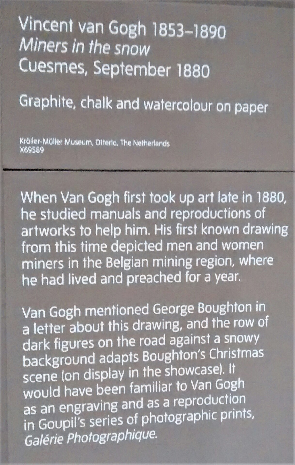
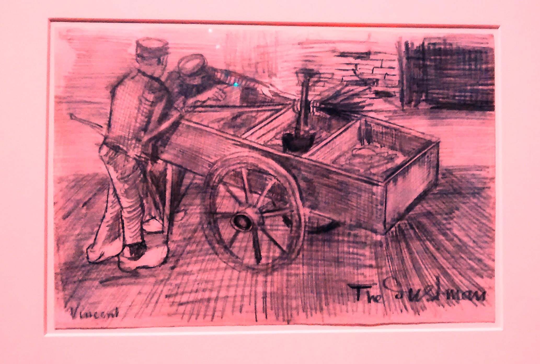
I was particularly interested in the pictures not done in oil as at that is relevant to me at the moment ( studying drawing skills ) I like the Miners in the snow drawn with Graphite, chalk and watercolour, it creates an atmosphere of cold and hard work. Also like the ‘Dustmen’ drawing ( didn’t capture the display text for that one ) . The quality of my images are not the best and because it was so crowded in the gallery I had to be quick!
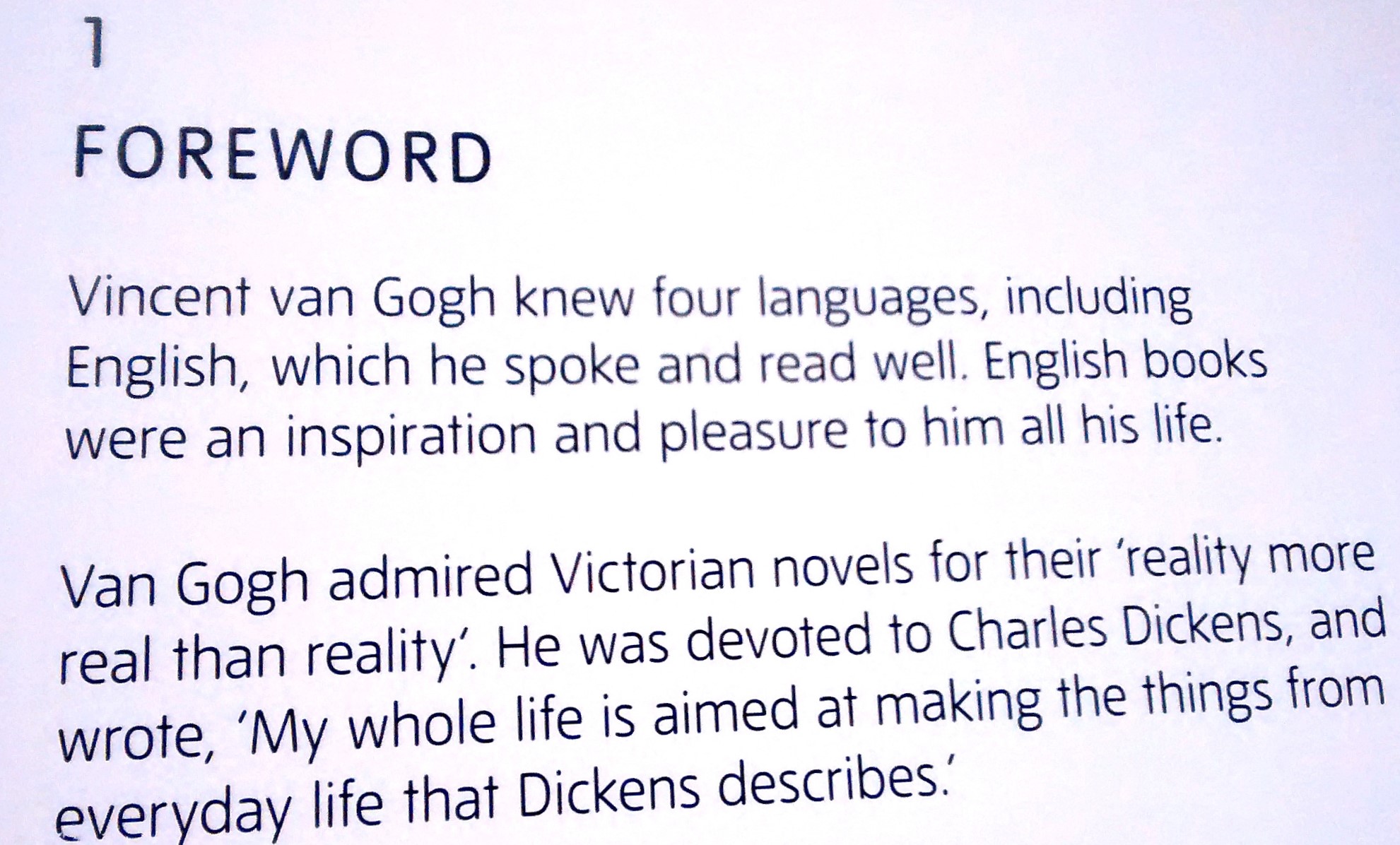
It came as a surprise to learn that Vincent read Charles Dickens books and seemed passionate to depict in his artwork the things that Dickens writes – see foreword below –
was happy to discover the ‘Still Life with plaster statuette ‘ ( bottom left ) as my studies are focusing on still life and I’m interested in the way artists choose different viewpoints in their compositions. As you can see this is painted from a high viewpoint which captures our attention and you wonder what is underneath to support.
Below is a sample of some of the artwork which inspired me –
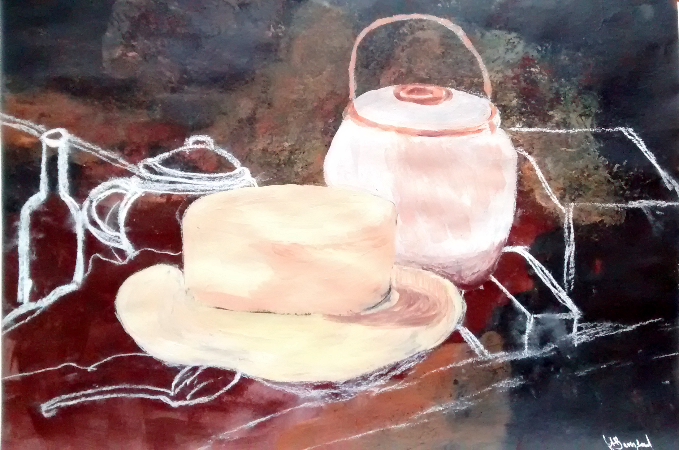
I painted a copy of Van Gogh’s ‘ Still life with yellow straw hat’ I used chalk pastel to map it out first leaving some areas to show the planning process, painted in acrylic on pastel paper.
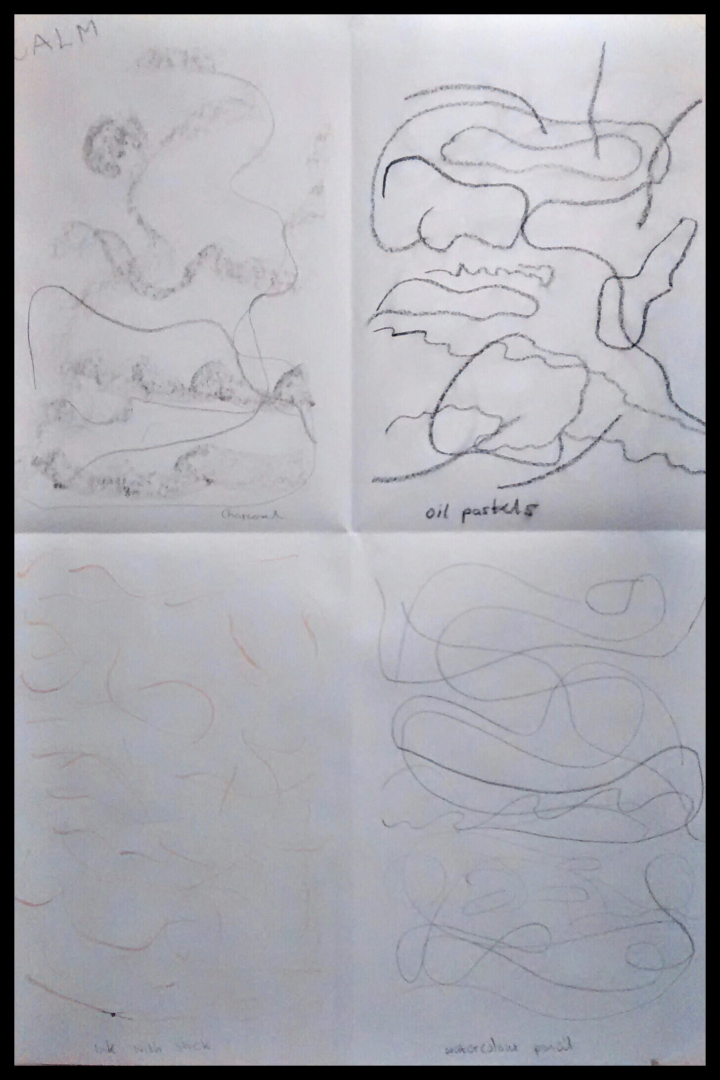
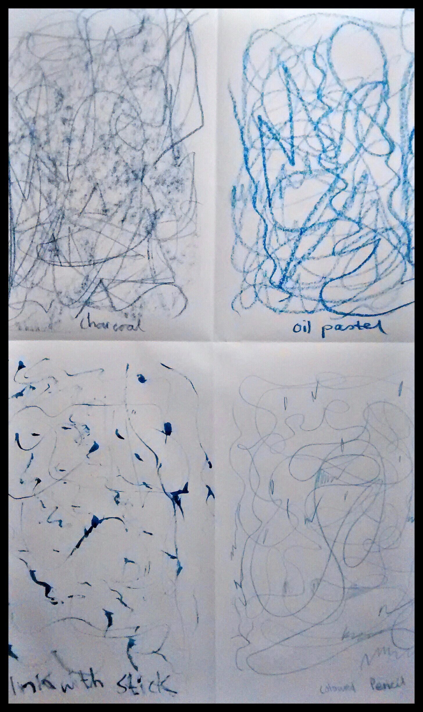
Exercise 1 – Experimenting with expressive lines and marks
Calm
Joy
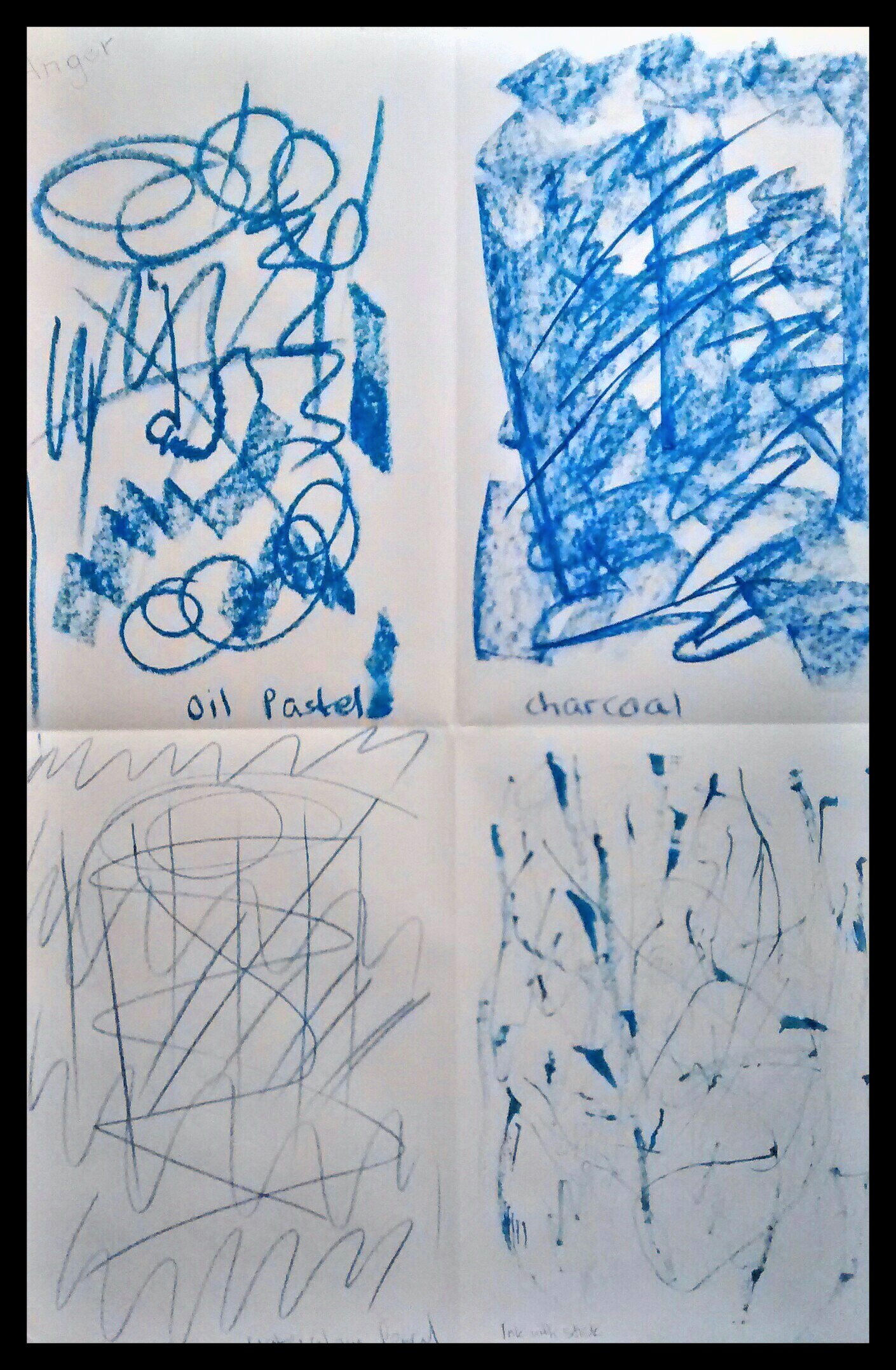
Anger
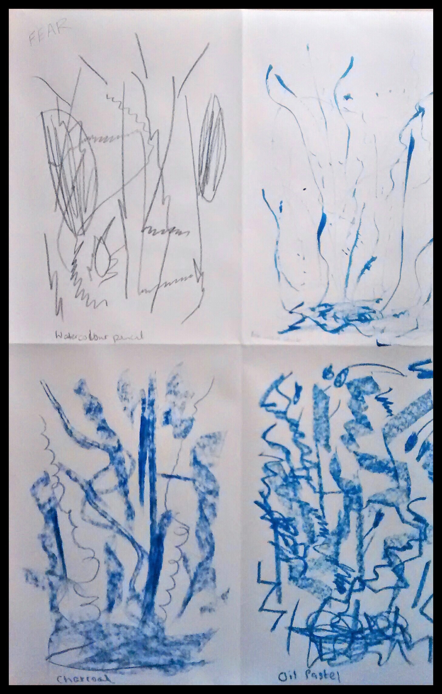
Fear
Calm – Happy to be drawing on paper without the pressure of producing a picture. Thoughts came to mind whilst drawing across the page, remembering stepping stones across a stream in Dovedale, the clear sparking water not too deep and the feeling of security as the stones already in place, take me across to the other side. I enjoy the moments and find my shapes and strokes are mostly soft curves, wavy lines with not too much pressure on the paper.
Joy – Great time drawing unbroken curves and swirls feeling like I was dancing on the paper with lilting movements. Enjoyed doing some splodges of ink with a stick. Liked the effects with charcoal drawn holding it on its side.
Anger – I didn’t want to do this one at first as I was afraid of the emotion. Once I started putting marks on paper it was easy to continue. Most of the drawings were lines and shapes with hard edges. Also the markings were darker as I applied them with more energy and pressure to the paper to release the angry feelings.
Fear – With this drawing I noticed most of the shapes and markings started at the top of the page and went downwards, often beginning with light strokes and increasing in intensity as I imagined a sinking feeling e.g. before a flight or public speaking. I also felt the fear of seeing a bat flying at night or going into a dark basement without a light.
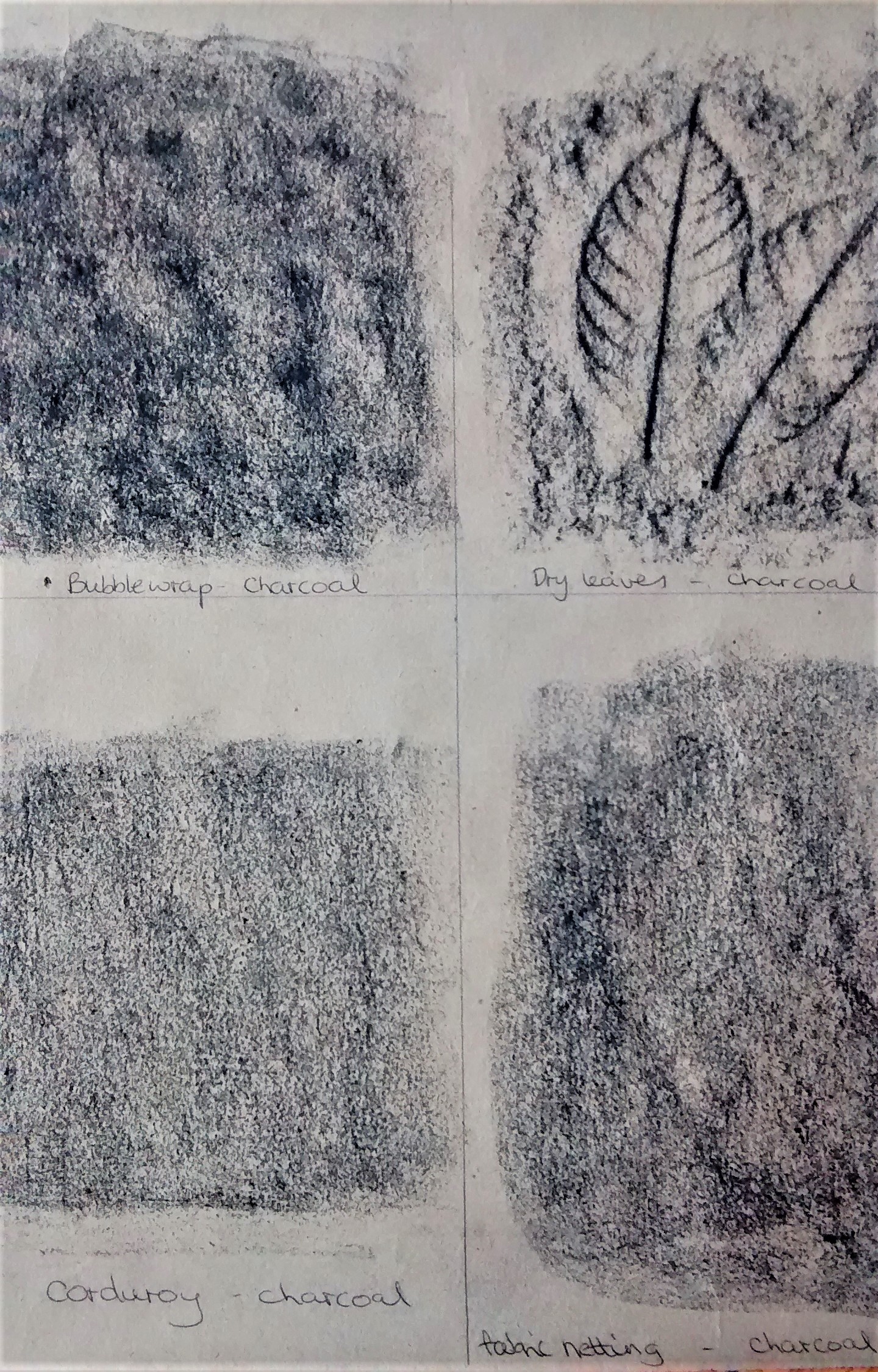
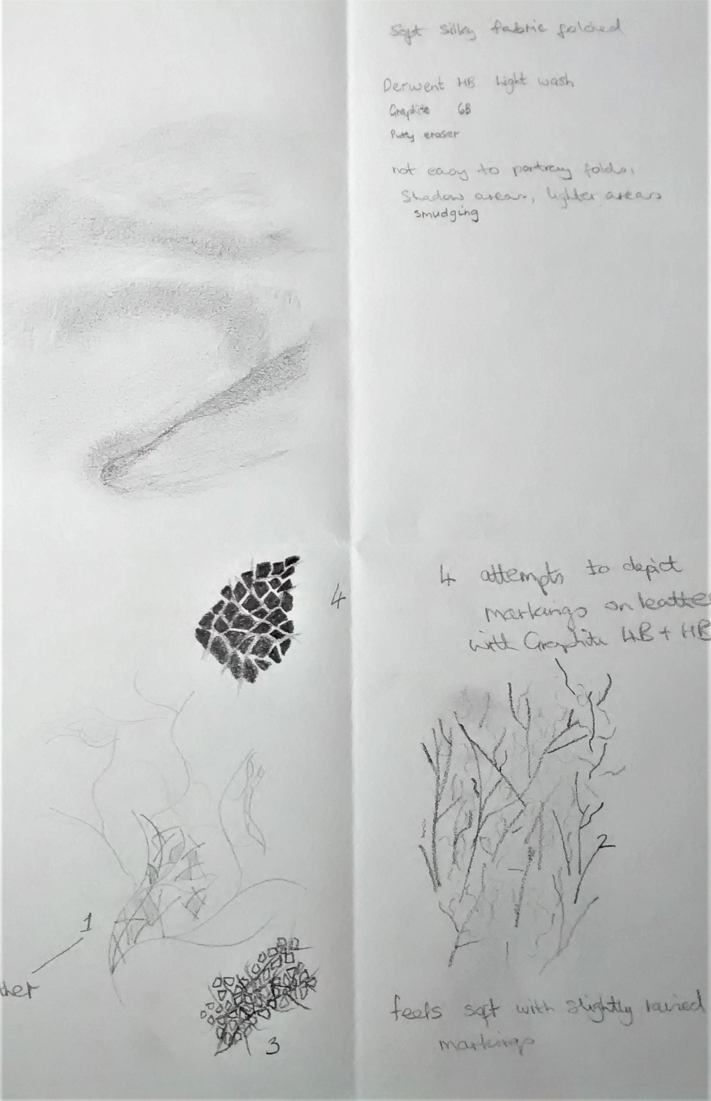
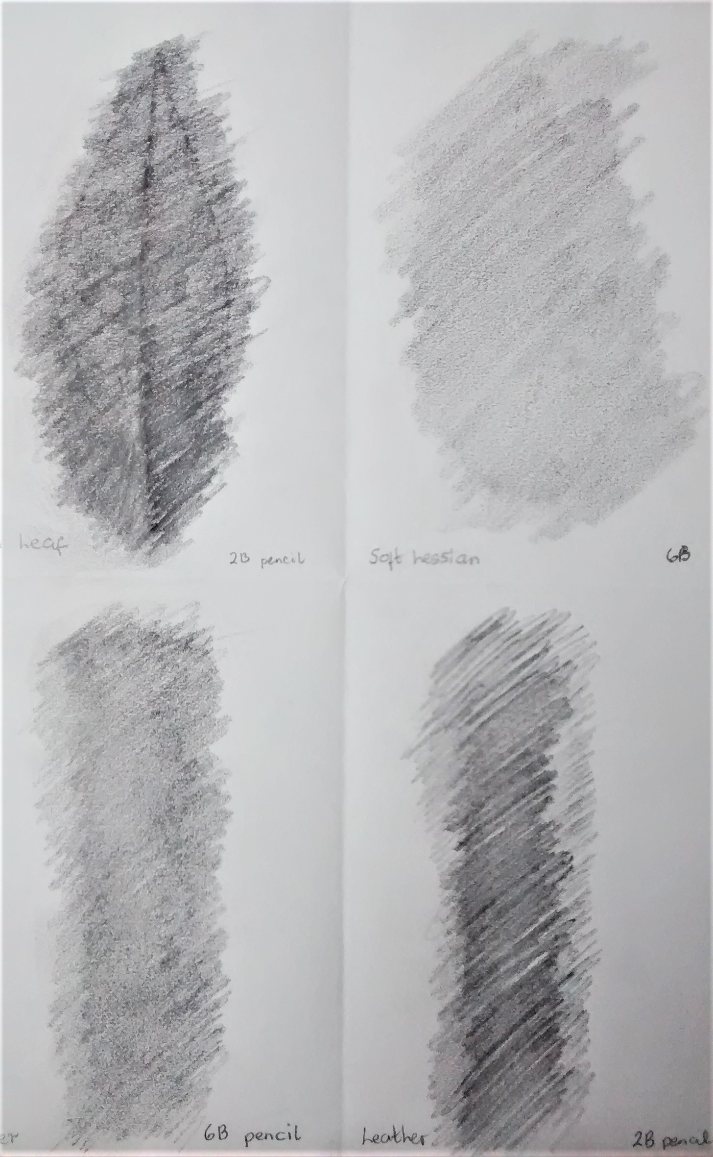
Exercise 2 Experimenting with texture
Notes
This was a very enjoyable exercise and I will try to describe some of the textures shown in the images above. I used a range of drawing tools – pencil 2B+6B, graphite stick, graphite pencil,chalk pastel, charcoal, drawing ink and writing ink.
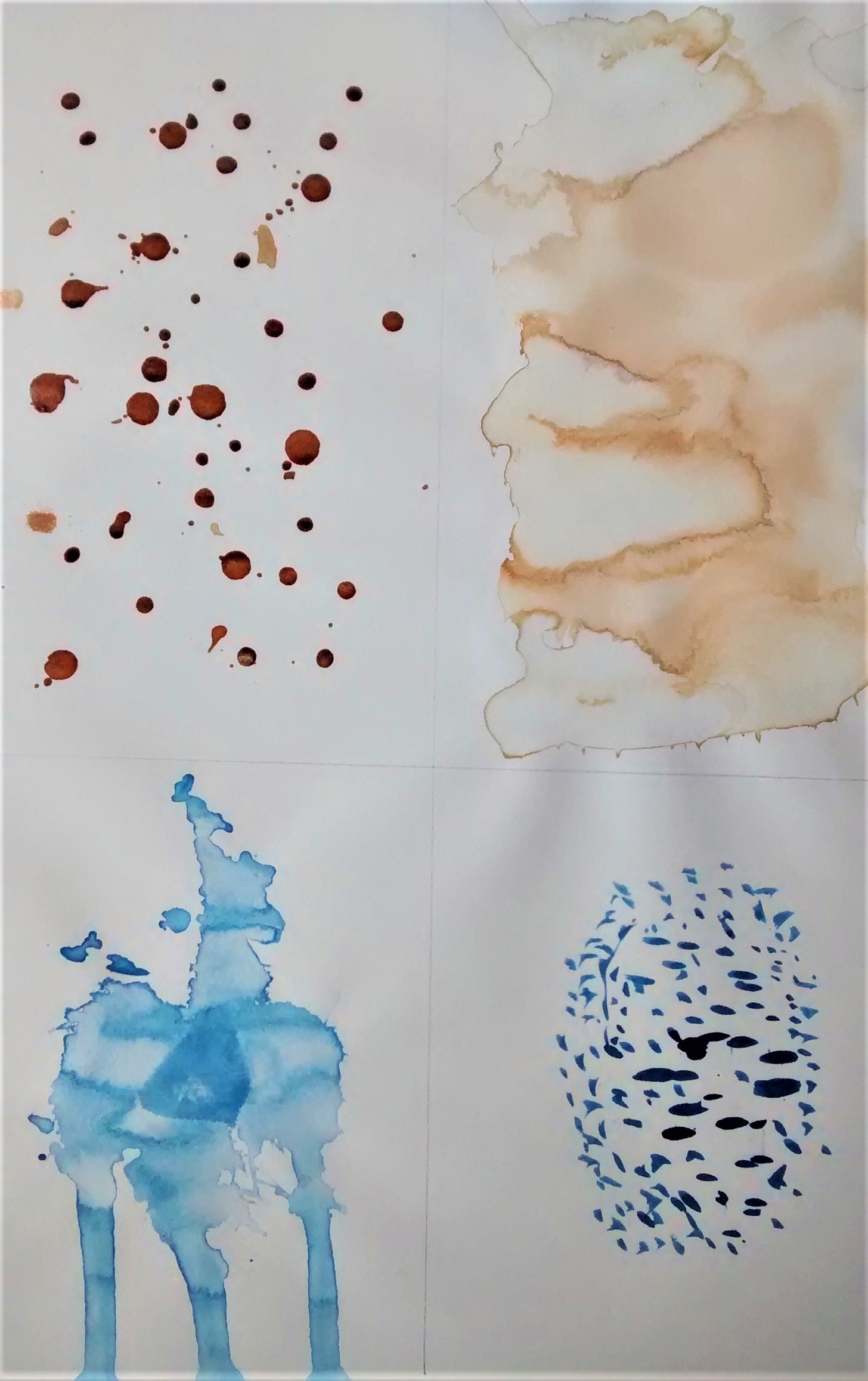
Top left – Drops of drawing ink had a shiny surface when dry which felt smooth and crisp. The blue streaks were a stick dipped in ink which was difficult to control and so was more interesting.
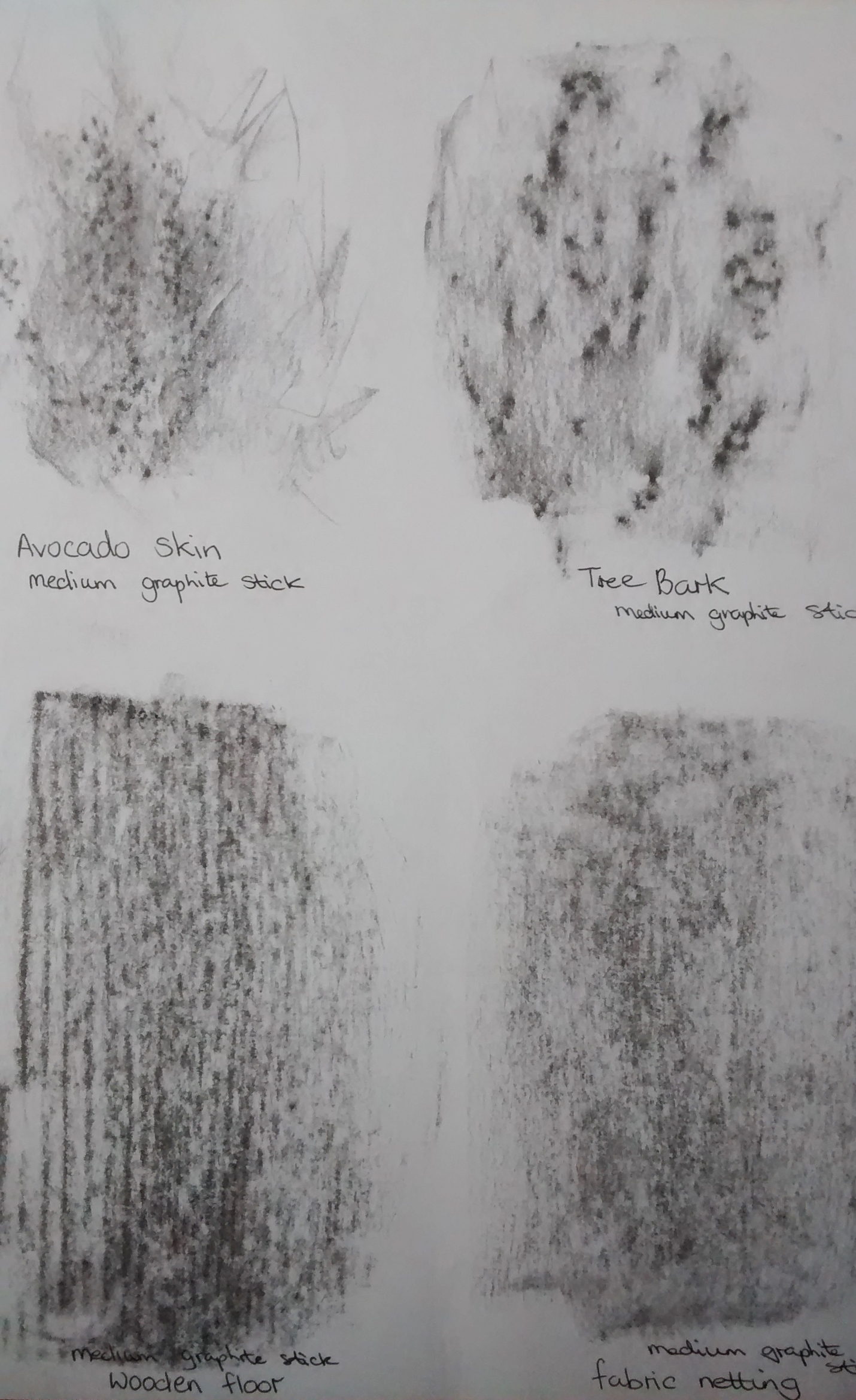
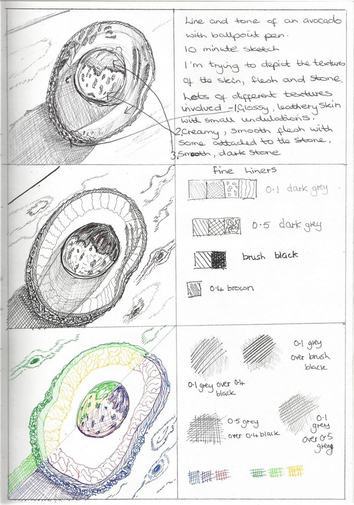
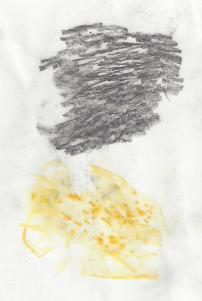
Top middle – my favourite of all these experiments was the avocado with its wonderful waxy,rough textured skin which made an exciting frottage that would look stunning when incorporated into a drawing.
The image on the right shows my attempt to draw soft,silky fabric with graphite and a putty eraser plus some smudging. it wasn’t easy to portray the folds and I will need more practice at doing this. I also tried to depict markings on leather with graphite 4B, this was a challenge as there are so many marks and lines involved.
Reflections As I begin part 5 I am going to revisit my earlier notes on each assignment and I will add some new thoughts in italics. Any notes in bold are where I have taken on board the advice from my tutor.
Assignment 1
. During this assignment I used a range of materials and some for the first time. My techniques are developing and need to be practised more thoroughly. Observation is rising with each exercise. Visual awareness needs to be increased as sometimes I miss things. I need to be more confident in design and composition.
. The content needs to be more varied. My application of knowledge is somewhat limited particularly in organising my log/blog and coursework using WordPress. Discernment and conceptualisation of thoughts and ideas are emerging with each exercise but I have felt I’m only at the tip of the iceberg.
.I have begun to express creativity in a small way and experimenting with different papers and materials is helping to see what it means to develop a personal voice. I need to use my imagination much more and not feel bound by what I feel safe with.
. Research and critical thinking have been limited and I want to progress in these areas and reflect far more on their value in art. I often look at the art of others but neglect to reflect on what is being said.
It is very obvious to me now that apart from the required exercises, and work in my sketchbook, I didn’t do any planning drawings for this assignment. It was’t obvious at the time and I’m not even sure why. What I do know is that now I always plan a sketch and experiment with format, composition, materials,subject matter etc. this makes me realise that I have learned a lot so far in this course that will be a foundation for future work.
Feedback from my tutor for Assignment 1 suggested making a note when I come across a new idea or technique that will inform my future work, so this is my aim as I progress.
Assignment 2
During this assignment I have increased the range of materials used and explored some new techniques which I an beginning to use with more confidence. My observational skills are strengthening as I put more planning and preliminary experimentation into my work (as advised in tutor feedback). Visual awareness is increasing and became evident when working on interiors. I am becoming more confident in design and compositional skills.
Content is becoming more varied as the exercises pushed me to try new subjects. My application of knowledge is increasing. Presentation of work in a coherent manner is getting much better as I chose to write and draw in this A3 coursebook, keeping the work together in chronological order. Discernment is increasing with each project. Conceptualisation of thoughts and communication of ideas is a challenge which I welcome and seek to take forward.
Imagination and experimentation are emerging and I have sought to be more confident in making decisions which is sometimes a weakness when choosing a subject. Invention is emerging throughout the projects. I still lack confidence in developing a personal voice but I am excited about the journey of discovery.
I have enjoyed the research for this project and used the inspiration gained to inform some decisions in my work. Handwriting my learning log alongside the work has helped it to flow better and be more consistent. Critical thinking is developing and reading other artist’s blogs/diaries is helpful. Visiting galleries and engaging in conversations with other artists is a valuable learning experience. I often ask others to critique my work and I welcome their feedback.
This part of the course was so enjoyable when experimenting with different media and trying out what works and doesn’t. It widened my knowledge of materials and I was excited about colours and textures e.g Project 3, exercise 3 – Experiment with mixed media. I try now not to worry too much about the final outcome when beginning a project and I now benefit from experimenting, being inventive and gaining inspiration from others. As stated above * I hand wrote my learning log which I later regretted as I neglected to keep up with the online log already started in Part 1. This made it difficult to catch up when it came to submitting work to the tutor.I have since factored time into my week to update the log and be consistent in storing my work digitally.
This is one reflection on the tutors feedback for assignment 2 – Looking at the artist Kindah Kalidy – as recommended by my tutor. I’ve been encouraged to explore mark making and materials in a free way and consider whether I could build elements into my finished work to help tell a story or convey atmosphere. Words of wisdom here which have I am building into the work I do.
Assignment 3
Throughout this assignment I have constantly felt challenged and pushed to explore new skills in drawing. It has been the most difficult work so far and I have learned so much. Working with linear and angular perspective is something I need to work on, my rooftop drawings conveyed in some way the urban beauty I was attempting to show but the accuracy has weaknesses I feel.
I have been experimenting with using mixed media in my work and trying different supports but I need to do this more. My observational skills and visual awareness are improving although I am aware of sometimes drawing what I think I see rather than what is actually there. I have noticed that my design and compositional skills are increasing slowly as I work through the exercises and look at other artists work. I also am realising that the exercises are a guide and that I can use them to do further sketches beyond what is being asked.
The exercises with aerial perspective felt more enjoyable and I was able to demonstrate this more easily in the final drawing.
I can see that the quality of my work is improving and especially as I focused on using preliminary drawings to inform the final piece and present the work in a coherent way. This is especially evident in the assignment final drawing of rooftops. I also found the sketchbook walks exercise improved the quality of the outcome for the composition I did with acrylic inks. Discernment is developing with each project and conceptualisation of thoughts is something I want to develop as I become more confident and not worry about my drawings being carefully composed. I am seeking to communicate my ideas in a small way and this course is aiding that process.
I sought to demonstrate creativity particularly in project 3, ex 1, with experimenting in mark making to inform future drawings some of which I used for landscape drawings but not so much for townscapes. I tried to use imagination by recreating other artists work in my own style which I enjoyed and found helpful. The work for project 3 was my most creative and I experimented more with different media.
I have gained knowledge of other artists techniques through the research in these projects and made notes when finding a new technique that I want to try in the future (this was recommended by my tutor in the previous assignment feedback).
I am developing critical thinking and meeting up with local art groups, attending an OCA study event has been invaluable.
It became clearer during these projects that perspective was a great challenge to me and I researched many other artists and watched lots of tutorials to find answers. Doing this part of the course during the winter months was not easy as daylight was shortened and the opportunity to draw outdoors was limited. I tried to look at what was around me and use this in the work.
After receiving feedback for assignment 3 my aim is to take on board the tutors advice to use colour in the planning process of a drawing instead of leaving it until the final piece, this I tried in e.g ‘reclining figure’ assignment 4 . Also the suggestion to explore the range of ways that one type of medium can be used to bring visual interest.As suggested in the tutors feedback I looked at some of the work of Julie Mehretu I especially like the large paintings of American politicised landscapes https://art21.org/artist/julie-mehretu/
Assignment 4
I have learned so much throughout part 4 and this assignment. I continually feel pushed to explore new skills and techniques. Drawing on A1 has been a great challenge physically and I want to find more opportunity to do this perhaps by working outside in the warmer weather. Looking at the figure has caused me to be much more observant of bone structure and facial features. I especially like the technique for drawing a face using tone which I have tried in my final portrait. Observing figures – still and moving is an emerging skill which I want to develop. I have tried to keep in mind design and composition in some of the exercises and to use a viewfinder or grid was helpful in drawing the larger sketches.
I can see that the quality of my work gradually improved as I went along. I began to realise what a vast subject the figure and head really could become and felt I could spend years studying this part alone.It was helpful to keep a visual diary with drawings of different body features to inform the 3 assignment pieces and present the work in a coherent way. The quality of the outcome for the figure drawings has need for improvement , this has been my first experience of life drawing and I see the benefit of the opportunity to draw living beings in real time. Discernment is improving with each project and conceptualisation of thoughts is something I am seeking to develop as I learn from other artists. In this part of the course I didn’t focus a lot on communicating ideas as I was very taken up with learning the technical skills I needed to produce a believable likeness of figure or face.
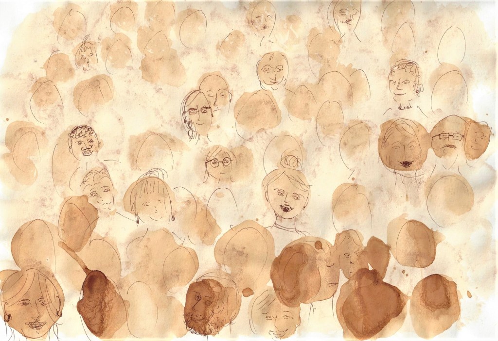
For this part of the course I worked through the exercises in a different way to all the other parts due to waiting for availability of models and then the cancellation of Life classes due to social distancing. I used imagination and invention such as collecting old magazines and drawing over the photos of people or copying them e.g in the collage for project 5 – exercise 2 and also in using collage for assignment 4 ,1 figure study using line. I enjoyed experimenting with teabags to depict a crowd in an audience (also project 5 , ex.2). When thinking about developing a personal voice I look forward to it emerging and becoming recognisable in the future.
I have been informed by the techniques of other artists throughout this part of the course particularly as I reached out for help and information due to my lack of experience and knowledge in figure drawing. I regret only being able to attend 1 Life drawing class but was able to watch a virtual class (although I think nothing can replace attending in person) My learning log has become invaluable in helping me keep track of my thoughts and organise my work whilst completing the exercises in a different order. Critical thinking is something I need to develop more. I looked at some artists views whilst researching for project 1 and this provoked many thoughts on my feelings about figure drawing. I didn’t write as much about my research as in previous parts of the course because my time was taken up in finding models/opportunities in different poses, and I consider photographs/videos of lesser value. Many things to think about and consider from these projects that have sparked my imagination.
During this part of he course I became more relaxed about writing my learning log and adding to it regularly (as stated earlier) is the best advice I would give to someone just starting this course. At times I felt overwhelmed and under skilled in this assignment but I know I would not have attempted some of these suggested projects had I not been studying the course.
Looking at the feedback from my tutor for part 4 gives me lots of suggestions to work on and I would like to begin Part 5 with her recommendation to test materials on a larger scale other than thumbnails. I have been advised to revisit Project 3 Form- Ex.1 – foreshortening and do more research and make practical works.
Artist’s statement
My chosen option for this project is from part 2 – Intimacy. projects 2 and 3
The title is – Observing detail in vegetables through a range of patterns and marks, line and tone, using inks and coloured pencil and pastel. looking at the work of the young contemporary artist CJ Hendry –https://www.instagram.com/p/BgJqEsXlDu4/ and carol Sowden http://www.carolsowden.com/
Looking back at the work I did for Part 2, projects 2 and 3 makes me feel happy as I know this was the most enjoyable part of the course for me in terms of the success of the exercises and finished drawings but more importantly my development in observational skills. I do know now that the other parts were successful in that I pushed myself to attempt projects I would naturally avoid. After discussing this choice with my tutor I realised how timely it is to be looking at objects around my environment during this time of ‘lock-down’ and working from home. I have had time to focus on ordinary things we use everyday and I am particularly wanting to explore the patterns and markings we see in vegetables. As a developing artist I have begun to see the importance of looking more closely at things around me to help to communicate this through my work. Throughout this project I would like to experiment with several mediums which I used in part 2. I particularly want to use coloured pencil as the main medium for the final piece. My choice was partly influenced by the artist C.J Hendry and also from my work in part 2 which I wanted to explore further and attempt a more detailed work. I am aiming to use A3 size paper for the final piece as this is more manageable physically for me at the moment but I will use other sizes for experiments. I want to show a close-up/zoomed in view of the subject as I feel this will enable me to work in detail and depict the beauty of the patterns in a clearer way. This is seen in the work of both my chosen artists and I can learn from their example of taking time to observe and focus on my work, whilst also enjoying the process and sometimes being led by that process to develop a work further. I intend to make use of photographs taken from several angles alongside sketches that I make as a reference to use whilst working and also to touch and handle the subjects to really get to know them. I am interested in testing different viewpoints that maybe I haven’t done before e.g the subject not being in the middle of the page as is often the case in traditional drawing. I am also interested in testing out ways of interpreting some work in more abstract ways or even mixing this with some realistic features. Although my intention is to focus on vegetables, I don’t want to rule out other natural objects that I have in my everyday surroundings and I will try out ways of focusing on some that are appealing. I will also look at other artists work as I work through the project and I am keen to learn from others examples. Looking back through the previous parts of this course and my tutors feedback as a reminder of methods and skills I have learned will be valuable in this project.
Line drawing with ink from Part 2 , project 3 , exercise 1– I feel this was my most successful drawing in this part of project 3. I would like to adapt this drawing into something with colour whilst focusing on the patterns which here are depicted well in the use of various marks, dark and light lines.Another successful drawing from part 2, project 3 – I feel the shape is good and the highlights show the sense of it being 3 dimensional. If I were to develop this I might try adding other shells with different shapes.
I started with the suggestion of my tutor to test materials on a larger scale and use playful experimentation. I taped two A2 sized papers to the wall near my work station and added marks with different types of medium to try out an interpretation of the subject I am observing. This was enjoyable and free from worrying about a perfect finish. I also then had it readily available as a reference throughout the project.
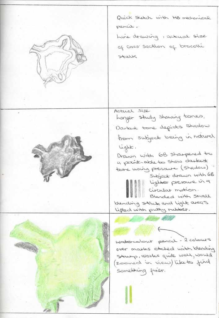
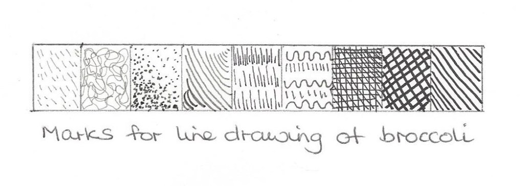
From my sketchbook- several studies of broccoli which are so interesting to look at when fresh. having time and head-space to observe in more detail makes us appreciate the goodness and beauty in some parts of nature that often get overlooked in our usually busy lives.
Testing on a larger scale – Close up study in pastel on A3 black paper using the photo on the left and previous sketches, also taking time to look at and handle the vegetable, feel the texture and observe the patterns.Fig.1 Squash (1924) I like the way the artist depicts the shape and form of the squash. Using ink and watercolour to make soft edges, we can sense the smooth, roundness of the vegetable at the same time giving an aura of beauty and regality. I am trying to decide which medium to use for my final piece – I like the effects of ink to show line as in the drawing I did for part 2 see below – but I also want use colour to add warmth and show the variation in hues in nature.
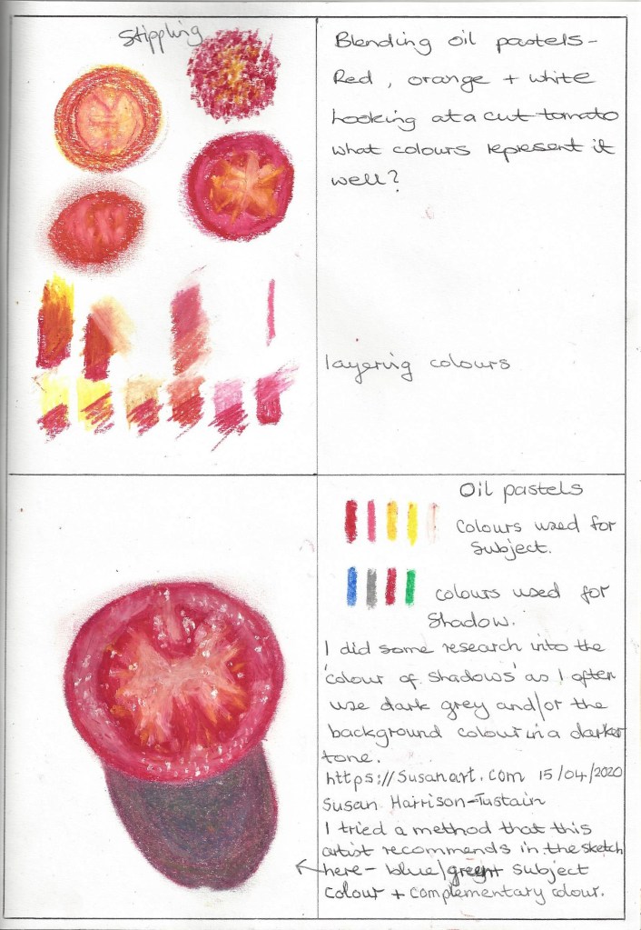
Also tried this shadow method with a larger scale pastel drawing of the broccoli I had drawn previously to see how it enhanced the drawing and gave it a more depth.
Grey shadow
Added blue to the shadow
Added red to the shadow – I like the improvement to this drawing , it gives a more lively outcome.
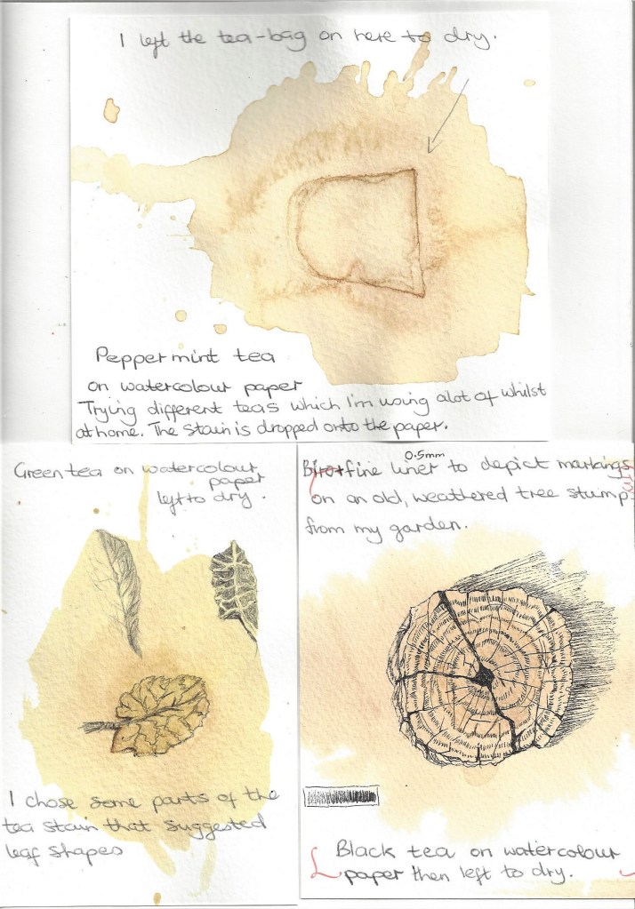
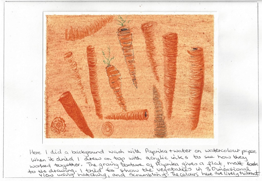
sketch of a tomato in ink on A4 page of my sketchbook – really enjoy drawing these patterns I am considering the composition of the final piece and perhaps zooming in on the subject to give an interesting view. Fig.2 Peach tree (2016) In this drawing the contemporary artist Becky Blair shows leaves in an abstract way which bursts with colour and life. I am undecided at this point whether to draw realism or abstract or a mixture of both.Fig.3 Vegetables in a Basket (2012) This drawing shows a more realistic style than the one above. Both are appealing and colourful, I particularly like the patterns on the red cabbage which catch the eye as the white pops out against the deep red/purple. So which style suits what I am trying to convey through my work is my question to my self? Tea has been a great feature in my life since working from home and I became interested in using what was around me as a medium. Wondering if it could be used as a background wash so I tried it on watercolour paper (cold pressed) wet on dry. I used the results of the process of these experiments to help depict a subject and looked at the possible shapes that I could outline. Looking at the veins in leaves is fascinating.
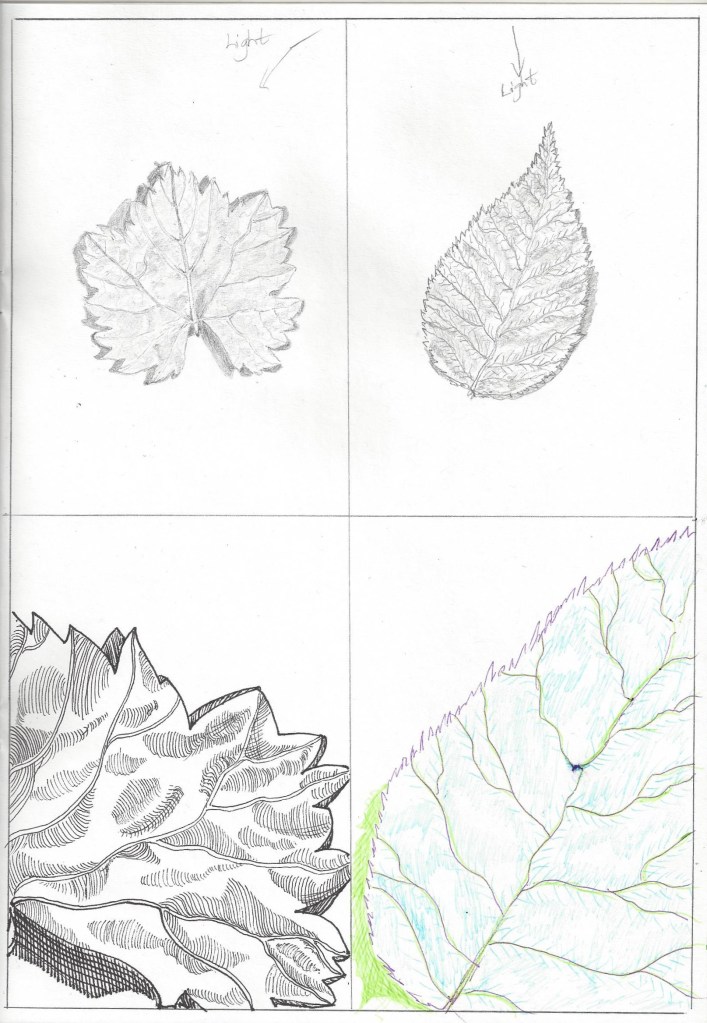
Research point – http://www.carolsowden.com/needleprick-drawing-skeletal-leaf.html I researched contemporary artists who draw nature as part of their work and came across the artist from Yorkshire – Carol Sowden. The skeletal leaf works are very detailed and precise and we get the sense of her dedication to observation and attention to detail.
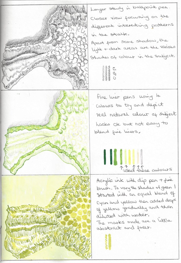
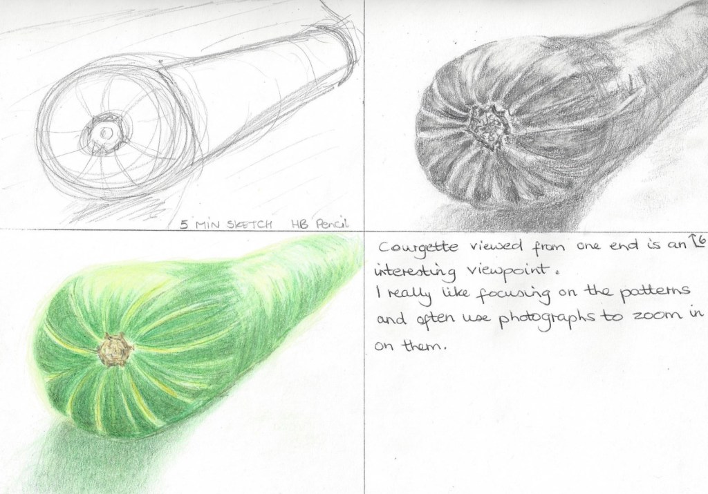
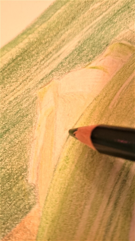
I drew the 2 leaves in the top 2 sketches true to scale and life-like in pencil. Then below I interpreted each leaf zoomed in and in a more abstract way. The leaf on the left in with fine liners o.8 and 0.5mm. I wanted to show the veins as open canals that are the life-line of the plant. The hatching is used to depict the small undulations on the surface of the leaf which reflect light. The drawing on the right is with coloured fine -liner and unrealistic colours, I’n not too happy with the result of the marks I used but I do like the zoomed in view. After the previous sketch I feel inclined to choose a close- up of my subject. This drawing is done on A4 paper with fine-liners in black and grey and various sizes as suggested in the feedback from my tutor for assignment 4 – the darker, thicker marks show the edges of the shadow and the lighter marks describe the highlights/lighter tones. Exploring other vegetables and focusing on their unique shapes and patterns-below is a frottage of the avocado skin which is something I did in Part 1,project 1, exercise 2 and I enjoyed re-visiting this exercise although I’m don’t think the avocado frottage is something I will use in this project. Sketches of this vegetable on A4 paper to show the patterns from an interesting viewpoint which I often overlook. Using a lamp for lighting on the subject I began by drawing the basic shapes and then i sketched in tone using HB , 2B and 4B pencil and a putty rubber to add highlights. I then used coloured pencils in several shades of green and yellow adding layer upon layer blending each one in.
Fig.4 Beresford, J. (2020) My workspace. [Photograph, painting] In possession of : the author: Northampton. Whilst clearing out a cupboard I discovered a large amount of ground Paprika which had been there a while. I mixed it to a paste with water and painted with a brush- first as a wash on watercolour paper and then I drew shapes that perhaps could be used to depict vegetables or wood in an abstract way.
Here I wanted to experiment with other natural things in my surroundings to look at patterns, this is an impression of my garden – drawn with coloured charcoal on A4 black paper
Now I have outlined some of the negative spaces to observe, using white on black paper helps to focus . this is something I remember enjoying from part 2.
It wasn’t in my plan to use charcoal but they were more of a comfort thing as the subtle , earthy colours looked lovely.I drew an imaginary garden on A4 watercolour paper in mixed-media – charcoal, ink, graphite, wax resist and leaf stencils using dip pen, fine liner pen, candle and twig from the garden. experimenting using things around me, the leaves were from my garden and I painted ink onto them and printed them onto the paper. L like the wildness of this picture and I added the yellow to depict a sense of hope coming through in a dark place. I drew this in mid April at the peak of the Covid 19 virus.Fig. 5 Out of the darkness (2020) After drawing the previous sketch I researched contemporary artists who draw nature and came across Jo Starkey- ” As a nature lover, I try to depict the essence of nature and its magic, into my paintings.” (Starkey, 2020 ) I like the effect of the highlighted flowers coming out of the darker background and drawing our eyes around the picture.
I wanted to experiment further with coloured pencils after looking back at some my work in part 2 , project 2,exercise 1 see next image below – I also wanted to observe the leaves especially and note the different hues of green. It really helps in developing observational skills to look closely at not just the main subject (flowers) but also the surrounding vase and water.I remember when I drew this that I enjoyed the way the pencils could be blended to make other colours and how they could be applied to show shape and form. This drawing is quite good at depicting the shape and form of the fruit and the highlights give a sense of depth.Fig.6 Bamboo Shoots, from an album of vegetables (s.d.) I researched historical artists who had drawn vegetables and came across this piece in the Bridgman Library. I like the simplicity of the marks that carefully depict the head of the shoots and the close up view makes them look almost like landscape, very grand and majestic, reaching for the heights.
Research point – I looked at some images in the Bridgman library where artists had used coloured pencil and added them to a slideshow (first time I’ve done a slideshow) see link below -https://www.bridgemaneducation.com/en/slideshow/private/1a80ae6a4ad381d8efb432d547d422e2a3958bd9 I also came across a young contemporary artist who works mostly in coloured pencil and draws her subjects in great detail https://cjhendry.live/
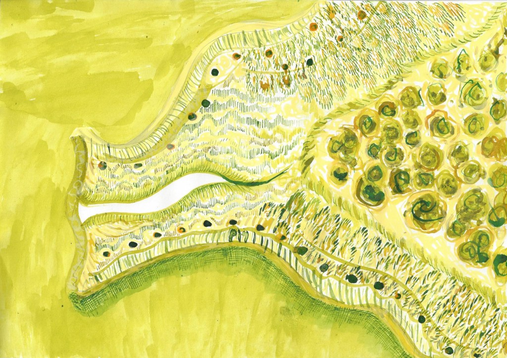
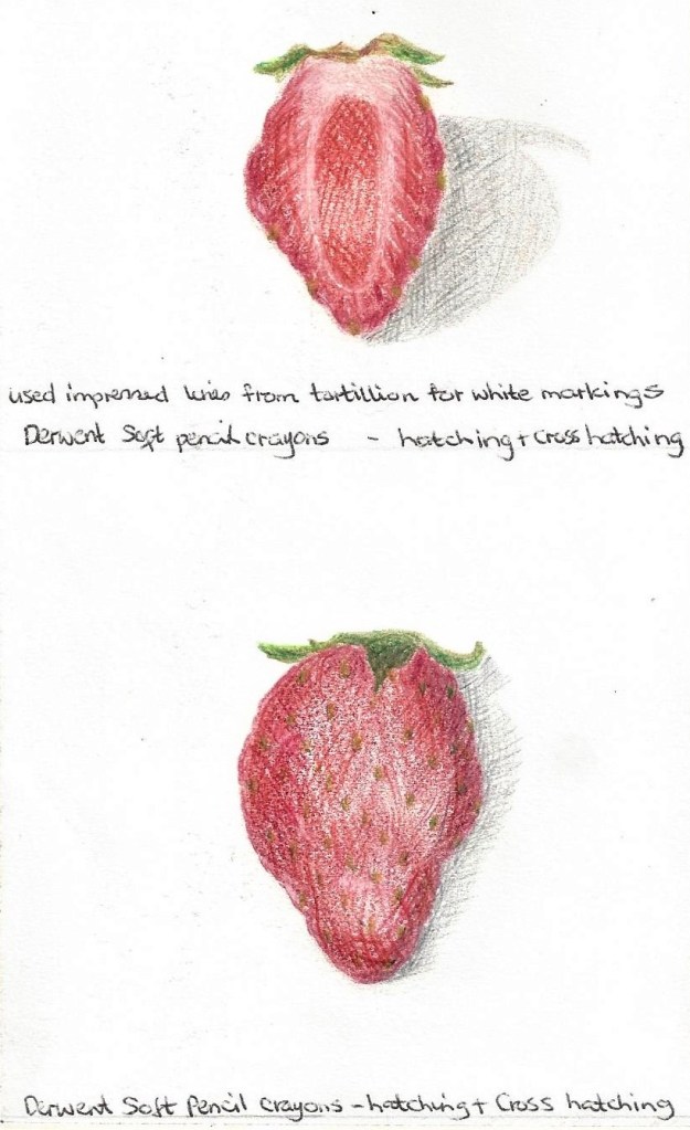
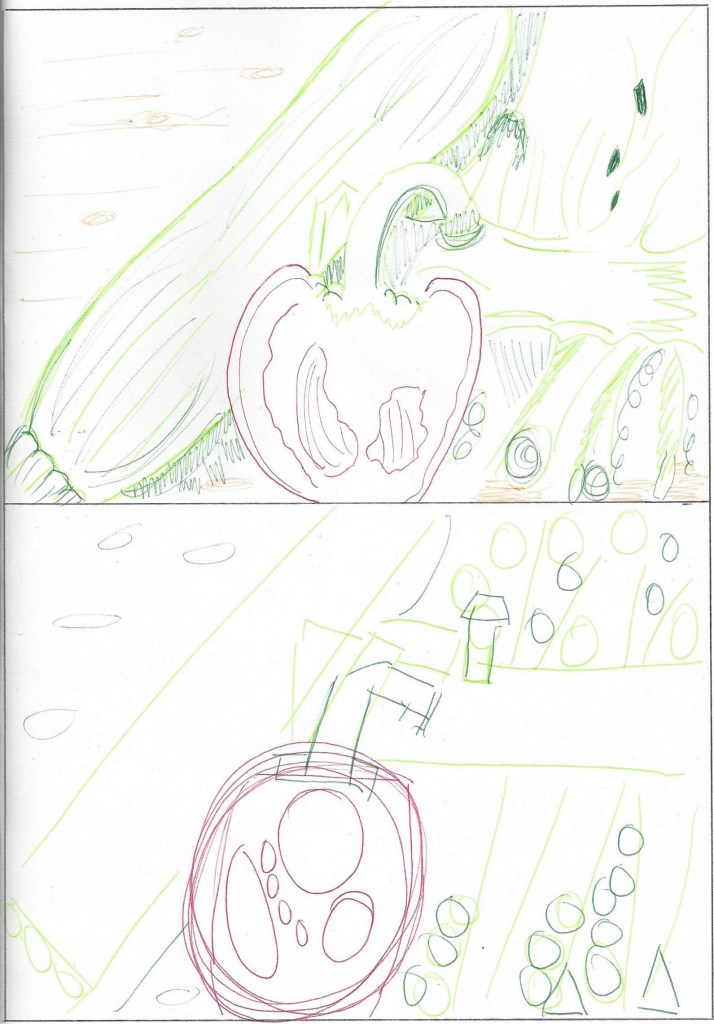
Final drawing Now I am starting the final piece, having chosen to use a cut pepper (prompted by project 3 shown earlier and the brightness of its colour) a courgette because it is a completely different shape to the pepper and a cut through stem of broccoli because I really want to showcase the patterns,shapes,negative spaces and colours. I feel the contrast of red and green together will be interesting and add energy to the drawing.
Now that I have chosen which vegetables to draw I want to look at the composition and see what suits the subject framing. I feel the bottom 2 arrangements are overcrowded and too busy, I want to create an atmosphere of calm and slowing down, having time to observe.I sketched out the basic shape after deciding on the arrangement in the top sketch. Landscape orientation suits the layout of the subject giving space to each vegetable whilst also showing the pattern of the wooden surface as the ground. I benefited from organising my work space to have easy access to materials and to pin to the wall some sketches, post-it notes, helpful methods that I came across which I could see everyday.
Starting a tonal sketch on A4 paper in pencil
Finished tonal sketch
I used natural light and lamplight when photographing the subject to see which enhanced the shadows best. using a mixture of both worked well as some days the sky was quite cloudy. I wanted to create an impression of what can bring joy in a difficult time. I think this comes across but I need people to let me know.
Began with light a sketch in HB pencil for the underdrawing
I used my preliminary sketches and photographs for reference as the fresh vegetables began to deteriorate
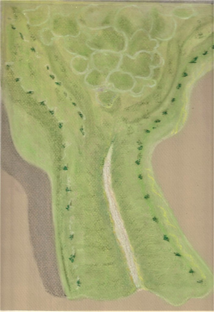
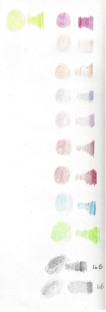
colour chart
I kept the subjects close-by whilst working, to be used as a constant reference alongside photographs. During this drawing I used a blending pencil to help to blend the colours smoothly. I then used a burnishing pencil (which acts as a waxy layer) for the florets on the broccoli- by using a circular motion over the first layer of lighter colour I was able to add a layer of darker colour whilst keeping the lighter colour visible and highlighted. This was more of an abstract way of depicting the florets and I am quite pleased with the outcome as I only discovered it whilst experimenting.
Blending shadows
Checking the edges
Looking at negative spaces
I used a cake board as a surface underneath the paper to give texture to the skin of the courgette as I drew.
Drawing in the darker tones
Blending the colours and adding many layers
Looking at the direction of the pencil lines and the shape of the subject.
Trying to make the red inside parts look hollow and bring the white parts forward by lots of layering and looking at the direction of the pencil strokes.
Whilst working my way through this drawing it reminded me of doing a jigsaw, taking time, finding the right pieces and putting them together to from a whole. It was extremely therapeutic in a worrying time to have something lovely to focus on.
Final piece – I grouped the vegetables together like this to show how different each shape is and yet they have a relationship to each other, i chose to view them from above, close-up and place them off centre so our eyes are drawn around the composition. At first i wasn’t sure about leaving a space empty to the left and toyed with the idea of adding another vegetable but I wanted to show the patterns of the wood which was also a living thing. I also remember from the course that still life works better with an odd number in the arrangement.I am pleased with the result here and especially have enjoyed focusing on the negative spaces.Finished work – A3 Graphite pencil, coloured pencil and fine liner on heavy drawing paper.
Reflection – After completion and as I was about to email my tutor, I read the guidance in the course book which recommended a final self-assessment check against the criteria. So I went back over this whole project and made several adjustments. I am glad I remembered to read it!
List of illustrations
Fig.1 Kuniyoshi,Y. (1924) Squash. [pencil,ink and watercolour on white paper] At: IMAGE numberIMA207270 TitleSquash, 1924 (pencil, pen, ink & w/c on white paper)CreatorKuniyoshi, Yasuo (1889/94-1953)NationalityAmericanLocationIndianapolis Museum of Art at Newfields, USAMediumpencil, pen, ink and watercolour on white paperDimensions38.7×56.5 cmsCreditSquash, 1924 (pencil, pen, ink & w/c on white paper), Kuniyoshi, Yasuo (1889/94-1953) / Indianapolis Museum of Art at Newfields, USA / The Robert and Traude Hensel Collection / Bridgeman Images (Accessed 04.2020)
Fig.3 Thewsey,J. (2012)Vegetables in a Basket.[pencil and watercolour on handmade paper] At: THE1449321: (pencil and water colour on handmade paper), Thewsey, Joan / Private Collection / Bridgeman Images: Vegetables in a Basket, 2012, (pencil and water colour on handmade paper), Thewsey, Joan / Private Collection / Bridgeman Images (Accessed 04.2020)
Fig.4 Beresford, J. (2020) My workspace. [Photograph, painting] In possession of : the author: Northampton.
Fig.6 Pien,S. (s.d.) Bamboo shoots, from an album of vegetables [ink on paper]At: MNS881091: Bamboo Shoots, from an album of vegetables (ink on paper), Pien, Shou-min (1684-1752) / Minneapolis Institute of Arts, MN, USA / Bridgeman Images (Accessed 04.2020)
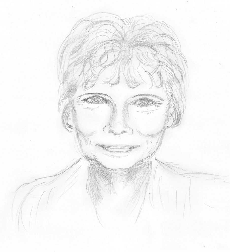
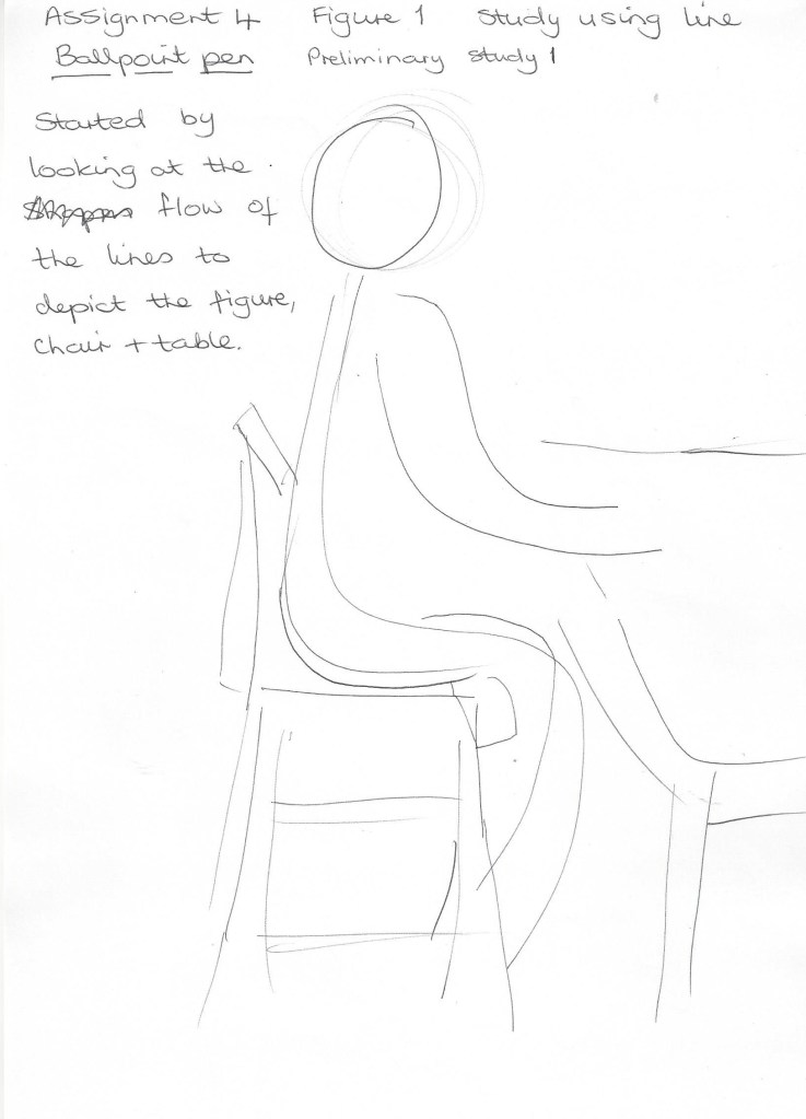
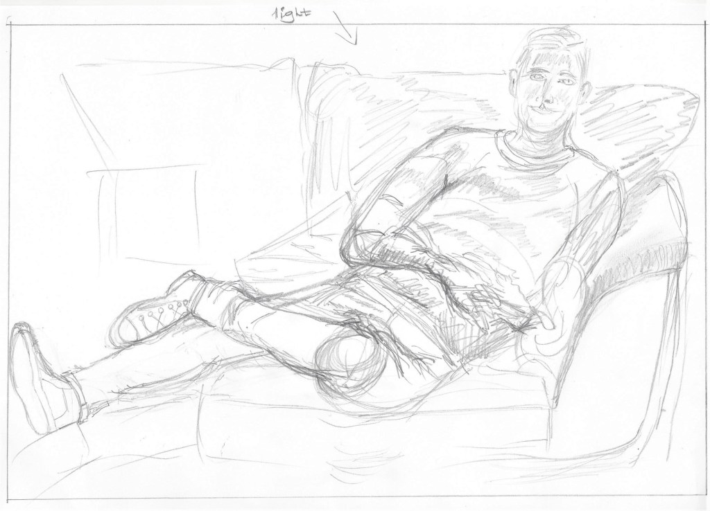
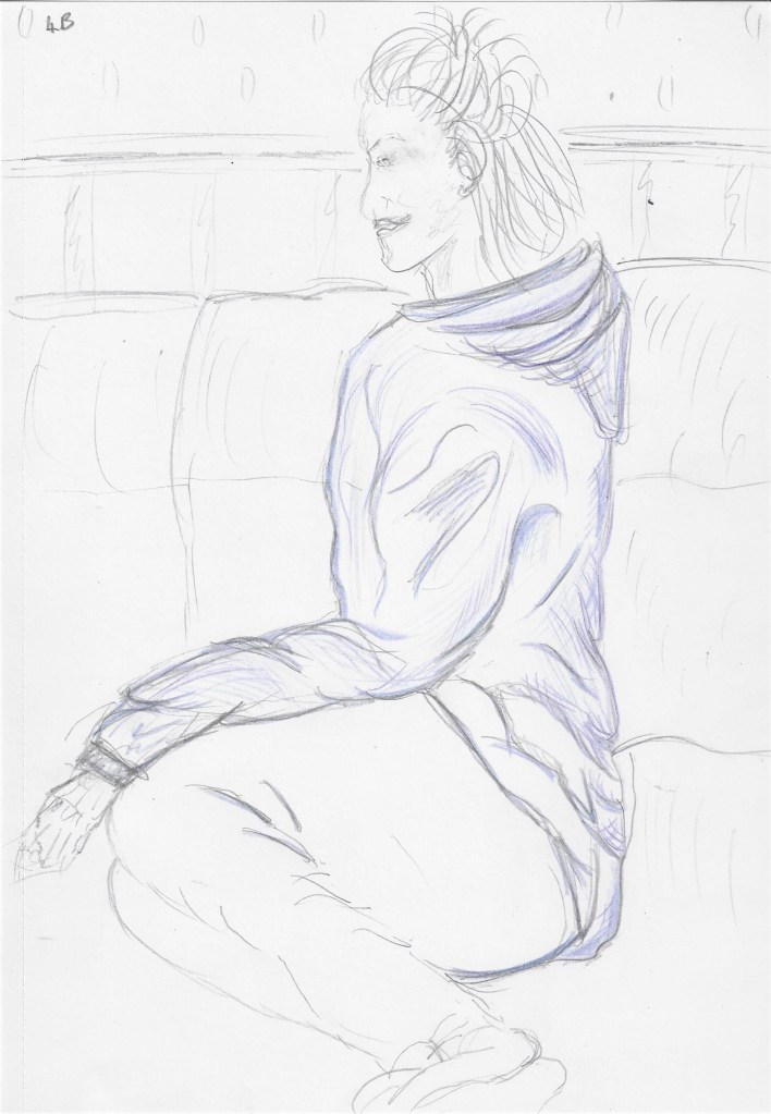
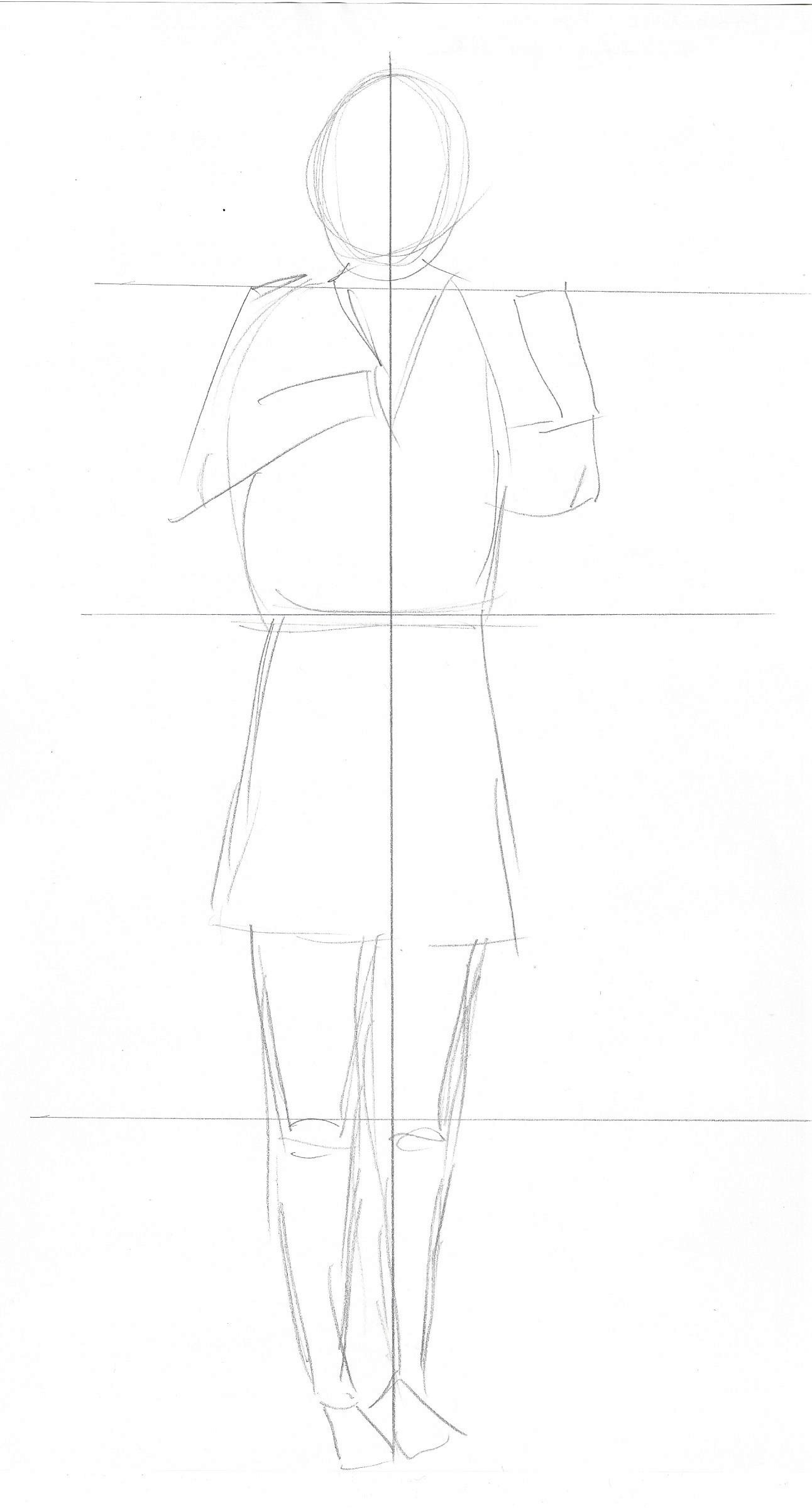
I sketched the model in a real life situation. She had just finished some studying and was looking thoughtful and pensive. I plan to use a portrait orientation as I feel it suits the shape of the whole composition. I would like to include some colour and/or collage as I have been inspired by the use of collage in some of the work of Picasso and Braque when researching for Part 2 Intimacy.
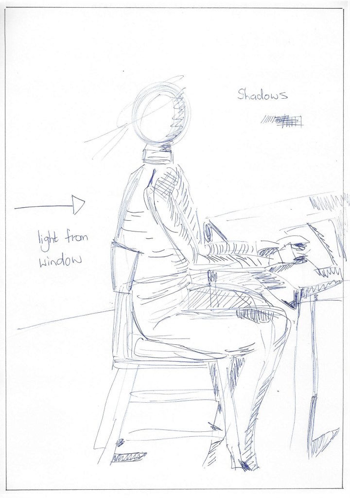
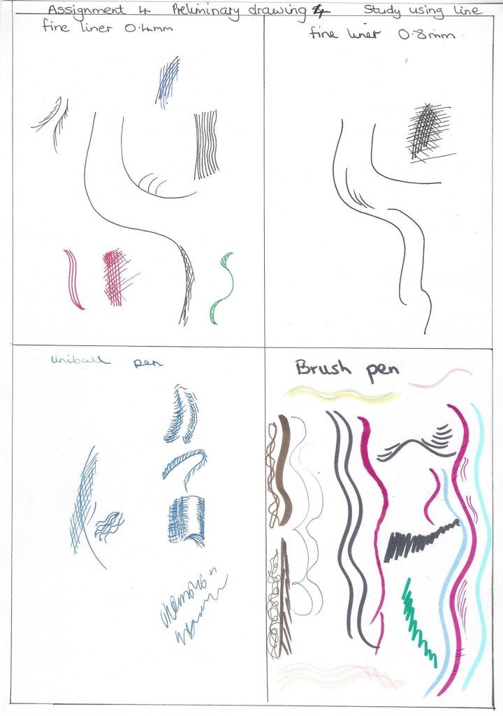
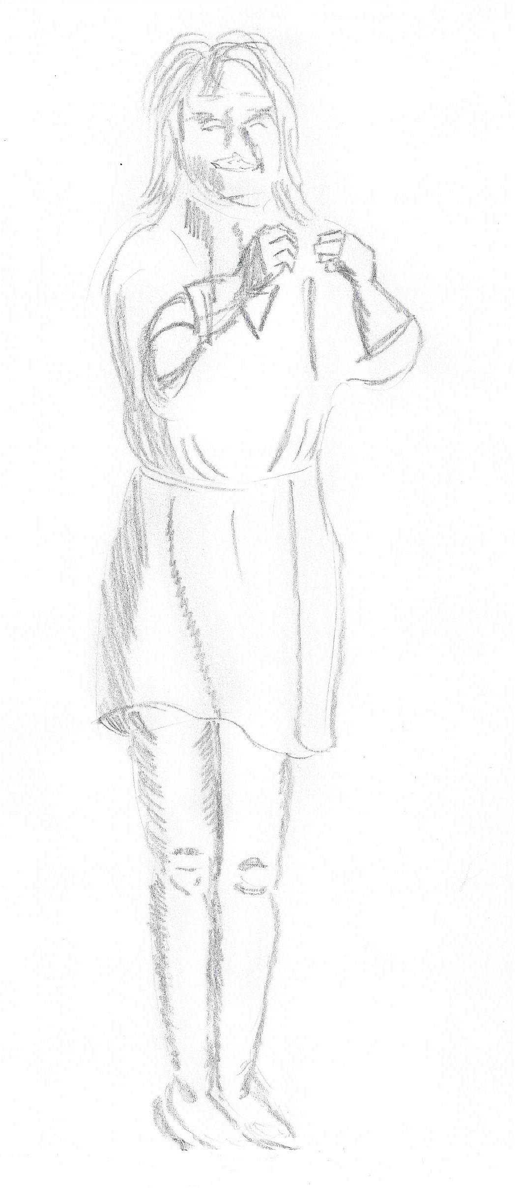
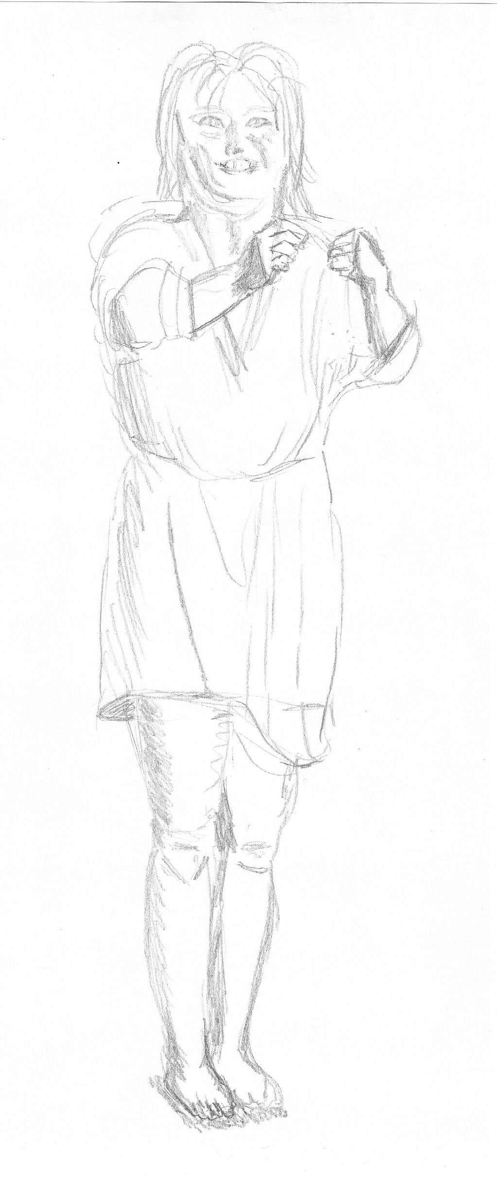
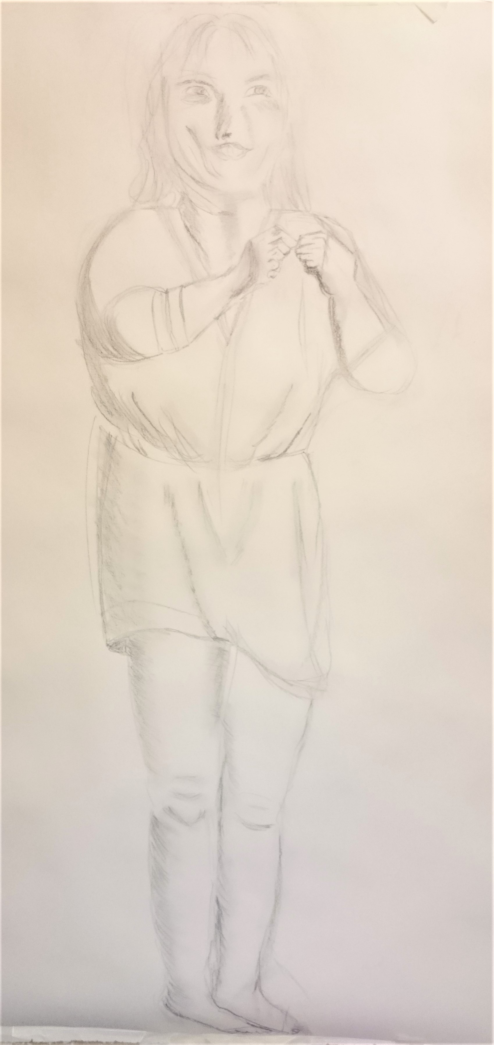
A quick sketch to note position of figure in relation to the chair and table. Light is coming from a window from the left onto the back of the model.Fig,17 Saskia sitting by a window (c.1638) I found this drawing by Rembrandt and was struck by the simplicity of the lines for the figure and yet they would be informative for the artist if used for a painting.A quick sketch to highlight shadows ,on A4 paper using biro.I sketched this on A4 drawing paper using wax crayon. I wanted to see how these colours went together. The wax crayon flowed well across the paper and shows some of the paper texture which depicts the matt surface of the wood and table.Fig.18 Sushi bar (2017) I like the work of Charlotte Orr who uses brush pens in a lot of her work. The bold bright colours capture our attention, the figures are simple yet their actions are believable. I have wanted to try brush pens as it is not my usual medium and I would like to be expressive in this assignment.A longer sketch on A4 using pencil. Here I have added more detail and noted how the clothing describes the shape of the figure.A1 drawing paper. For this final piece I have used brush pens over light pencil sketch and collage using found papers. I don’t often use brush pens and although this drawing probably isn’t technically skilful I wanted to be experimental and free with the pens on a large scale drawing. I was apprehensive about using the brush pens as they cannot be erased once they are applied and so I lacked confidence at first. I like the addition of collage which I wanted to try alongside the pens to show texture and boldness. I have used thick and thin lines, straight and curved.
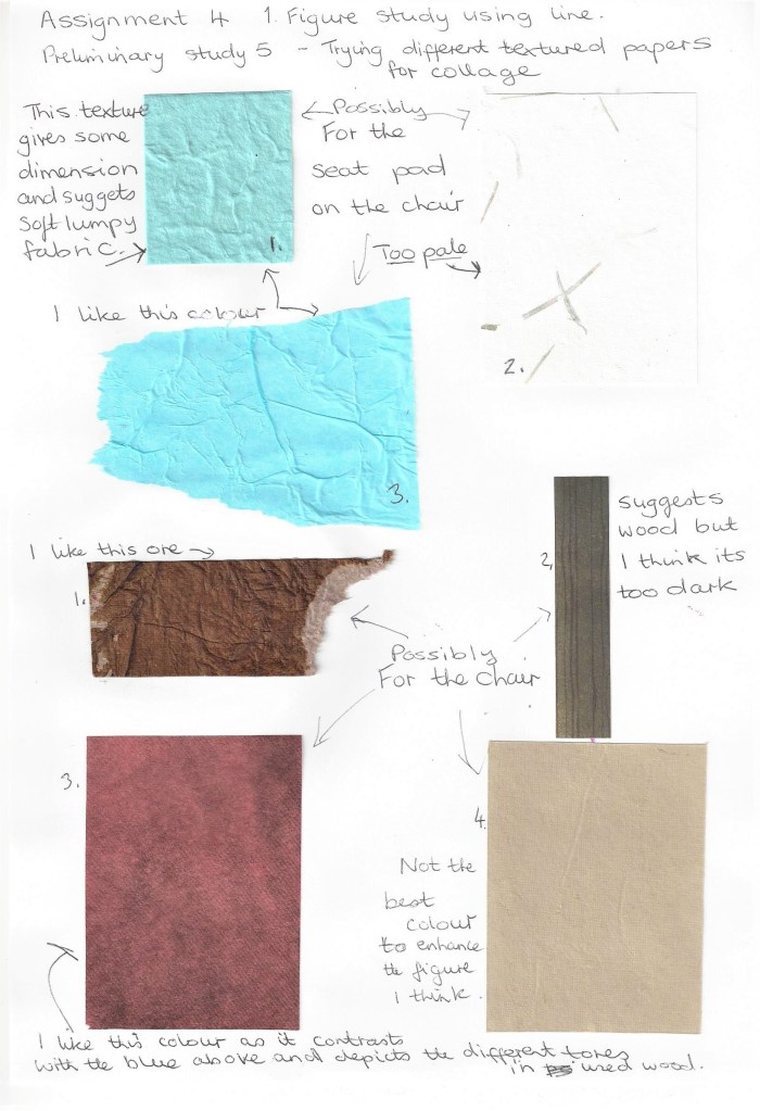
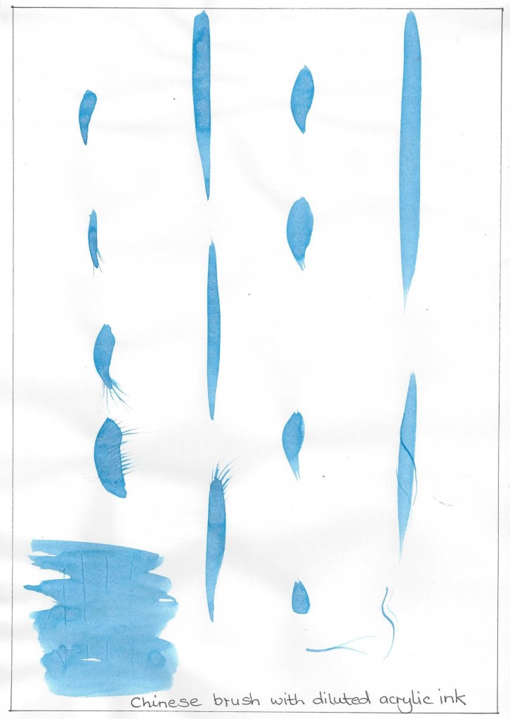
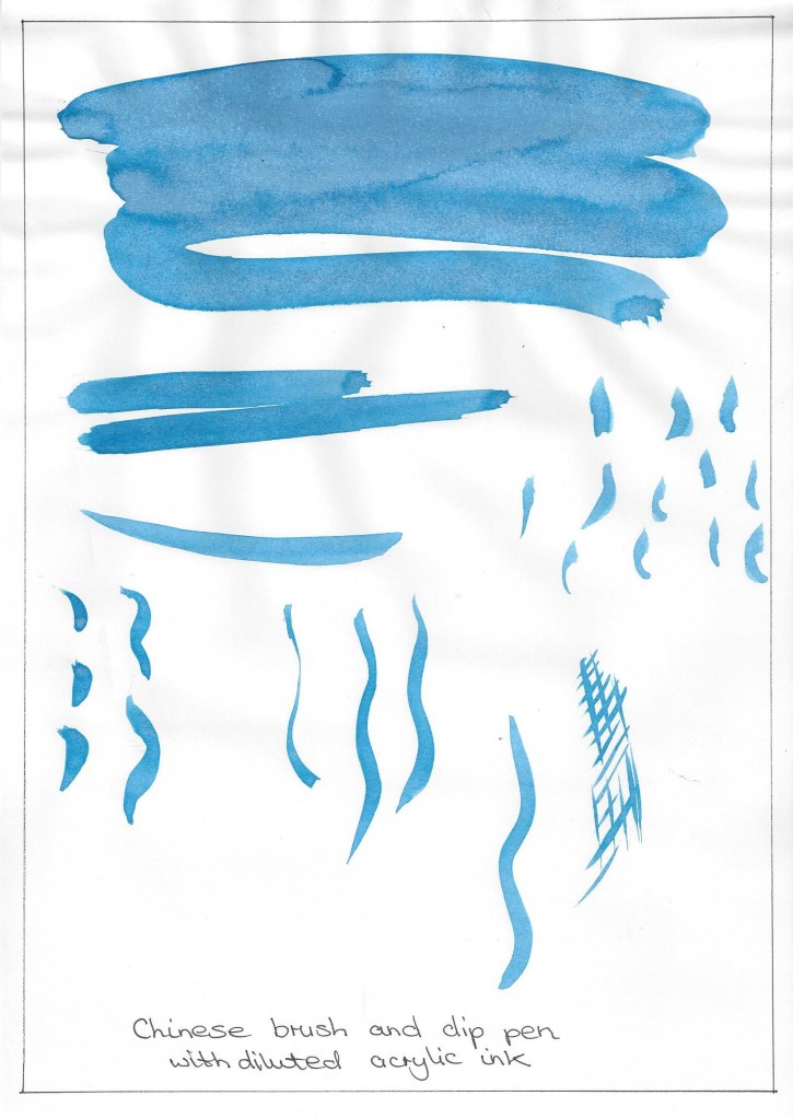
I experimented making different marks made with a chinese brush and dip pen using diluted acrylic ink. I wanted to add some background to give the drawing more depth. I also tried several ways of hatching/cross hatching with fine liner pens and tested the different colours. I then checked the preliminary studies for notes on shadows and chose to use fine lines with some cross hatching for the darker spaces. I also added the far table leg which I hadn’t put in the preliminary sketches and I didn’t want the table to look as if it was floating.Final for figure study using line. A1 drawing paper, HB pencil, acrylic ink, brush pen and collage. The background marks are made with a Chinese brush using acrylic ink to depict the wallpaper pattern, I also added some marks to the jumper to define the creases around the shoulder and arms. This drawing has developed as I went along and I made decisions based on each outcome although always referring to the preliminary drawings. It is not my favourite drawing and several times I wondered if I should start again. As I had spent a lot of time on it I decided to keep it and look at what I had experimented with and learned .
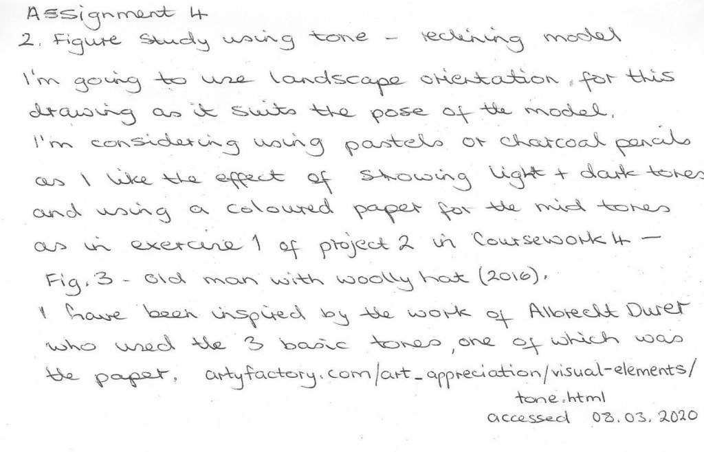
2. Figure study using tone
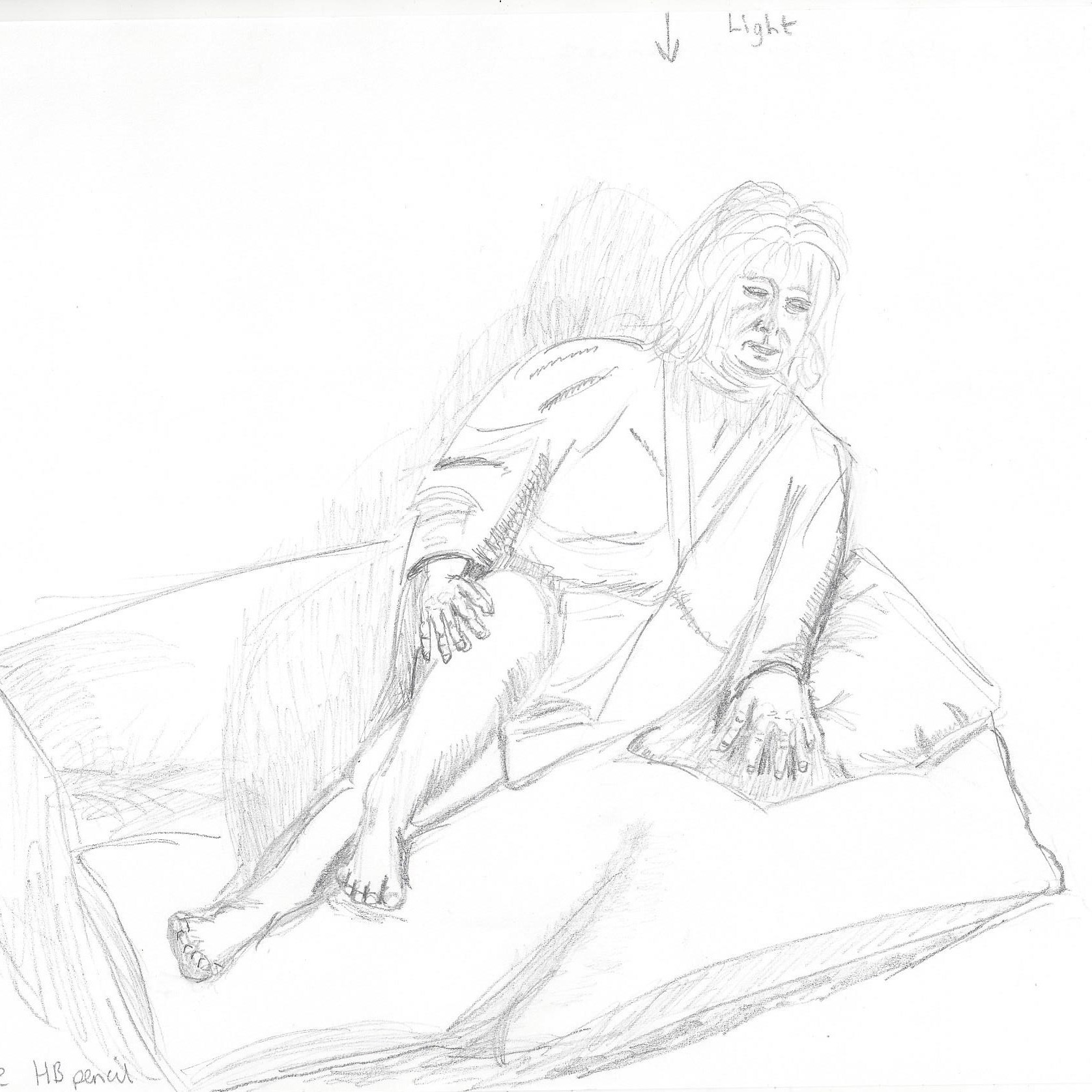
5 minute sketch to look at the shapes of the figure and surroundings.20 minute sketch to see if this pose works which I feel it does, also to focus on the proportion.Light was coming from a window behind the model.Hb pencil to mark out subject, Soft pastels, charcoal pencil on A4 brown sugar paper. The paper here is a bit too smooth and doesn’t hold the charcoal well. I like the colour of the paper as it brings warmth to the drawing as opposed to the stark black and white.Hb pencil to mark out subject, black and white soft pastel on A4 green pastel paper. I wanted to try this drawing without using any lines , I started with the black pastel then added lightest areas with white. Then I used a blending stump to smooth out the pastel. I like this pastel paper as it is quite textured and holds the pastel but also leaves some of the surface of the support showing through. I think I may have added too much pastel to the back of the sofa and it seems to overpower the figure.Using the planning sketches I drew on A1 green sugar paper, sketching out first with black willow charcoal. I then built up some layers with black, white and grey conte stick. Drawing on A1 without an easel in a cramped space was a challenge and I spent a long time on this sketch.Final drawing for figure study using tone. I wanted to add some background colour that harmonised with the striking background paper. I then coloured the rolled cushion to bring it together with the background. I darkened the negative spaces to make them more obvious. I added some more shading to the facial features but I think it looks a little cartoon like. The folds on the tee-shirt depict a leaning torso underneath. I am pleased with the way the settee cushions appear to mould/bend with the weight of the figure. I had difficulty in drawing the hands in this position and in proportion and tried several times to re-draw them. The paper then began to wear thin and I didn’t want to risk tearing a hole. This tells me several things – Choose the right quality of support, more practice drawing difficult features and re-draw sparingly.
3. A self portrait combining line and tone.
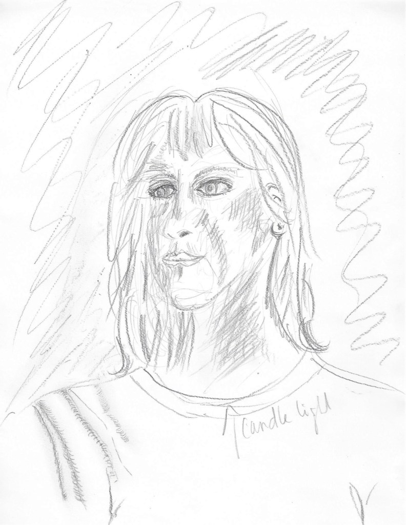
I used graphite and Hb pencil on A4 catridge paper to sketch out the form and identify the tones. I used candlelight in front of a mirror. hatching is used to show shadows on the face and neck. I’ve tried to show folds in the fabric on the shoulder but this needs working on. The head looks too small for the body here and this maybe because they were added later after the initial sketch.A longer sketch with more detail. Hb mechanical pencil on A4 paper.I wanted to try light on dark so I have used white conte stick on dark blue pastel paper. First I completely covered the paper with the conte stick on its side. I then rubbed it in using a circular motion. The darker tones were then drawn in with a pencil top eraser which has a small edge and works like a calligraphy pen nib in that the line can be varied depending on the angle it is held to the paper. For the mid- tones I then smoothed between some of the light and dark tones. When I used spray fixative on this picture it darkened a lot of the white areas too much ans the sketch seemed to have faded. When it dried I worked in some more white with conte stick. I like the mysterious atmosphere depicted by this drawing.
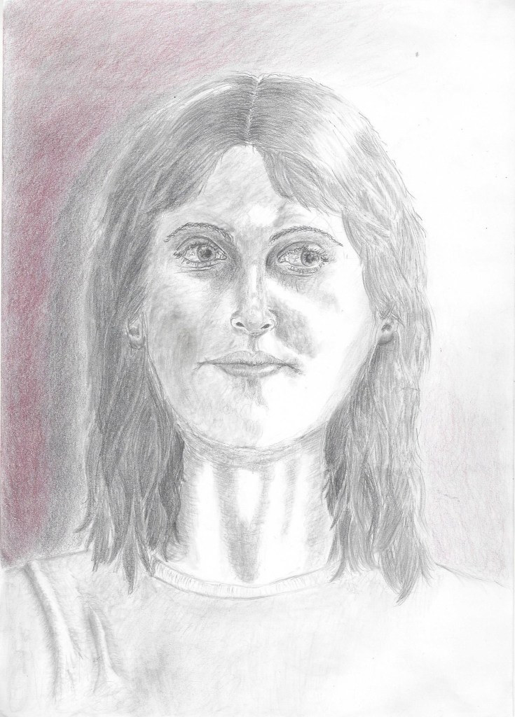
Planning the final drawing –
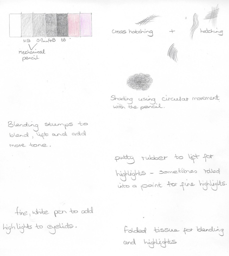
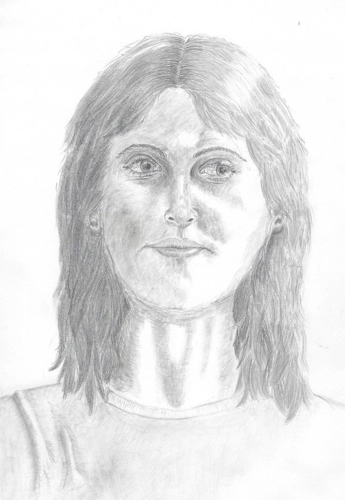
These are the techniques that I used to draw the final portrait. Looking back at some of the techniques I have tried in other parts of the course enabled me to be more informed when planning this portrait.I drew this portrait on A4 cartridge paper. Light was coming from a candle placed on a shelf to my right. I decided to use sketching pencils as so far I have found this the most successful medium for me when drawing facial features that require detail. I began by lightly sketching with a HB mechanical pencil the overall shape and position of the features. I then used 4B and 6B to build up layers of tone and then go back in with the HB to darken the lines. Drawing the eyes took me the longest but this was the most enjoyable part. It seemed that even the slightest mark, highlight or tone had the most impact on what the eyes depicted. I spent quite a lot of time on the hair to try and convey the thickness of the layers and the shadows made in between the strands. The most challenging part was the mouth and getting to look in proportion to the other features. When drawing the folds in the fabric on the shoulder I thought back to the first exercise in part 4 and recalled the methods I tried then to use tone to depict a fold.
The final portrait for assignment 4
Finally I decided to add some background shading and a touch of colour to give the drawing a more interesting atmosphere. I added 2 shades of coloured pencil and placed them on top of 6B graphite to give a muted colour effect. I like the texture of the grain of the paper that shows in the background.
Reflection
Demonstration of technical and visual skills
I have learned so much throughout part 4 and this assignment. I continually feel pushed to explore new skills and techniques. Drawing on A1 has been a great challenge physically and I want to find more opportunity to do this perhaps by working outside in the warmer weather. Looking at the figure has caused me to be much more observant of bone structure and facial features. I especially like the technique for drawing a face using tone which I have tried in my final portrait. Observing figures – still and moving is an emerging skill which I want to develop. I have tried to keep in mind design and composition in some of the exercises and to use a viewfinder or grid was helpful in drawing the larger sketches.
Quality of outcome
I can see that the quality of my work gradually improved as I went along. I began realised what a vast subject the figure and head really could become and felt I could spend years studying this part alone.It was helpful to keep a visual diary with drawings of different body features to inform the 3 assignment pieces and present the work in a coherent way. The quality of the outcome for the figure drawings has need for improvement , this has been my first experience of life drawing and I see the benefit of the opportunity to draw living beings in real time. Discernment is improving with each project and conceptualisation of thoughts is something I am seeking to develop as I learn from other artists. In this part of the course I didn’t focus a lot on communicating ideas as I was very taken up with learning the technical skills I needed to produce a believable likeness of figure or face.
Demonstration of creativity
For this part of the course I worked through the exercises in a different way to all the other parts due to waiting for availability of models and then the cancellation of Life classes due to social distancing. I used imagination and invention such as collecting old magazines and drawing over the photos of people or copying them e.g in the collage for project 5 – exercise 2 and also in using collage for assignment 4 ,1 figure study using line. I enjoyed experimenting with teabags to depict a crowd in an audience (also project 5 , ex.2). When thinking about developing a personal voice I look forward to it emerging and becoming recognisable in the future.
Context reflection
I have been informed by the techniques of other artists throughout this part of the course particularly as I reached out for help and information due to my lack of experience and knowledge in figure drawing. I regret only being able to attend 1 Life drawing class but was able to watch a virtual class (although I think nothing can replace attending in person) My learning log has become invaluable in helping me keep track of my thoughts and organise my work whilst completing the exercises in a different order. Critical thinking is something I need to develop more. I looked at some artists views whilst researching for project 1 and this provoked many thoughts on my feelings about figure drawing. I didn’t write as much about my research as in previous parts of the course because my time was taken up in finding models/opportunities in different poses, and I consider photographs/videos of lesser value. Many things to think about and consider from these projects that have sparked my imagination.
At the beginning of this part I reminded myself of the feedback from my tutor for part 3 – ”If using colour, try to bring sketches and studies of colour into your idea development too, rather than sketching everything out in black and white and only adding colour when working on the final. This will help you to explore more creative and communicative possibilities which can come from adjusting your use of colour.
– Drawing with all colours: Explore how you can draw with different coloured materials to create interesting and expressive marks with them rather than using this to ‘colour in’ a black and white drawing” Russell, N (2020) Feedback I have begun to put this into practice in a small way and would like to do it more in further units.
Project 1 Fabric and form
Exercise 1 Drawing fabric using line and tone
15 minute sketch using line I drew this soft white cotton fabric with ballpoint pen and tried to keep the line moving and not stop too long look at any details. It is easier to focus on line when the fabric is plain.15 minute sketch concentrating on tone I was glad to have a time limit here as I could have kept drawing for a long time. As I was drawing I began to notice the different shapes that appeared – cones, triangles and cylinders. I had to look closely at where the dark tones became lighter towards a fold in the fabric.5 minute sketches of different parts of the fabric using different media. Here I taped a sheet of A1 to the wall and drew inside the squares focusing on a small area of the fabric. I tried different media and found I was able to create volume when using tone/shading and looking at the direction of the marks. When tones gradually move from dark to light next to a fold with the lightest area on the top of the fold this helps to create volume. I also found it good to look at the shapes that the folds had formed – cones, triangles and curves , which help to convey volume .30 minute sketch – A knotted piece of fabric drawn with charcoal pencil on pale pink pastel paper. The lightest tones are the paper , I sketched in the mid to light first and then the mid to dark tones.
Exercise 2 Emphasising form with cloth
Using graphite pencils B and 2B on cartridge paper I first sketched out some thumbnails and looked at the shape of the seated figure – an S – shape and then decided to draw the bottom right composition as a larger picture below – Using graphite pencil 4B on cartridge paper. Here I focused on the main body of the figure and the way the baggy jumper formed around the body. I’m not really happy with the arm as it doesn’t seem in proportion, I quite like the way the marks of the pencil are shaped down the back and do give some sense of three dimensional form.
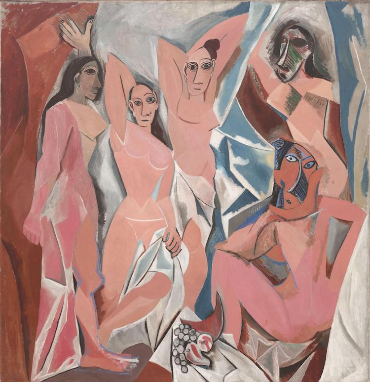
Episode 2 looks at the Nude paintings in history and discusses peoples attitudes towards them. This is a very thought provoking documentary which I haven’t come across before and although made in the seventies I feel it is still relevant today. It seems to me that across the centuries the nude has caused controversy at various times. Some artists have challenged the opinions and religious views of their time. I think Picasso perhaps did this with this oil painting shown below – not only with the style ( cubism) but in showing the female form in a gritty way, unlike centuries before when nudes looked pure and sculpted.
Fig.1 Les Demoiselles d’Avignon (1907)
Project 2 Proportion
Exercise 1 Quick studies
5 two minute sketches drawn with 2B pencil on cartridge paper. It is really helpful to look at some basic shapes in the figure before adding detail. I can see the spheres, cylinders and cones throughout the figure.My first of two 10 minute sketches – The head looks too small for the body, the hands are difficult to draw quickly. I did try to use the pencil against thumb technique to measure the figure, it isn’t always successful.My second 10 minute sketch from a different viewpoint, again I tried using pencil against thumb to measure proportion, I think it is more successful in this sketch than the other. I neglected to add shadow across the figure and to show the light coming from the lamp in the background as I was so involved in getting proportion correct and showing the creases and folds in the fabric.Added some colour and texture to see what it looks like. Fig.2 Moss, C popular press(c.1958) I like the simplicity of this drawing with the chair lightly sketched. The white on coloured background stands out well and brings the subject to life. I would like to try this method.
Fig.3 Old man with woolly hat (2016)
I did this drawing by copying an image form a book and using a similar style to the Colin Moss drawing above. I chose this image of an old fisherman as I thought the bold green pastel paper would bring out the feeling of a life of hard work that shows in the etched wrinkles on his face. It was so interesting to draw a face with so much character.I first sketched four thumbnails as a plan for the drawing although the top left looks a bit out of proportion now. I then lightly sketched the outline with a 2H pencil. I drew in the outline and dark tones with black soft pastel, the support is the mid tone, and white pastel and chalk were used for the highlights. The chalk I used had a crisper, brighter white than the pastel. Overall I think it is quite effective to use black and white on a bold coloured support. Fig.4 Studies of a woman playing a guitar (1717) N.B remembering tutor feedback from part 3 and using colour in the exercises and not just final pieces.
Exercise 2 A longer study
I used conte stick on A3 cartridge paper. I have lots of this colour conte stick which I like using as they are quick to apply, soft like pastel and easy to handle. I made marks for the outermost parts of the figure. I think I have captured the characteristics of the pose but I feel the proportions don’t look right – legs look too short and feet look too small. I re-drew over the original to try to improve this but still the legs were too short. I am hoping that I will become more confident in time as I draw more figures.
Research point – Foreshortening
Self portrait drawn whilst lounging on the sofa- an experiment in foreshortening. This was an enjoyable exercise as I felt relaxed and wasn’t anxious about drawing someone else.
An example of foreshortening below-
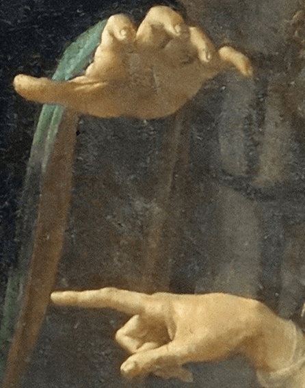
Fig.5 Virgin of the Rocks (c. 1483–1485) Here is an example of where the artist has used foreshortening to emphasise the hands and make give them prominence in the picture.
Experiment in foreshortening
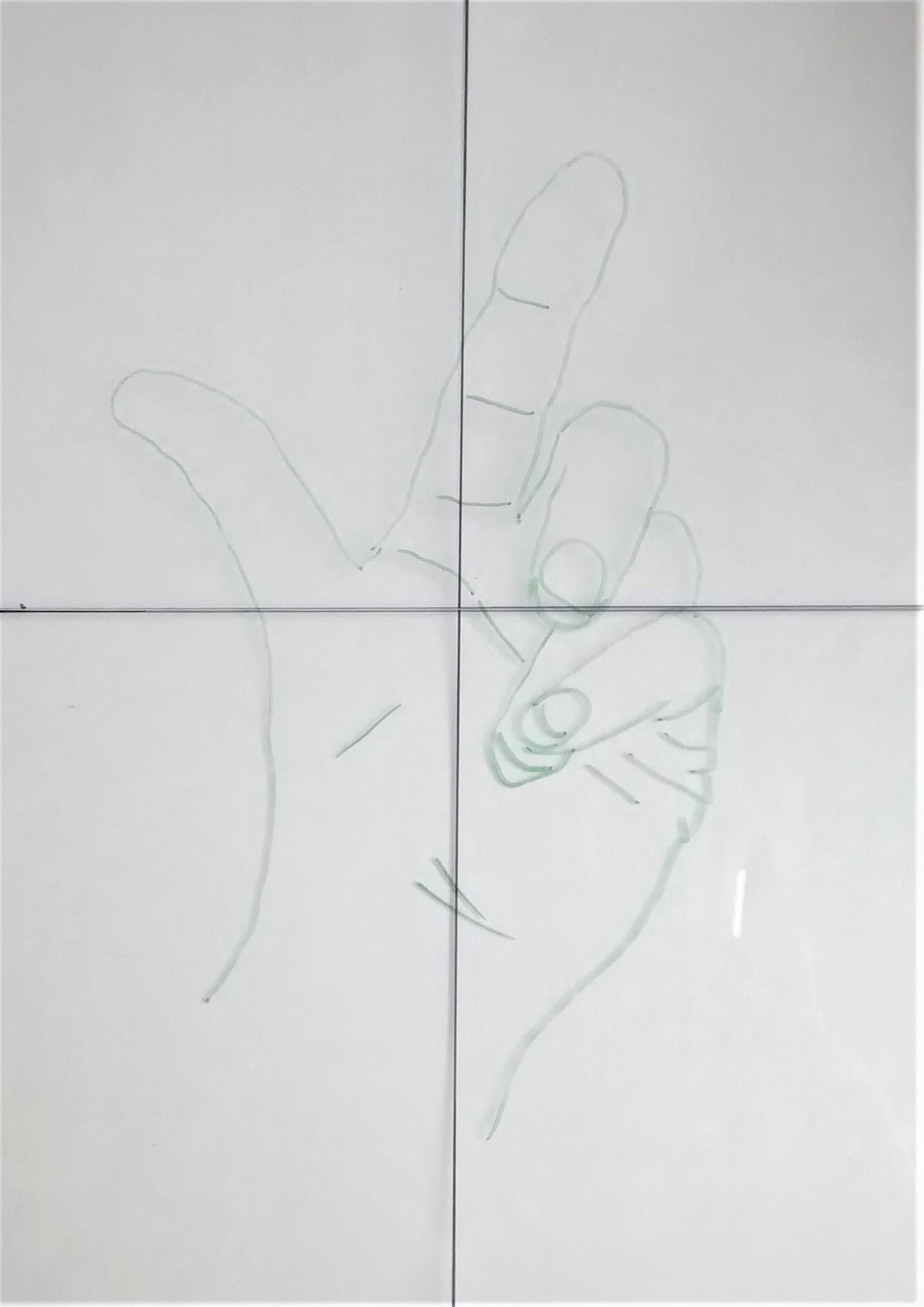
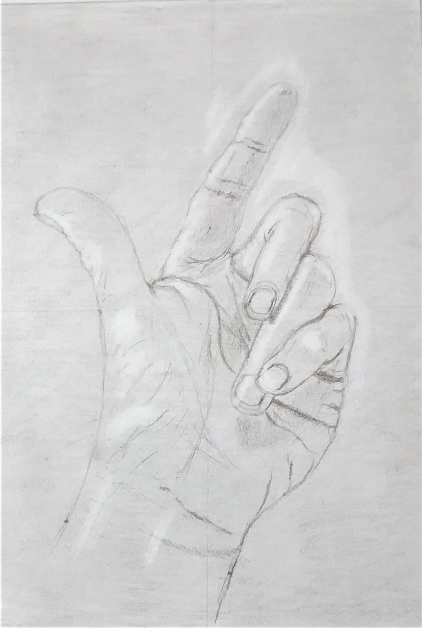
I first traced my hand onto a glass picture plane and then used grid lines to copy it onto paper that had been toned lightly with graphite and blended into the paper. I next used an eraser to lift out the highlights. The outline was sketched very lightly with a HB pencil . 2B graphite was added for shadows and darker tones. Lastly I erased the background graphite to help give a more 3D view to the hand. This method was suggested in ( Edwards,1999:97-98) Although lengthy, I enjoyed this method to look at foreshortening, it seemed to make more sense after trying this and I’m quite pleased with the outcome.
Project 3 Form
Exercise 1 basic shapes
Exercise 1 Basic form
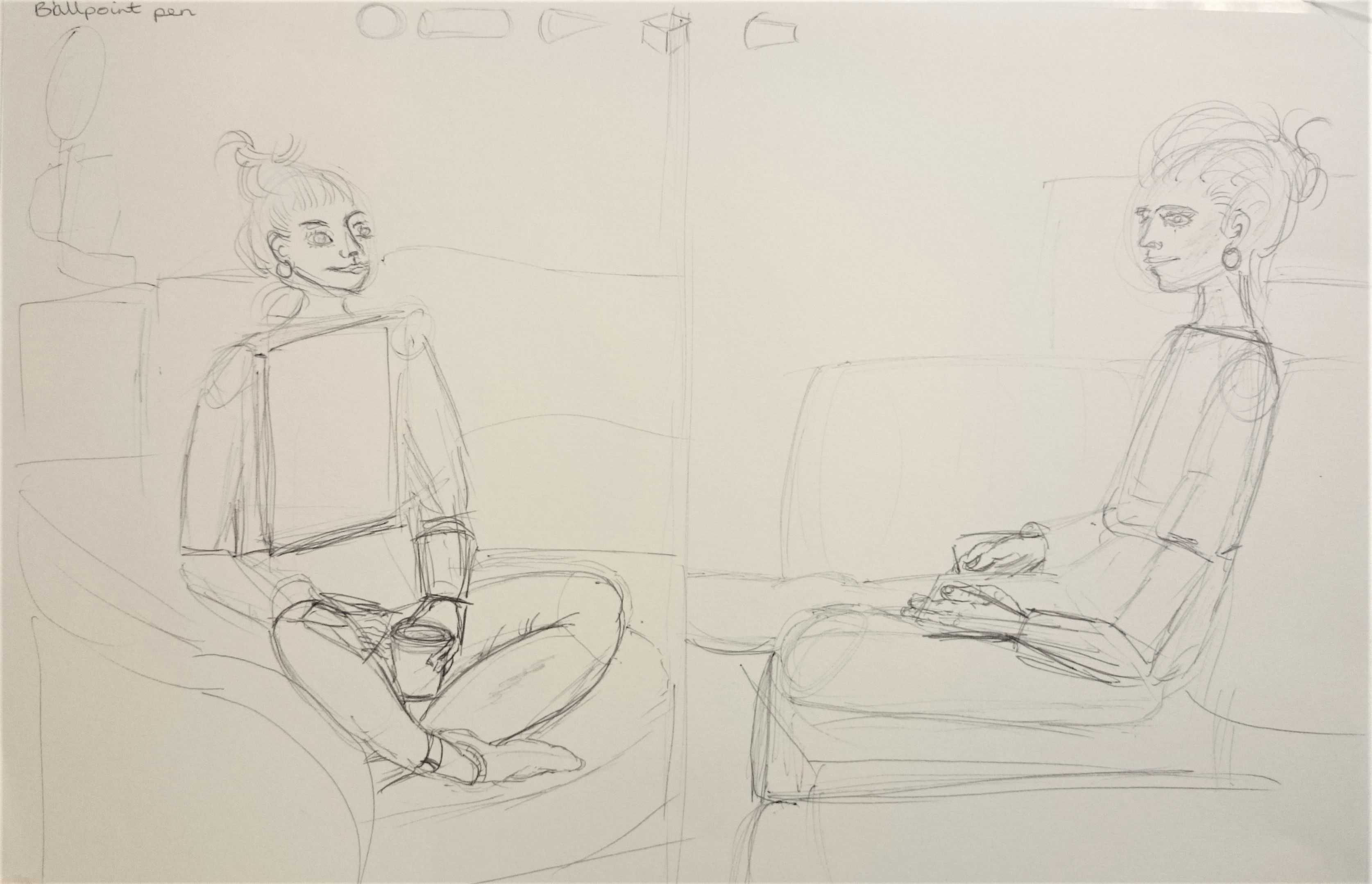
I used ballpoint pen on A3 cartridge paper. I like the flow of ballpoint but i am nervous of not being able to erase it! In these 2 sketches above and the 1 below I have tried to connect exercises 1 and 2 due to the models time restraints. I began by sketching the basic shapes and noted the angle of the planes . There is a slight twist of the shoulder in the sketch on the left and a twist of the right ankle.
Soft pastel on A3 cartridge paper. I used the models top left arm as a measured unit which seemed effective. Here there is a twist of the left ankle and possibly some foreshortening of the hands on the keyboard. I wanted to emphasise the dark and light tones by using one colour in broad sweeps and letting the paper be the lightest tone. It was a challenge to focus on proportion and tone at the same time and I feel using pastel helps me with this. I like the way the legs sweep out over from the chair to the table showing the space beneath them.
Exercise 2 Essential elements
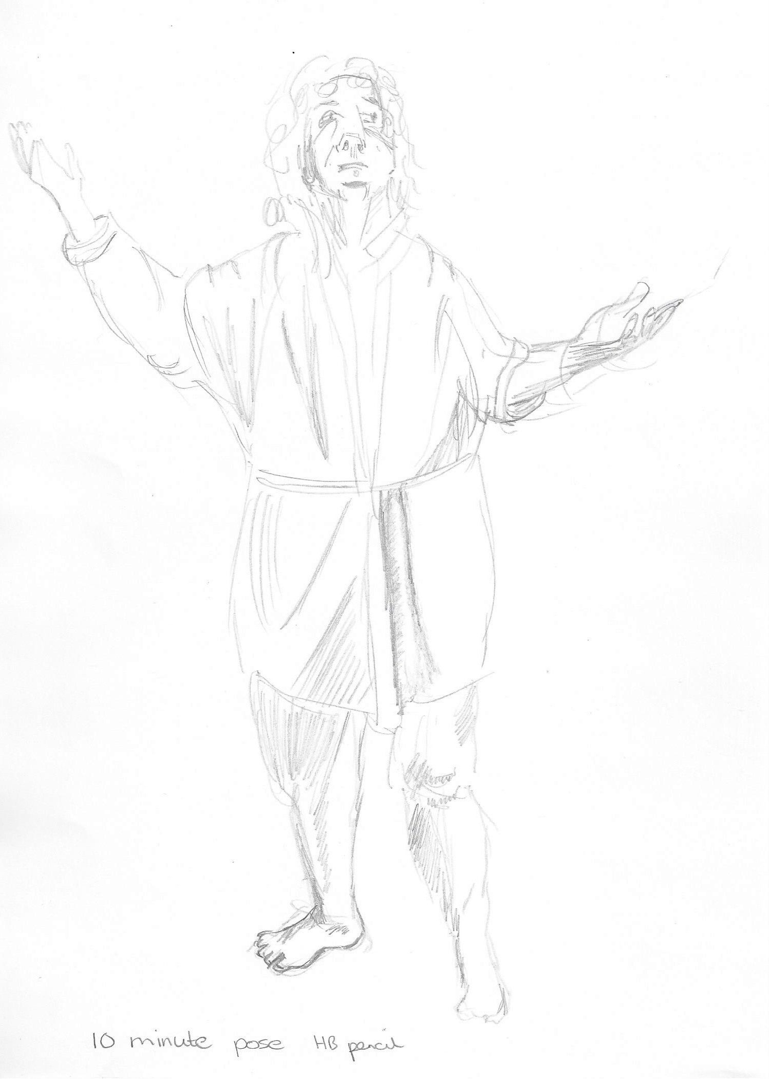
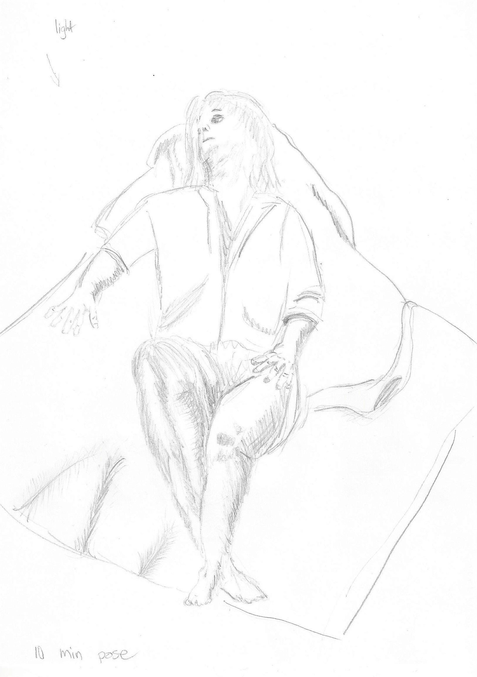
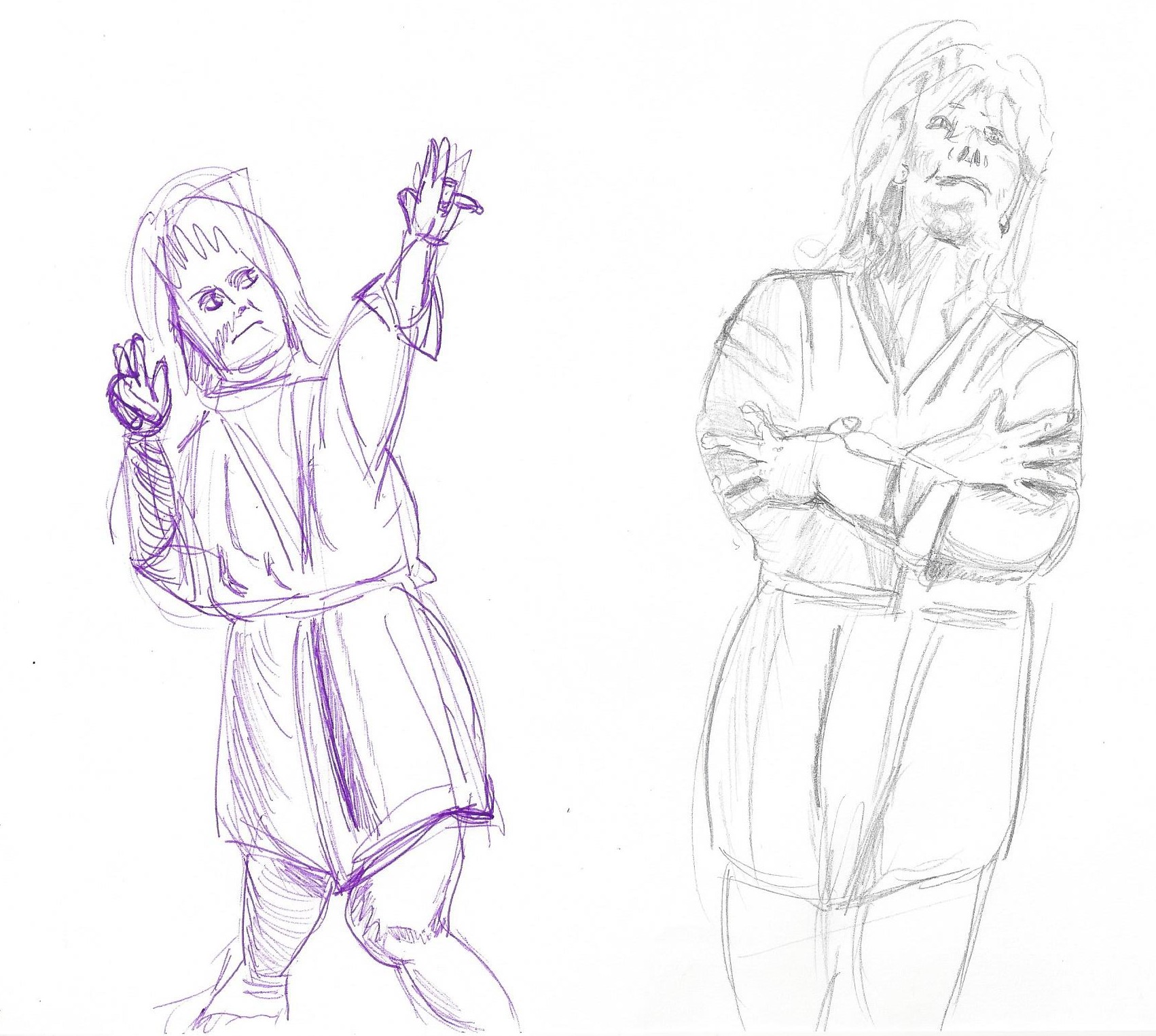
Above slideshow – 10 minute sketches – The challenge for me was the proportion of the hands and feet, sometimes I ran out of space for the feet and the hands were sometimes too big . Difficult to do in 10 minutes whilst trying to focus on a three dimensional form. I think the drawing on the left in purple biro gives the best sense of the pose. I have shown the model leaning and moving away from the central axis putting weight onto one leg more than the other and the arms raised with some foreshortening on her right arm to depict it drawn towards her body.
Exercise 3 Stance
Fig.6 ( Ambrus,1993: p112) Willow charcoal on A1 cartridge paper – First I noted the centre of gravity which is something new to me and helps me to focus on the figure. I placed points on the paper – head, feet and hands first and then shapes of the body. I then altered some parts to try to make them look in proportion but not very successfully. The top half of the body is a lot bigger than the bottom half. I need to practice finding a measuring point as a guide.
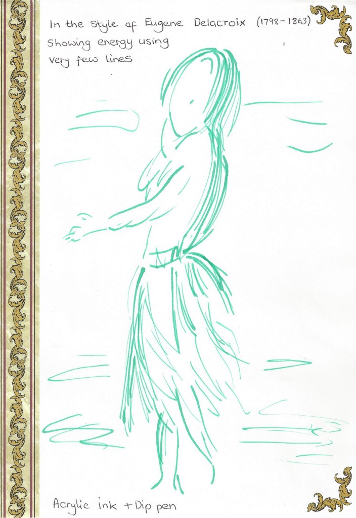
Exercise 4 Energy
Dynamic position Charcoal on A3 cartridge paper. Quick 5 minute sketch. The raised leg added interest to this sketch and I was able to note the negative space between the two figures. I have added some marks to the heel of the left foot on the raised leg after reading the last line of this exercise in the course book ( should have read it through earlier!) which suggest movement, maybe I added too many but it does show how a few repeated lines show a sense of movement in a drawing.Fig.7 (Barber, 2002:33) A4 found paper. I like the fact that this sketch has very few lines and yet we get a sense of the energy and movement.Experimenting with marks that depict movement. Mixed media on paper.Movement gestures – I used soft pastel on A3 black sugar paper and plastic loyalty card to pull out thin lines on top of the pastel. This was an experiment in painting to music. I listened to an energetic piece of classical music and drew along to it – wonderful experience!
Project 4 Structure
Exercise 1 The structure of the human body
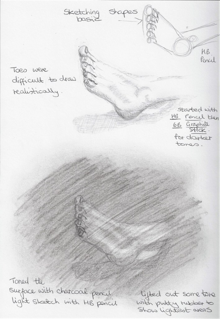
To help me become familiar with the structure of the human body I have been tracing over a printed copy of a skeleton regularly and thinking about how the bones connect to each other. I have a small sketch book in which I have begun to draw my own body parts. Below is an example –
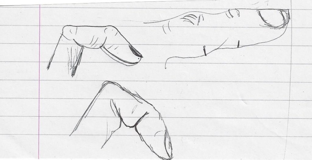
Focusing on the joints of the fingers and what happens when they bend. It was very interesting to look at the patterns on the palm of my hand, it could be used for a future drawing.Fig.8 Bridgman (2017:15) A page from a wonderful book by George B. Bridgman which at first glance seemed like a medical journal. This method of looking at the body in detail, should give me a greater understanding when drawing, as I have never really thought about the way parts are in relation to each other. So glad I purchased this book.
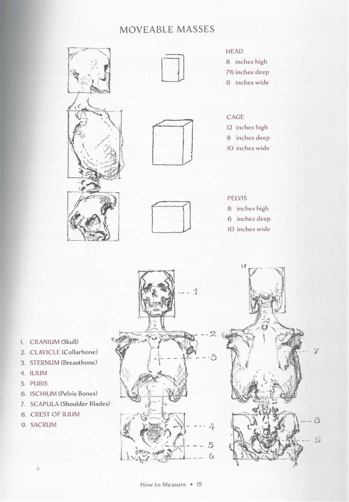
I looked at some of the anatomy drawings of Leonardo da Vinci , the link above is an example of the incredible detail he added to his work.
Below is an example of work by Sarah Simblet – a contemporary artist that I discovered when searching for ‘structure of the body’ artists. Her drawings are very detailed.
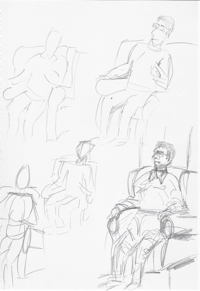
Model was standing turning slightly to her left and with light coming from high face on. First I did two, 2 minute sketches with HB pencil on A4 paper- top and bottom left above. The first one to look at alignment and shapes, second one to look at tone. The middle sketch was a 10 minute sketch using HB pencil on A4 paper with more detail added. I noticed that because the model was smiling her eyes were a slightly different shape with the lower lid slightly arched upwards. I observed the foreshortening of the arms and it helped to think of the bone structure of the hands and draw them with straight lines. The far right A1 sketch with 6B graphite is not in proportion, the head is too big and the hands and arms are too small. It is a challenge to draw on A1 and I need to practice more.
Lounging
I began with a 2 minute sketch on A4 paper landscape view to look at shapes of the figure and the area surrounding. The second 2 minute sketch was to look at tone and shadow created by light coming from above and facing the model. Third sketch on the right is a 10 minute sketch with more details of hands, feet and facial features. I’m still struggling with hands but I have noticed a slight improvement the more I observe them, although they are not in proportion in this drawing. I have chosen not to alter them as I can use this to learn from and see how I can improve. The top larger sketch was done on A2 drawing paper with HB mechanical pencil and took 45 minutes. I chose to darken the negative spaces particularly between the fingers as these did stand out when viewing the model and the way the hand restinf on the cushion caused creases to form. I like the result of the foreshortening of the raised knee.
Seated
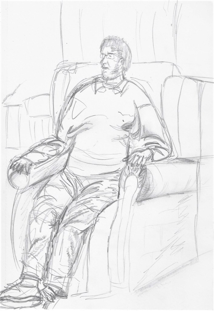
This was my first time at a life drawing class and the experience challenged some of my preconceived ideas. Were a group of 14 with a tutor present if we needed guidance but mostly we were left to work independently. I began by sketching quickly in pencil in my A4 sketch book the basic shapes of the figure.A1 drawing paper with 4B pencil. Next I did another quick sketch to try to get the proportions looking believable. I used the thumb on pencil method to measure the figure but still had to re-sketch over the drawing. A1 drawing paper using charcoal I used soft pastels, charcoal and pencil on A2 pastel paper. I like the result of the soft pastels to show skin colour and depict some of the light ans dark tones. The result here is better in proportion than my first sketches, it is a thin , slight model and I did have difficulty drawing the shoulders and back. it helped to think about the bone structure for a while especially when drawing the legs and thighs to give them the correct shape . I would have liked to have had to chance to draw the model in different poses but we ran out of time.
Project 5 The moving figure
Exercise 1 Single moving figure
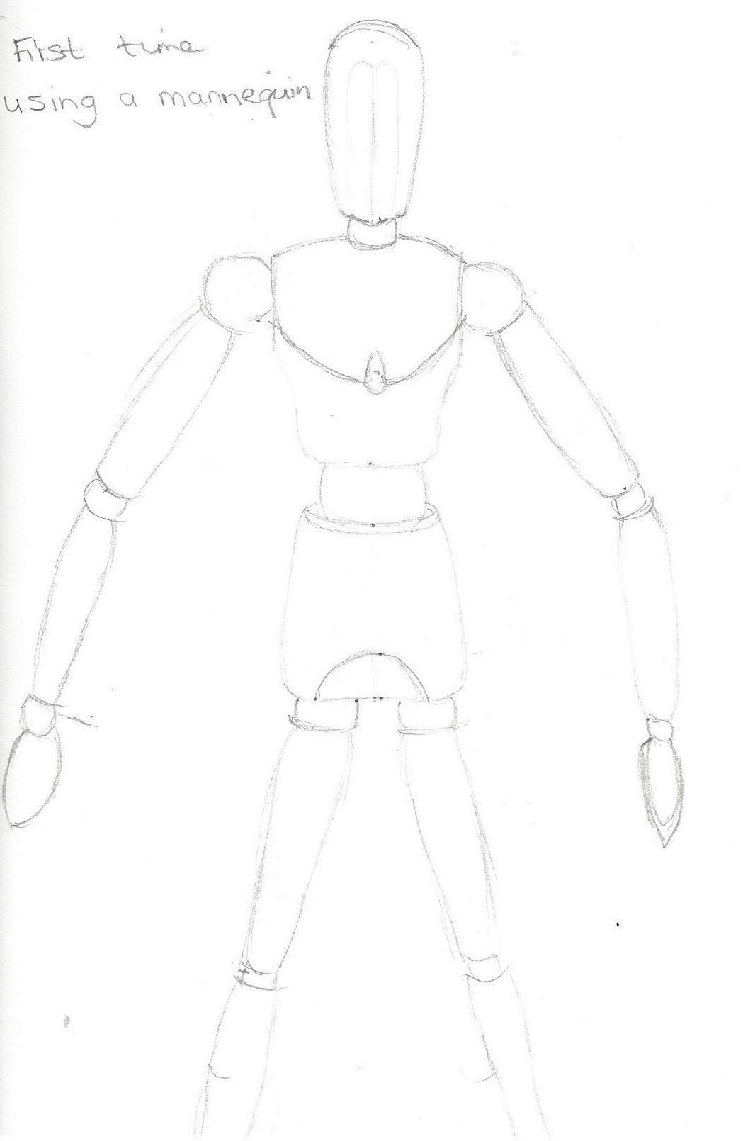
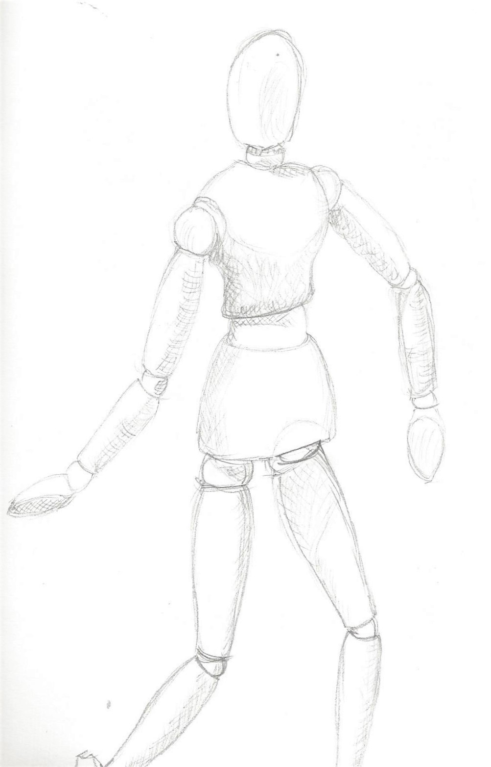
Using a mannequin
The images below are my first attempt at using a mannequin. I found this a helpful tool for looking at different movements, I added tone to the 3rd sketch. I still managed to run out of room for the feet every time!
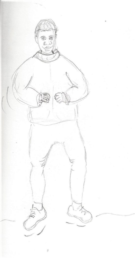
10 minute pencil sketch to capture movement of 2 models. I have to remember not to worry about the details and focus on CAPTURING!This model was walking and wearing a thick jacket which restricted arm movements somewhat, which I tried to convey with the markings near the elbow.
Exercise 2 Groups of figures
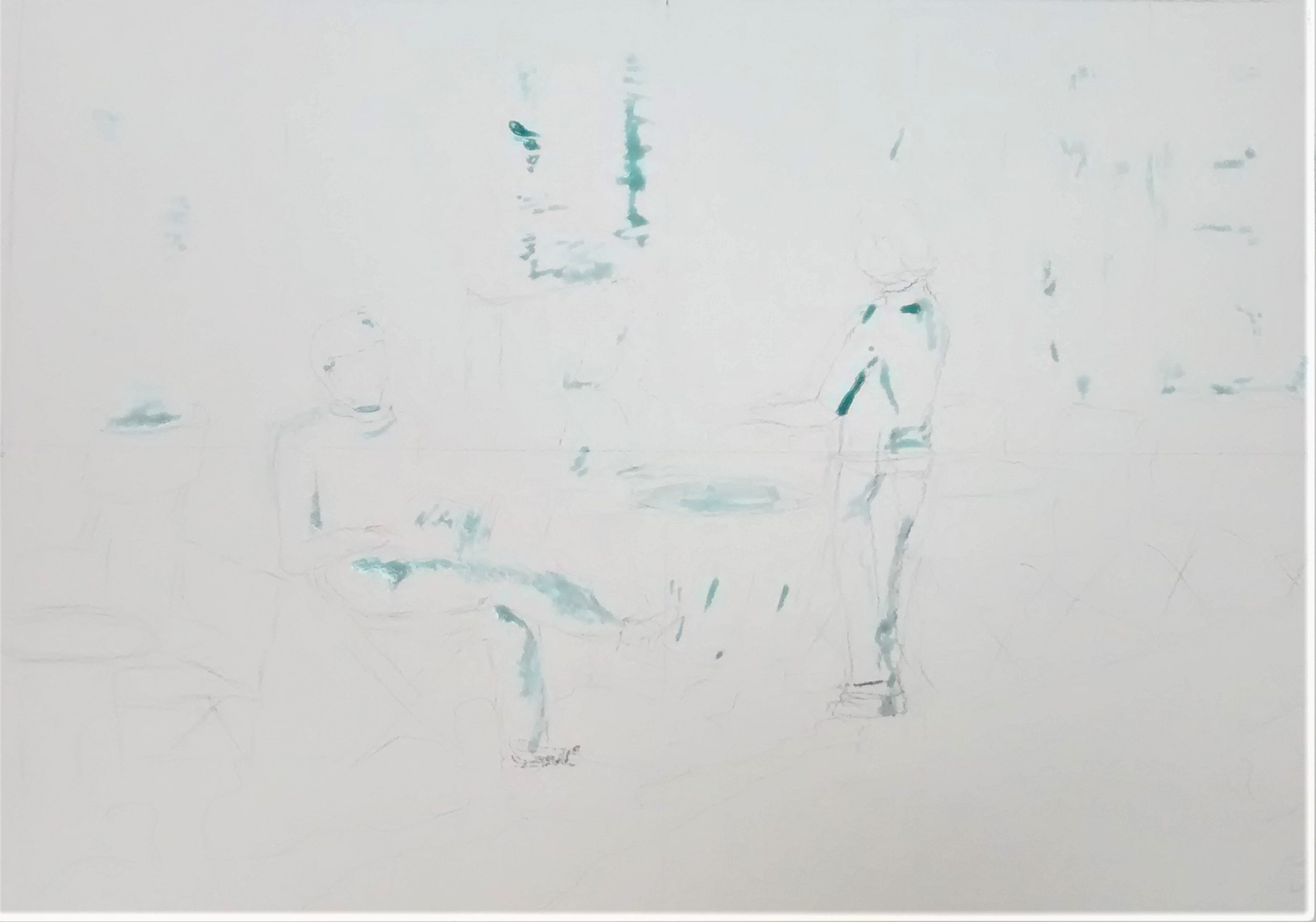
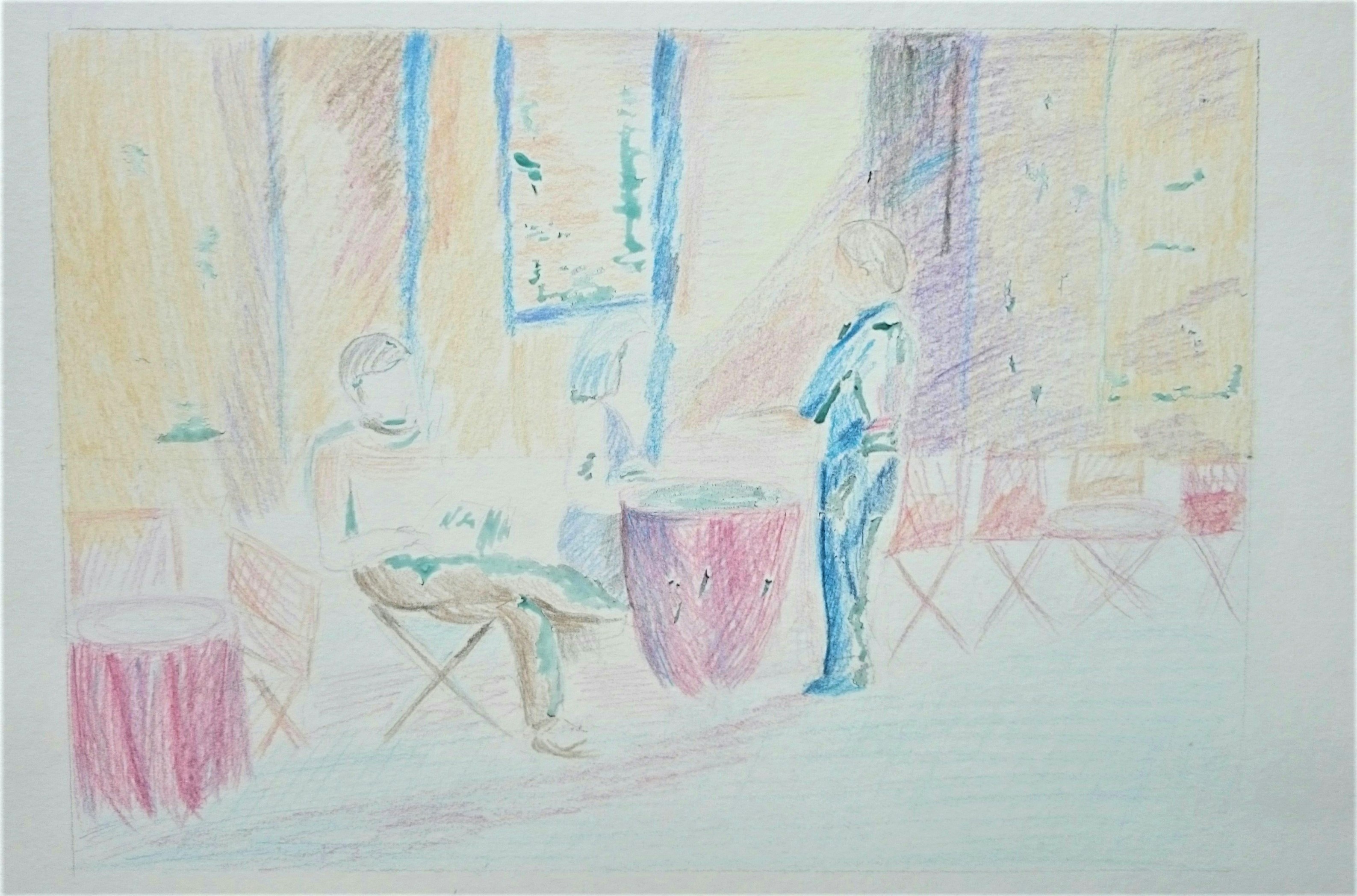
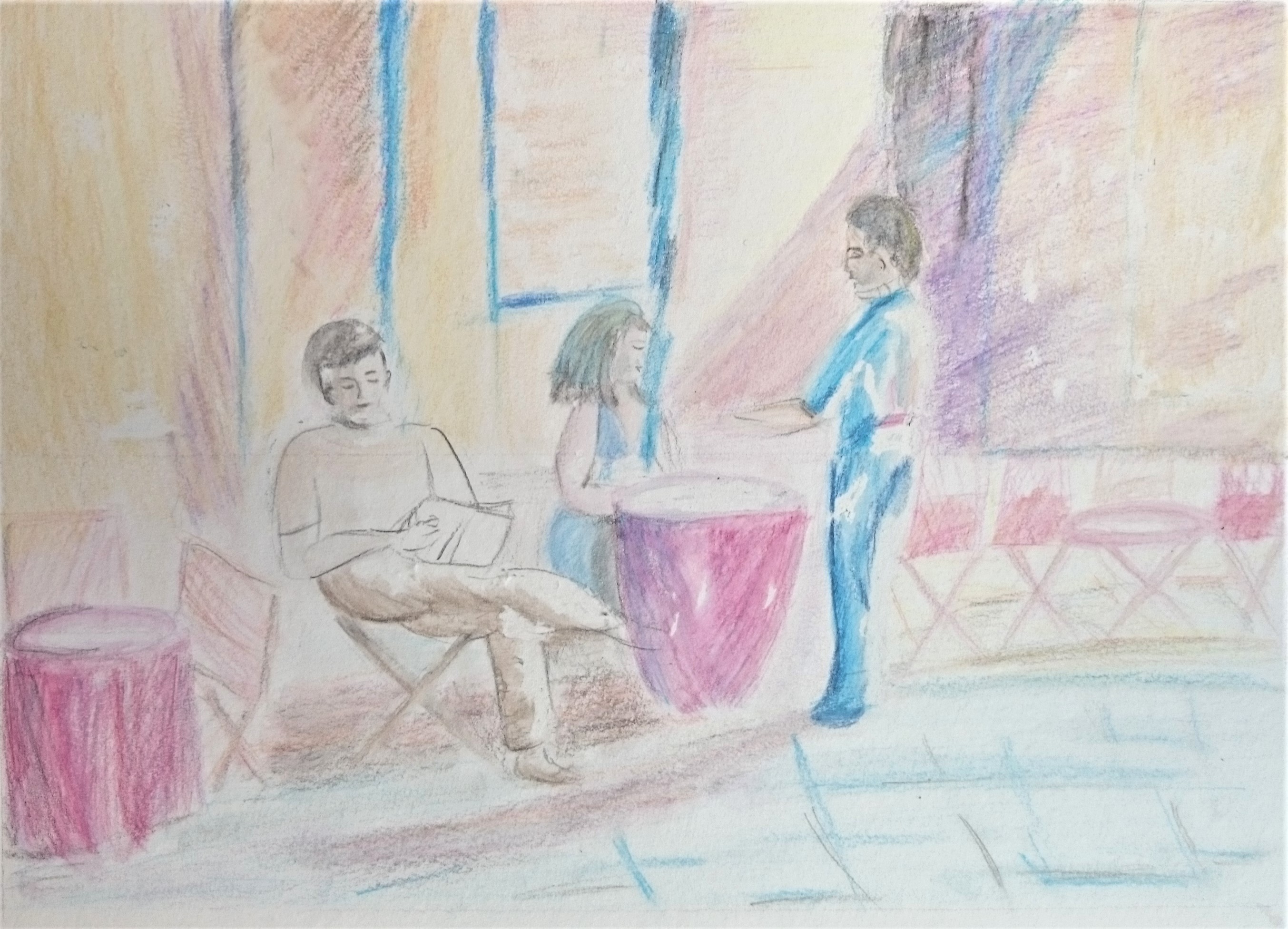
A picture I found of a cafe scene – I sketched lightly with HB pencil on A3 watercolour paper, then masked some areas for lightest tones.
Next I used watercolour pencils and made hatching and cross hatching marks to depict mid dark tones.
After wetting a few areas of the watercolour pencil to draw out the colours I then removed the masking fluid to reveal the lightest tones. The figures here blend into the scene as I chose similar colours for figures and background. The chairs and tables are only’ suggested’ by the few lines and shapes but we can tell what they are immeadiately.
Fig.10 Oatly advertisement (18.02.2020) I experimented with these cut out pictures of different poses and copied next to each figure with fine liner pens and acrylic ink . I discovered this is a really helpful method of learning to observe different figures when live models are not available. It felt easier to draw next to an image rather than from a distance. In this picture I am attempting to retain an image of an audience in a large hall which I could see from the stage whilst I was singing in a choir recently. I pressed used, wet teabags onto cartridge paper. I built it up in layers and waited for each layer to dry before adding the next. I was trying to show distance with light, smaller marks for the people at the back of the room, gradually increasing in size and pressure of marks towards the front. I’ve added some facial features ( but not all ) with a fine liner pen. I wanted to depict the atmosphere of a crowd in close contact and how we often don’t take in details of every face but maybe a few stand out or stick in our minds and especially when viewed from above.
Project 6 The Head
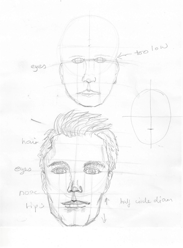
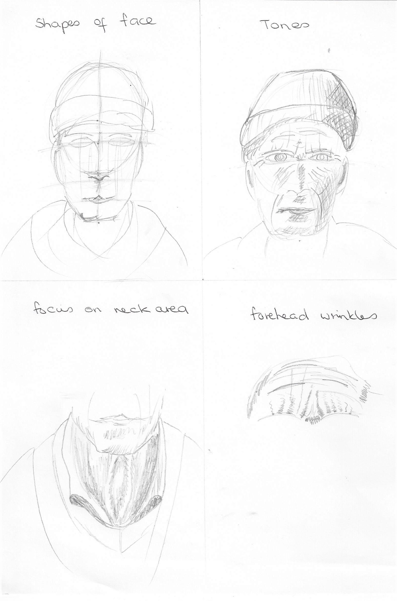
Exercise 1 Facial features
Fig.11 (Edwards 1999:174) Drawing theses eyes was my favourite feature of the face!Fig. 12 ( Barber 2002:p.45) I copied a sketch by Henry Carr who used hatching to show tone. Copying from the masters really helps as I am limited in technical drawing skills for figure work. I do enjoy working like this and look forward to a time when I am more confident in sketching heads and features.4b pencil on cartridge paper Soft pastels on pastel paper copied from a found picture of unknown source.
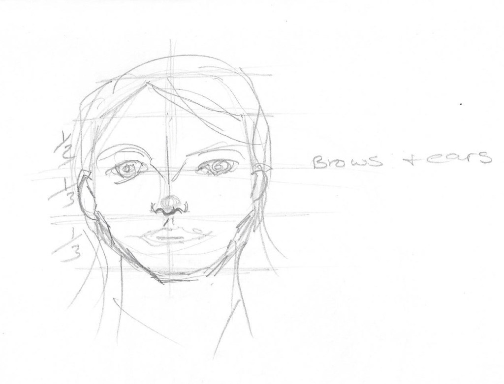
Exercise 2 Your own head
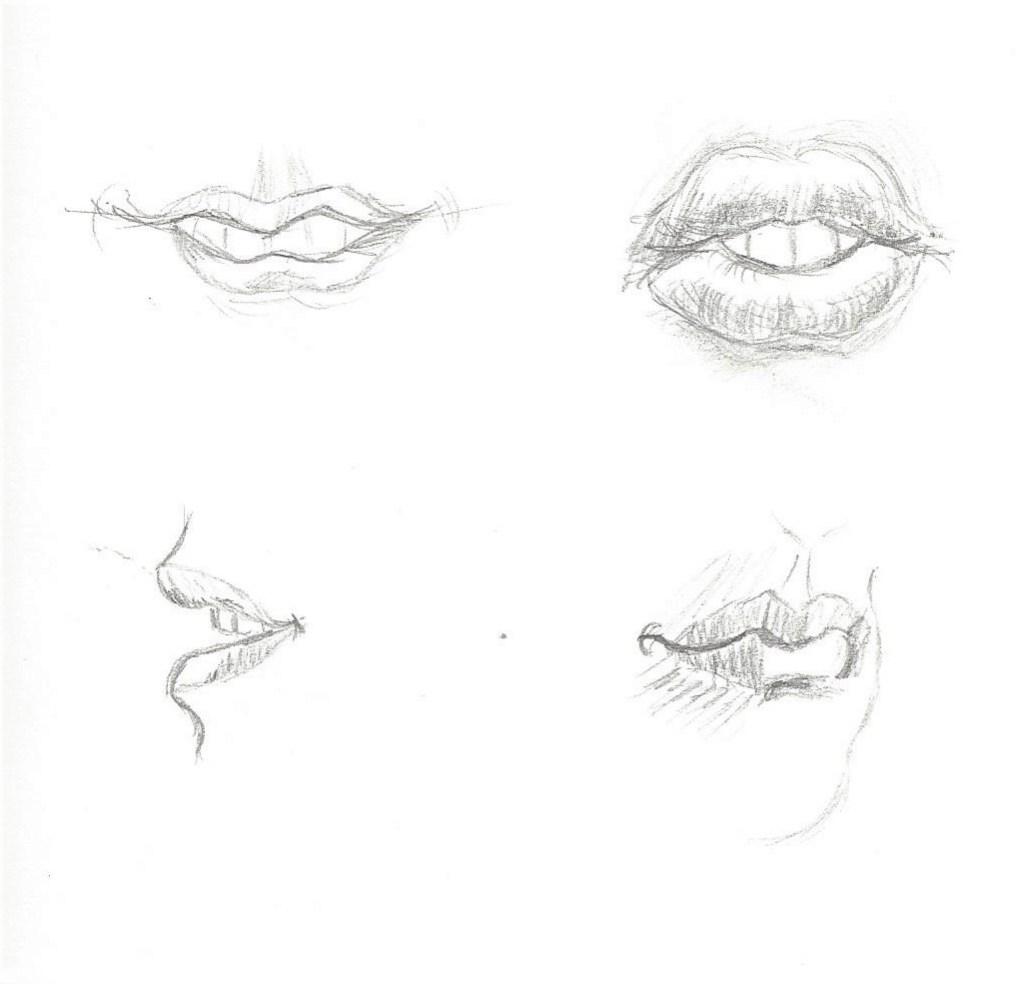
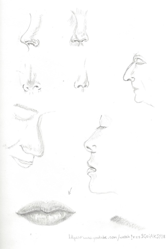
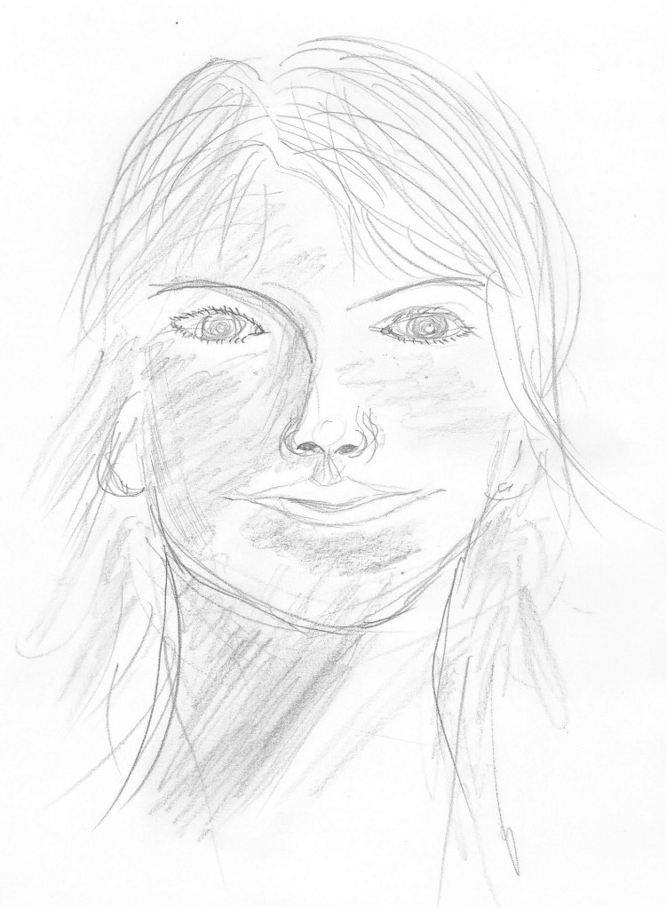
Hb pencil on paper. The jaw here is too square to look like me.5 minute study of my self, in pencil on the back of an envelope. This jaw and nose are too long.My head in 4b and Hb pencil on cartridge paper. I actually coudn’t work out why the eyes looked so ‘starey’ then I read the exercise again I noticed the sentence about the shadows in the eye sockets either side of the nose. So I re-worked on this sketch as below.So when going back to rework the sketch I realised I had forgotten to draw any eyelids which would also give the eyes that over-staring look. After adding eyelids I put some shadows in the eye sockets and some cross-hatching on the neck. I also changed the iris and made it smaller and altered the pupil to make it look in a different direction. I have added some hatching to the lips as well so they don’t look so flat. The 4b pencil works well for showing the darker tones , I did some rubbing in to create some variation of tone without hard edges.
Colour plan for the self portrait below –
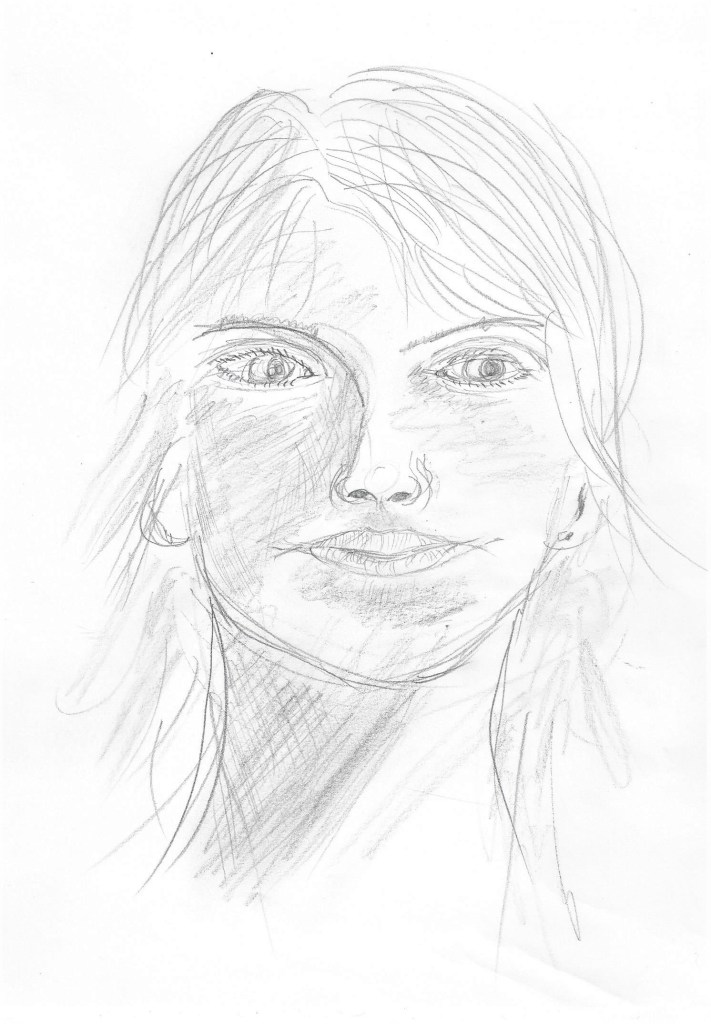
For this one I chose coloured pencils on A4 pastel support. The coloured pencils flow well on this paper and also do not saturate the paper thus leaving some of the colour of the paper showing as it has a ‘tooth’. This one is more of a likeness although the eyes are too close together. This is a good angle with my gaze looking away.
Research point- Artists self- portraits
Fig.13 La Pittura (1638-1639) I came across this self-portrait of a female artist called Artemisia Gentileschi .I like the strong ,determined look on her face and the way the light tones contrast with the dark tones of her hair, dress and room.Fig.14 Squid (1978) I like this portrait because of the different media used – Pencil, ball point pen, brush, black ink, grey wash, coloured crayon, watercolour and body colour. It’s a mix I would consider experimenting with.Fig.15 Always felt so alone (2018) IMAGE numberAPQ5977743TitleI Always Felt So Alone, 2018, (oil on canvas)CreatorPhang Gung Fook, AbigailLocationPrivate CollectionMediumoil on canvasDimensions150x100 cmsCreditI Always Felt So Alone, 2018, (oil on canvas), Phang Gung Fook, Abigail / Private Collection / Bridgeman ImagesFig.16 No(t)here 3 (2002) This image by the artist Julie Brixey-Williams is a photograph with photographic dye.Whilst not typically a self portrait it is a photo of the artist and then she has used dyes to create a figure drawing . It caught my eye as the quick white lines are so simple yet effective in depicting what is happening – telling the story of the artist moving and dancing.
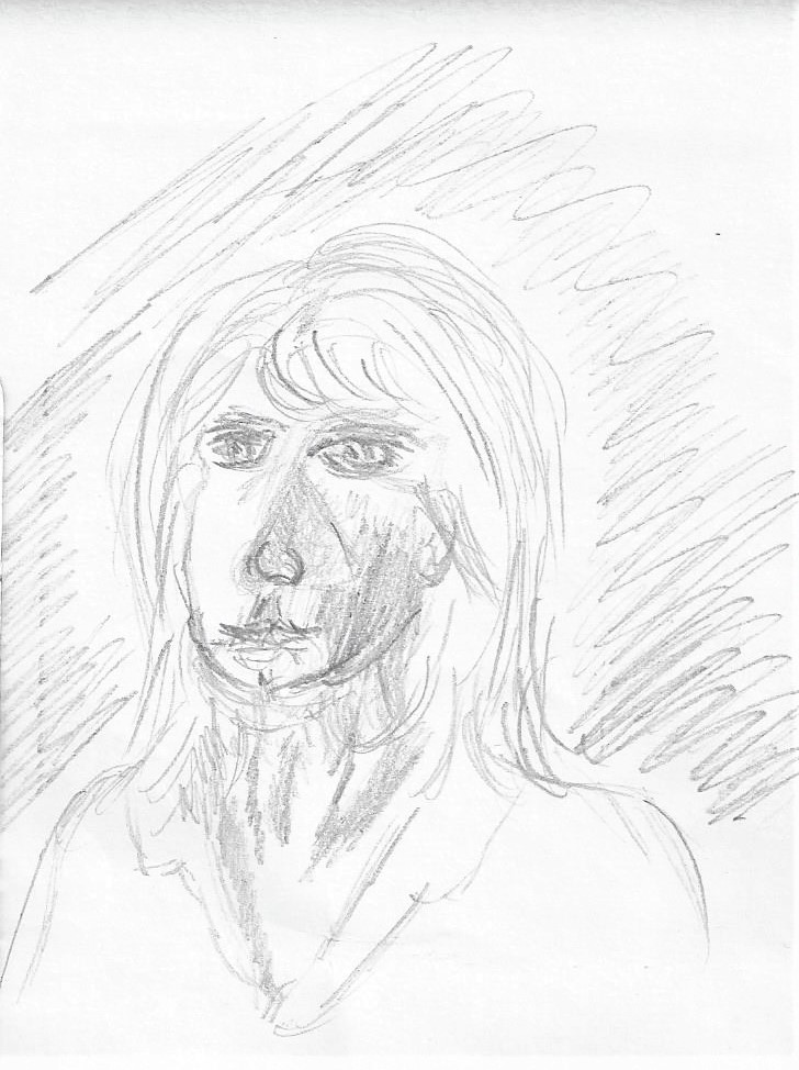
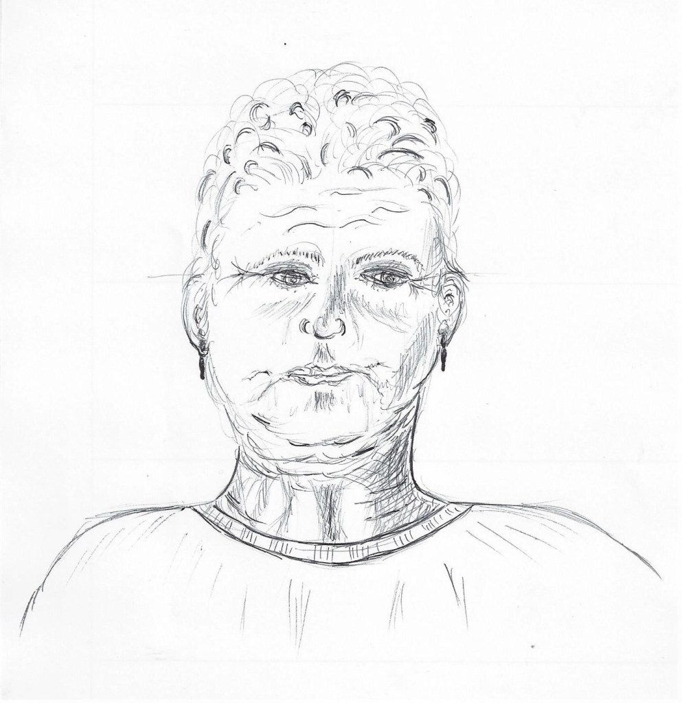
Exercise 3 Portrait from memory or the imagination
I drew this portrait from my imagination and wanted to draw an older person. As I drew I did start to think of people in real life as a reference to how to depict an older persons features eg. wrinkles and crows feet. I enjoyed doing this exercise as I didn’t feel the pressure of having to portray what is in front of me. It definitely helps to have already drawn several features previously. I had difficulty in depicting the hair and tried to use some darker tones which somehow don’t look quite right. At that point I would have liked someone to look at!