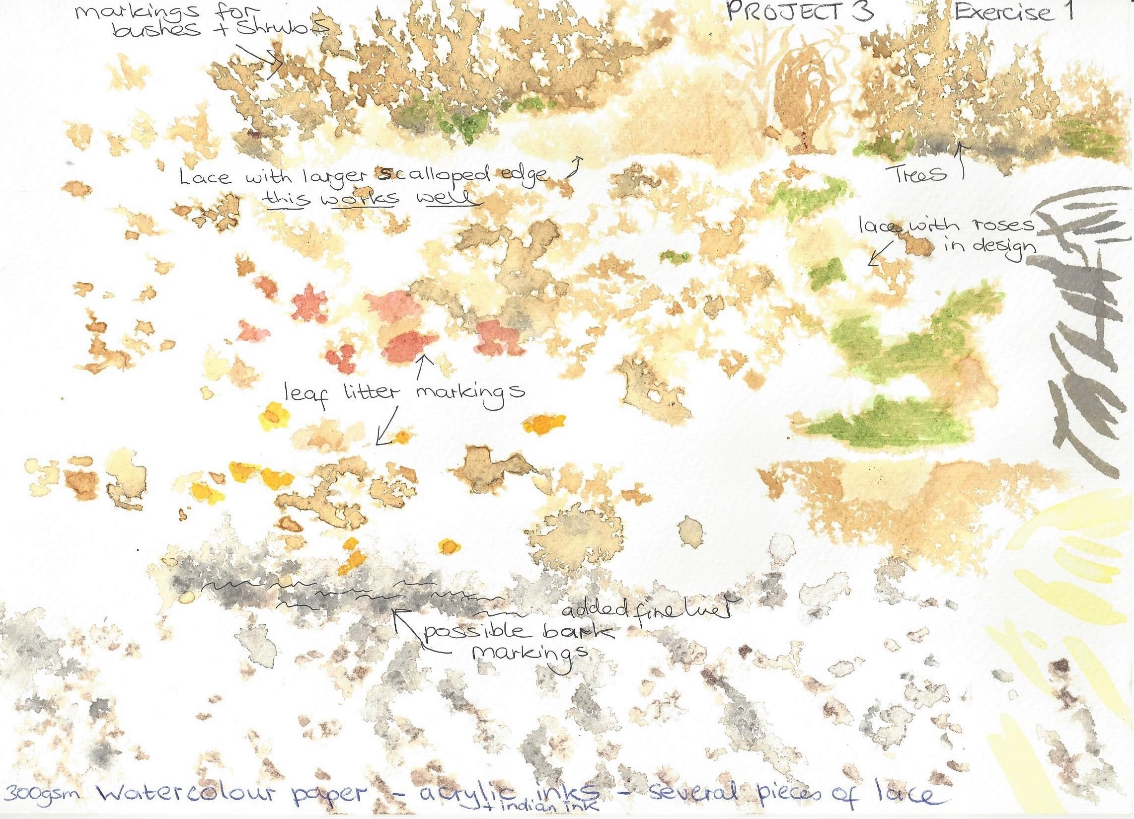
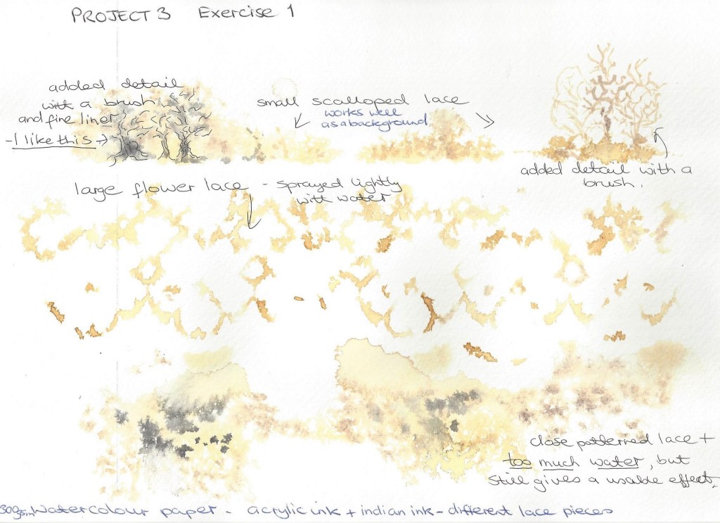
Mark making experiments – I attended a study day in Oxford where the artist Katy Taylor talked about her work and demonstrated a technique used in her textile work . Below is a sample of what I did in her workshop which I thoroughly enjoyed and can see how I could incorporate this into my artwork. We place pieces of open lace onto watercolour paper and then sprayed over with water lightly, the lace was then carefully removed and whilst still wet we dropped Indian ink into small areas around the page. I like the effect a lot , it could be used for landscape – trees, plants, paths, sky etc.
These are my own experiments following the workshop.
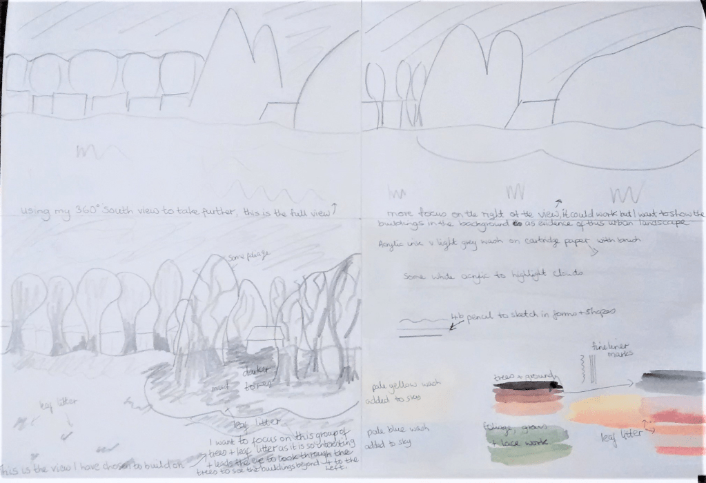
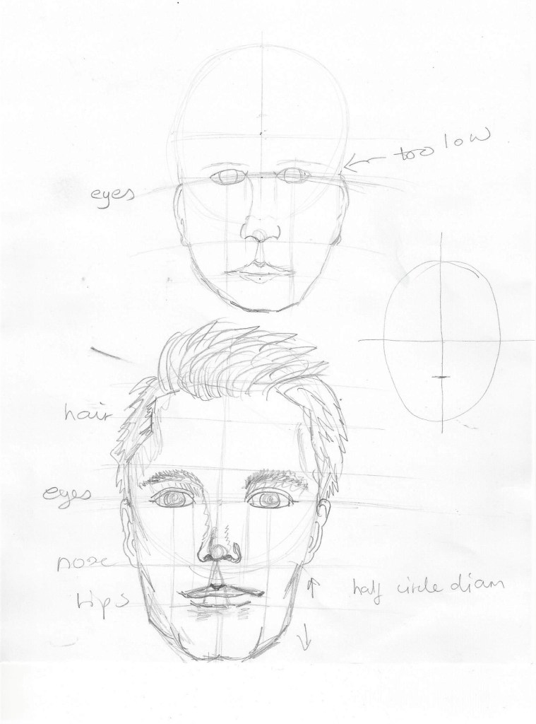
Preparing for a larger drawing- I reviewed some of my preparatory drawings from project 2 and selected from the 360 degree studies a sketch to develop into a further drawing. Below is the planning for this :
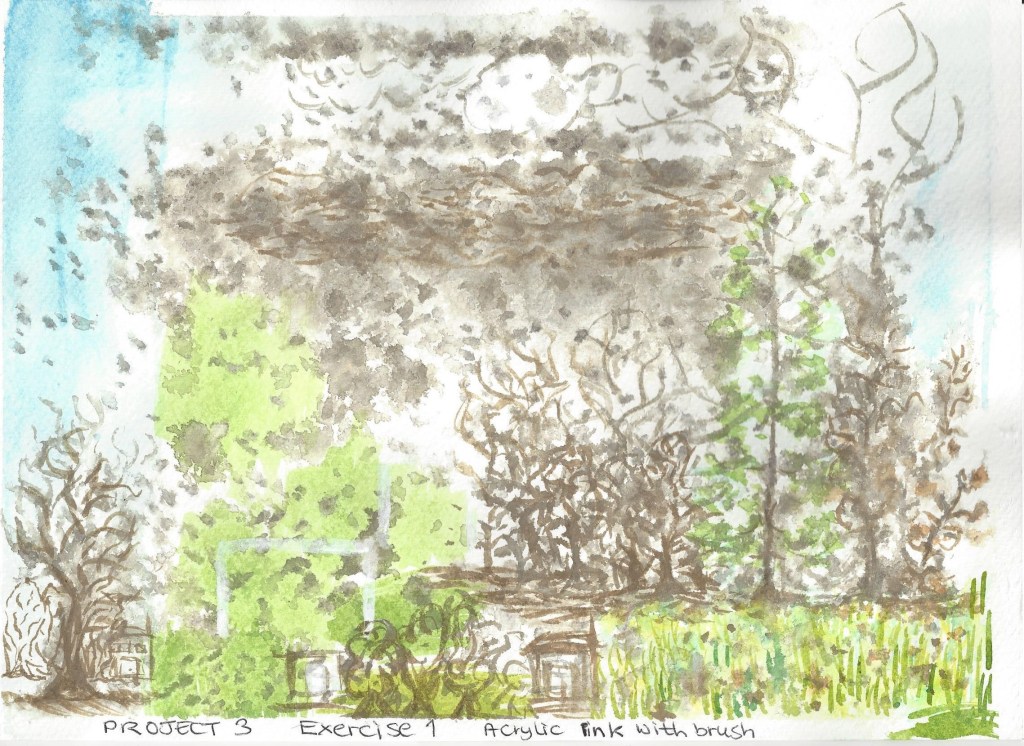
Planning for the compositionFinal drawing – I wanted to focus on the colour of leaf litter and the group of trees in the middle of an urban environment. I wanted to use the middle distance group of trees to lead the eye from the middle tallest tree, then along to the right of the picture and then to the half hidden buildings in the background. I stared with a background wash of diluted grey acrylic ink, when dry I used a 4b pencil to sketch the shapes of the buildings and outlines of the trees. I then added colour with acrylic ink , some wet on wet so that the colours blended in part.
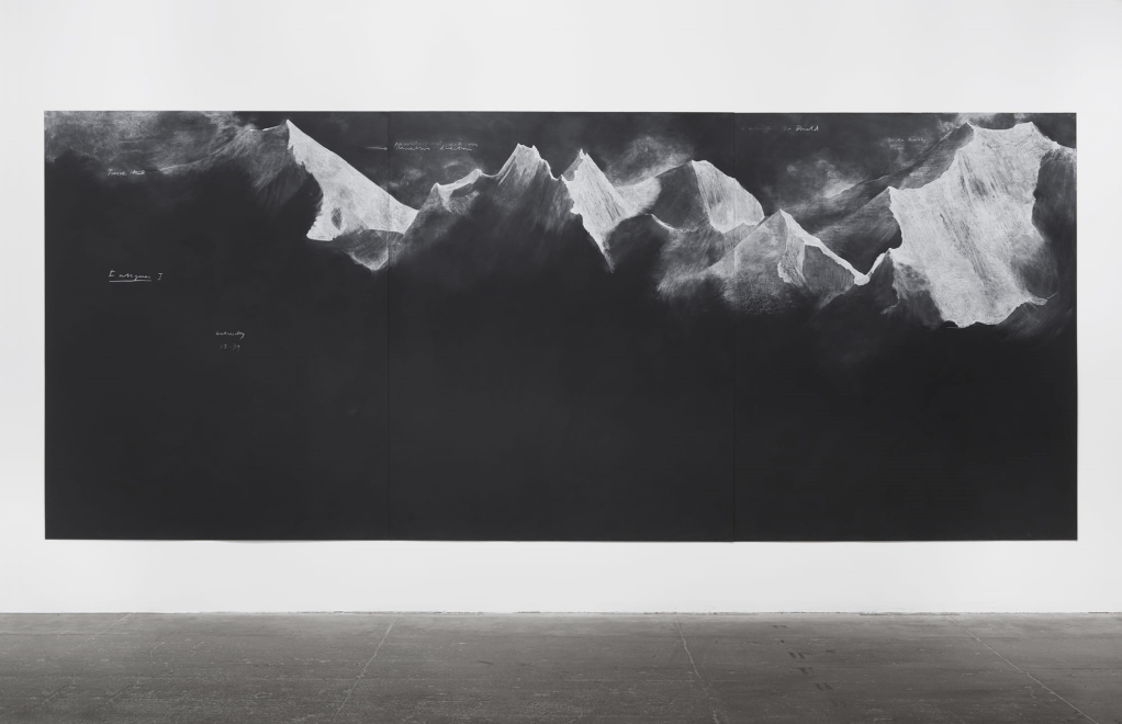
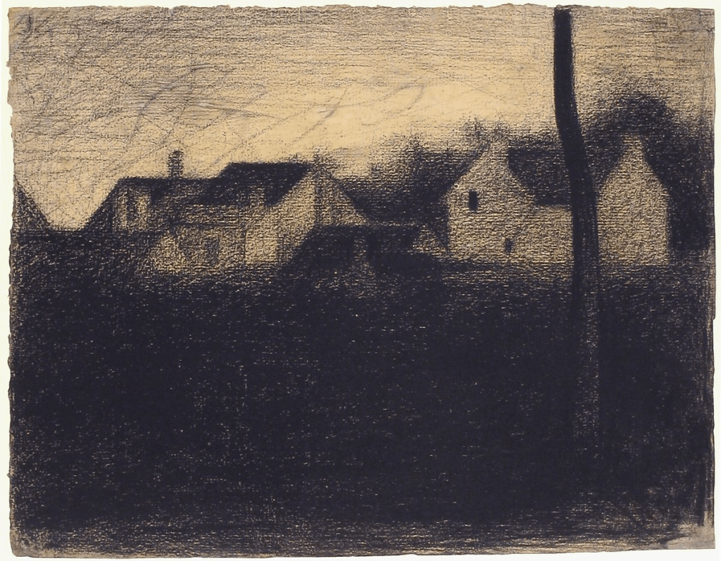
Research point – Similarities – differences Looking at contemporary artists and who work with landscape and a range of viewpoints and comparing their approaches with those of earlier artists. Tacita Dean has some drawings on blackboard which look very dramatic and atmospheric as also does Seurat’s Landscape with houses below, both use light and dark to contrast and create depth. The most obvious difference between them is the viewpoint, Tacita’s mountains are immense and almost overwhelming. Seurat’s is more focused on what most people see around us.
Fig.18 Fatigues 2012 chalk on blackboard – Tacita DeanFig.19 Landscape with houses 1881-1882 Georges Seurat
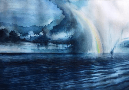
Fig.20 2019 Whilst researching for contemporary landscape artists I came across Adem Potas who is based in Istanbul. This painting is done in watercolour (it does not have a title or date that I can find.)
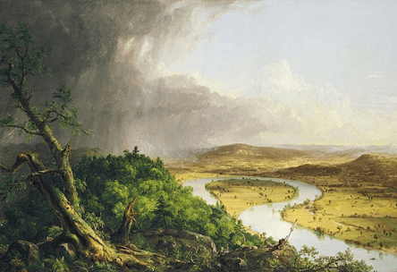
The skies here are particularly dramatic and portray a sense of power and fast changing beauty similar to Thomas Cole’s painting below of the sky after a thunderstorm. Both artists use light and dark contrasts and reflection to take our eye around the paintings. There is also the similar use of aerial perspective – Adem paints the distant clouds on the left in a light tone and smaller shapes, Thomas depicts the distant hills in pale violet with not much detail.
Fig.21 View from Mount Holyoke, Northampton, massachusetts, Thomas Cole, after a thunderstorm – The oxbow (1836)The difference between them is Adem paints in a more impressionist style whilst Thomas paints in a naturalistic way, almost like a photograph of the view. Both these paintings capture the thrilling and striking nature of the sky.
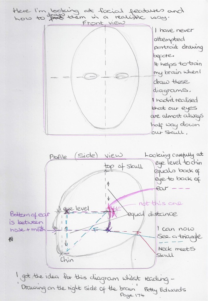
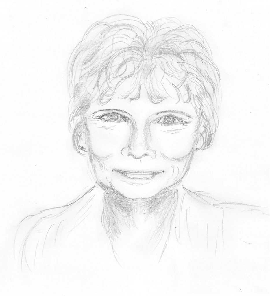
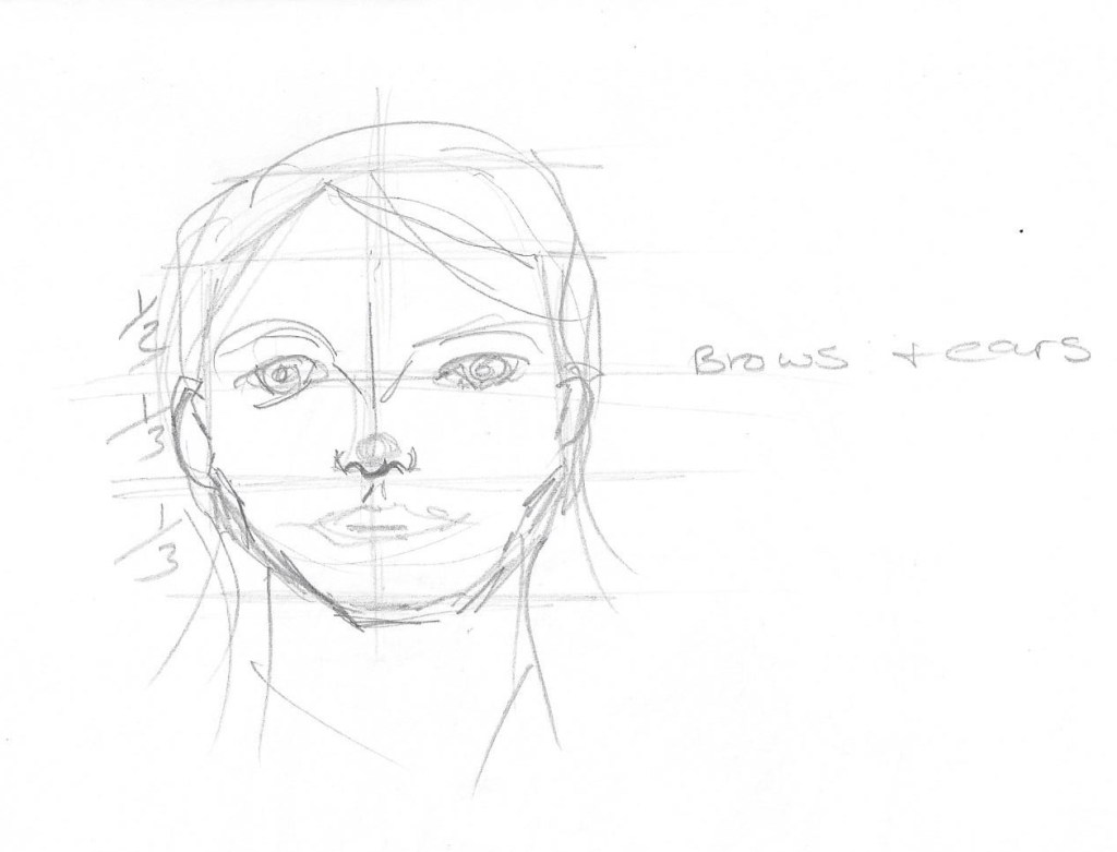
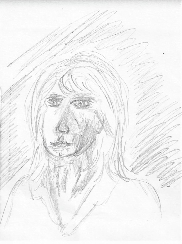
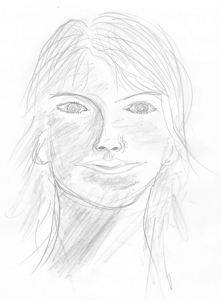
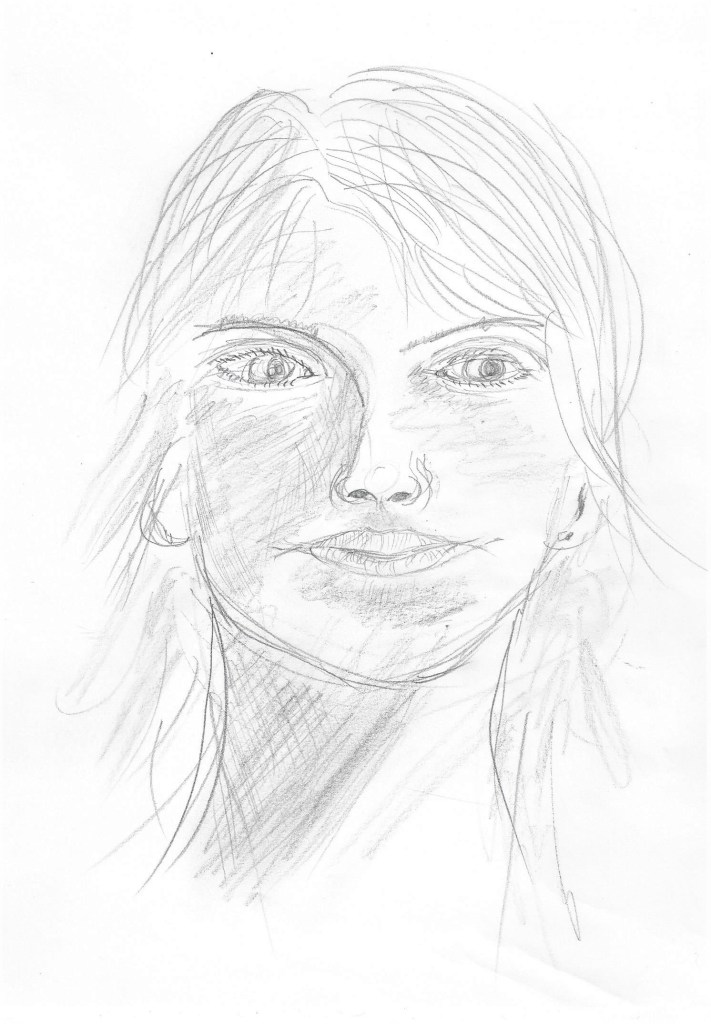
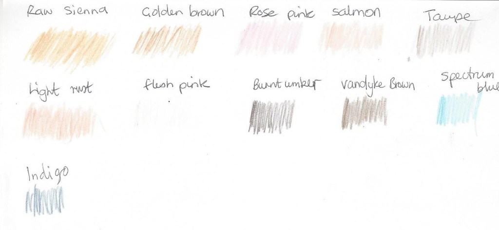
Fig.11 (Edwards 1999:174)Fig. 12 ( Barber 2002:p.45) I copied a sketch by Henry Carr who used hatching to show tone. Copying from the masters really helps as I am limited in technical drawing skills for figure work. I do enjoy working like this and look forward to a time when I am more confident in sketching heads and features.Soft pastels on pastel paper copied from a found picture of unknown source.Hb pencil on paper. The jaw here is too square to look like me5 minute study of my self, in pencil on the back of an envelope. This jaw and nose are too long.My head in 4b and Hb pencil on cartridge paper. I actually coudn’t work out why the eyes looked so ‘starey’ then I read the exercise again I noticed the sentence about the shadows in the eye sockets either side of the nose. So I re-worked on this sketch as belowSo when going back to rework the sketch I realised I had forgotten to draw any eyelids which would also give the eyes that over-staring look. After adding eyelids I put some shadows in the eye sockets and some cross-hatching on the neck. I also changed the iris and made it smaller and altered the pupil to make it look in a different direction. I have added some hatching to the lips as well so they don’t look so flat. The 4b pencil works well for showing the darker tones , I did some rubbing in to create some variation of tone without hard edges.Colour plan for the self portrait below –For this one I chose coloured pencils on A4 pastel support. The coloured pencils flow well on this paper and also do not saturate the paper thus leaving some of the colour of the paper showing as it has a ‘tooth’. This one is more of a likeness although the eyes are too close together. This is a good angle with my gaze looking away.Fig.13 La Pittura (1638-1639) I came across this self-portrait of a female artist called Artemisia Gentileschi .I like the strong ,determined look on her face and the way the light tones contrast with the dark tones of her hair, dress and room.Fig.14 Squid (1978) I like this portrait because of the different media used – Pencil, ball point pen, brush, black ink, grey wash, coloured crayon, watercolour and body colour. It’s a mix I would consider experimenting with.Fig.15 Always felt so alone (2018) by the artist Phang Gung Fook, IMAGE numberAPQ5977743TitleI Always Felt So Alone, 2018, (oil on canvas)Creator AbigailLocationPrivate CollectionMediumoil on canvasDimensions150x100 cmsCreditI Always Felt So Alone, 2018, (oil on canvas), Phang Gung Fook, Abigail / Private Collection / Bridgeman ImagesFig.16 No(t)here 3 (2002) This image by the artist Julie Brixey-Williams is a photograph with photographic dye.Whilst not typically a self portrait it is a photo of the artist and then she has used dyes to create a figure drawing . It caught my eye as the quick white lines are so simple yet effective in depicting what is happening – telling the story of the artist moving and dancing.
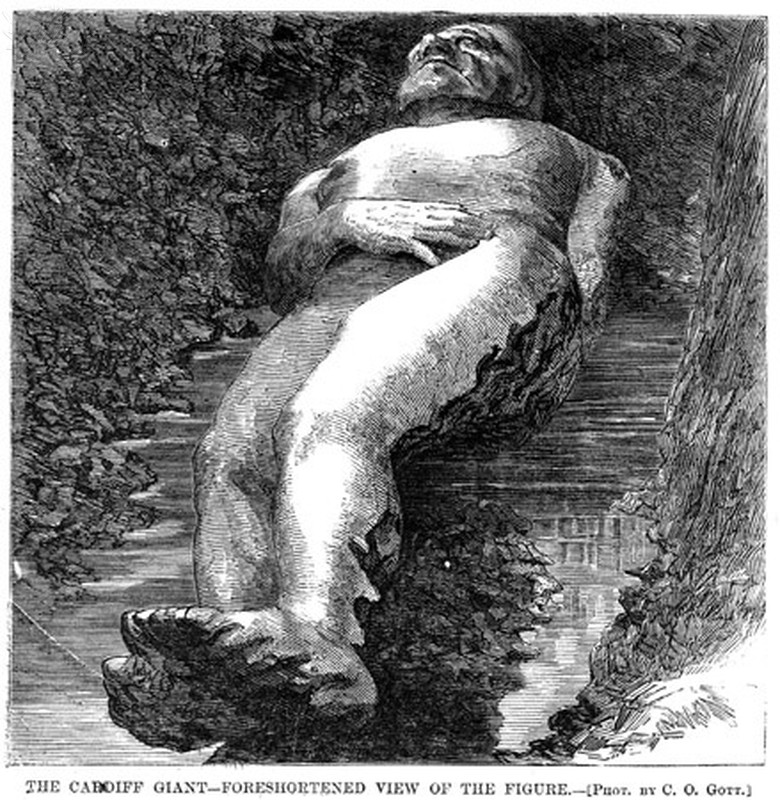
Following feedback from the tutor I am looking again at project 2 exercise 2 – ‘foreshortening’ . I looked at the image below which clearly shows the feet and legs seeming large compared to the rest of the body which is further from our view.
CARDIFF GIANT, 1869. – ‘The Cardiff Giant – Foreshortened view of the figure.’ The Cardiff Giant, one of the most famous hoaxes in American history, was a 10-foot-tall stone man ‘discovered’ on the Newell farm at Cardiff, New York, on 16 October 1869. Wood engraving from a contemporary, American, newspaper.. [Fine Art]. Encyclopædia Britannica ImageQuest. Retrieved 19 May 2020, from https://quest.eb.com/search/140_1669526/1/140_1669526/citeI copied this from a book by the artist Barrington Barber, the hand and foot on our left come forward and appear larger than the right side.Again, a copy I drew from Barrington Barber, here the forearms and hands are drawn larger than the lower body as this is what we see when looking from one end along the subjectHere I have drawn myself in front of a mirror and my feet look larger because they are nearer to the viewer
Illustrations
Fig.11 Edwards, B (1999) The New Drawing on the right side of the brain. (2nd edition): Canada: Penguin Putnam Inc. p174
Fig.12 Carr , H (c.1894 – 1970) Drawing. In: Barber, B (2002) Advanced drawing skills.[Drawing] London: Arcturus Publishing limited. p45
Fig.13 Gentilescgi, A (1637) Painting. In: Wilkes,A (2018) Great paintings. [painting]London: Dorling Kindersley p.97