At the beginning of this part I reminded myself of the feedback from my tutor for part 3 – ”If using colour, try to bring sketches and studies of colour into your idea development too, rather than sketching everything out in black and white and only adding colour when working on the final. This will help you to explore more creative and communicative possibilities which can come from adjusting your use of colour.
– Drawing with all colours: Explore how you can draw with different coloured materials to create interesting and expressive marks with them rather than using this to ‘colour in’ a black and white drawing” Russell, N (2020) Feedback I have begun to put this into practice in a small way and would like to do it more in further units.
Project 1 Fabric and form
Exercise 1 Drawing fabric using line and tone
15 minute sketch using line I drew this soft white cotton fabric with ballpoint pen and tried to keep the line moving and not stop too long look at any details. It is easier to focus on line when the fabric is plain.15 minute sketch concentrating on tone I was glad to have a time limit here as I could have kept drawing for a long time. As I was drawing I began to notice the different shapes that appeared – cones, triangles and cylinders. I had to look closely at where the dark tones became lighter towards a fold in the fabric.5 minute sketches of different parts of the fabric using different media. Here I taped a sheet of A1 to the wall and drew inside the squares focusing on a small area of the fabric. I tried different media and found I was able to create volume when using tone/shading and looking at the direction of the marks. When tones gradually move from dark to light next to a fold with the lightest area on the top of the fold this helps to create volume. I also found it good to look at the shapes that the folds had formed – cones, triangles and curves , which help to convey volume .30 minute sketch – A knotted piece of fabric drawn with charcoal pencil on pale pink pastel paper. The lightest tones are the paper , I sketched in the mid to light first and then the mid to dark tones.
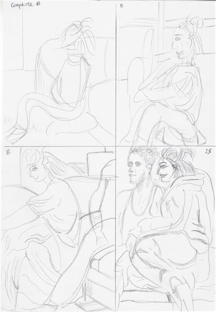
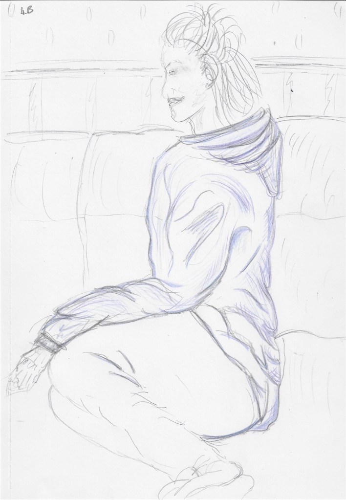
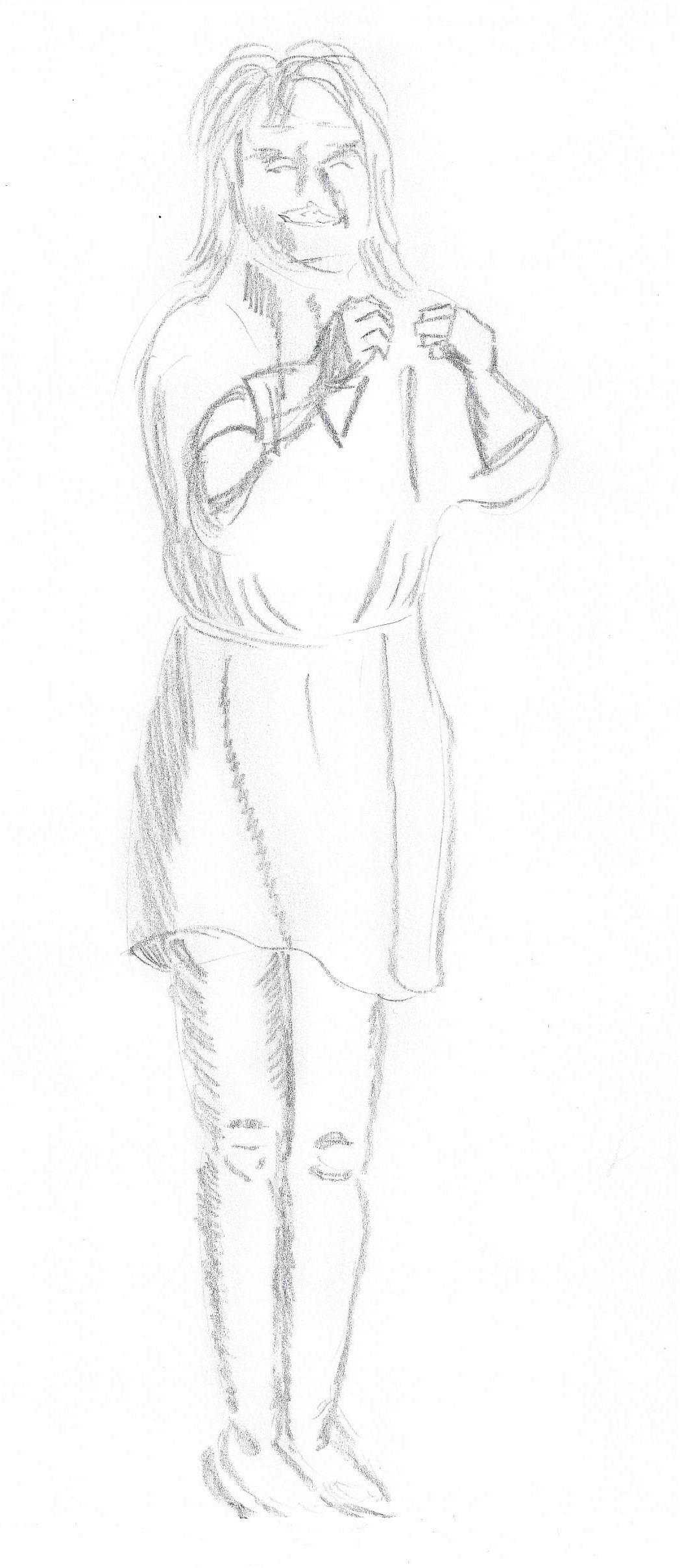
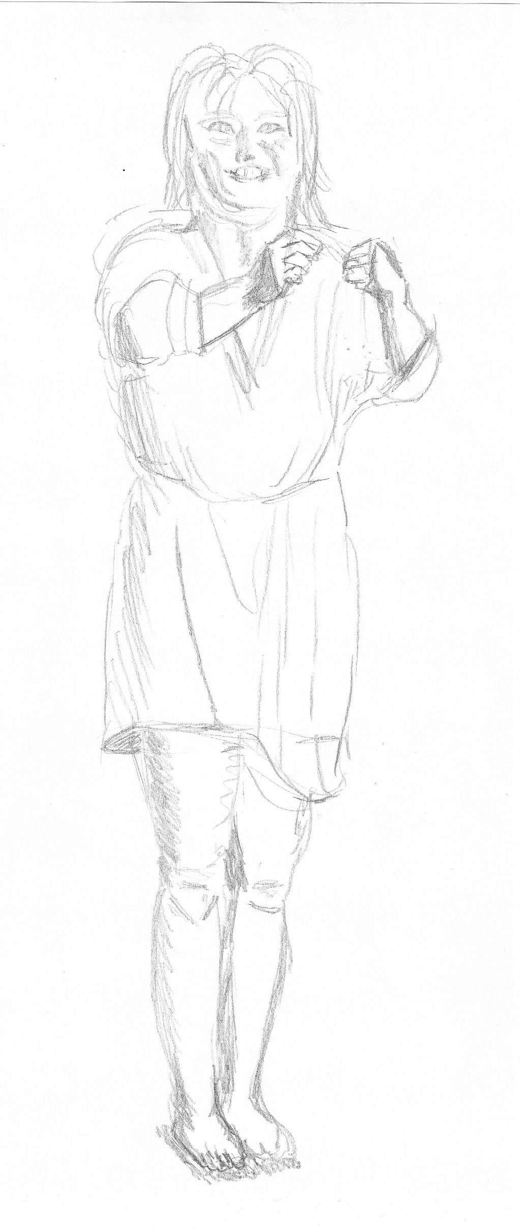
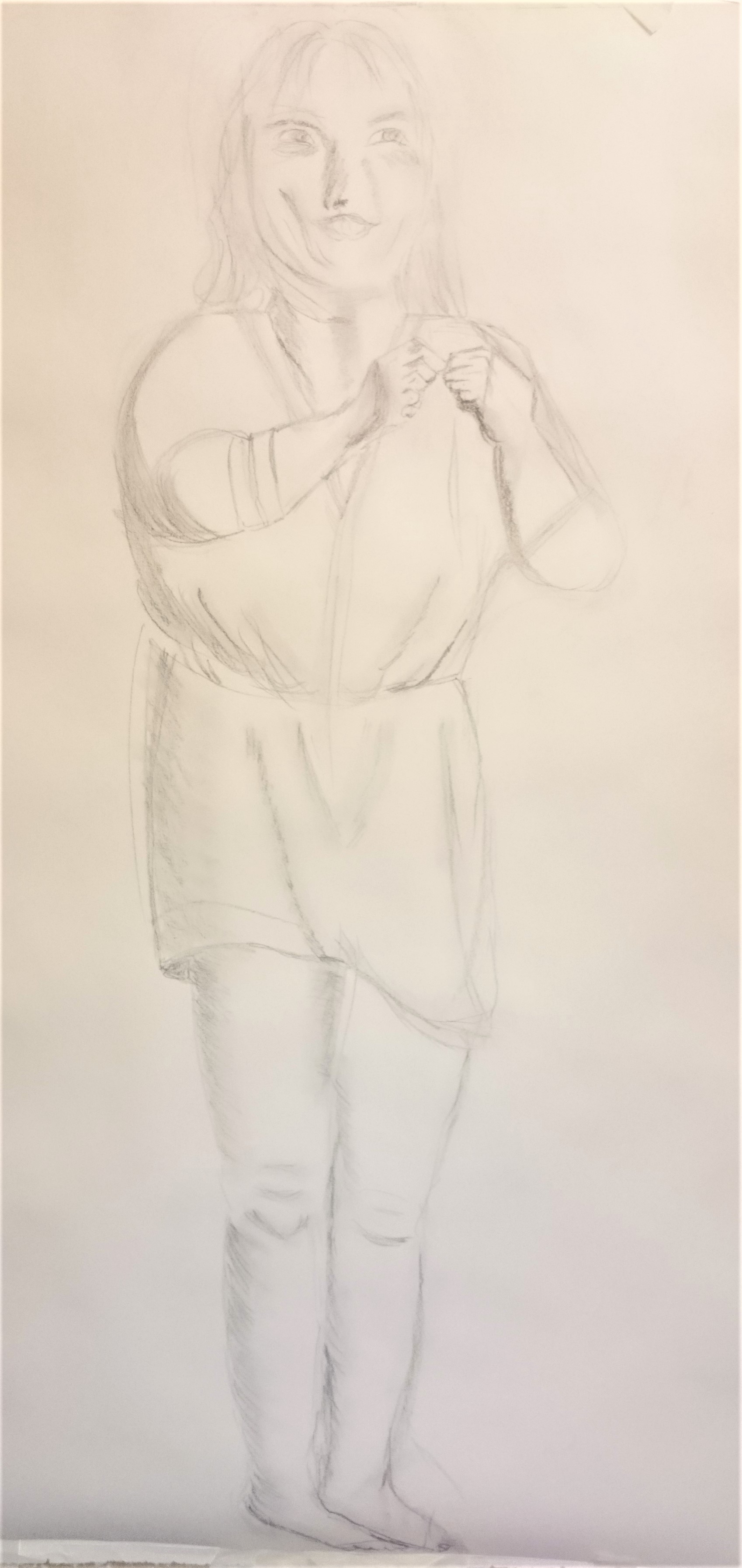
Exercise 2 Emphasising form with cloth
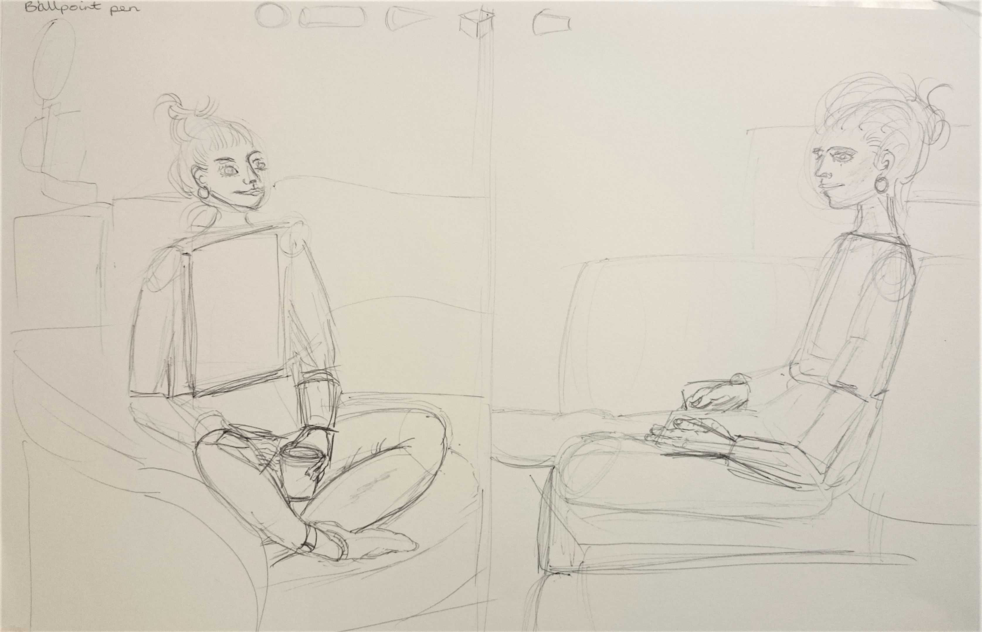
Using graphite pencils B and 2B on cartridge paper I first sketched out some thumbnails and looked at the shape of the seated figure – an S – shape and then decided to draw the bottom right composition as a larger picture below – Using graphite pencil 4B on cartridge paper. Here I focused on the main body of the figure and the way the baggy jumper formed around the body. I’m not really happy with the arm as it doesn’t seem in proportion, I quite like the way the marks of the pencil are shaped down the back and do give some sense of three dimensional form.
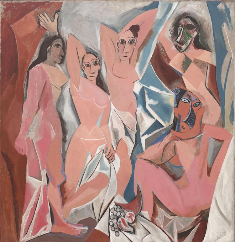
Episode 2 looks at the Nude paintings in history and discusses peoples attitudes towards them. This is a very thought provoking documentary which I haven’t come across before and although made in the seventies I feel it is still relevant today. It seems to me that across the centuries the nude has caused controversy at various times. Some artists have challenged the opinions and religious views of their time. I think Picasso perhaps did this with this oil painting shown below – not only with the style ( cubism) but in showing the female form in a gritty way, unlike centuries before when nudes looked pure and sculpted.
Fig.1 Les Demoiselles d’Avignon (1907)
Project 2 Proportion
Exercise 1 Quick studies
5 two minute sketches drawn with 2B pencil on cartridge paper. It is really helpful to look at some basic shapes in the figure before adding detail. I can see the spheres, cylinders and cones throughout the figure.My first of two 10 minute sketches – The head looks too small for the body, the hands are difficult to draw quickly. I did try to use the pencil against thumb technique to measure the figure, it isn’t always successful.My second 10 minute sketch from a different viewpoint, again I tried using pencil against thumb to measure proportion, I think it is more successful in this sketch than the other. I neglected to add shadow across the figure and to show the light coming from the lamp in the background as I was so involved in getting proportion correct and showing the creases and folds in the fabric.Added some colour and texture to see what it looks like. Fig.2 Moss, C popular press(c.1958) I like the simplicity of this drawing with the chair lightly sketched. The white on coloured background stands out well and brings the subject to life. I would like to try this method.
Fig.3 Old man with woolly hat (2016)
I did this drawing by copying an image form a book and using a similar style to the Colin Moss drawing above. I chose this image of an old fisherman as I thought the bold green pastel paper would bring out the feeling of a life of hard work that shows in the etched wrinkles on his face. It was so interesting to draw a face with so much character.I first sketched four thumbnails as a plan for the drawing although the top left looks a bit out of proportion now. I then lightly sketched the outline with a 2H pencil. I drew in the outline and dark tones with black soft pastel, the support is the mid tone, and white pastel and chalk were used for the highlights. The chalk I used had a crisper, brighter white than the pastel. Overall I think it is quite effective to use black and white on a bold coloured support. Fig.4 Studies of a woman playing a guitar (1717) N.B remembering tutor feedback from part 3 and using colour in the exercises and not just final pieces.
Exercise 2 A longer study
I used conte stick on A3 cartridge paper. I have lots of this colour conte stick which I like using as they are quick to apply, soft like pastel and easy to handle. I made marks for the outermost parts of the figure. I think I have captured the characteristics of the pose but I feel the proportions don’t look right – legs look too short and feet look too small. I re-drew over the original to try to improve this but still the legs were too short. I am hoping that I will become more confident in time as I draw more figures.
Research point – Foreshortening
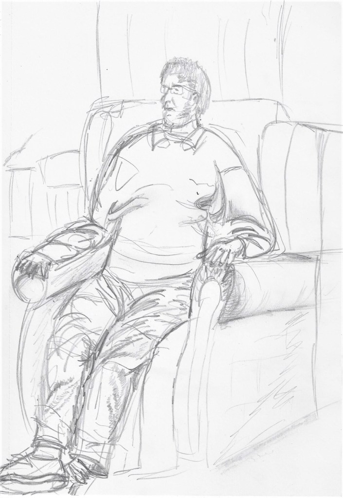
Self portrait drawn whilst lounging on the sofa- an experiment in foreshortening. This was an enjoyable exercise as I felt relaxed and wasn’t anxious about drawing someone else.
An example of foreshortening below-
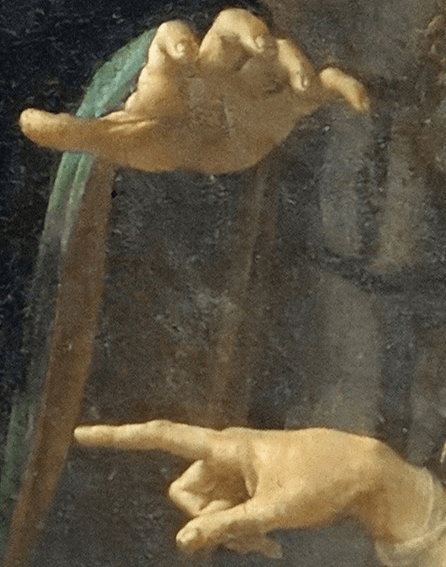
Fig.5 Virgin of the Rocks (c. 1483–1485) Here is an example of where the artist has used foreshortening to emphasise the hands and make give them prominence in the picture.
Experiment in foreshortening
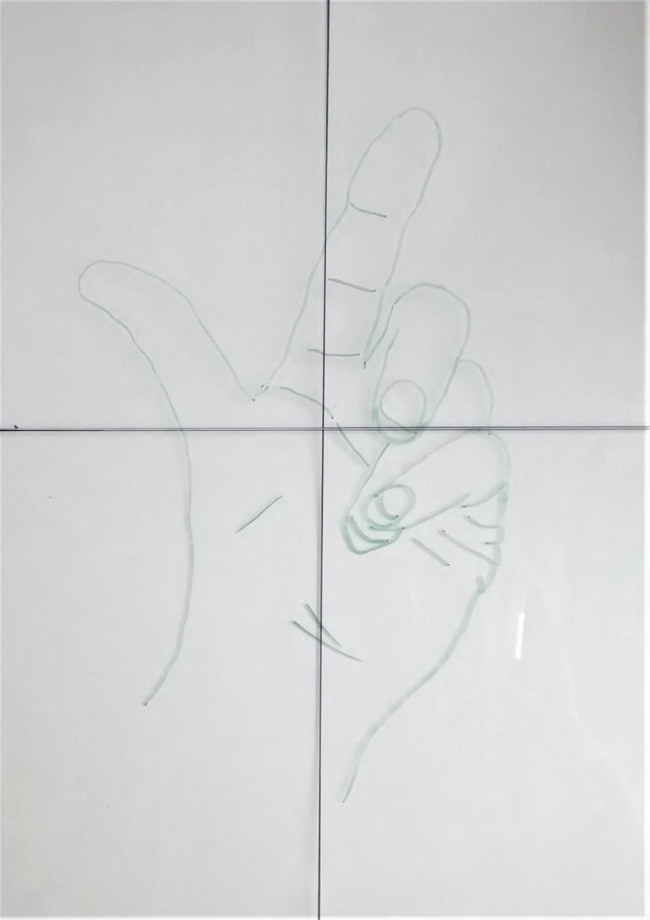
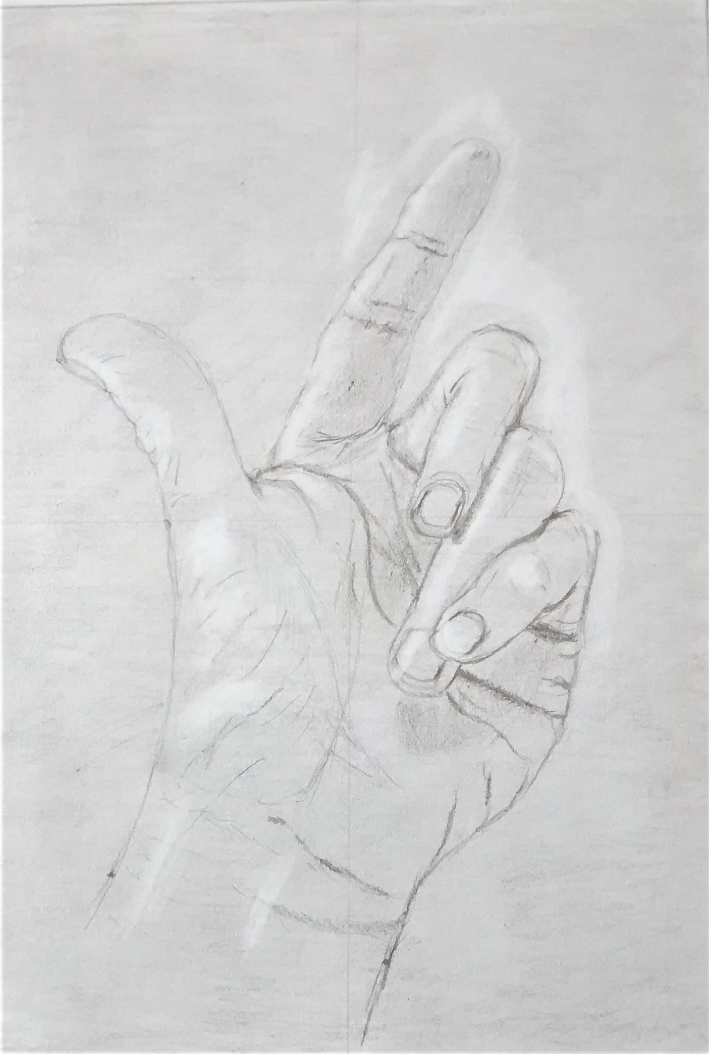
I first traced my hand onto a glass picture plane and then used grid lines to copy it onto paper that had been toned lightly with graphite and blended into the paper. I next used an eraser to lift out the highlights. The outline was sketched very lightly with a HB pencil . 2B graphite was added for shadows and darker tones. Lastly I erased the background graphite to help give a more 3D view to the hand. This method was suggested in ( Edwards,1999:97-98) Although lengthy, I enjoyed this method to look at foreshortening, it seemed to make more sense after trying this and I’m quite pleased with the outcome.
Project 3 Form
Exercise 1 basic shapes
Exercise 1 Basic form
I used ballpoint pen on A3 cartridge paper. I like the flow of ballpoint but i am nervous of not being able to erase it! In these 2 sketches above and the 1 below I have tried to connect exercises 1 and 2 due to the models time restraints. I began by sketching the basic shapes and noted the angle of the planes . There is a slight twist of the shoulder in the sketch on the left and a twist of the right ankle.
Soft pastel on A3 cartridge paper. I used the models top left arm as a measured unit which seemed effective. Here there is a twist of the left ankle and possibly some foreshortening of the hands on the keyboard. I wanted to emphasise the dark and light tones by using one colour in broad sweeps and letting the paper be the lightest tone. It was a challenge to focus on proportion and tone at the same time and I feel using pastel helps me with this. I like the way the legs sweep out over from the chair to the table showing the space beneath them.
Exercise 2 Essential elements
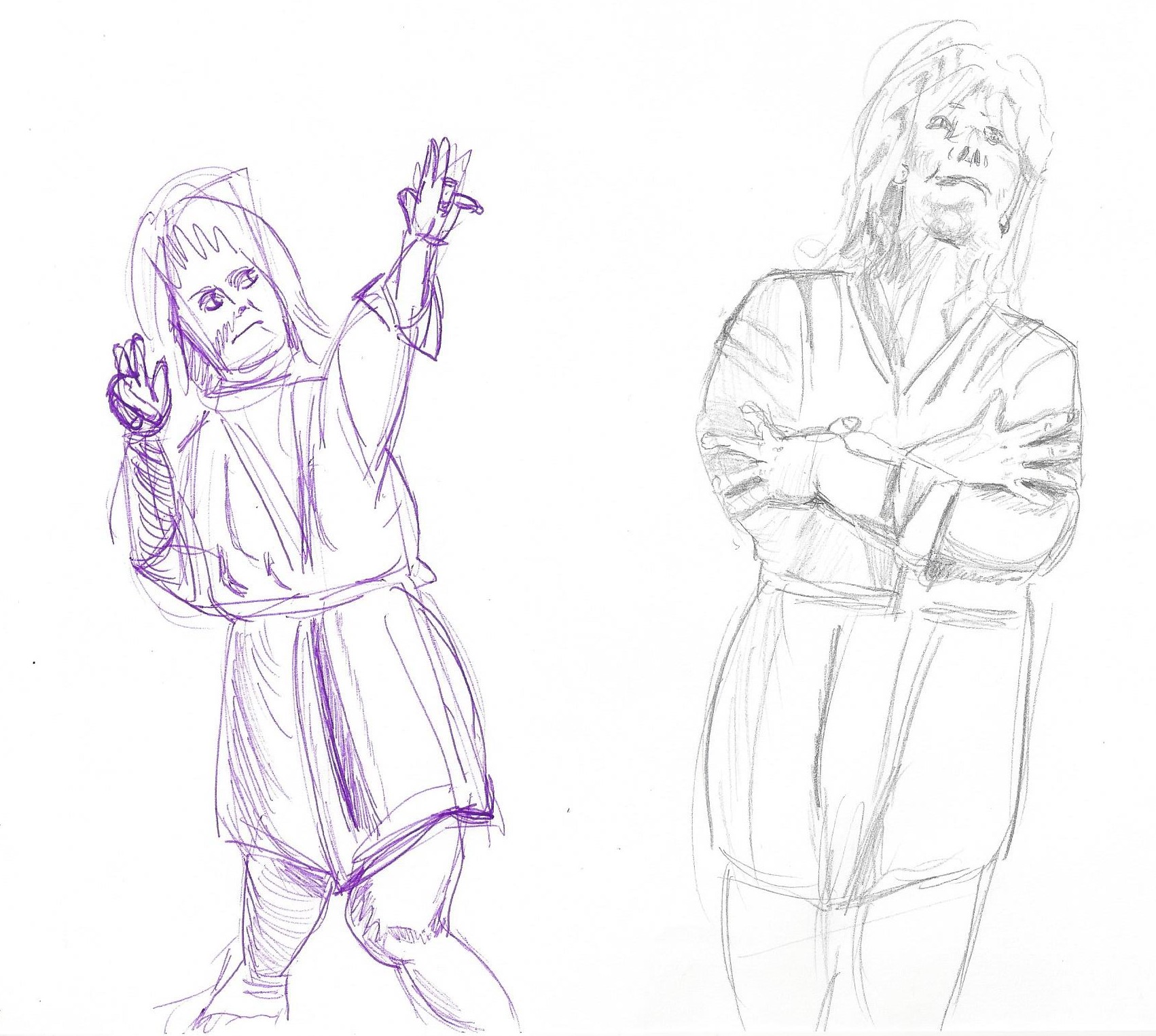
Above slideshow – 10 minute sketches – The challenge for me was the proportion of the hands and feet, sometimes I ran out of space for the feet and the hands were sometimes too big . Difficult to do in 10 minutes whilst trying to focus on a three dimensional form. I think the drawing on the left in purple biro gives the best sense of the pose. I have shown the model leaning and moving away from the central axis putting weight onto one leg more than the other and the arms raised with some foreshortening on her right arm to depict it drawn towards her body.
Exercise 3 Stance
Fig.6 ( Ambrus,1993: p112) Willow charcoal on A1 cartridge paper – First I noted the centre of gravity which is something new to me and helps me to focus on the figure. I placed points on the paper – head, feet and hands first and then shapes of the body. I then altered some parts to try to make them look in proportion but not very successfully. The top half of the body is a lot bigger than the bottom half. I need to practice finding a measuring point as a guide.
Exercise 4 Energy
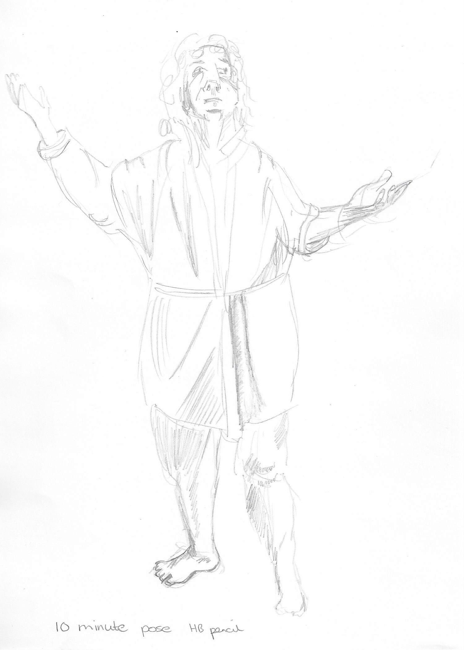
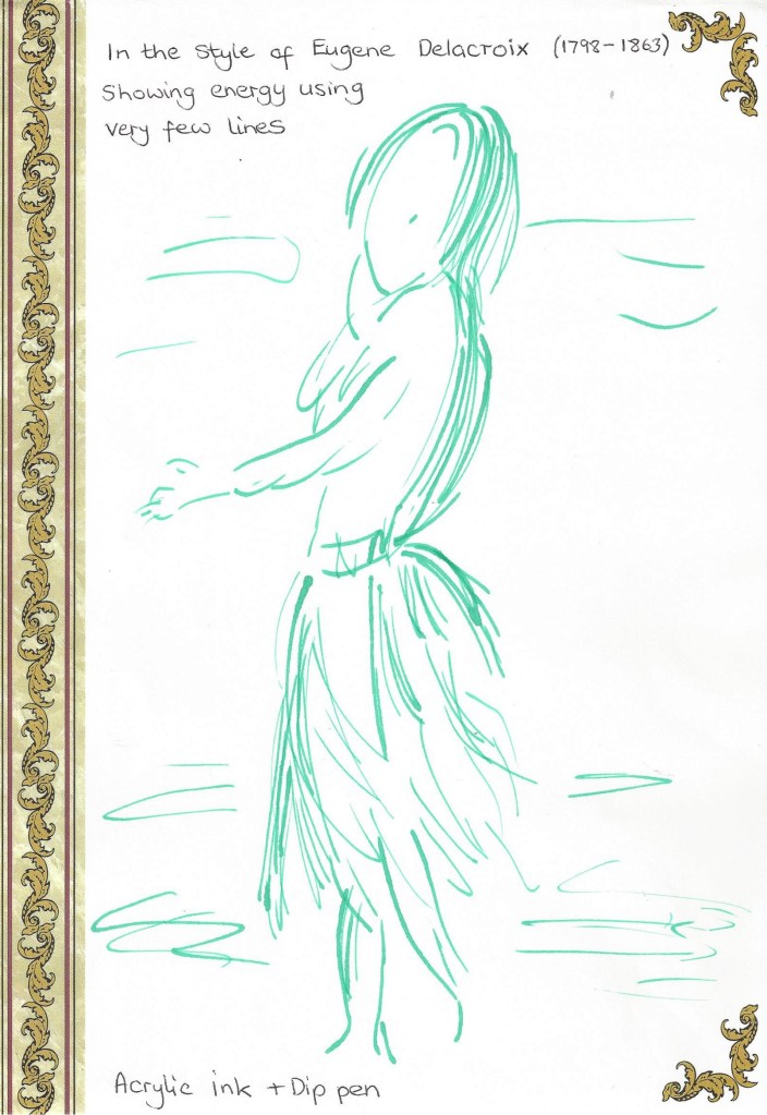
Dynamic position Charcoal on A3 cartridge paper. Quick 5 minute sketch. The raised leg added interest to this sketch and I was able to note the negative space between the two figures. I have added some marks to the heel of the left foot on the raised leg after reading the last line of this exercise in the course book ( should have read it through earlier!) which suggest movement, maybe I added too many but it does show how a few repeated lines show a sense of movement in a drawing.Fig.7 (Barber, 2002:33) A4 found paper. I like the fact that this sketch has very few lines and yet we get a sense of the energy and movement.Experimenting with marks that depict movement. Mixed media on paper.Movement gestures – I used soft pastel on A3 black sugar paper and plastic loyalty card to pull out thin lines on top of the pastel. This was an experiment in painting to music. I listened to an energetic piece of classical music and drew along to it – wonderful experience!
Project 4 Structure
Exercise 1 The structure of the human body
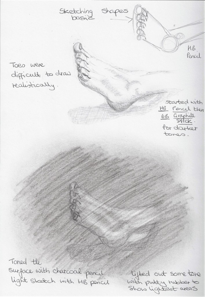
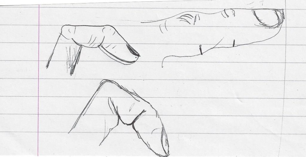
To help me become familiar with the structure of the human body I have been tracing over a printed copy of a skeleton regularly and thinking about how the bones connect to each other. I have a small sketch book in which I have begun to draw my own body parts. Below is an example –
Focusing on the joints of the fingers and what happens when they bend. It was very interesting to look at the patterns on the palm of my hand, it could be used for a future drawing.Fig.8 Bridgman (2017:15) A page from a wonderful book by George B. Bridgman which at first glance seemed like a medical journal. This method of looking at the body in detail, should give me a greater understanding when drawing, as I have never really thought about the way parts are in relation to each other. So glad I purchased this book.
I looked at some of the anatomy drawings of Leonardo da Vinci , the link above is an example of the incredible detail he added to his work.
Below is an example of work by Sarah Simblet – a contemporary artist that I discovered when searching for ‘structure of the body’ artists. Her drawings are very detailed.
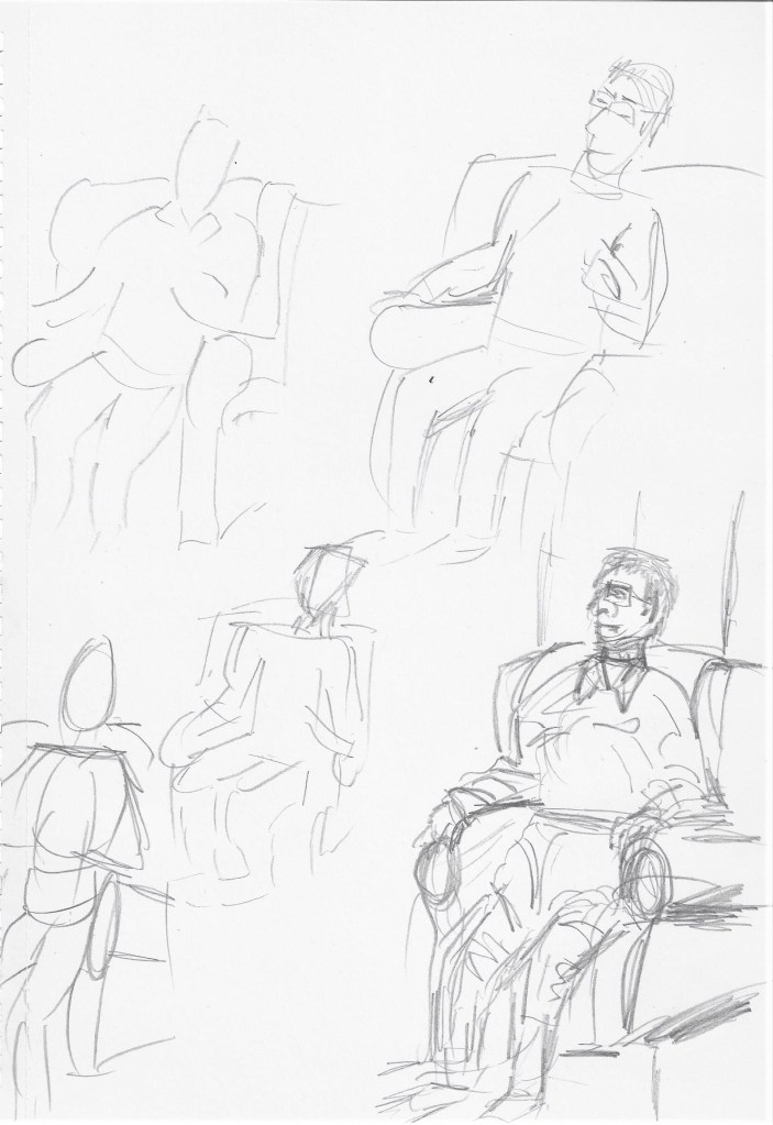
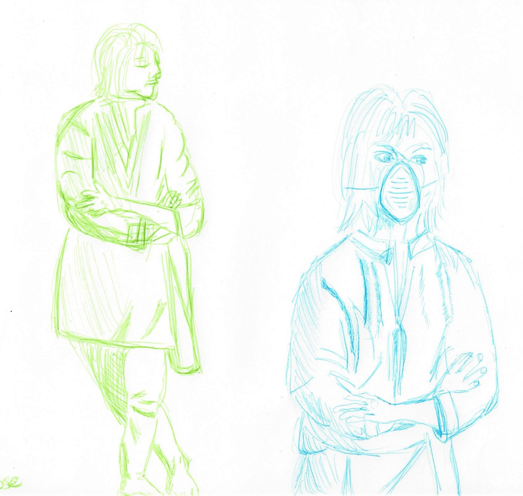
Model was standing turning slightly to her left and with light coming from high face on. First I did two, 2 minute sketches with HB pencil on A4 paper- top and bottom left above. The first one to look at alignment and shapes, second one to look at tone. The middle sketch was a 10 minute sketch using HB pencil on A4 paper with more detail added. I noticed that because the model was smiling her eyes were a slightly different shape with the lower lid slightly arched upwards. I observed the foreshortening of the arms and it helped to think of the bone structure of the hands and draw them with straight lines. The far right A1 sketch with 6B graphite is not in proportion, the head is too big and the hands and arms are too small. It is a challenge to draw on A1 and I need to practice more.
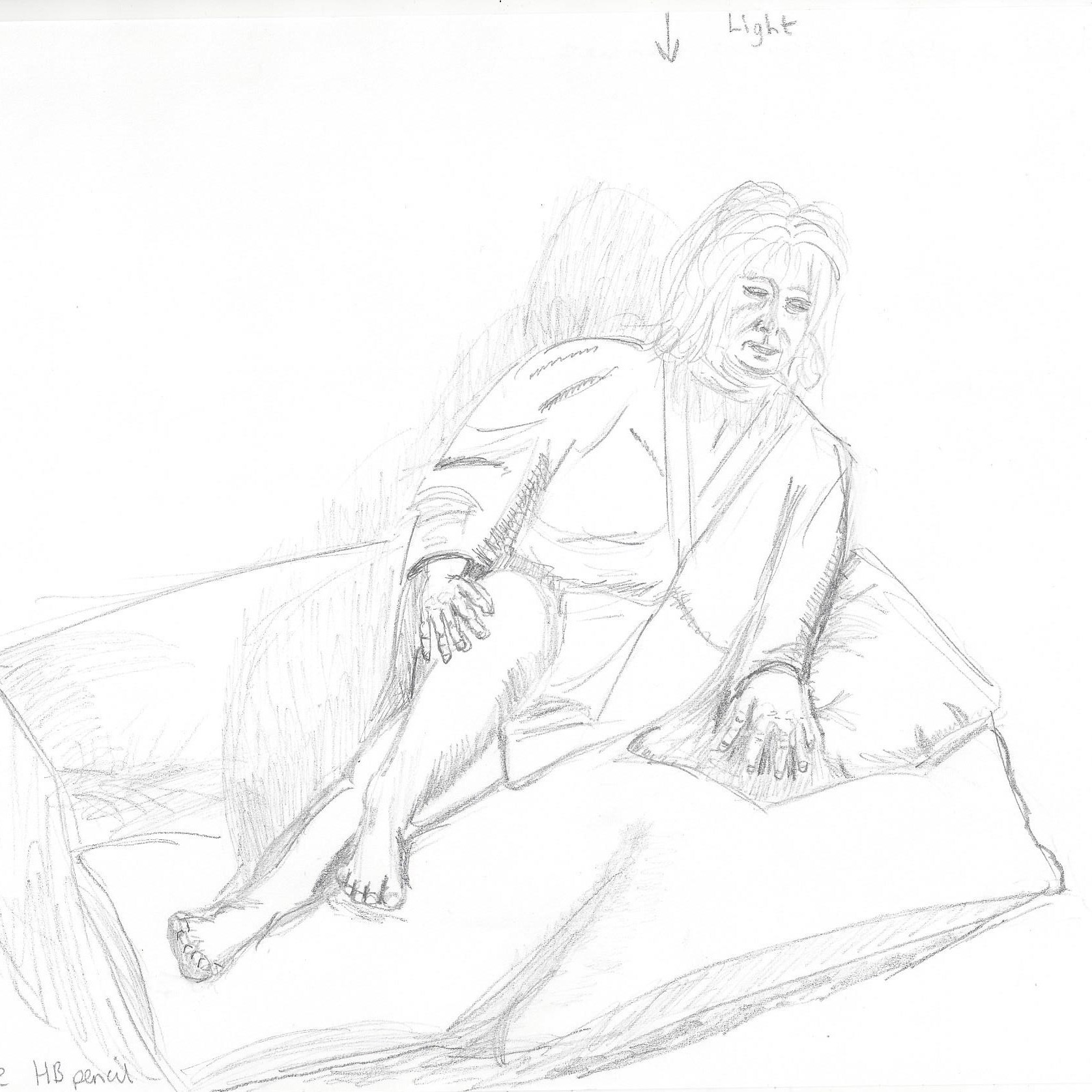
Lounging
I began with a 2 minute sketch on A4 paper landscape view to look at shapes of the figure and the area surrounding. The second 2 minute sketch was to look at tone and shadow created by light coming from above and facing the model. Third sketch on the right is a 10 minute sketch with more details of hands, feet and facial features. I’m still struggling with hands but I have noticed a slight improvement the more I observe them, although they are not in proportion in this drawing. I have chosen not to alter them as I can use this to learn from and see how I can improve. The top larger sketch was done on A2 drawing paper with HB mechanical pencil and took 45 minutes. I chose to darken the negative spaces particularly between the fingers as these did stand out when viewing the model and the way the hand restinf on the cushion caused creases to form. I like the result of the foreshortening of the raised knee.
Seated
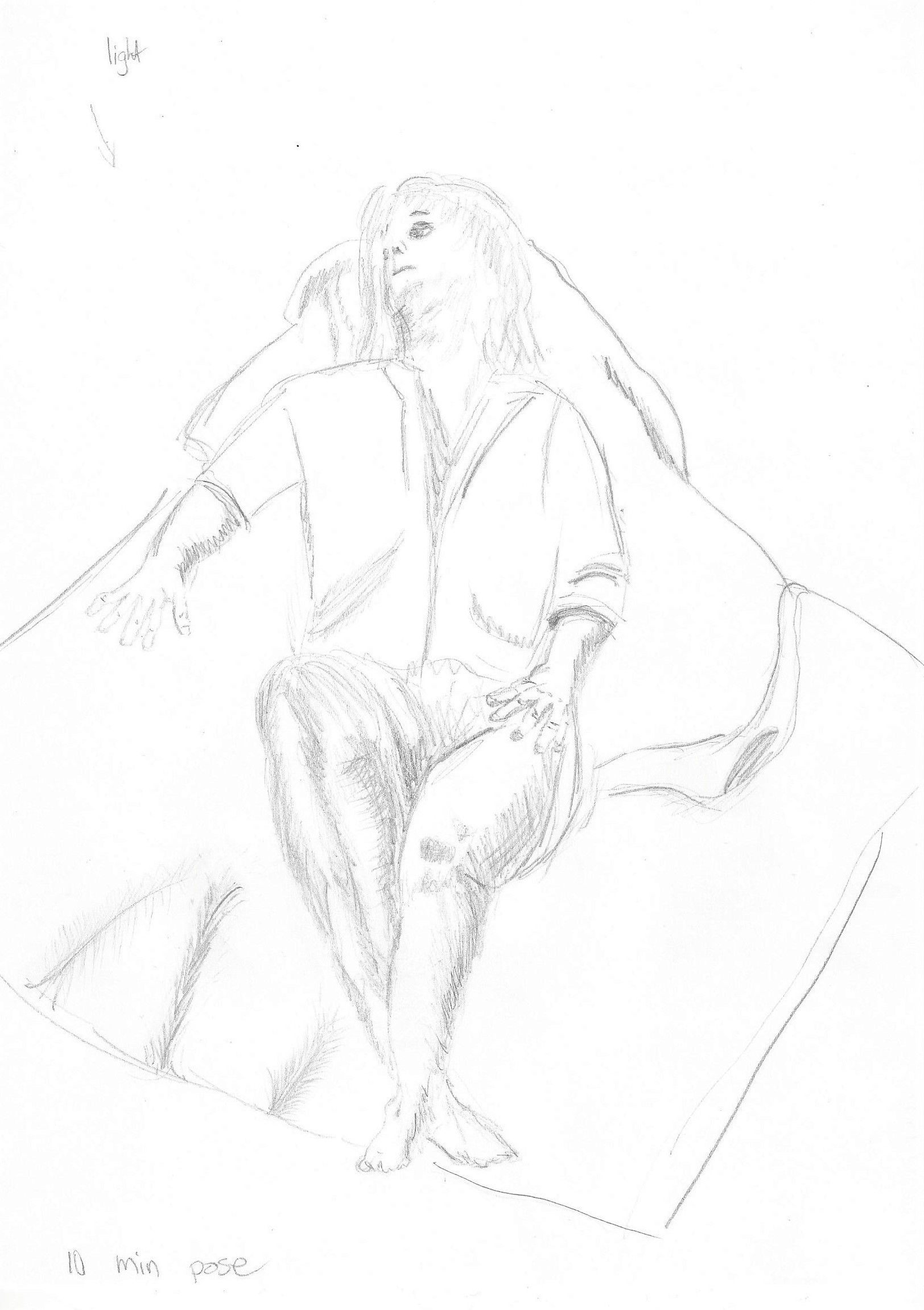
This was my first time at a life drawing class and the experience challenged some of my preconceived ideas. Were a group of 14 with a tutor present if we needed guidance but mostly we were left to work independently. I began by sketching quickly in pencil in my A4 sketch book the basic shapes of the figure.A1 drawing paper with 4B pencil. Next I did another quick sketch to try to get the proportions looking believable. I used the thumb on pencil method to measure the figure but still had to re-sketch over the drawing. A1 drawing paper using charcoal I used soft pastels, charcoal and pencil on A2 pastel paper. I like the result of the soft pastels to show skin colour and depict some of the light ans dark tones. The result here is better in proportion than my first sketches, it is a thin , slight model and I did have difficulty drawing the shoulders and back. it helped to think about the bone structure for a while especially when drawing the legs and thighs to give them the correct shape . I would have liked to have had to chance to draw the model in different poses but we ran out of time.
Project 5 The moving figure
Exercise 1 Single moving figure
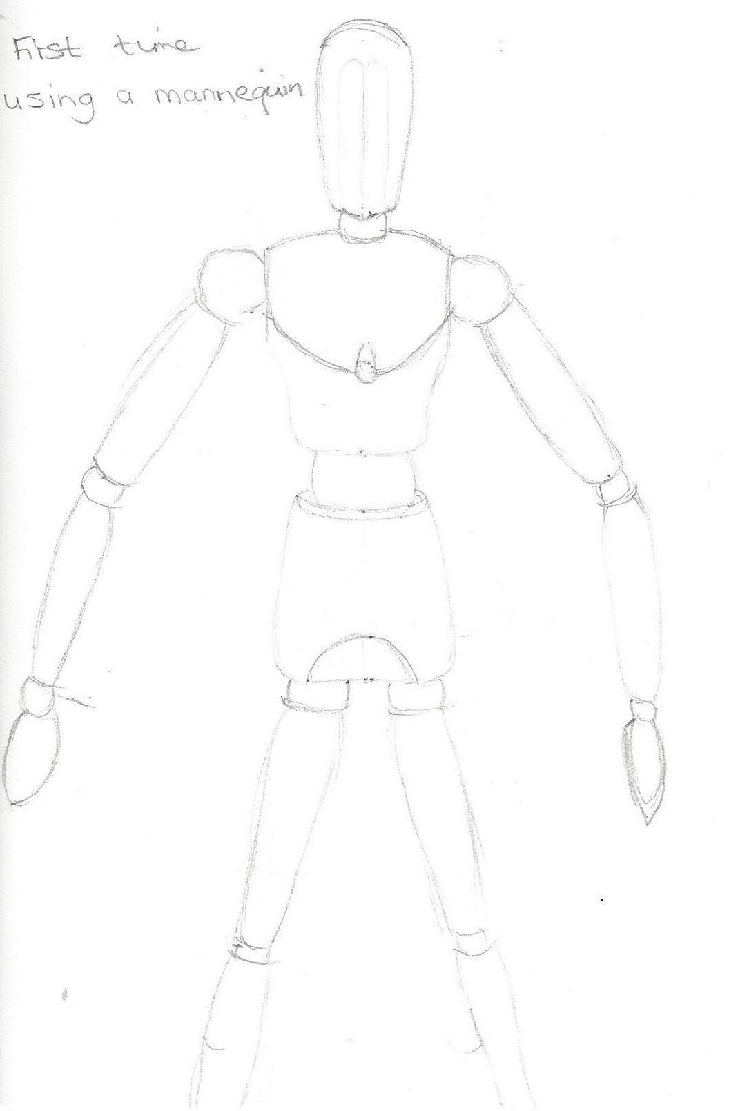
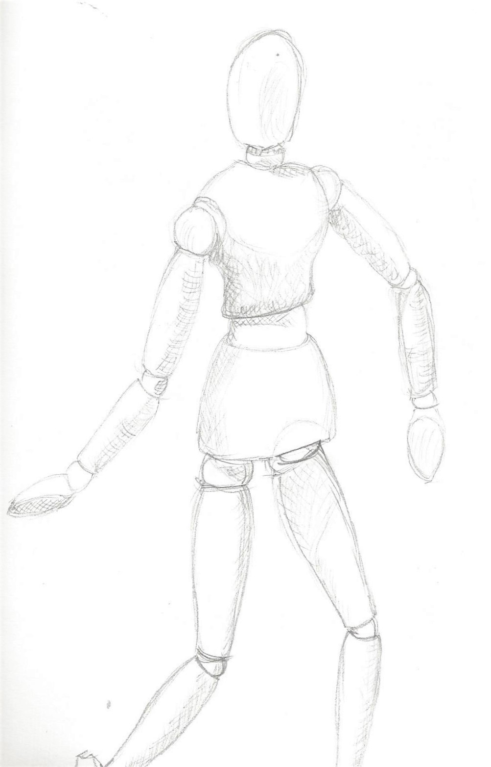
Using a mannequin
The images below are my first attempt at using a mannequin. I found this a helpful tool for looking at different movements, I added tone to the 3rd sketch. I still managed to run out of room for the feet every time!
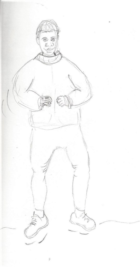
10 minute pencil sketch to capture movement of 2 models. I have to remember not to worry about the details and focus on CAPTURING!This model was walking and wearing a thick jacket which restricted arm movements somewhat, which I tried to convey with the markings near the elbow.
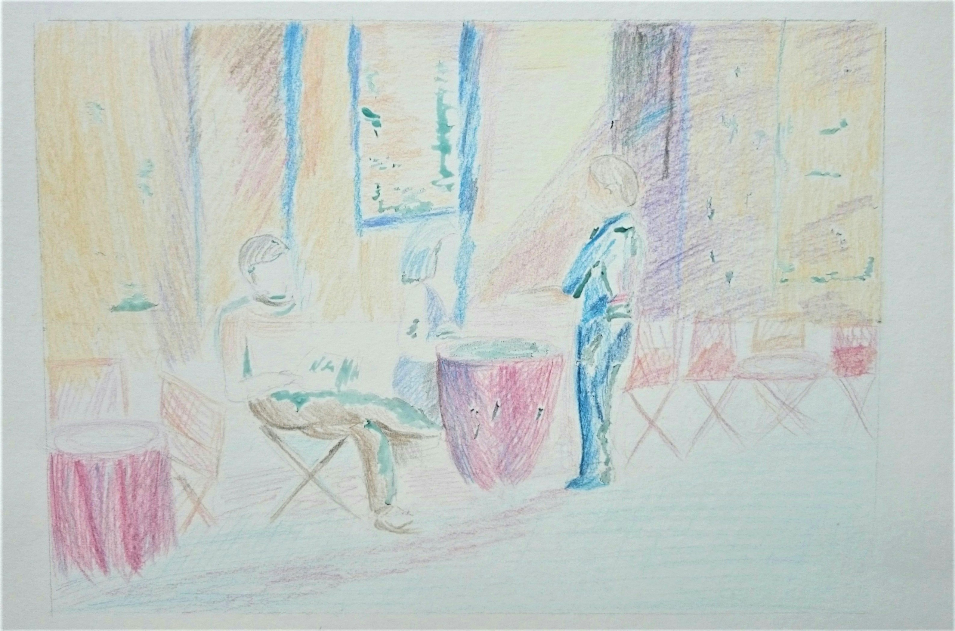
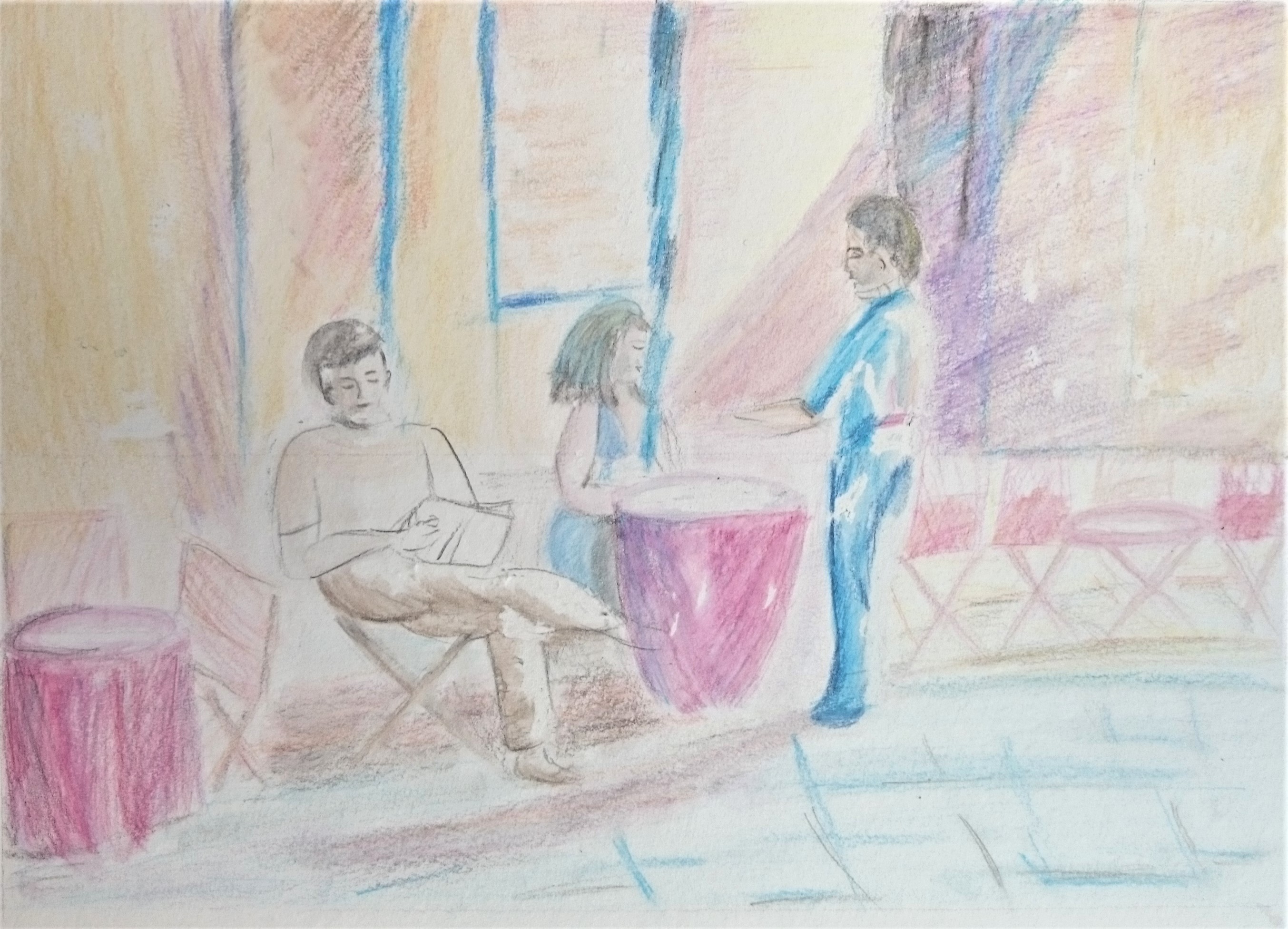
Exercise 2 Groups of figures
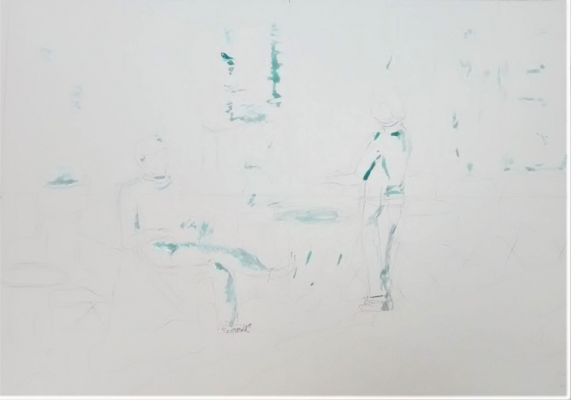
A picture I found of a cafe scene – I sketched lightly with HB pencil on A3 watercolour paper, then masked some areas for lightest tones.
Next I used watercolour pencils and made hatching and cross hatching marks to depict mid dark tones.
After wetting a few areas of the watercolour pencil to draw out the colours I then removed the masking fluid to reveal the lightest tones. The figures here blend into the scene as I chose similar colours for figures and background. The chairs and tables are only’ suggested’ by the few lines and shapes but we can tell what they are immeadiately.
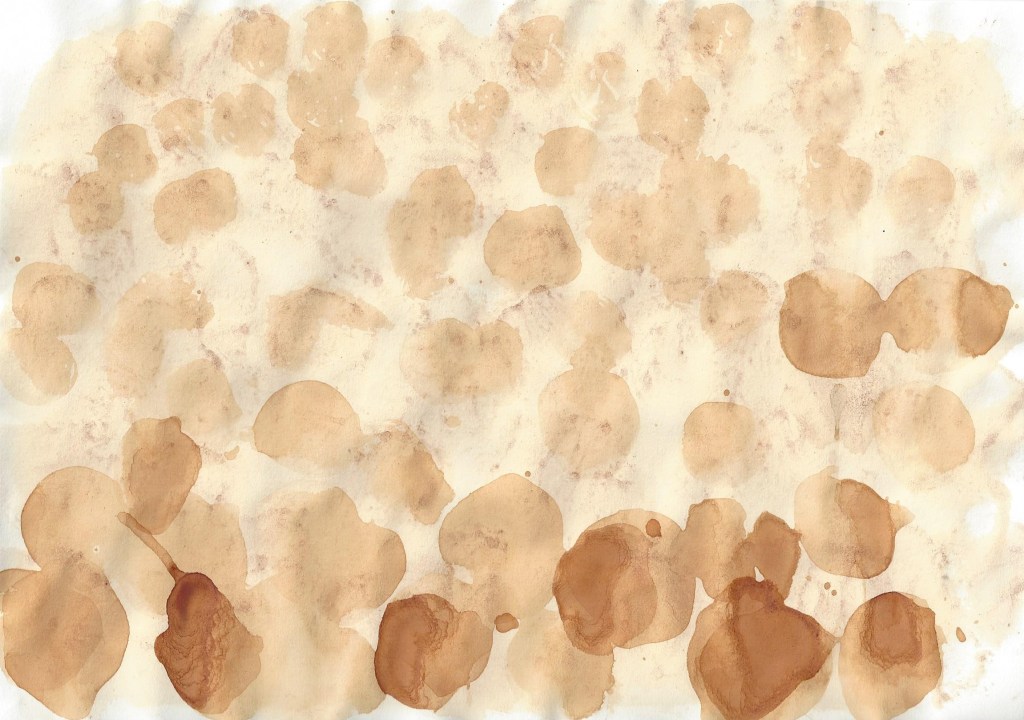
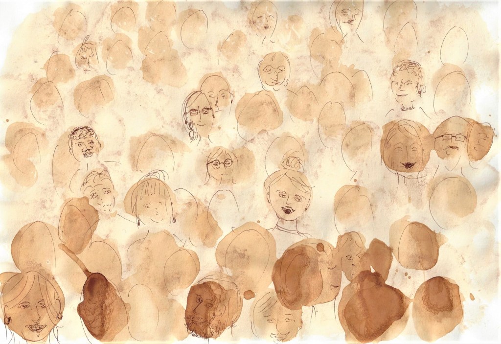
Fig.10 Oatly advertisement (18.02.2020) I experimented with these cut out pictures of different poses and copied next to each figure with fine liner pens and acrylic ink . I discovered this is a really helpful method of learning to observe different figures when live models are not available. It felt easier to draw next to an image rather than from a distance. In this picture I am attempting to retain an image of an audience in a large hall which I could see from the stage whilst I was singing in a choir recently. I pressed used, wet teabags onto cartridge paper. I built it up in layers and waited for each layer to dry before adding the next. I was trying to show distance with light, smaller marks for the people at the back of the room, gradually increasing in size and pressure of marks towards the front. I’ve added some facial features ( but not all ) with a fine liner pen. I wanted to depict the atmosphere of a crowd in close contact and how we often don’t take in details of every face but maybe a few stand out or stick in our minds and especially when viewed from above.
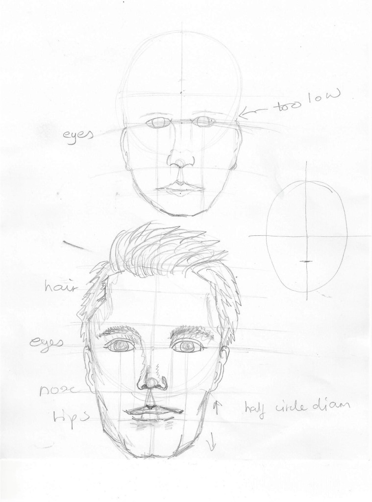
Project 6 The Head
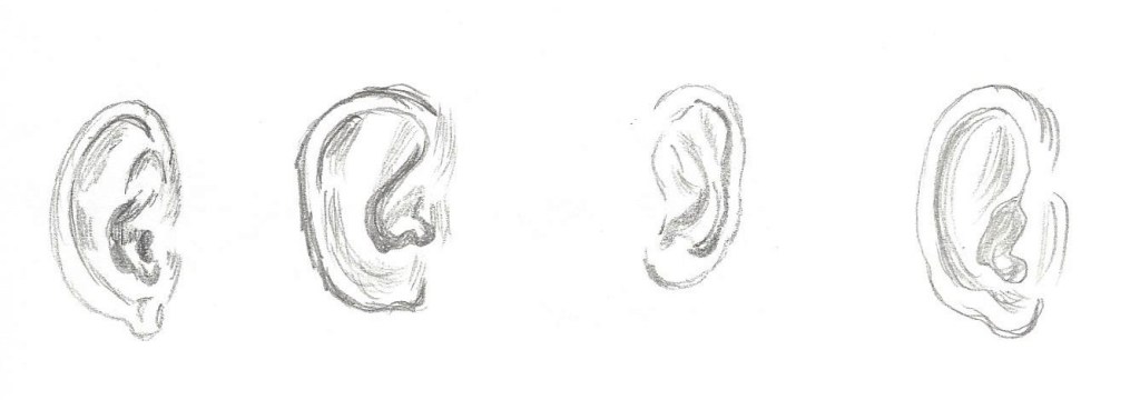
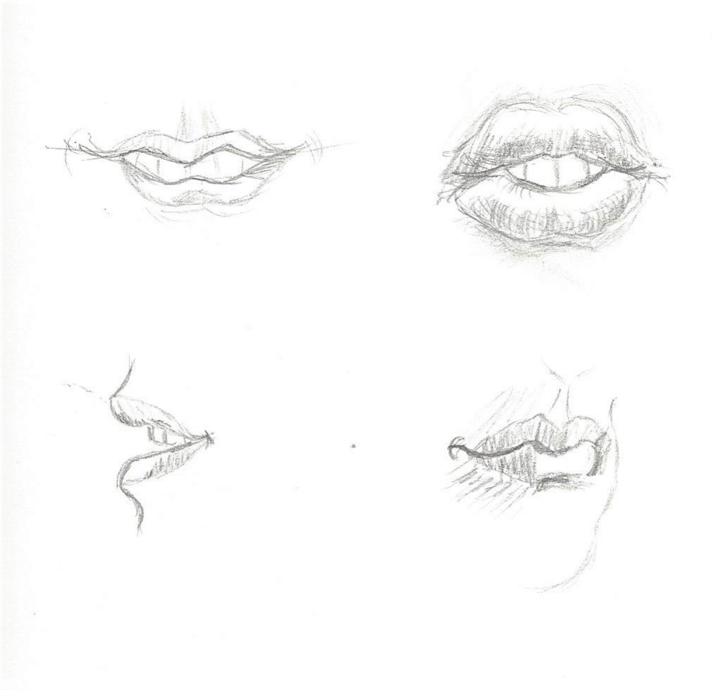
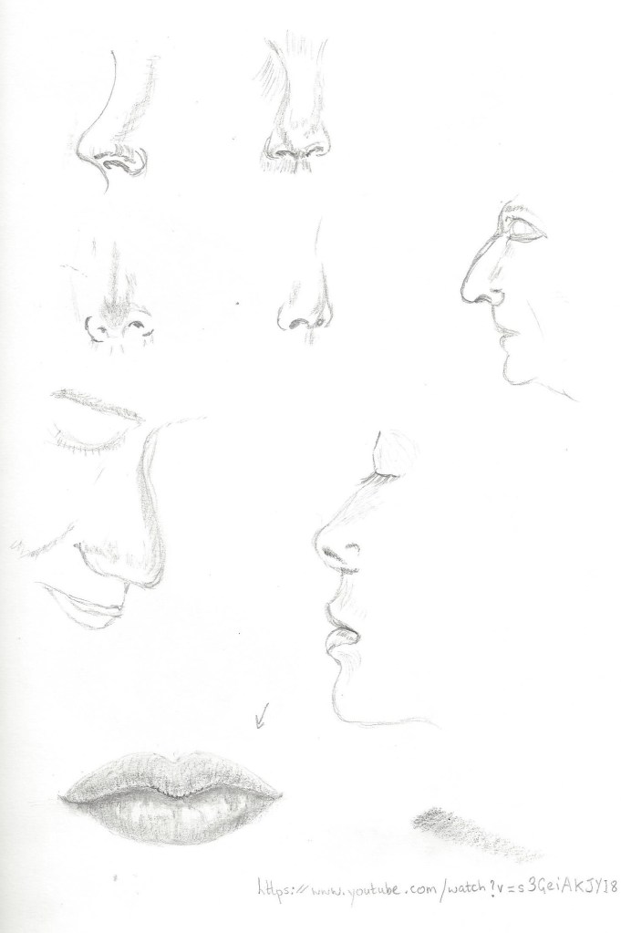
Exercise 1 Facial features
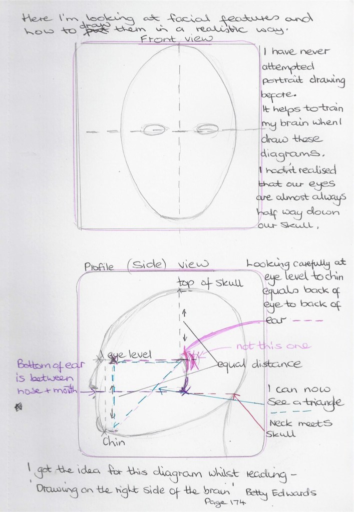
Fig.11 (Edwards 1999:174) Drawing theses eyes was my favourite feature of the face!Fig. 12 ( Barber 2002:p.45) I copied a sketch by Henry Carr who used hatching to show tone. Copying from the masters really helps as I am limited in technical drawing skills for figure work. I do enjoy working like this and look forward to a time when I am more confident in sketching heads and features.4b pencil on cartridge paper Soft pastels on pastel paper copied from a found picture of unknown source.
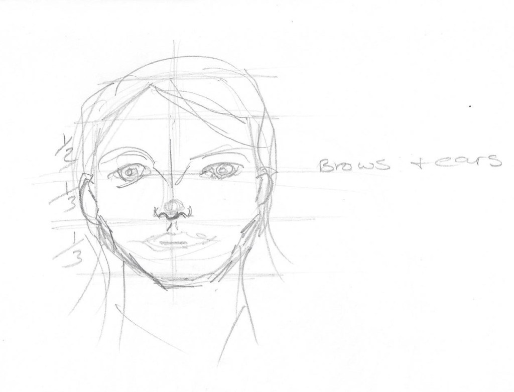
Exercise 2 Your own head
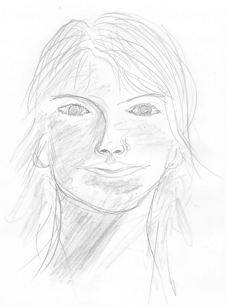
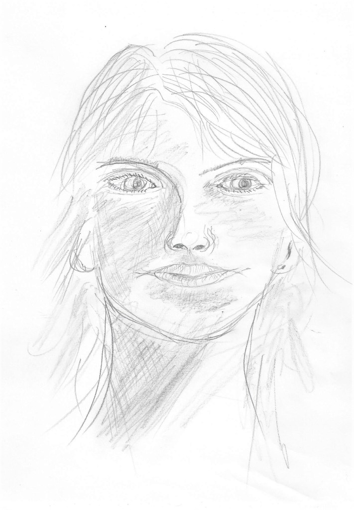
Hb pencil on paper. The jaw here is too square to look like me.5 minute study of my self, in pencil on the back of an envelope. This jaw and nose are too long.My head in 4b and Hb pencil on cartridge paper. I actually coudn’t work out why the eyes looked so ‘starey’ then I read the exercise again I noticed the sentence about the shadows in the eye sockets either side of the nose. So I re-worked on this sketch as below.So when going back to rework the sketch I realised I had forgotten to draw any eyelids which would also give the eyes that over-staring look. After adding eyelids I put some shadows in the eye sockets and some cross-hatching on the neck. I also changed the iris and made it smaller and altered the pupil to make it look in a different direction. I have added some hatching to the lips as well so they don’t look so flat. The 4b pencil works well for showing the darker tones , I did some rubbing in to create some variation of tone without hard edges.
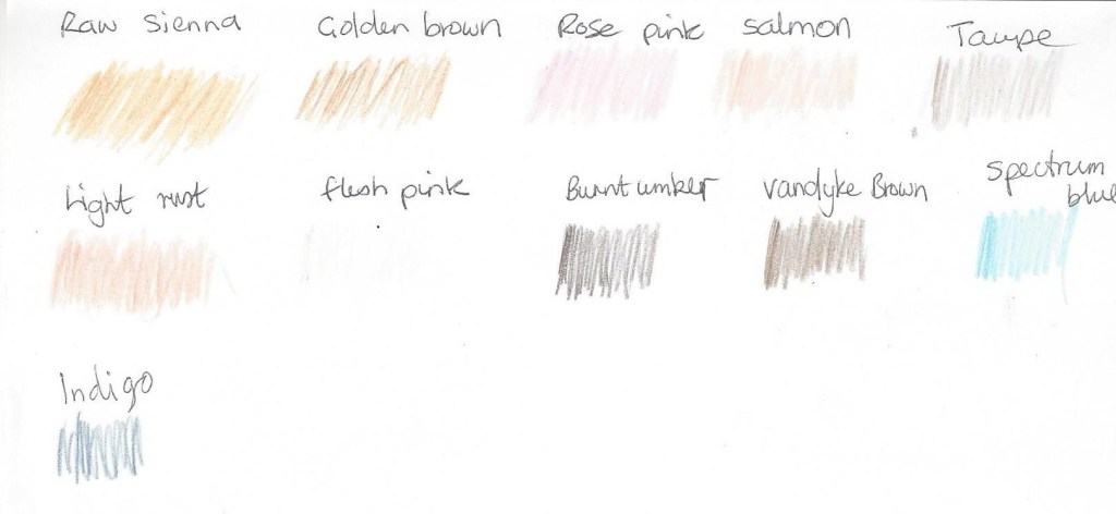
Colour plan for the self portrait below –
For this one I chose coloured pencils on A4 pastel support. The coloured pencils flow well on this paper and also do not saturate the paper thus leaving some of the colour of the paper showing as it has a ‘tooth’. This one is more of a likeness although the eyes are too close together. This is a good angle with my gaze looking away.
Research point- Artists self- portraits
Fig.13 La Pittura (1638-1639) I came across this self-portrait of a female artist called Artemisia Gentileschi .I like the strong ,determined look on her face and the way the light tones contrast with the dark tones of her hair, dress and room.Fig.14 Squid (1978) I like this portrait because of the different media used – Pencil, ball point pen, brush, black ink, grey wash, coloured crayon, watercolour and body colour. It’s a mix I would consider experimenting with.Fig.15 Always felt so alone (2018) IMAGE numberAPQ5977743TitleI Always Felt So Alone, 2018, (oil on canvas)CreatorPhang Gung Fook, AbigailLocationPrivate CollectionMediumoil on canvasDimensions150x100 cmsCreditI Always Felt So Alone, 2018, (oil on canvas), Phang Gung Fook, Abigail / Private Collection / Bridgeman ImagesFig.16 No(t)here 3 (2002) This image by the artist Julie Brixey-Williams is a photograph with photographic dye.Whilst not typically a self portrait it is a photo of the artist and then she has used dyes to create a figure drawing . It caught my eye as the quick white lines are so simple yet effective in depicting what is happening – telling the story of the artist moving and dancing.
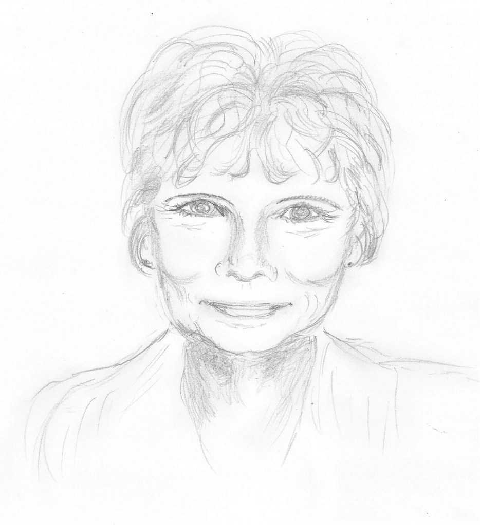
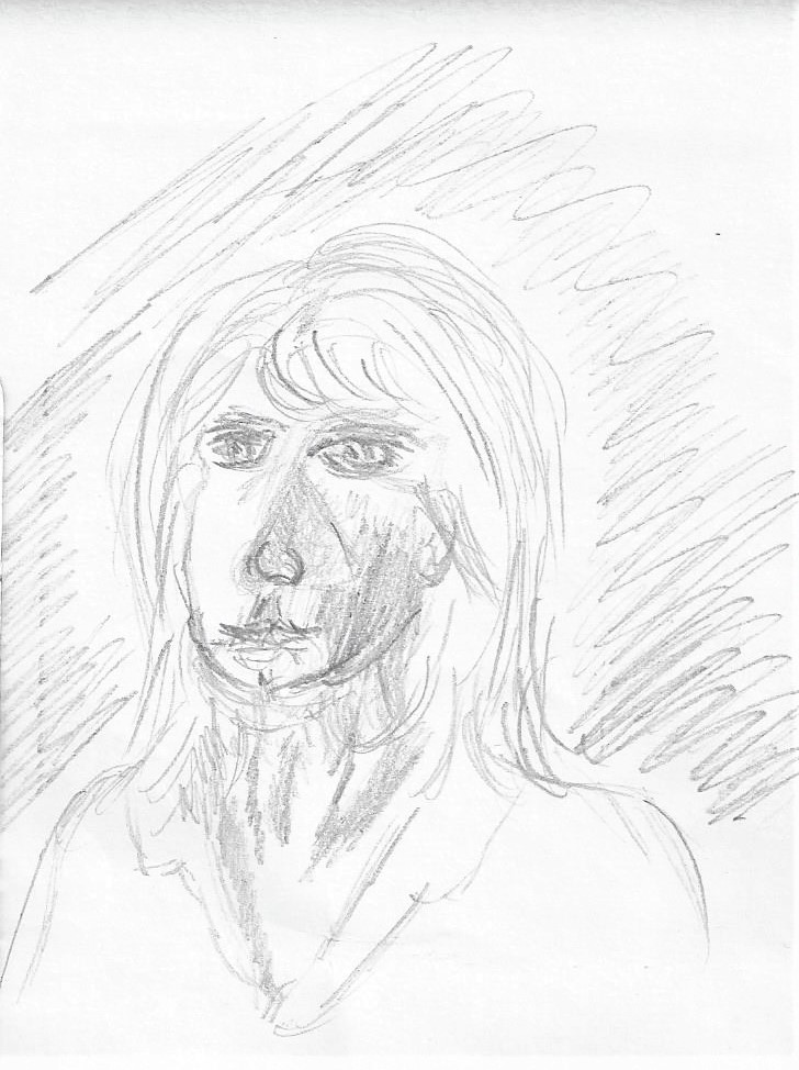
Exercise 3 Portrait from memory or the imagination
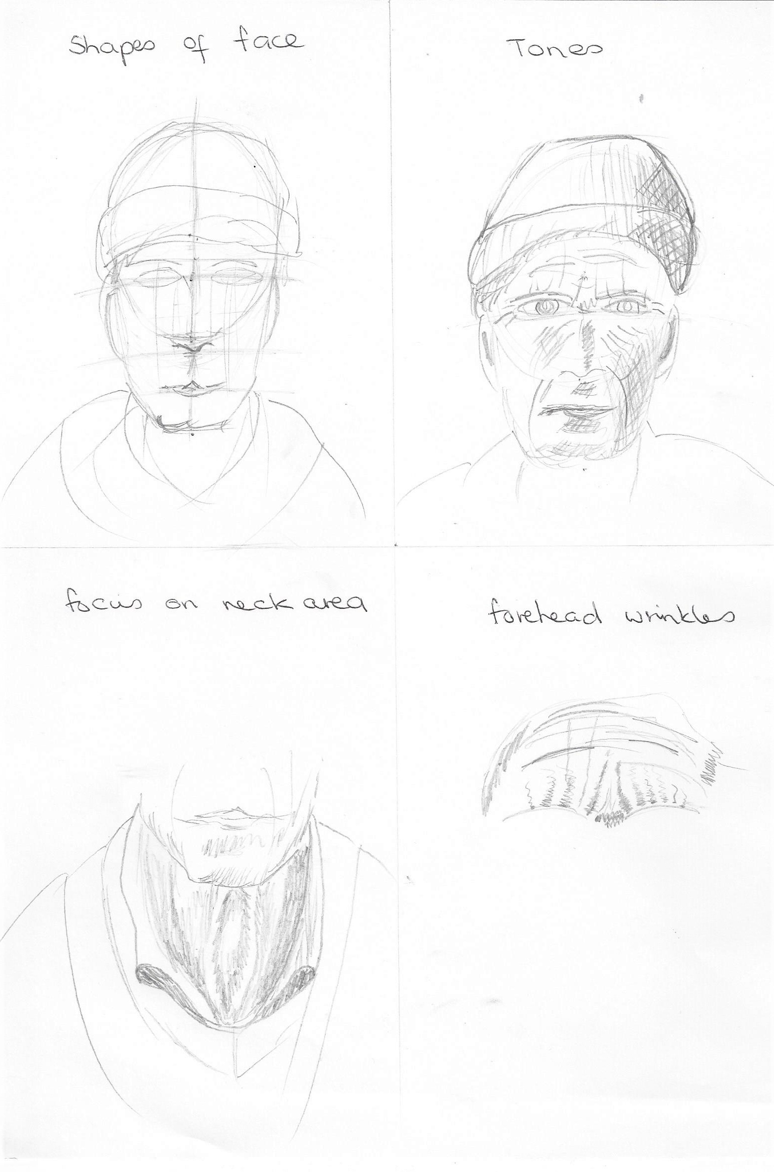
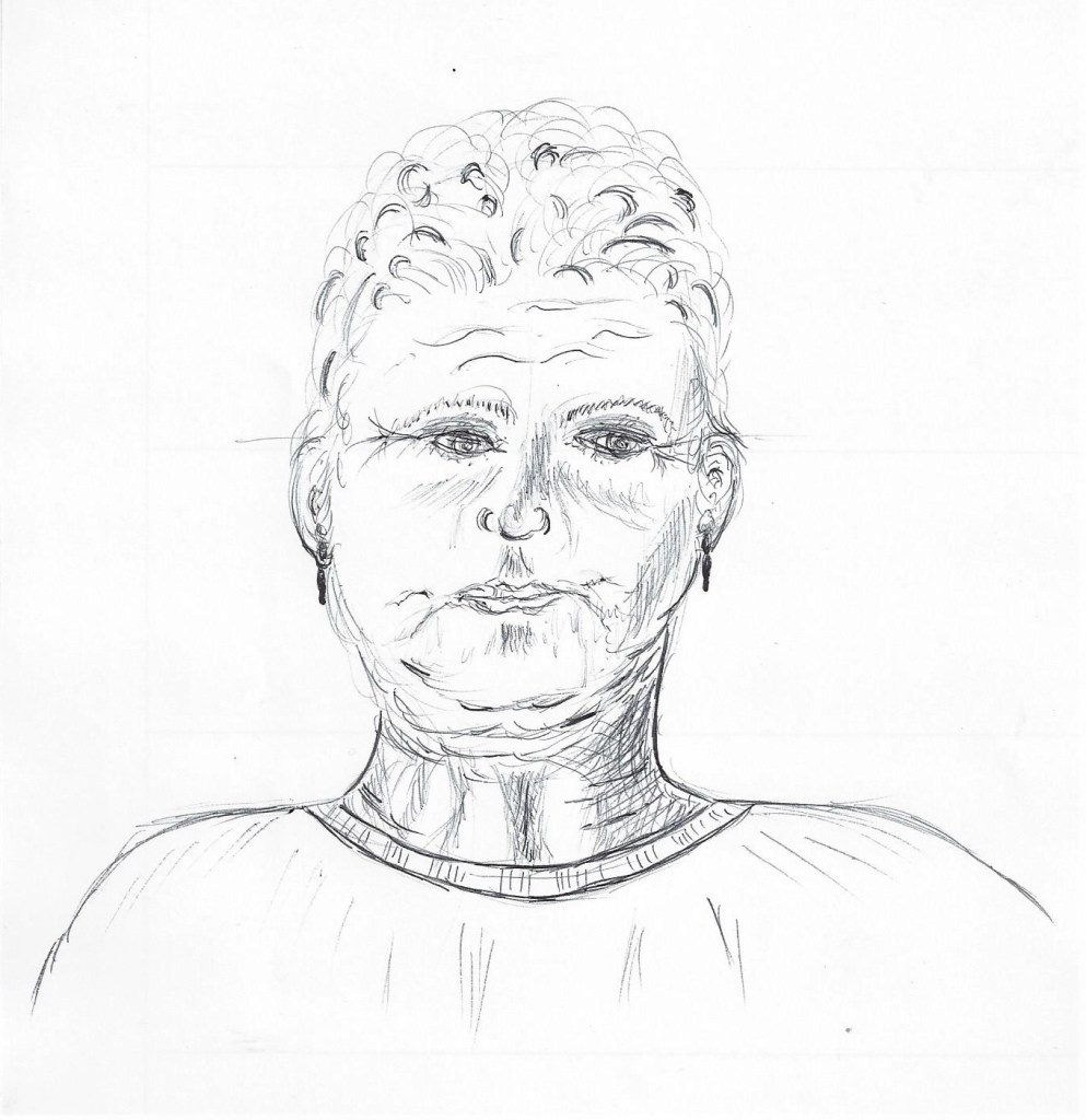
I drew this portrait from my imagination and wanted to draw an older person. As I drew I did start to think of people in real life as a reference to how to depict an older persons features eg. wrinkles and crows feet. I enjoyed doing this exercise as I didn’t feel the pressure of having to portray what is in front of me. It definitely helps to have already drawn several features previously. I had difficulty in depicting the hair and tried to use some darker tones which somehow don’t look quite right. At that point I would have liked someone to look at!