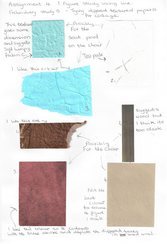
I sketched the model in a real life situation. She had just finished some studying and was looking thoughtful and pensive. I plan to use a portrait orientation as I feel it suits the shape of the whole composition. I would like to include some colour and/or collage as I have been inspired by the use of collage in some of the work of Picasso and Braque when researching for Part 2 Intimacy.
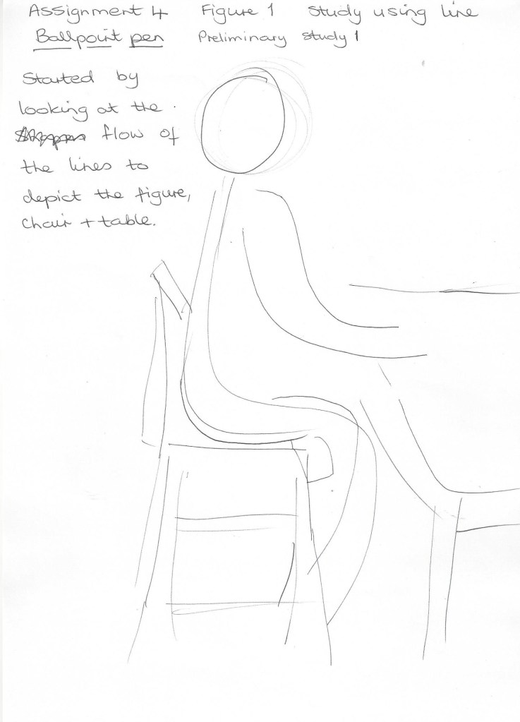
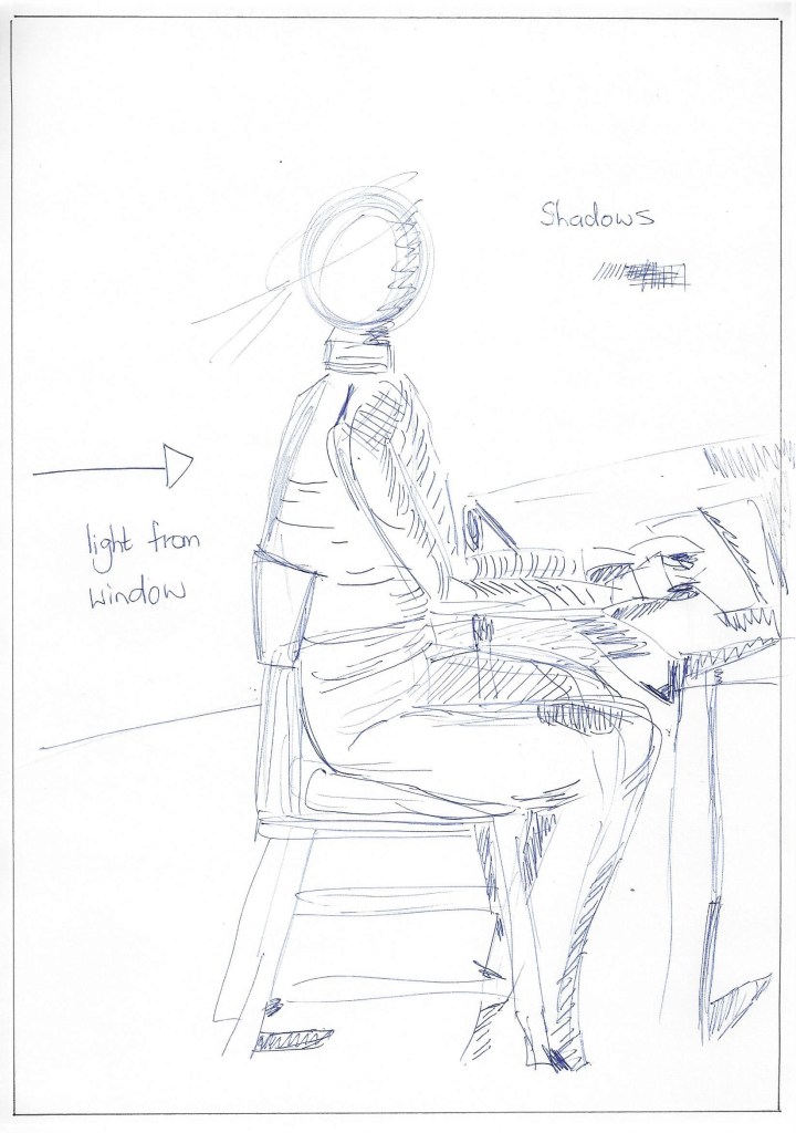
A quick sketch to note position of figure in relation to the chair and table. Light is coming from a window from the left onto the back of the model.Fig,17 Saskia sitting by a window (c.1638) I found this drawing by Rembrandt and was struck by the simplicity of the lines for the figure and yet they would be informative for the artist if used for a painting.A quick sketch to highlight shadows ,on A4 paper using biro.I sketched this on A4 drawing paper using wax crayon. I wanted to see how these colours went together. The wax crayon flowed well across the paper and shows some of the paper texture which depicts the matt surface of the wood and table.Fig.18 Sushi bar (2017) I like the work of Charlotte Orr who uses brush pens in a lot of her work. The bold bright colours capture our attention, the figures are simple yet their actions are believable. I have wanted to try brush pens as it is not my usual medium and I would like to be expressive in this assignment.A longer sketch on A4 using pencil. Here I have added more detail and noted how the clothing describes the shape of the figure.A1 drawing paper. For this final piece I have used brush pens over light pencil sketch and collage using found papers. I don’t often use brush pens and although this drawing probably isn’t technically skilful I wanted to be experimental and free with the pens on a large scale drawing. I was apprehensive about using the brush pens as they cannot be erased once they are applied and so I lacked confidence at first. I like the addition of collage which I wanted to try alongside the pens to show texture and boldness. I have used thick and thin lines, straight and curved.
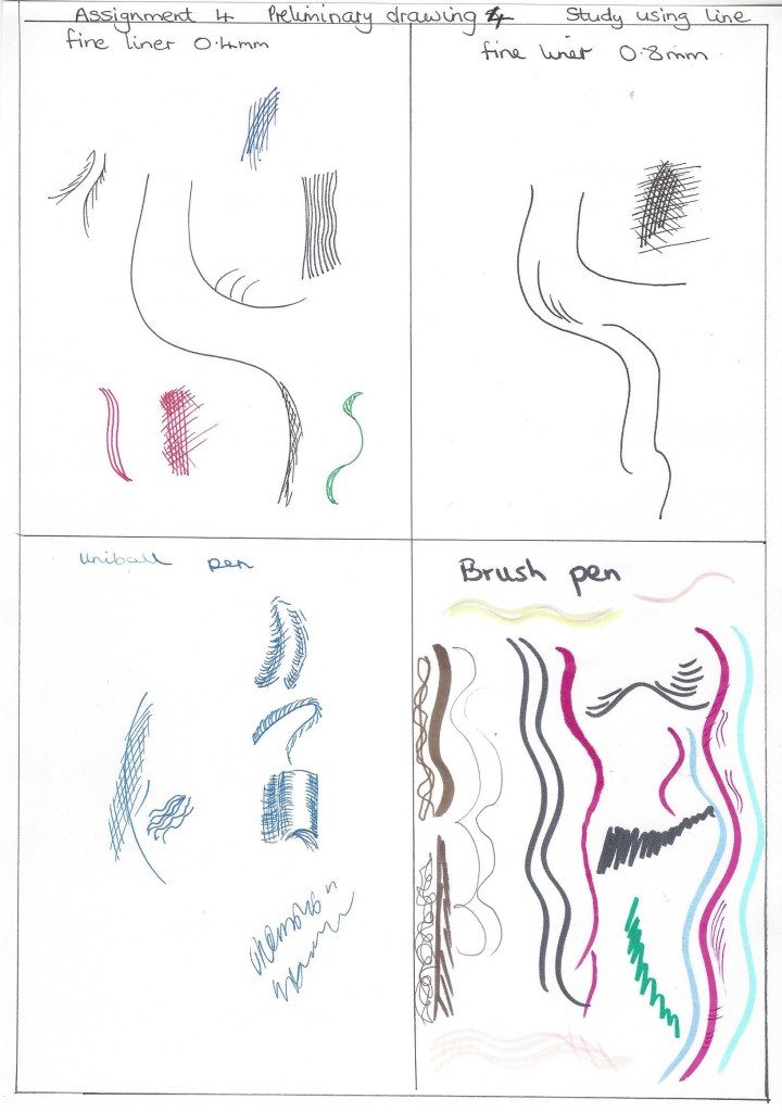
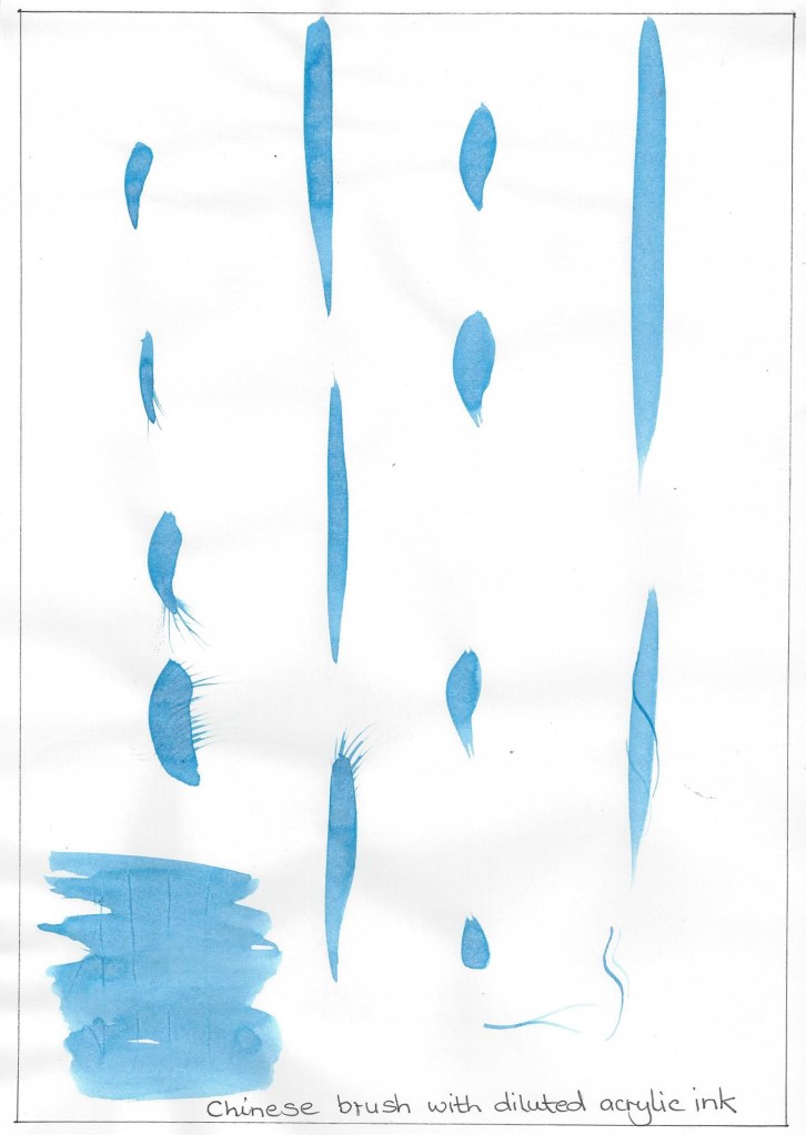
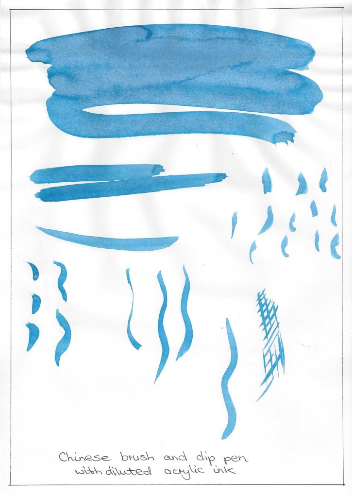
I experimented making different marks made with a chinese brush and dip pen using diluted acrylic ink. I wanted to add some background to give the drawing more depth. I also tried several ways of hatching/cross hatching with fine liner pens and tested the different colours. I then checked the preliminary studies for notes on shadows and chose to use fine lines with some cross hatching for the darker spaces. I also added the far table leg which I hadn’t put in the preliminary sketches and I didn’t want the table to look as if it was floating.Final for figure study using line. A1 drawing paper, HB pencil, acrylic ink, brush pen and collage. The background marks are made with a Chinese brush using acrylic ink to depict the wallpaper pattern, I also added some marks to the jumper to define the creases around the shoulder and arms. This drawing has developed as I went along and I made decisions based on each outcome although always referring to the preliminary drawings. It is not my favourite drawing and several times I wondered if I should start again. As I had spent a lot of time on it I decided to keep it and look at what I had experimented with and learned .
2. Figure study using tone
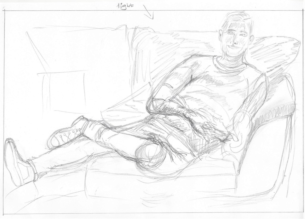
5 minute sketch to look at the shapes of the figure and surroundings.20 minute sketch to see if this pose works which I feel it does, also to focus on the proportion.Light was coming from a window behind the model.Hb pencil to mark out subject, Soft pastels, charcoal pencil on A4 brown sugar paper. The paper here is a bit too smooth and doesn’t hold the charcoal well. I like the colour of the paper as it brings warmth to the drawing as opposed to the stark black and white.Hb pencil to mark out subject, black and white soft pastel on A4 green pastel paper. I wanted to try this drawing without using any lines , I started with the black pastel then added lightest areas with white. Then I used a blending stump to smooth out the pastel. I like this pastel paper as it is quite textured and holds the pastel but also leaves some of the surface of the support showing through. I think I may have added too much pastel to the back of the sofa and it seems to overpower the figure.Using the planning sketches I drew on A1 green sugar paper, sketching out first with black willow charcoal. I then built up some layers with black, white and grey conte stick. Drawing on A1 without an easel in a cramped space was a challenge and I spent a long time on this sketch.Final drawing for figure study using tone. I wanted to add some background colour that harmonised with the striking background paper. I then coloured the rolled cushion to bring it together with the background. I darkened the negative spaces to make them more obvious. I added some more shading to the facial features but I think it looks a little cartoon like. The folds on the tee-shirt depict a leaning torso underneath. I am pleased with the way the settee cushions appear to mould/bend with the weight of the figure. I had difficulty in drawing the hands in this position and in proportion and tried several times to re-draw them. The paper then began to wear thin and I didn’t want to risk tearing a hole. This tells me several things – Choose the right quality of support, more practice drawing difficult features and re-draw sparingly.
3. A self portrait combining line and tone.
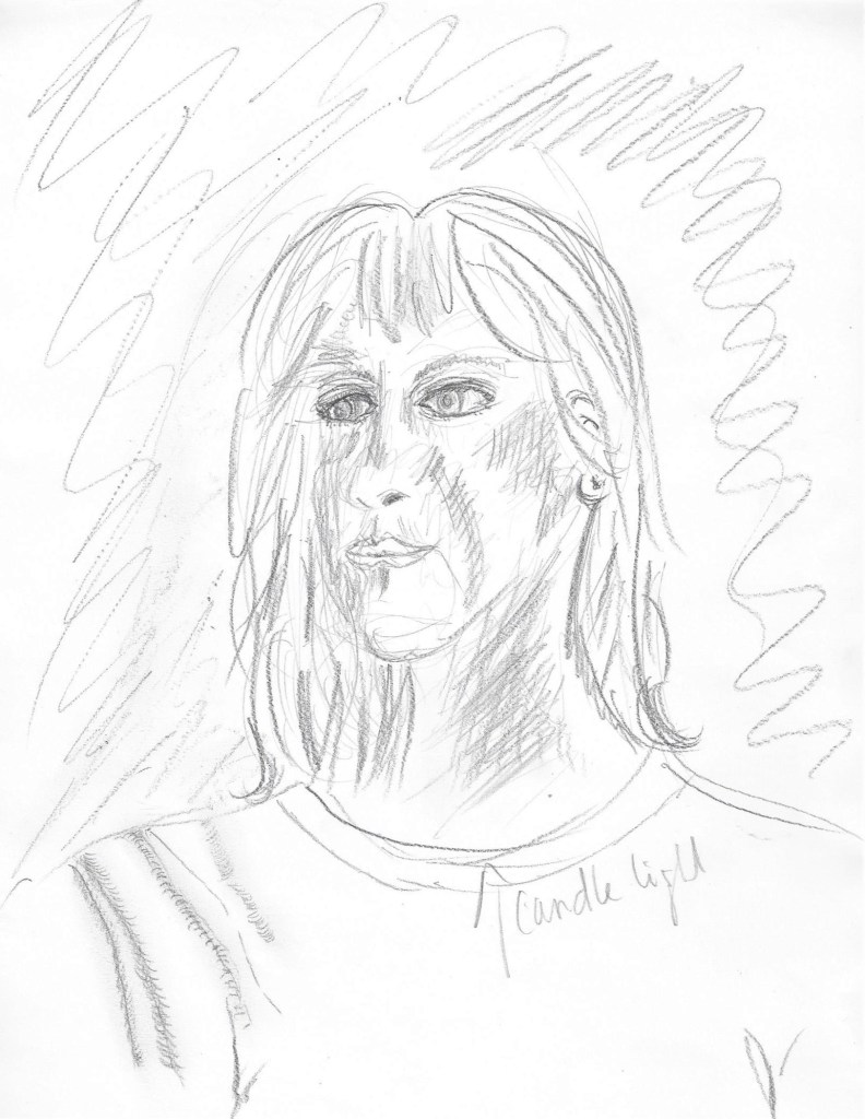
I used graphite and Hb pencil on A4 catridge paper to sketch out the form and identify the tones. I used candlelight in front of a mirror. hatching is used to show shadows on the face and neck. I’ve tried to show folds in the fabric on the shoulder but this needs working on. The head looks too small for the body here and this maybe because they were added later after the initial sketch.A longer sketch with more detail. Hb mechanical pencil on A4 paper.I wanted to try light on dark so I have used white conte stick on dark blue pastel paper. First I completely covered the paper with the conte stick on its side. I then rubbed it in using a circular motion. The darker tones were then drawn in with a pencil top eraser which has a small edge and works like a calligraphy pen nib in that the line can be varied depending on the angle it is held to the paper. For the mid- tones I then smoothed between some of the light and dark tones. When I used spray fixative on this picture it darkened a lot of the white areas too much ans the sketch seemed to have faded. When it dried I worked in some more white with conte stick. I like the mysterious atmosphere depicted by this drawing.
Planning the final drawing –
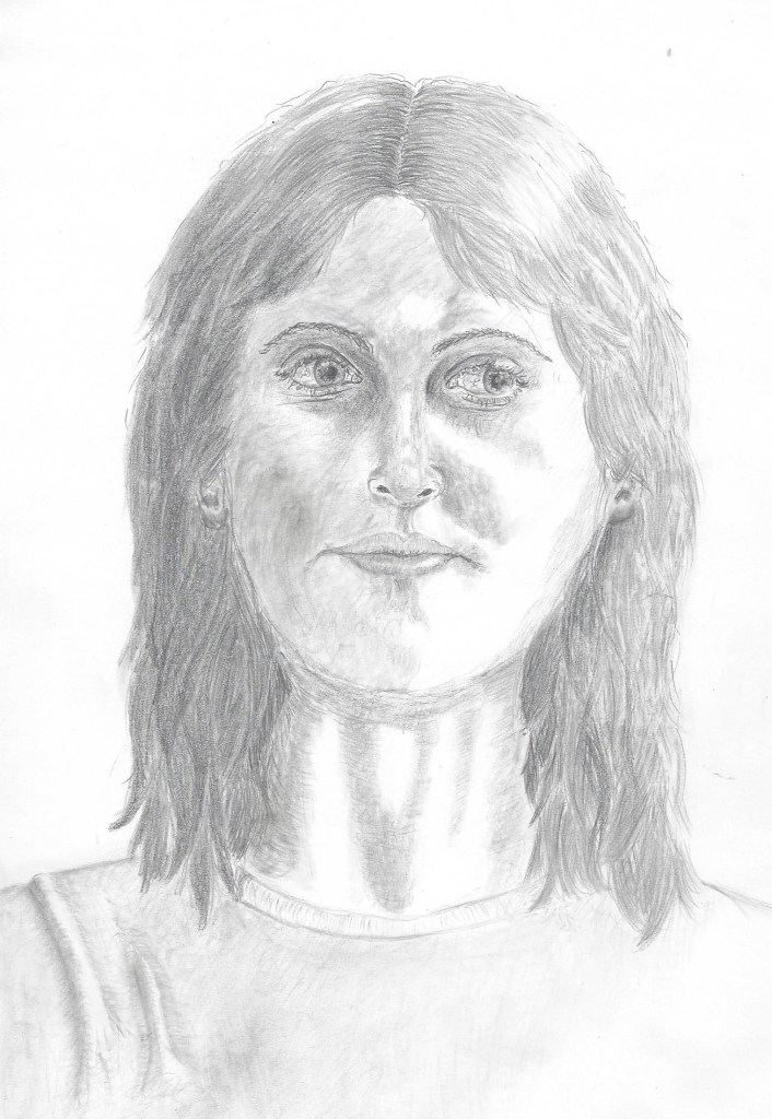
These are the techniques that I used to draw the final portrait. Looking back at some of the techniques I have tried in other parts of the course enabled me to be more informed when planning this portrait.I drew this portrait on A4 cartridge paper. Light was coming from a candle placed on a shelf to my right. I decided to use sketching pencils as so far I have found this the most successful medium for me when drawing facial features that require detail. I began by lightly sketching with a HB mechanical pencil the overall shape and position of the features. I then used 4B and 6B to build up layers of tone and then go back in with the HB to darken the lines. Drawing the eyes took me the longest but this was the most enjoyable part. It seemed that even the slightest mark, highlight or tone had the most impact on what the eyes depicted. I spent quite a lot of time on the hair to try and convey the thickness of the layers and the shadows made in between the strands. The most challenging part was the mouth and getting to look in proportion to the other features. When drawing the folds in the fabric on the shoulder I thought back to the first exercise in part 4 and recalled the methods I tried then to use tone to depict a fold.
The final portrait for assignment 4
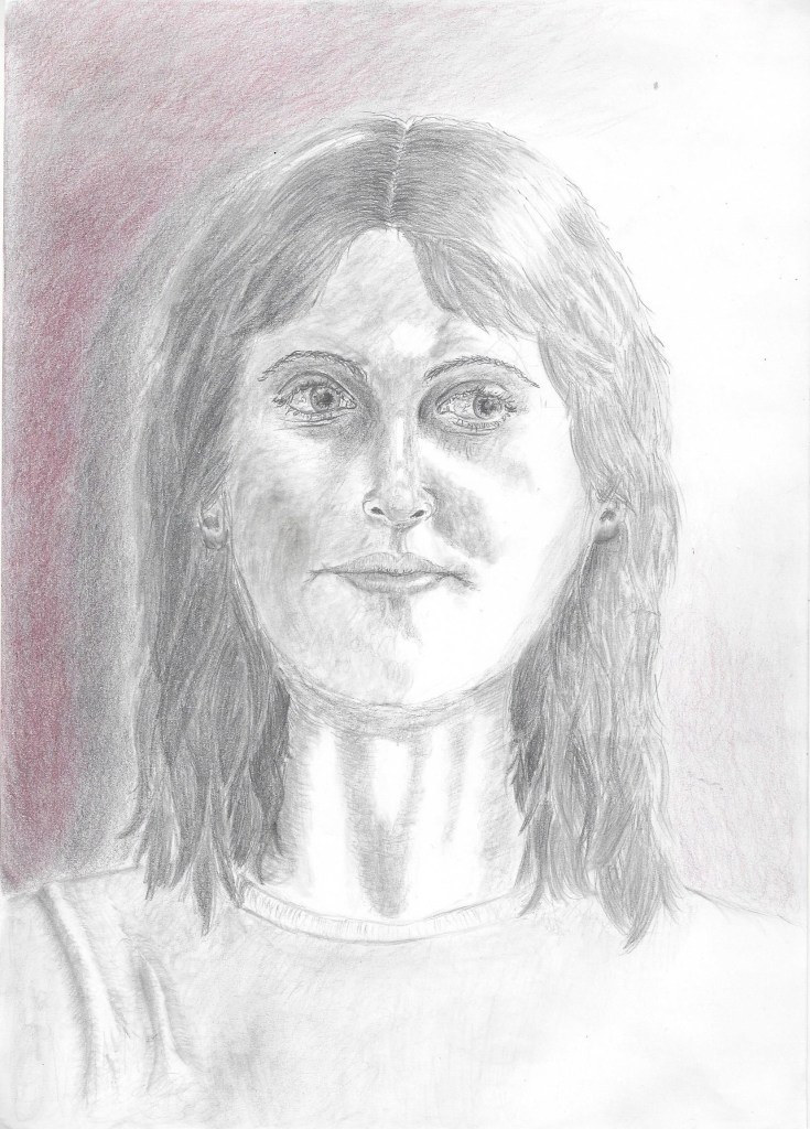
Finally I decided to add some background shading and a touch of colour to give the drawing a more interesting atmosphere. I added 2 shades of coloured pencil and placed them on top of 6B graphite to give a muted colour effect. I like the texture of the grain of the paper that shows in the background.
Reflection
Demonstration of technical and visual skills
I have learned so much throughout part 4 and this assignment. I continually feel pushed to explore new skills and techniques. Drawing on A1 has been a great challenge physically and I want to find more opportunity to do this perhaps by working outside in the warmer weather. Looking at the figure has caused me to be much more observant of bone structure and facial features. I especially like the technique for drawing a face using tone which I have tried in my final portrait. Observing figures – still and moving is an emerging skill which I want to develop. I have tried to keep in mind design and composition in some of the exercises and to use a viewfinder or grid was helpful in drawing the larger sketches.
Quality of outcome
I can see that the quality of my work gradually improved as I went along. I began realised what a vast subject the figure and head really could become and felt I could spend years studying this part alone.It was helpful to keep a visual diary with drawings of different body features to inform the 3 assignment pieces and present the work in a coherent way. The quality of the outcome for the figure drawings has need for improvement , this has been my first experience of life drawing and I see the benefit of the opportunity to draw living beings in real time. Discernment is improving with each project and conceptualisation of thoughts is something I am seeking to develop as I learn from other artists. In this part of the course I didn’t focus a lot on communicating ideas as I was very taken up with learning the technical skills I needed to produce a believable likeness of figure or face.
Demonstration of creativity
For this part of the course I worked through the exercises in a different way to all the other parts due to waiting for availability of models and then the cancellation of Life classes due to social distancing. I used imagination and invention such as collecting old magazines and drawing over the photos of people or copying them e.g in the collage for project 5 – exercise 2 and also in using collage for assignment 4 ,1 figure study using line. I enjoyed experimenting with teabags to depict a crowd in an audience (also project 5 , ex.2). When thinking about developing a personal voice I look forward to it emerging and becoming recognisable in the future.
Context reflection
I have been informed by the techniques of other artists throughout this part of the course particularly as I reached out for help and information due to my lack of experience and knowledge in figure drawing. I regret only being able to attend 1 Life drawing class but was able to watch a virtual class (although I think nothing can replace attending in person) My learning log has become invaluable in helping me keep track of my thoughts and organise my work whilst completing the exercises in a different order. Critical thinking is something I need to develop more. I looked at some artists views whilst researching for project 1 and this provoked many thoughts on my feelings about figure drawing. I didn’t write as much about my research as in previous parts of the course because my time was taken up in finding models/opportunities in different poses, and I consider photographs/videos of lesser value. Many things to think about and consider from these projects that have sparked my imagination.