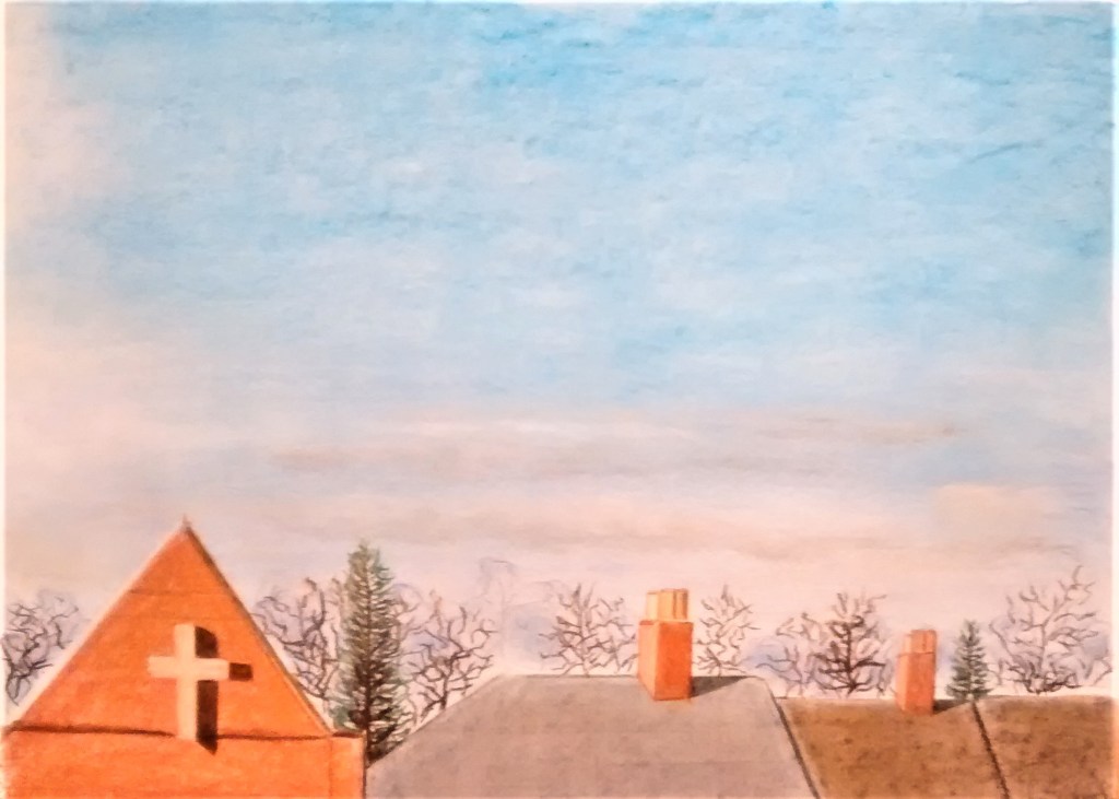
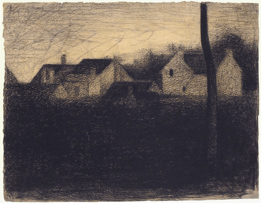
Experimenting with the composition – view AExperimenting with the composition – view BPractising graduated tone ( aerial perspective )Broad sketch in light charcoal Broad sketch in dark charcoal With my A2 heavy cartridge paper taped to a board and surrounded by my preliminary drawings I sketched lightly in pencil where the main shapes and eyeline would be . I began with a layer of two shades of blue soft pastel and blended it in with a cloth.I then added layers of violet soft pastel and another shade of blue blended in with a cloth.I added several layers of grey and white soft and hard pastels for the clouds , violet for the distance and middle trees. The rooftops to the left and right are orange, red and dark brown soft pastels, white pastel pencil, terracotta drawing pencil. black watersoluble pencil and violet and grey soft pastel for the middle rooftop. A putty rubber was used to lift some areas of the clouds.For the final layers I added the the straight lined objects . For the closer trees I used dark, mid brown, yellow and green soft pastels. The chimneys and cross are done with orange, red , cream and brown soft pastels and terracotta drawing pencil. I added the shadows last using black watersoluble pencil.
Assignment 3
Reflection
Demonstration of technical and visual skills
Throughout this assignment I have constantly felt challenged and pushed to explore new skills in drawing. It has been the most difficult work so far and I have learned so much. Working with linear and angular perspective is something I need to work on, my rooftop drawings conveyed in some way the urban beauty I was attempting to show but the accuracy has weaknesses I feel.
I have been experimenting with using mixed media in my work and trying different supports but I need to do this more. My observational skills and visual awareness are improving although I am aware of sometimes drawing what I think I see rather than what is actually there. I have noticed that my design and compositional skills are increasing slowly as I work through the exercises and look at other artists work. I also am realising that the exercises are a guide and that I can use them to do further sketches beyond what is being asked.
The exercises with aerial perspective felt more enjoyable and I was able to demonstrate this more easily in the final drawing.
Quality of outcome
I can see that the quality of my work is improving and especially as I focused on using preliminary drawings to inform the final piece and present the work in a coherent way. This is especially evident in the assignment final drawing of rooftops. I also found the sketchbook walks exercise improved the quality of the outcome for the composition I did with acrylic inks. Discernment is developing with each project and conceptualisation of thoughts is something I want to develop as I become more confident and not worry about my drawings being carefully composed. I am seeking to communicate my ideas in a small way and this course is aiding that process.
Demonstration of creativity
I sought to demonstrate creativity particularly in project 3, ex 1, with experimenting in mark making to inform future drawings some of which I used for landscape drawings but not so much for townscapes. I tried to use imagination by recreating other artists work in my own style which I enjoyed and found helpful. The work for project 3 was my most creative and I experimented more with different media.
Context reflection
I have gained knowledge of other artists techniques through the research in these projects and made notes when finding a new technique that I want try in the future (this was recommended by my tutor in previous assignment feedback).
I am developing critical thinking and meeting up with local art groups, attending an OCA study event has been invaluable.
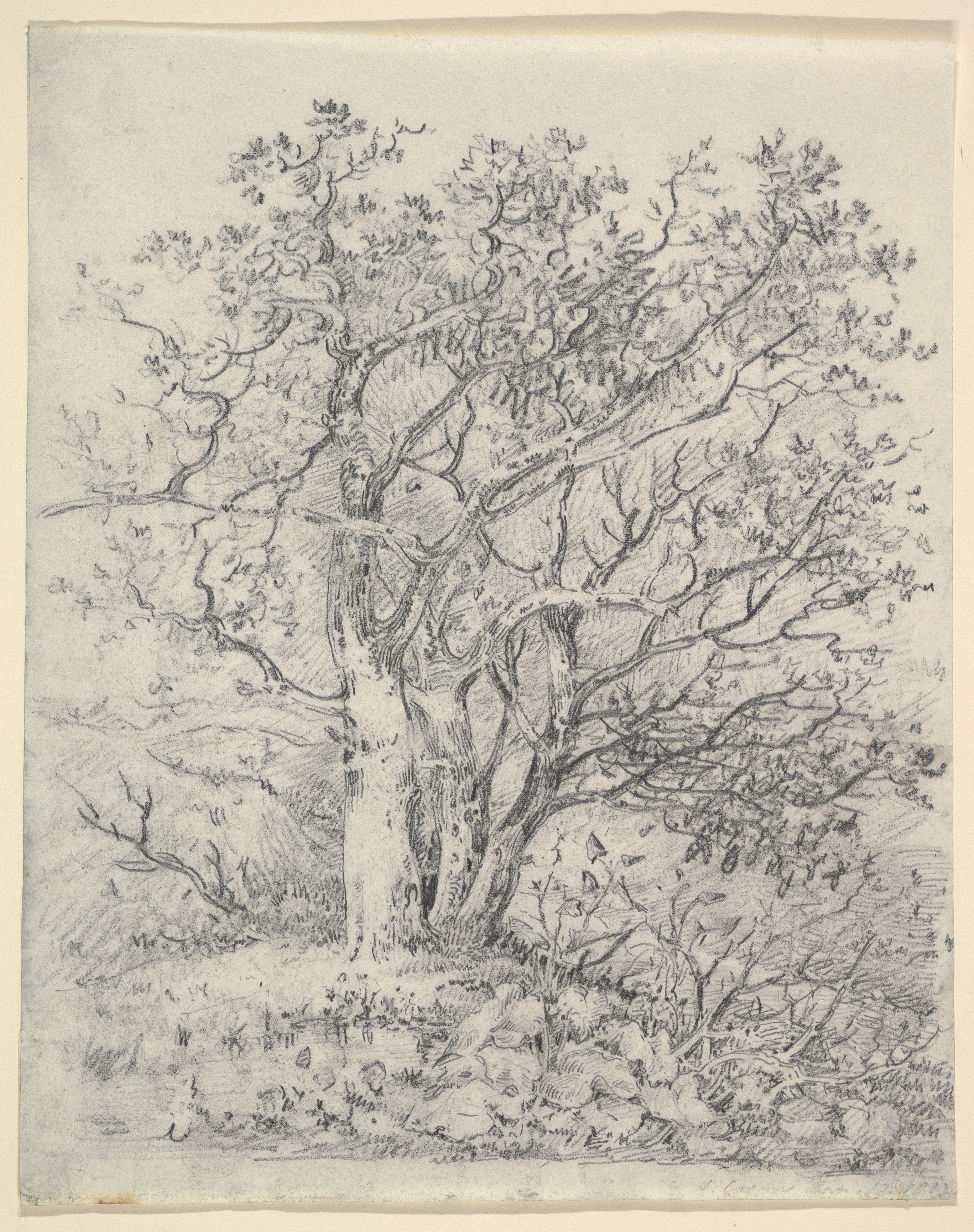
Project 1 Trees I am looking forward to this project as I feel trees will be such an interesting subject to look at and study. I Found this great drawing by the artist – J.Chrome which shows lots of mark making which I feel gives a sense of movement to the drawing.
Fig.1 Three trees (1812)
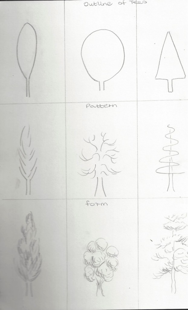
Exercise 1 – Sketching individual trees
We were asked to build up and sketch the overall shape and outline of the trees.This is a helpful way to start to observe the simple shape and will inform my future drawings of landscapes.
4B Pencil 4B Pencil Charcoal pencilThis drawing above was done on a canvas board and mostly copied from a found picture – possibly an old Christmas card or calendar. I used a HB pencil to sketch out the tree shapes , moon and path. I then used acrylic paint to add colour and tone. I like the repeated shapes of the fir trees as it makes it easy to observe the way they diminish in the distance. The pathway draws the eye to look from front to back and gives a flow to the landscape.
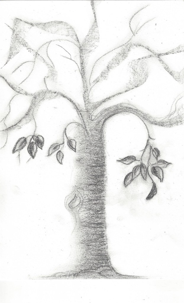
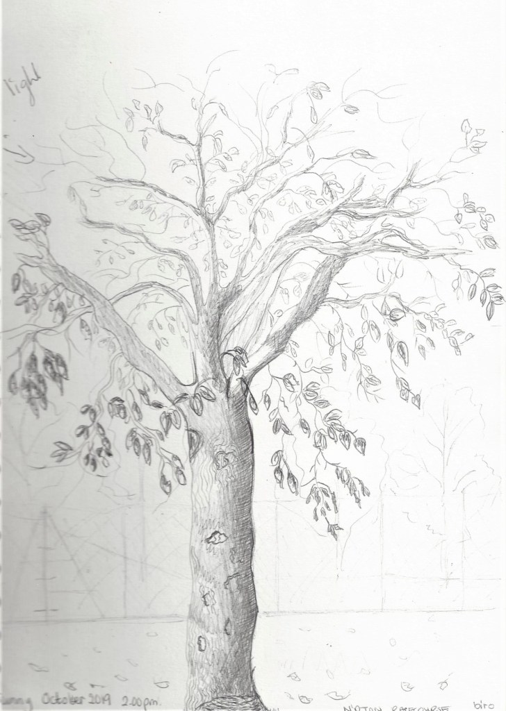
Exercise 2 – Larger observational study of an individual tree.
Large sketch– bottom- I drew this whilst sitting in the park on an Autumn day. A good season to be able to observe the branches without a lot of foliage. This was done in ballpoint pen. I enjoy the flow of the pen and smoothness of texture. Light was coming from the right – ballpoint is good for darkening shadow areas. I realise now that I forgot to note any shadow on the ground – must remember to look next time. The top left sketch was done using fine liner pen and drawn back at home using the first sketch for reference. Fine liner gives more of an illustrative look which I think suits the subject. The top right sketch was drawn from memory as an experiment, with charcoal pencil- I am pleased with the texture of the bark and even the abstract look of the branches.
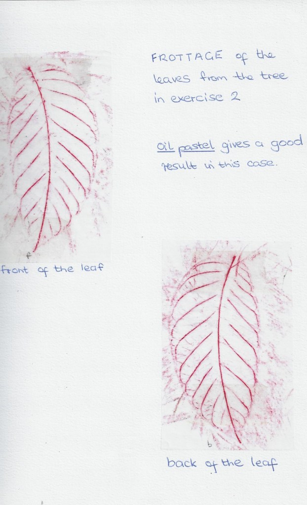
Frottage of the leaves
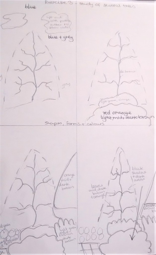
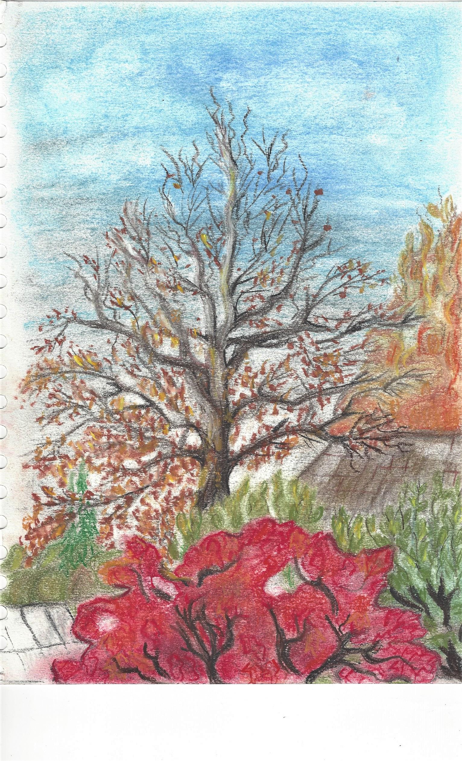
Exercise 3 Study of several trees
Preliminary sketches for study on a group of trees
Final drawing
Tree experiments –
Left – experiment using HB pencil and Acrylic paint on canvas, copied from a photograph. Right – silhouette using pencil and soft pastels on sugar paper.
PROJECT 2 landscape
Research – Artists from different eras who use landscape as their main subject.
Fig.2
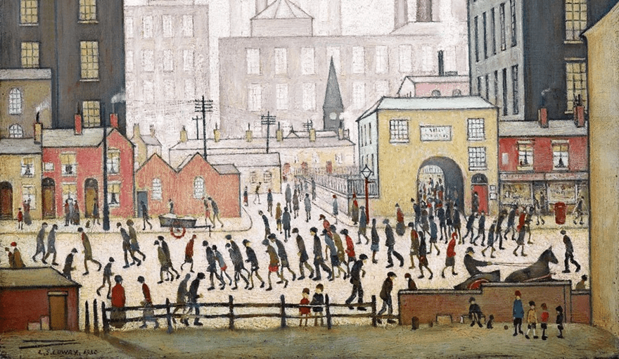
Left – Perseus and the origin of coral – Claude Lorrain 1674 Pen and brown ink, brush with grey and blue washes, heightened with white on blue paper. Right – My own experiment on blue paper using brown coloured pencil- firstly to practice quick light sketches of trees and clouds and secondly to try brown on blue paper – as I like the dramatic effect it gives.Fig.3The Watermill, 1495-97 (pen & ink, gouache and w/c on paper), Dürer or Duerer, Albrecht (1471-1528) / Bibliotheque Nationale, Paris, France I like the shapes of the foliage on the tree in the forefront with the light falling on the tips of the branches giving life to the picture, also the dark storm clouds contrasting against the lighter sky below give an intense atmosphere to the scene.Fig.4Road in the Alps, 1495 (gouache & w/c on paper), Dürer or Duerer, Albrecht (1471-1528) I like this theatrical atmosphere created by the viewpoint and the colour used. The shapes of the trees are simple but effective in showing the differences between the types of trees. The darker tones used to show the angles and shapes on the rocks put the work into perspective.Fig.6 Ash Wednesday 2004-2005 George Shaw enamel on board I feel so happy to have come across this artists works which show urban landscapes and gives us a chance to observe what we may think of as ordinary. Fig.5 Coming from the mill (1930) I chose to look at this painting by Lowry as it clearly shows – foreground , middle ground and distance. This is something I haven’t been too aware of before until studying this course.
Fig. 7 Somewhere 2007 pencil on paper in perspex box, 20 x 60 x 20cm Sarah Woodfine This is the first time I have looked at this artists work and I like the way she has used her drawings in a different way . I wouldn’t have thought of doing this kind of work but it has encouraged me to think ‘ bigger’ about using art to communicate to people. It also reminds me to observe in my drawings how to create 3D by using distance, middle and foreground.
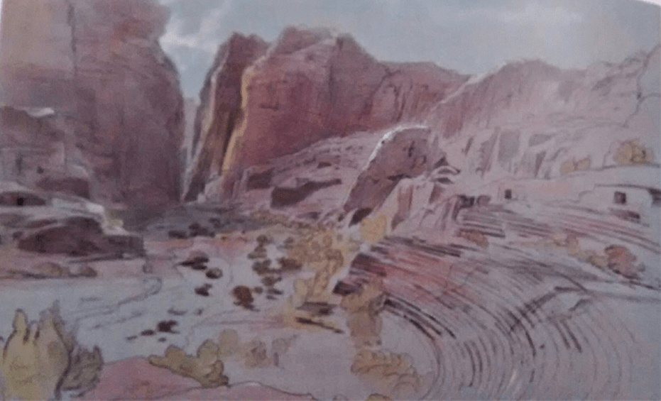
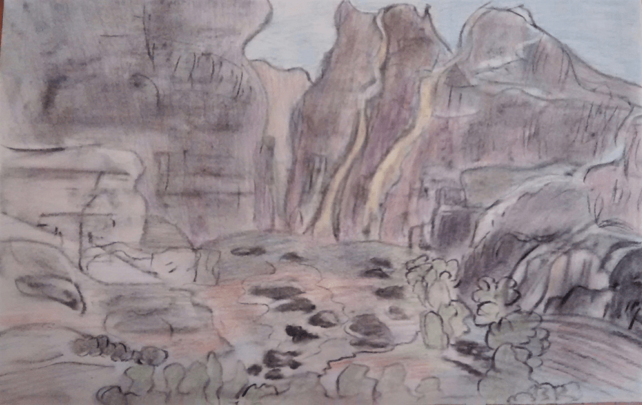
Fig. 8 The Golden Bough (1834) Oil on canvas Turner JMW Looking at some of the works of Turner I came across this painting and was struck by the glorious light in the sky and the way the tree in the foreground stands out against the light. I like the depth in this picture and the way the background seems to go on and on to another land. Fig.9 Petra (1858) Pen and brown ink over pencil with watercolour and gouache on blue paper. ‘Edward Lear travelled widely and used pen sketches to record what he saw, at the end of his trips, back in the studio,he applies watercolour washes to the compositions based on colour notes. ( Julian Brooks, 2010, page 85 ) My own version of the above Edward Lear work, which helps me to see how sketches inform the artist when working on a final piece. This quick sketch holds lots of information to guide a future work.
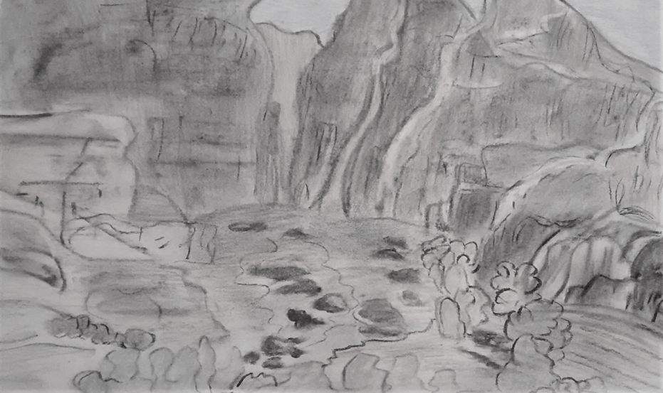
This one below is in black and white which helps me to focus on the tones
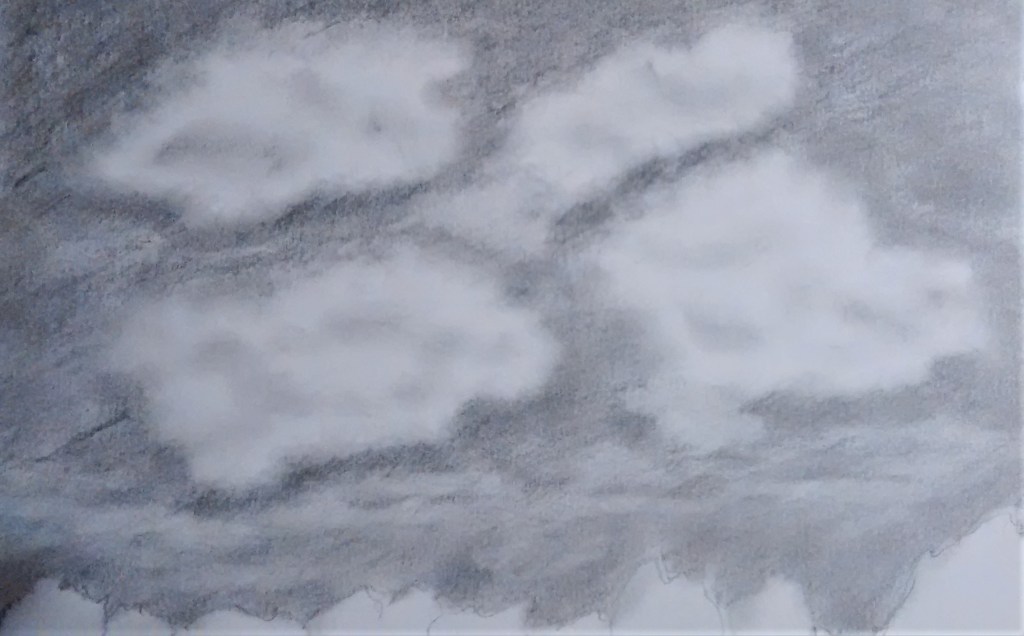
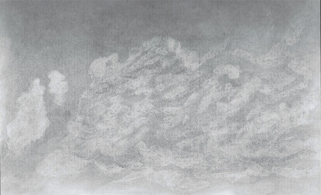
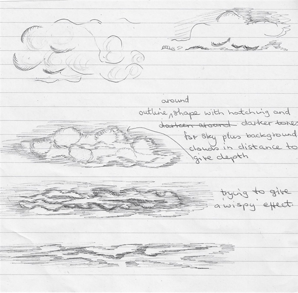
Found this cloud tutorial helpful with some interesting techniques that I’m going to try. N.B Feedback from my tutor for Assignment 1 suggested making a note when I come across a new idea or technique that will inform my future work, so this is my aim as I progress. This is my version below – Theses clouds were drawn around 3 pm in early November. The sky was quite overcast, it was dry with a slight breeze. I used a 4B pencil and lightly sketched the shape of the clouds first then hatched in the sky which was darker at the top. I used a blending stump in moving in circles around the shapes of the clouds. I lifted the distant clouds with a putty rubber and tried to depict where the light falls. A paper towel was then used to lift up some of the marks.
RESEARCH POINThttp://www.vimeo.com/22299024 I watched this video of Vija Celmins describing one of her exhibitions. I like her approach to drawing as ” re describing ” what we see. I feel I could have this attitude with my cloud drawings and not try to produce an exact copy, particularly as clouds are moving and constantly changing. I take pleasure in the fact that art can be a way of telling a story. I looked at some images that she produced which show a great attention to detail – https://www.tate.org.uk/art/artworks/celmins-sky-p78334 we get the sense of a vast space with no beginning or end.
Cloud experiments from photographs –
Graphite and eraser, from a photograph
Oil pastel
Drawn outdoors
A few sketches done on the move with HB pencil and found paper
Exercise 2 – Sketchbook walk
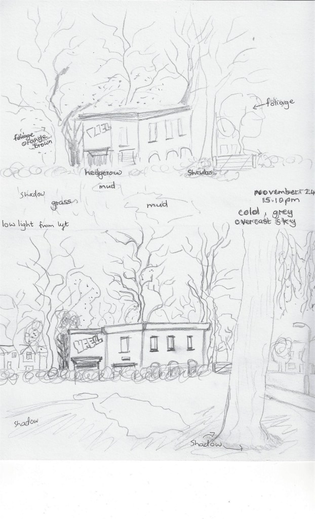
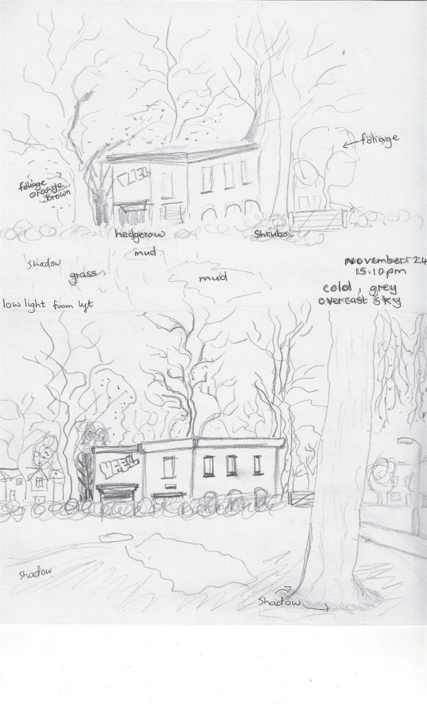
I sketched 2 drawings of this scene, I did the top one first and then took a few steps back for the bottom sketch as I preferred the view with the larger tree in the foreground and the path with lamp- post giving more depth to the scene. 4B pencil on cartridge paper – Main point of interest is the disused building Foreground – larger tree, grass and patch of mud, middle ground – building and hedgerow and gate, background- trees and houses and sky. Hedgerow patterns are squiggles and swirls. foliage is stippled, lines for bark pattern, several rectangles and arches on buildings, wavy lines for branches, distant trees outline shapes, block letters for grafitti. Dark tones mostly on the left by the corner of the building and around the windows.
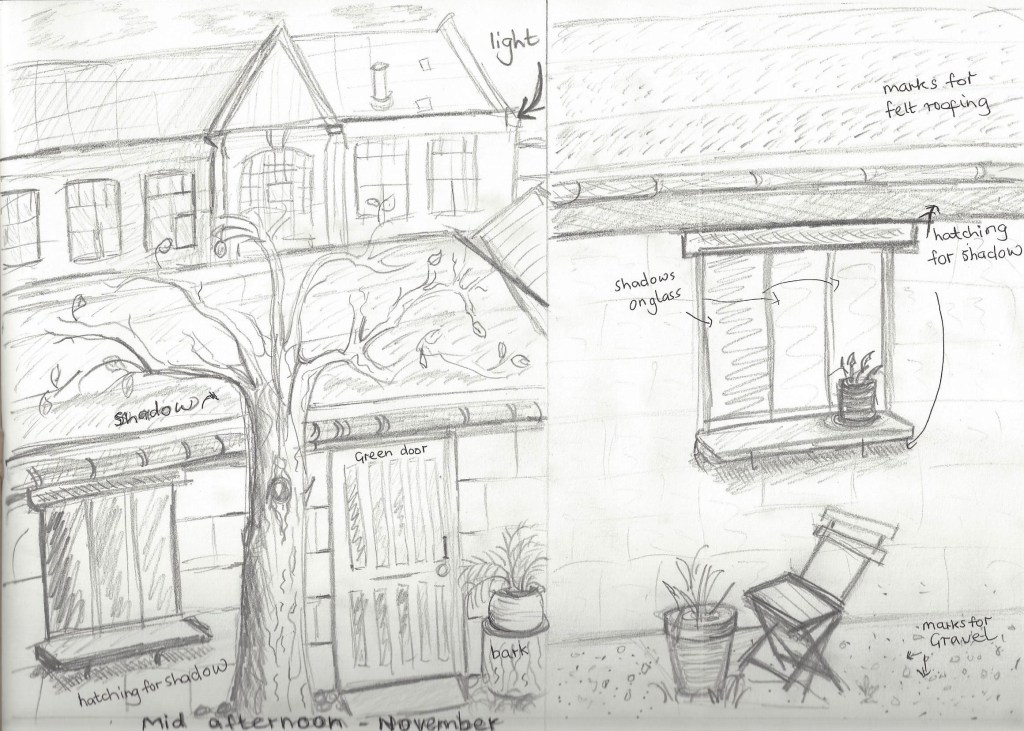
Drew this sketch looking through a window , very cold November afternoon, sun was low in the sky seems to be less obvious shadows, overall greyness. Light was coming from behind the buildings. My main point of interest for the left sketch is the pear tree in the foreground, the door in the middle ground and the factory in the background. Lots of rectangles here for the windows and door. Bark patterns on the tree and the tree stump on the bottom right of the picture. The right-hand sketch main focus is the window in the middle ground, the chair was difficult to get in perspective in the foreground and I don’t like the roof markings. Not sure here where the background really lies. Darker tones mostly underneath window ledges on both pictures and the negative space beneath the left-hand branches.
Exercise 3 360` studies
We were asked to choose a landscape where there is an open view in all directions- north, south,east and west. Then to use a viewfinder to help find a focal point and complete the 4 views in 15 minutes each. It was a very cold day and I chose a local park, this exercise enabled me to see the park in a different way and appreciate some beauty in an urban environment. Here are the 4 drawings below:
northeastwestsouth
RESEARCH POINT – Some artists I have looked at who have painted in series with the landscape –
As suggested in the exercises I looked at Nicholas Herbert’s work of landscapes and was amazed by the amount of different scenes drawn in the same location. I like the choice of media used ( graphite, colour pencil, soluble crayon, acrylic and pastel ) and will experiment in a similar way in my own work in the future.
Fig,10 Clearing below Sharpenhoe 2016 Fig.11 Landscape number 6241999 – 2000 John Virtue Black Ink and emulsion on canvas
Fig.12 The Boiler House 1993 Oil on canvas Peter Doig I really like the striking contrast of tones in the pictures above and below, the light draws the viewer in to look beyond the trees.Fig.13 Cabin Essence 1993 Oil on canvas Peter Doig
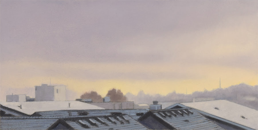
Whilst researching ‘series in landscape’ I came across the artist Mitchell Albala. I contacted him to ask permission to use some of his work titled ‘Rooftops series’ in my learning log. Mitchell got back to me with this quote –
‘ The inspiration for this series was found in my own “backyard” — the view out my studio window. For many years I didn’t consider it a “paintable” view because during daylight hours, all the shapes were an undifferentiated mass of similar values. Then one winter, a light snowfall accentuated the perspective formed by the rooftops. I began painting the scene in the late afternoon or dusk, when this perspective was most apparent, and now those rooftops serve as the foundation of each composition. Each piece reflects a different moment in time, a different color of light.’ (Albala, 2019) https://mitchalbala.com/rooftops/
14
15
16
Fig.14 Rooftops 59th Street, Winter Dusk, 2019 oil on paper, Fig.15 Rooftops 59th Street, Last Light,2019 oil on paper, Fig.16 Rooftops 59th Street,2019 Cobalt Dusk, oil on paper, I was particularly drawn to theses pictures as I too live in an urban environment and look out over lots of rooftops. I sometimes think that living somewhere rural would give me more opportunity for beautiful landscapes , seeing these paintings by Mitchell has inspired me to find beauty in a built-up inner city area.
Fif.17 Sketch for View on the Stour near Dedham 1821 – 1822 – oil on canvas I enjoy looking at this painting by John Constable as there is so much to see as your eye is drawn up and down the river.
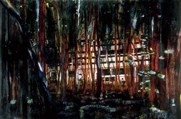
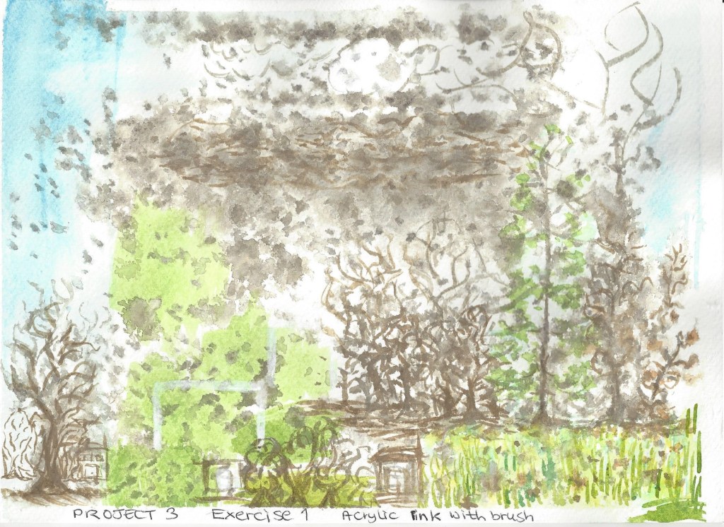
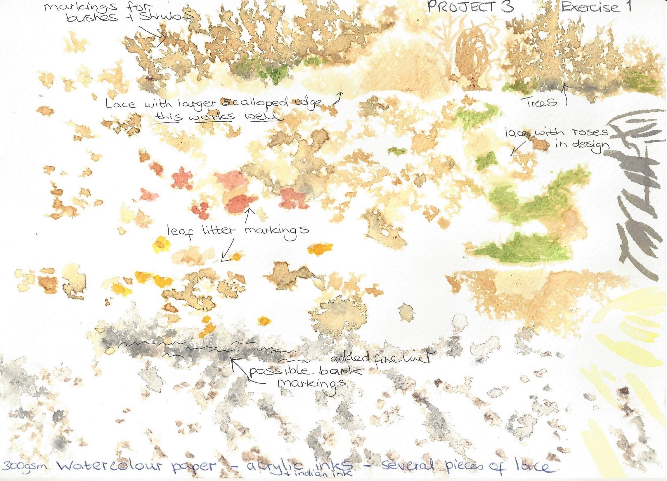
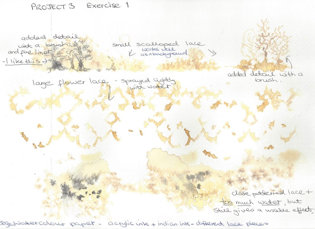
PROJECT 3 Composition
Exercise 1 Developing your studies
My thoughts on paper
Mark making experiments – I attended a study day in Oxford where Katy Taylor talked about her work and demonstrated a technique used her textile work . Below is a sample of what I did in her workshop which I thoroughly enjoyed and can see how I could incorporate this into my artwork. We place pieces of open lace onto watercolour paper and then sprayed over with water lightly, the lace was then carefully removed and whilst still wet we dropped Indian ink into small areas around the page. I like the effect a lot , it could be used for landscape – trees, plants, paths, sky etc.
Experiments with Katy’s idea for lace and ink patterns
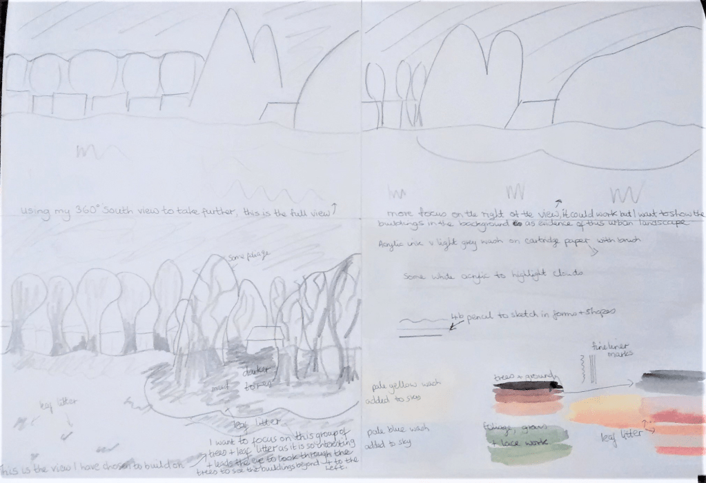
I reviewed some of my preparatory drawings from project 2 and selected from the 360 degree studies a sketch to develop into a further drawing. Below is the planning for this :
Planning for the composition
Final drawing– I wanted to focus on the colour of leaf litter and the group of trees in the middle of an urban environment. I wanted to use the middle distance group of trees to lead the eye from the middle tallest tree, then along to the right of the picture and then to the half hidden buildings in the background. I stared with a background wash of diluted grey acrylic ink, when dry I used a 4b pencil to sketch the shapes of the buildings and outlines of the trees. I then added colour with acrylic ink , some wet on wet so that the colours blended in part.
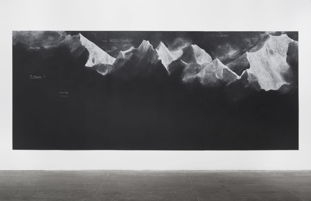
Research point – Similarities – differences Looking at contemporary artists and who work with landscape and a range of viewpoints and comparing their approaches with those of earlier artists. Tacita Dean has some drawings on blackboard which look very dramatic and atmospheric as also does Seurat’s Landscape with houses below, both use light and dark to contrast and create depth. The most obvious difference between them is the viewpoint, Tacita’s mountains are immense and almost overwhelming. Seurat’s is more focused on what most people see around us.
Fig.18 Fatigues 2012 chalk on blackboardFig.19 Landscape with houses 1881-1882
Whilst researching for contemporary landscape artists I came across Adem Potas who is based in Istanbul. This painting is done in watercolour (it does not have a title or date that I can find.) Fig.20 2019
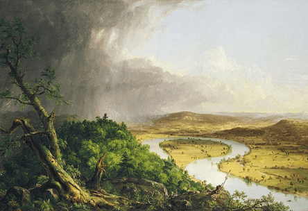
The skies here are particularly dramatic and portray a sense of power and fast changing beauty similar to Thomas Cole’s painting below of the sky after a thunderstorm. Both artists use light and dark contrasts and reflection to take our eye around the paintings. There is also the similar use of aerial perspective – Adem paints the distant clouds on the left in a light tone and smaller shapes, Thomas depicts the distant hills in pale violet with not much detail.
The difference between them is Adem paints in a more impressionist style whilst Thomas paints in a naturalistic way, almost like a photograph of the view. Both these paintings capture the thrilling and striking nature of the sky.
Fig.21 View from Mount Holyoke, Northampton, massachusetts, after a thunderstorm – The oxbow (1836)
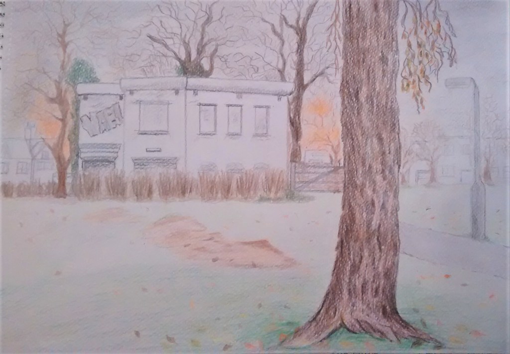
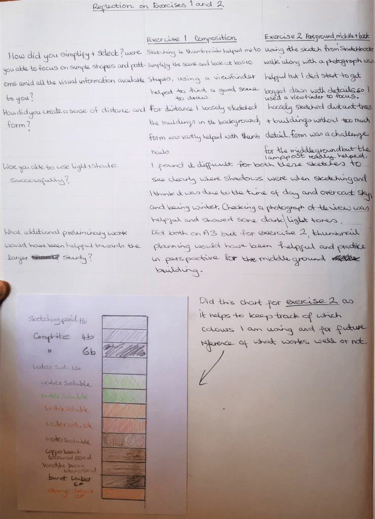
Exercise 2 Foreground, middle ground, background Using the sketches below from sketchbook walk ( project 2 exercise 2 ) I wanted to develop them into a drawing to show Foreground, middle ground and background – see the image on the right. I worked with pencil, graphite, coloured pencils and water soluble pencils on watercolour paper. I used marks from previous experiments for the bark of the foreground tree and leaf litter. Adding detail to the bark helped to show that it was closer and leaf litter was larger in the foreground.
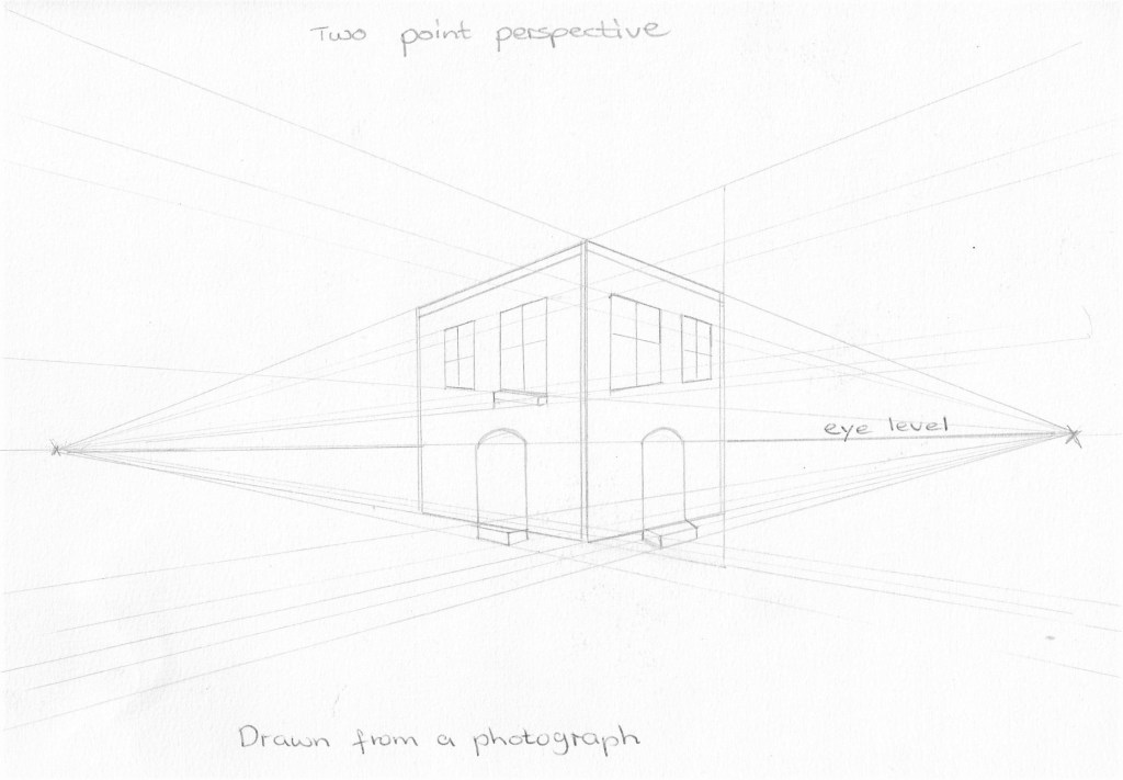
Project 4 – Perspective
Linear
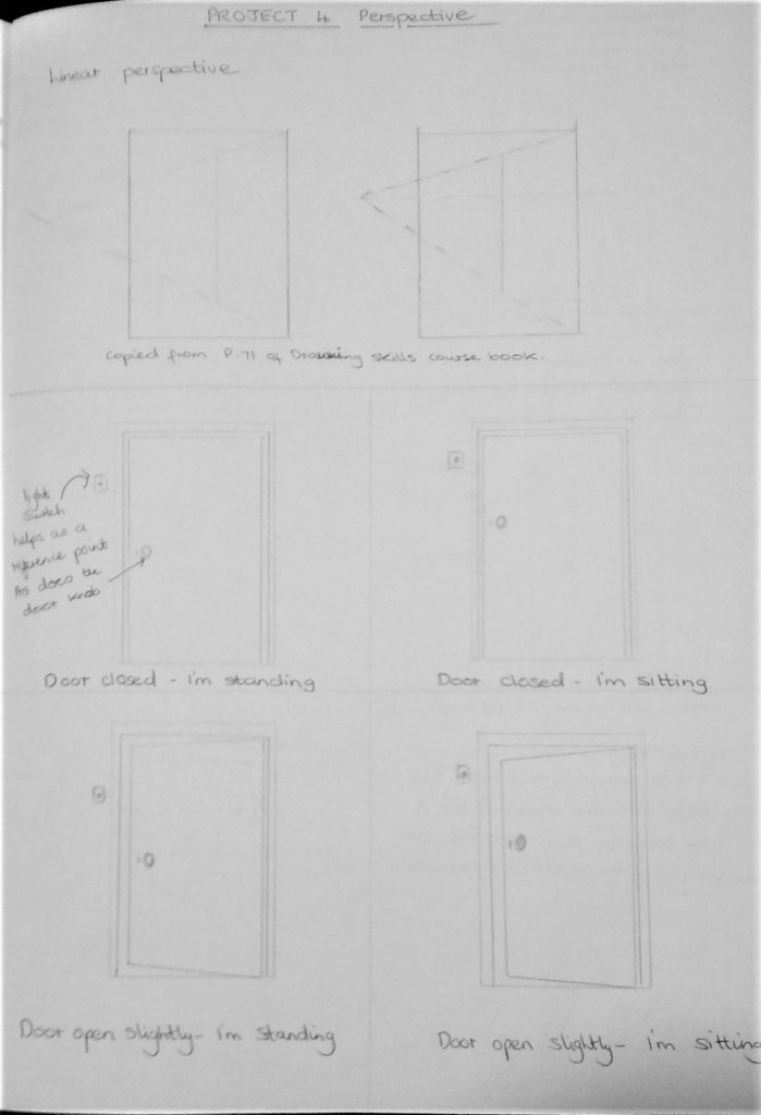
Exercise 1Parallel perspective
One point perspective feels more comfortable to me at the moment as I learn to look at other types. I like the dramatic feel of the street as it merges together in the distance.
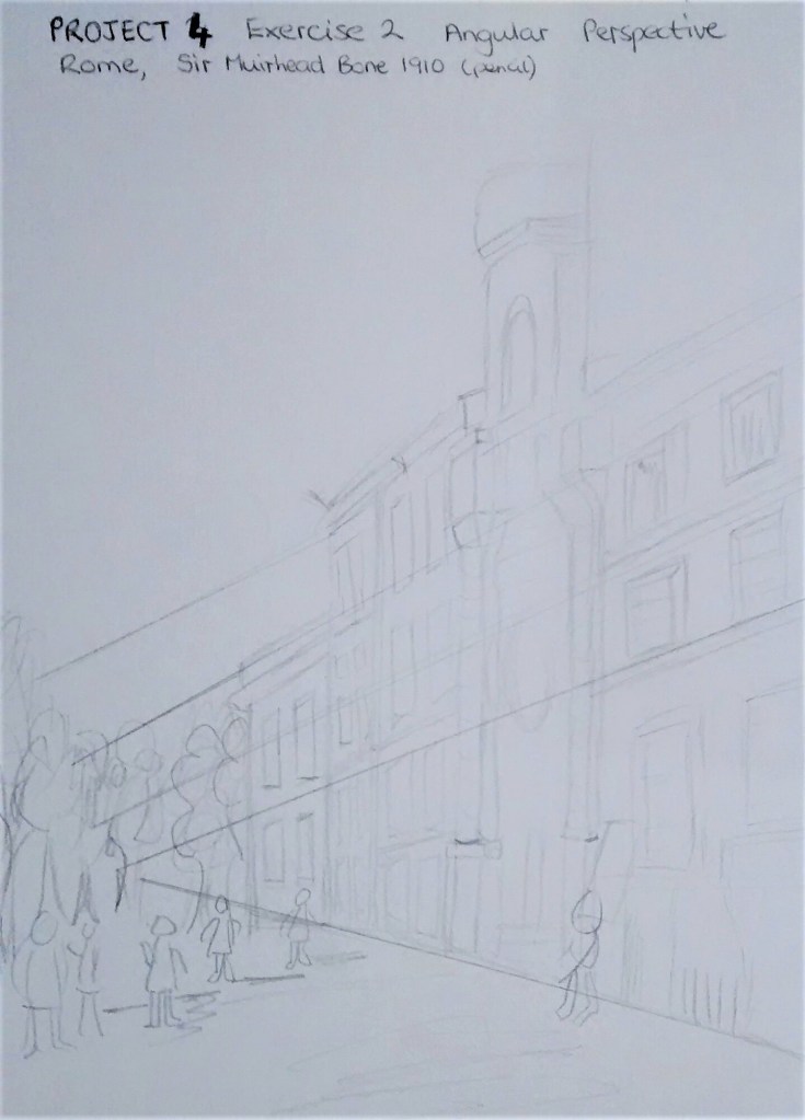
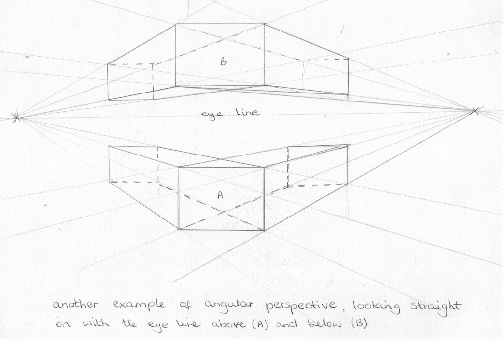
Exercise 2Angular perspective
For this exercise a pile of books were placed on a table. I was sitting at the table. All the vanishing points are off the paper.We were asked to copy a simplified version of Sir Muirhead Bone’s – Rome,1910 (pencil) and then to check the accuracy of the drawing by continuing the lines of perspective to the vanishing point. It was noted that this use of perspective will draw the viewers eye along the street. Drawing 1 , Drawing skills p75.Another example, the more I practice this I’m sure my drawings will improve.
Exercise 3 Aerial or atmospheric perspective
Project 4 exercise 3 Soft pastel on white paper – I worked in monochrome to focus on the gradation of tone- soft pastels work well for this and choosing blue as a colour creates an atmosphere of mystery.Project 4 exercise 3 – soft pastel on dark blue paper paper – Above drawing and this one are my own version from Artists Drawing techniques pages 106-107 and 256-257 – showing the distant hills in blue/grey and looking misty. Drawing on dark paper meant that I could leave some areas bare as in parts of the two tree trunks on the left and amongst some of the green in the foreground. This method brought these parts forward contrasting against the lighter green and yellow of the middle ground .
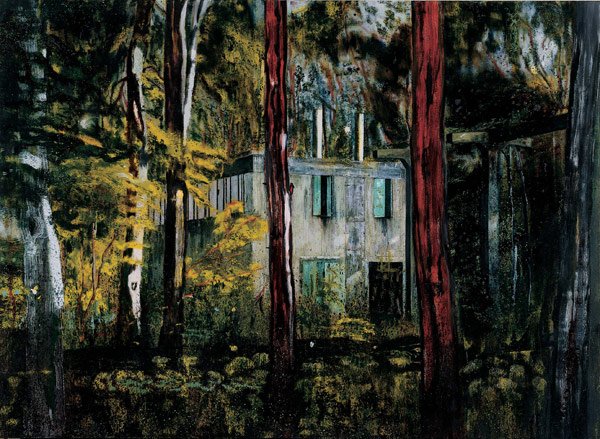
Project 5 Townscapes
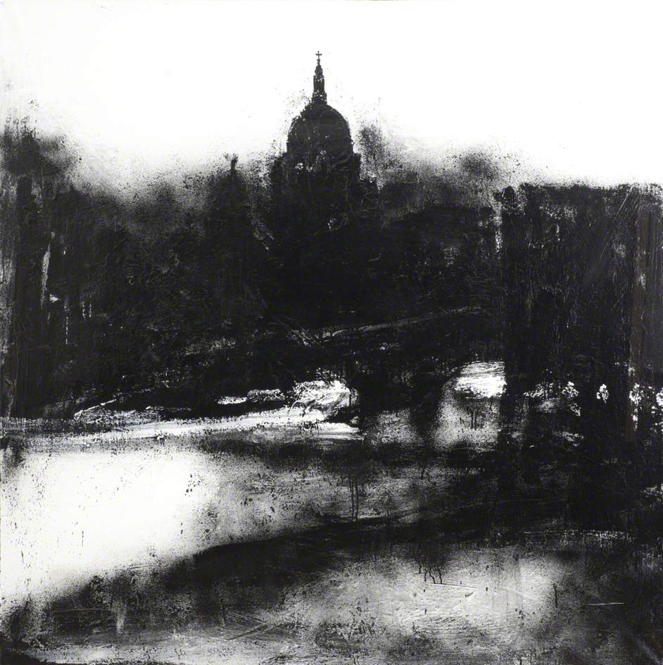
Fig.22 Landscape No.739 Looked again at some landscape paintings by John Virtue and particularly like this ‘Townscape’ work in monochrome. it seems very simple but conveys a lot of drama about the city of London.The artist I find inspiration from for the next project is Mitchell Albala and the rooftops series- see research Project 2 Exercise 3 figures 14,15 and 16.
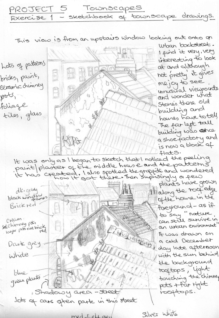
Exercise 1Sketchbook of townscape drawings
This is a quick drawing of what I think is the most interesting view.
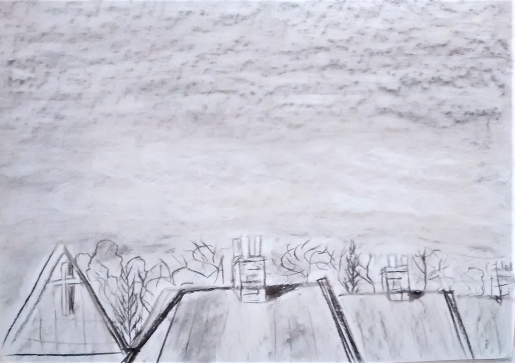
After using a viewfinder I chose what I feel is the most interesting view for the final composition. I gathered all the preliminary sketches and photographs around me. I also looked out at the view again and drew on the window pane in dry wipe pen and traced some of the outlines of the roofs onto the glass to see if it would help me with the perspective. I’m not sure that it helped to then translate that onto paper as I still had to think hard about positioning everything. I drew the main shapes in 3b pencil onto A2 rough brown wrapping paper using thumb and pencil method to measure the lengths and widths, this was helpful. I used a ruler for the straight edges as I don’t feel confident doing a large drawing in freehand. I used soft pastels and conte sticks building up the layers of several colours and then blending with a soft cloth.
I like the colours in this final drawing and I’m quite pleased with the peeling paint patterns. The rough paper wasn’t easy to draw on but it added texture to the brickwork I feel. I found it a challenge to see the perspective correctly , possibly because the buildings are at different angles and the street bends slightly (I decided to omit the furthest chimney pots as the drawing was taking me so long to do – 4 hours plus – )
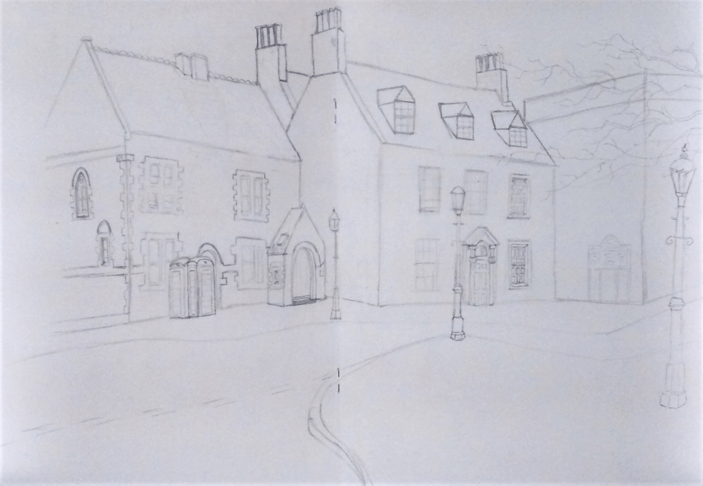
Exercise 2Study of a townscape using line. We are asked to make a preliminary drawing using two sketchbook pages. I went to the town centre close to where I live and found an interesting view of some old town houses that have been restored. It was a cold day in December so I took photographs to be able to complete the sketch at home. The sun was shining but not very brightly as it was hidden behind the buildings. I often prefer to draw scenes that show plenty of light and shadow. The focal point for me is the smallest lamp-stand so I centred this in the middle of the page. Ideally for me there were three lamp-stands which provided background, middle and foreground. I tried to provide enough detail to give information for the final working which seemed to be taking me a long time so I chose to detail only one or two windows in pencil to inform the later pen and ink drawing. Below is the preliminary sketch –
This is my drawing in progress with some black fineliner pen , I used 0.8 mm for thisThis is the finished drawing which I quite like, I used 0.5mm and 0.38 for the finer details, I also added some detail that wasn’t in the preliminary drawing but I observed when looking at a photograph e.g the foreground kerb stones. Getting the angles right on larger subject ( roof, house etc ) is very challenging and I sometimes feel frustrated . I would not have chosen to do a drawing like this before doing this course, so I know the challenge is good.
Exercise 3 A limited paletteUsing your sketches from the previous exercise, select a drawing to develop in colour. I chose to use conte sticks in 3 colours – grey, black and bistre- these were my middle and darkest values, the paper is the lightest. I also decided to experiment using smooth A2 cartridge paper. I wanted to work quickly and not get bogged down by too much detail consequently I missed out one of the chimney stacks! It was difficult to work with conte sticks to draw detail and also the smooth paper did not ‘hold’ the colour well. When I began the drawing I wasn’t feeling inspired by it at all, as it progressed and started to take shape I felt a little more confident. What I really like are the lamp-stands are their positions in the back,middle and foreground, also the swirling road/pathway. Were you able to create a sense of depth with your limited colour palette? I created some sense of depth by layering the colours to give more hues. I think I rely a lot on the dark tones to show depth and sometimes forget the middle ones. I used layers of grey for the roadway to try to show mid tones and layered it with black for the roofs.
Exercise 4 Statues
Statue of John Clare – a Northampton poet- This statue was sitting on a bench in an open courtyard. Light was coming from above and I tried to show this on his bald patch. It is made from bronze and I was very interested in the texture which I tried to convey in the frottage above. I sat next to the statue and viewed it side on. I did a quick sketch in Hb pencil then completed it in biro at home. This statue was in the same courtyard as John Clare- above. I stood in front of the statue and sketched quickly in Hb pencil and a few touches at home. I was interested in the folds of fabric and how it is formed and thinking I would like to learn more about drawing fabric.This statue is in the entrance of an art gallery in Dresden. I drew it from a photograph when I got back home. I wished that I’d had time to sketch it whilst there as it is so interesting and I like the angle (looking up at it) from which I took the photo. Light was coming from the left of the photo. It is quite weathered and the object being held in the statues right hand is broken, this creates interest as we don’t know what the object is as we draw. This is my first time drawing statues and I know my sketching isn’t in proportion always and I miss things out.
Figure. 4 Dürer A (1495) Road in the Alps [gouache & w/c on paper]At: / Monasterio del Escorial, Madrid, Spain / Bridgeman Images ://www-bridgemaneducation-com.ucreative.idm.oclc.org/en/asset/387385/summary?context=%7B%22route%22%3A%22assets_search%22%2C%22routeParameters%22%3A%7B%22_format%22%3A%22html%22%2C%22_locale%22%3A%22en%22%2C%22filter_text%22%3A%22albrecht+durer+landscape%22%7D%7D (Accessed 11.2019)
Figure. 8 Turner JMW (1834) The Golden Bough [ Oil on canvas ] At: [https://www.tate.org.uk/art/artworks/turner-the-golden-bough-n00371 (Accessed 21.11.2019)
Fig.9 Lear E (1858) Petra [ Pen and brown ink over pencil with watercolour and gouache on blue paper.] Master Drawings – Close-up by Julian Brooks Page 85 The British Museum 2010 ISBN 978 0 7141 2673 9