Part One – Form and Gesture
Project 1 – Feeling and expression
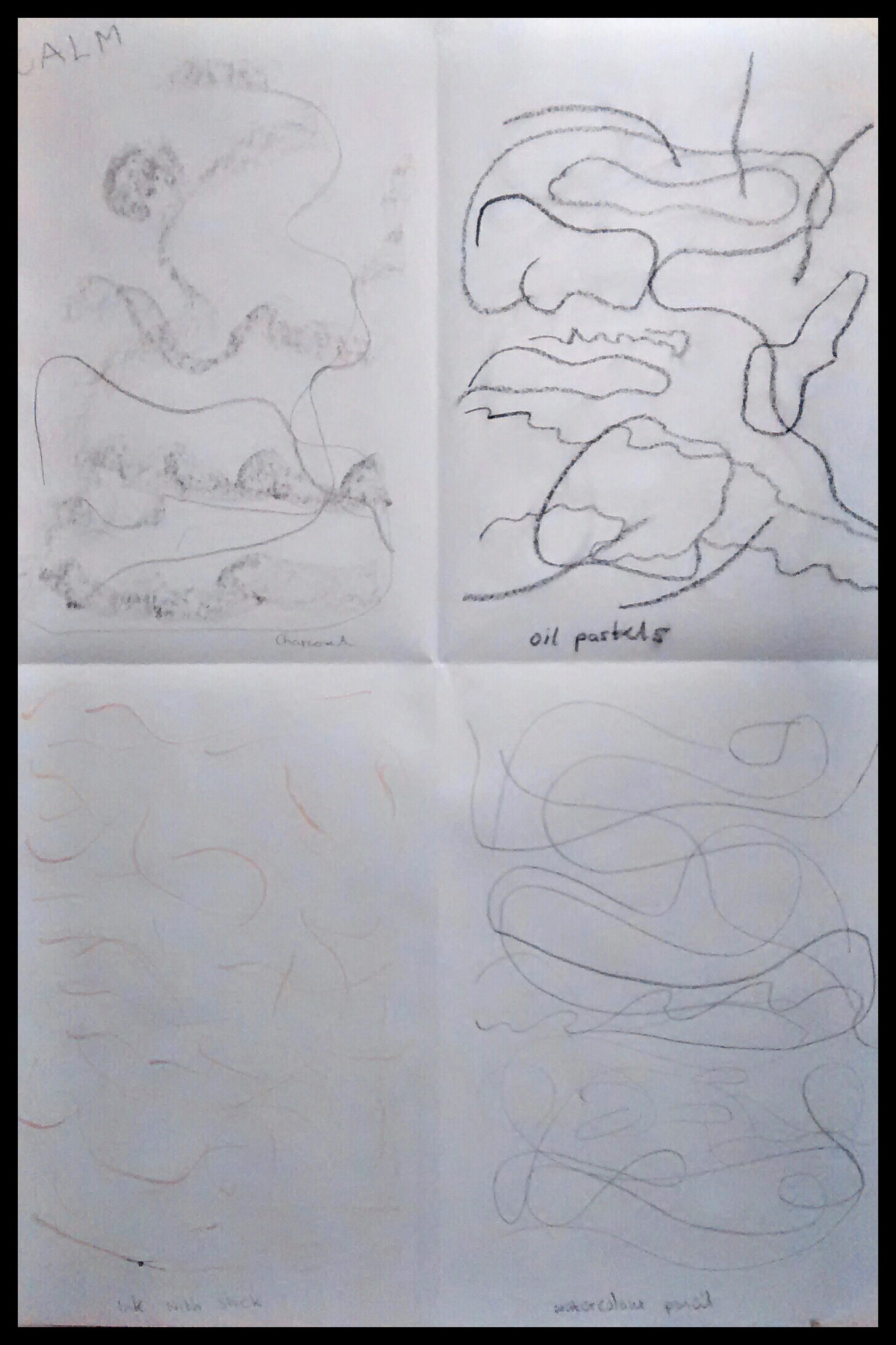
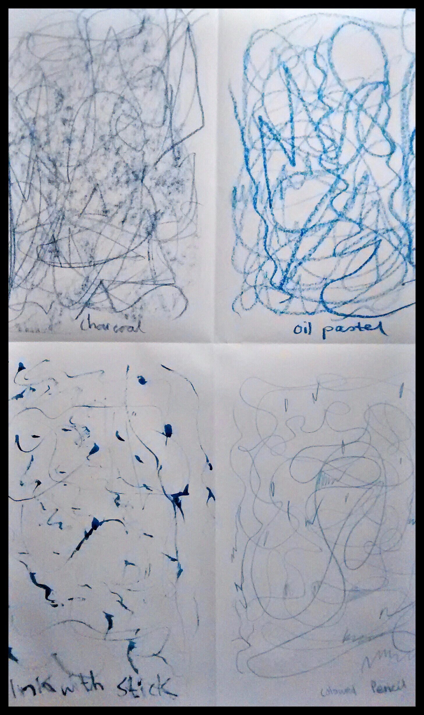
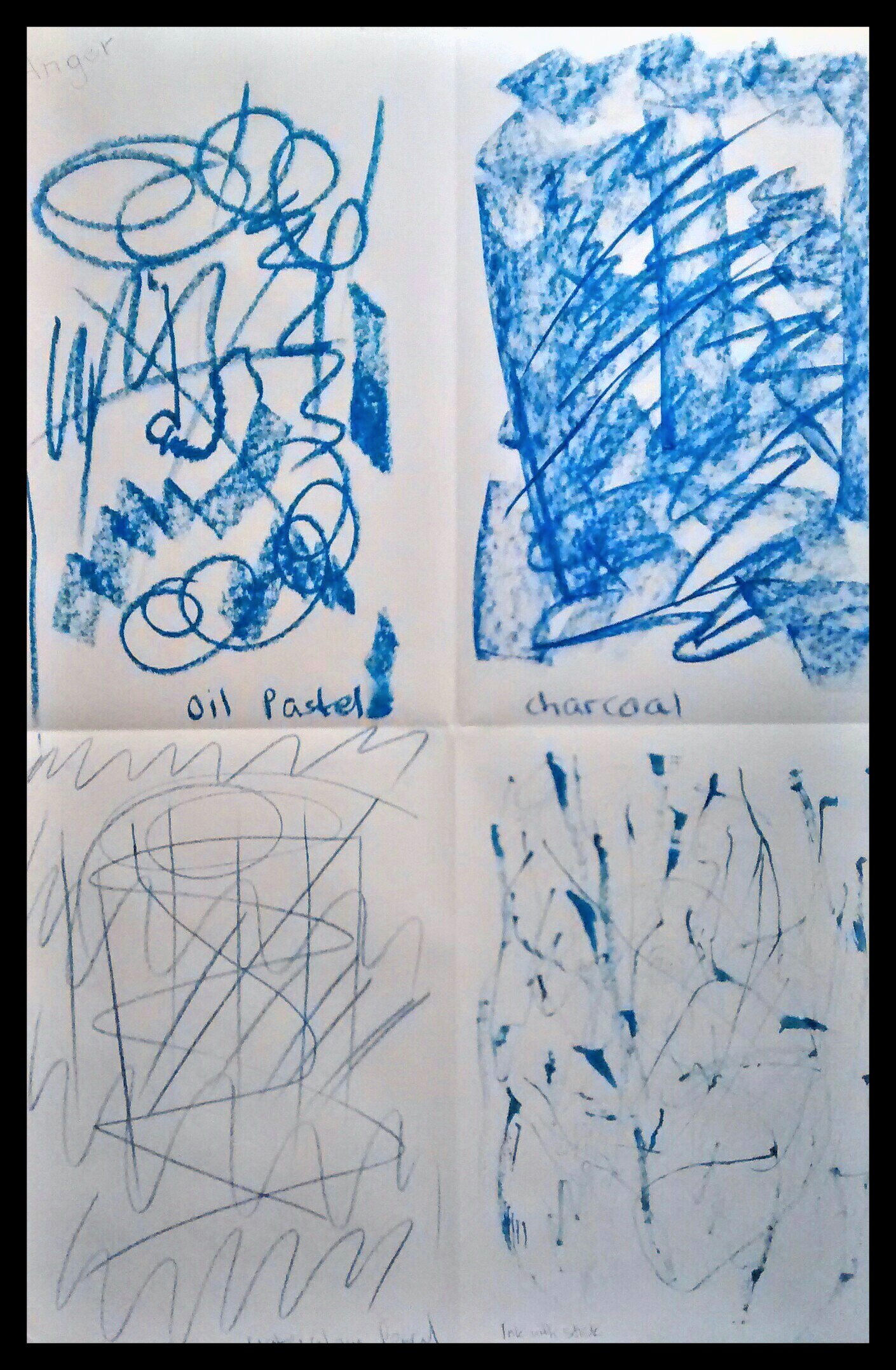
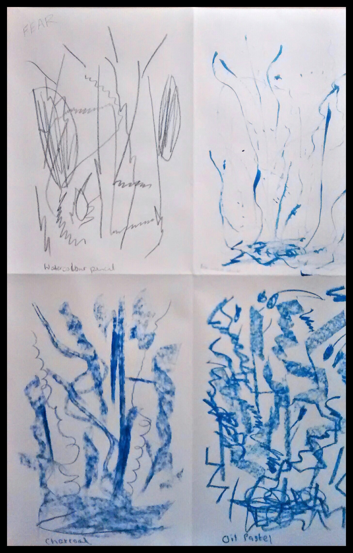
Exercise 1 – Experimenting with expressive lines and marks
Notes
Calm – Happy to be drawing on paper without the pressure of producing a picture. Thoughts came to mind whilst drawing across the page, remembering stepping stones across a stream in Dovedale, the clear sparking water not too deep and the feeling of security as the stones already in place, take me across to the other side. I enjoy the moments and find my shapes and strokes are mostly soft curves, wavy lines with not too much pressure on the paper.
Joy – Great time drawing unbroken curves and swirls feeling like I was dancing on the paper with lilting movements. Enjoyed doing some splodges of ink with a stick. Liked the effects with charcoal drawn holding it on its side.
Anger – I didn’t want to do this one at first as I was afraid of the emotion. Once I started putting marks on paper it was easy to continue. Most of the drawings were lines and shapes with hard edges. Also the markings were darker as I applied them with more energy and pressure to the paper to release the angry feelings.
Fear – With this drawing I noticed most of the shapes and markings started at the top of the page and went downwards, often beginning with light strokes and increasing in intensity as I imagined a sinking feeling e.g. before a flight or public speaking. I also felt the fear of seeing a bat flying at night or going into a dark basement without a light.
Exercise 2 Experimenting with texture


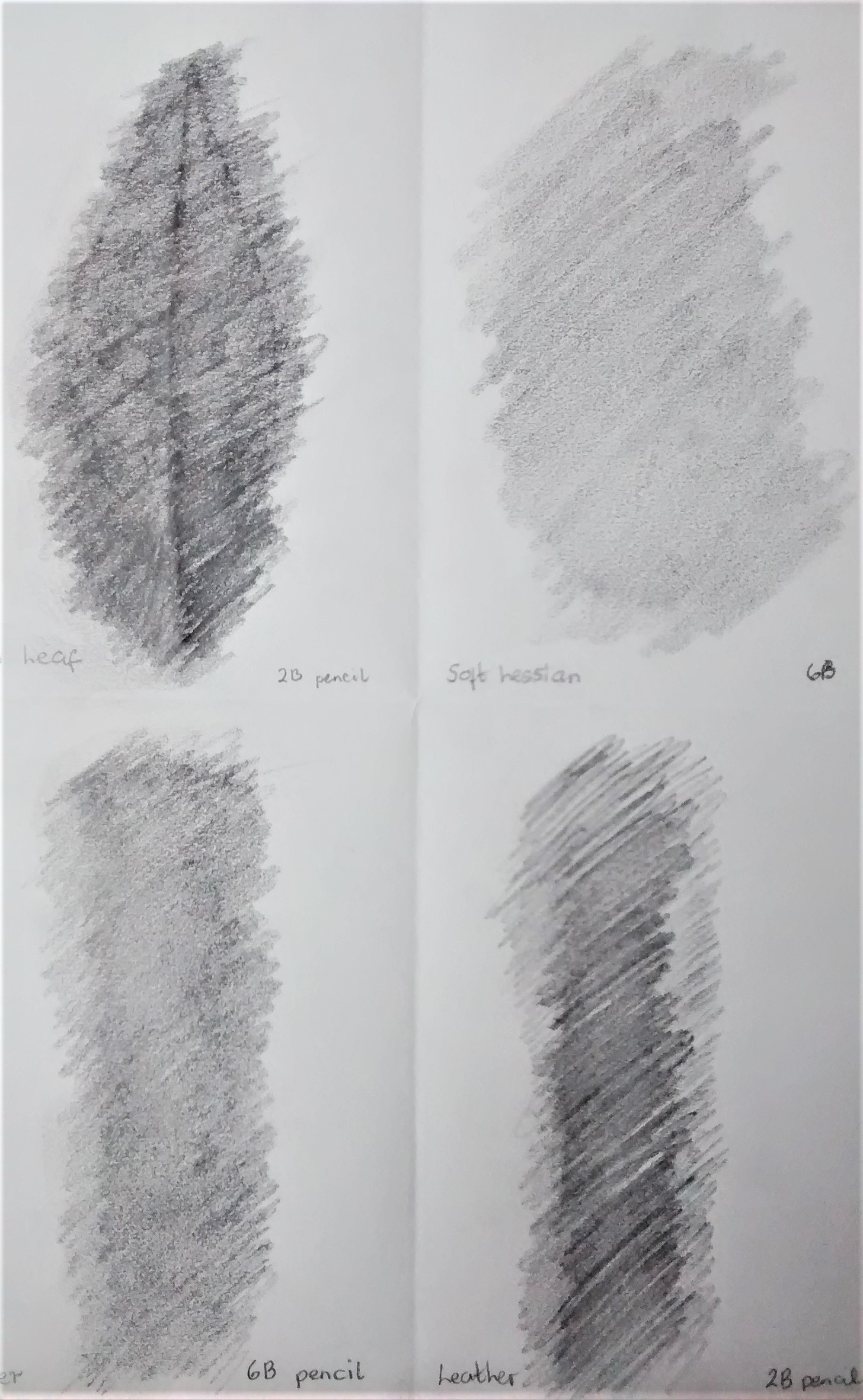
Notes
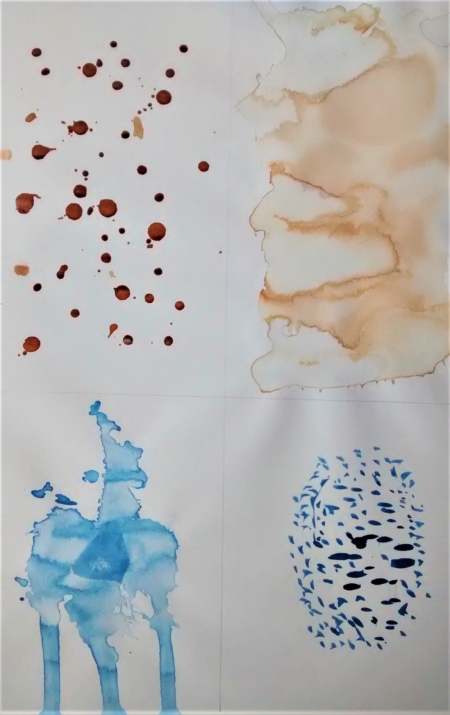
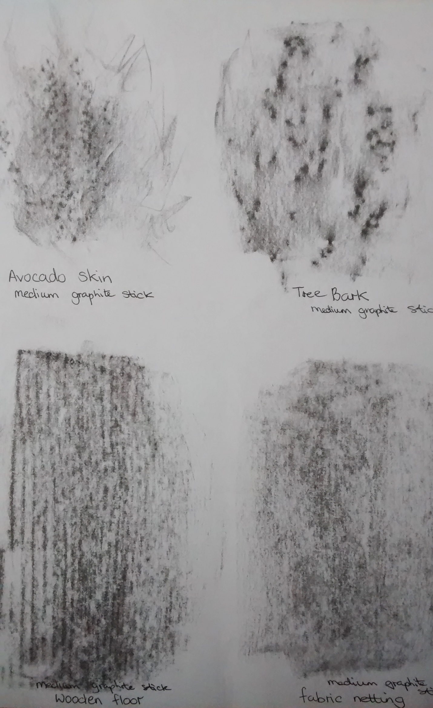
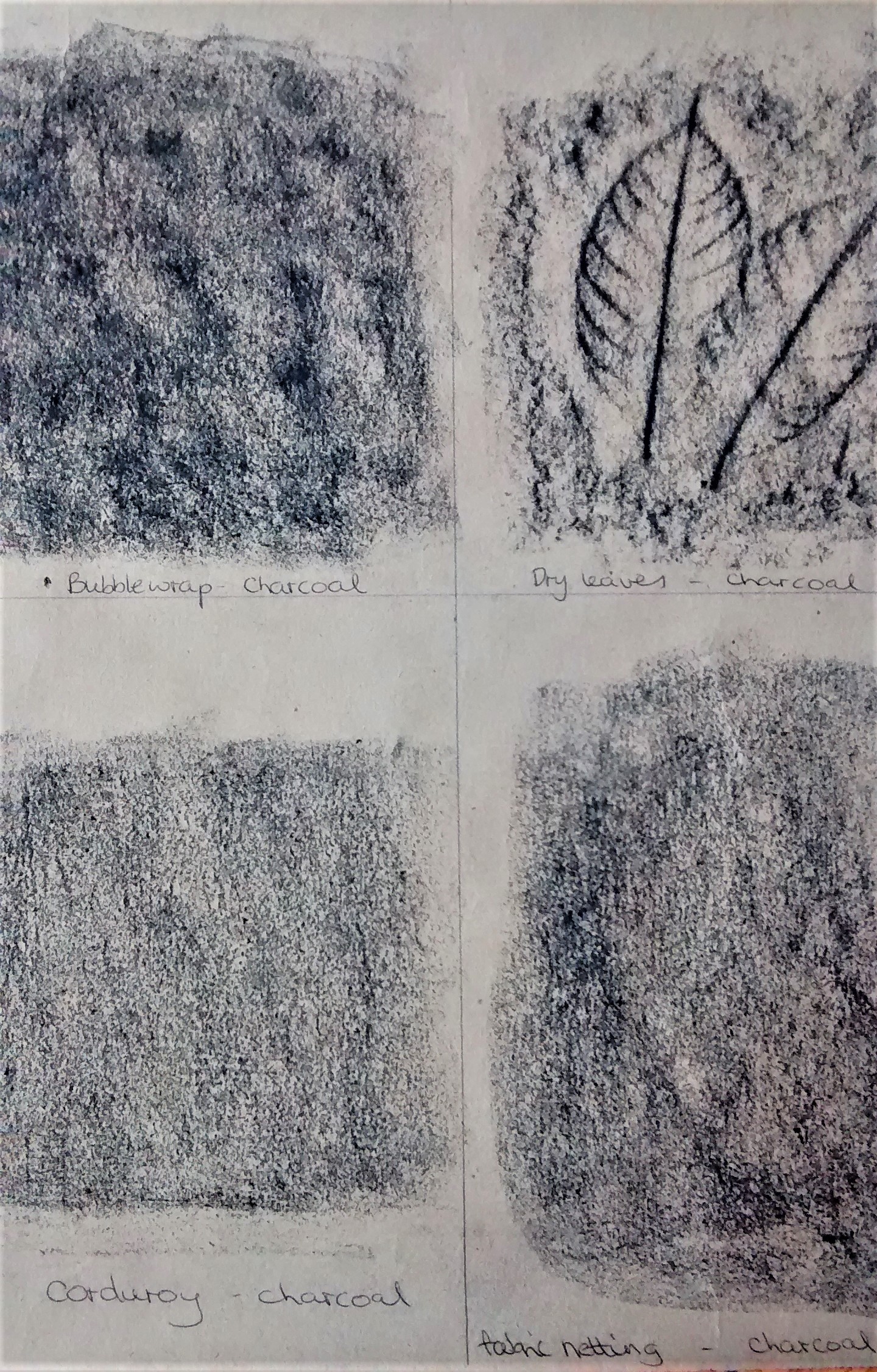
This was a very enjoyable exercise and I will try to describe some of the textures shown in the images above. I used a range of drawing tools – pencil 2B+6B, graphite stick, graphite pencil,chalk pastel, charcoal, drawing ink and writing ink.
Top left – Drops of drawing ink had a shiny surface when dry which felt smooth and crisp. The blue streaks were a stick dipped in ink which was difficult to control and so was more interesting.
Top middle – my favourite of all these experiments was the avocado with its wonderful waxy,rough textured skin which made an exciting frottage that would look stunning when incorporated into a drawing.
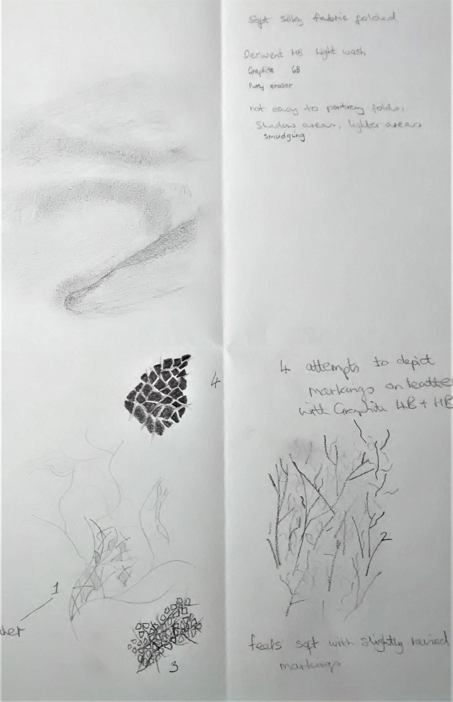
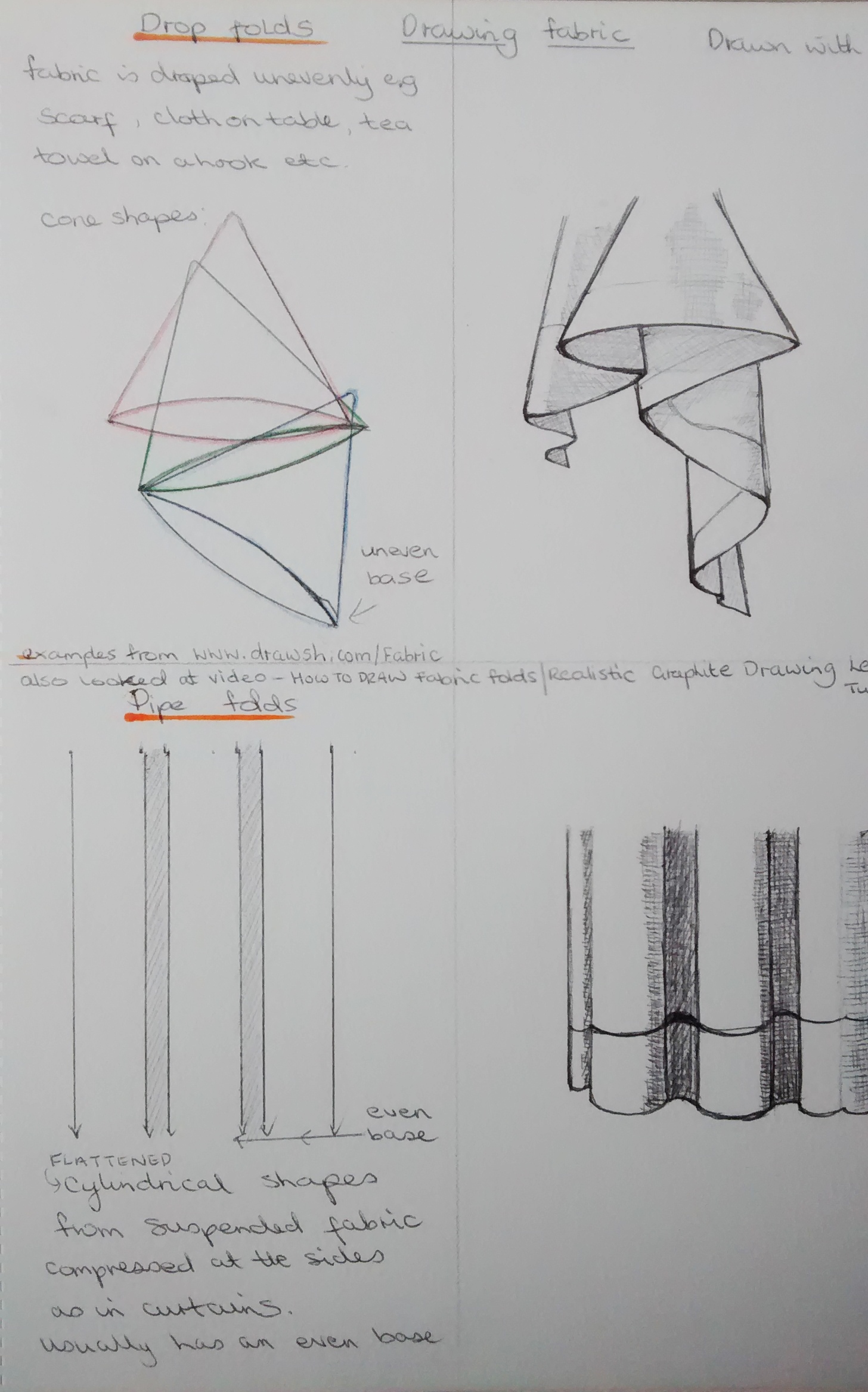
The image on the right shows my attempt to draw soft,silky fabric with graphite and a putty eraser plus some smudging. it wasn’t easy to portray the folds and I will need more practice at doing this. I also tried to depict markings on leather with graphite 4B, this was a challenge as there are so many marks and lines involved.
Project 2 Basic shapes and fundamental form
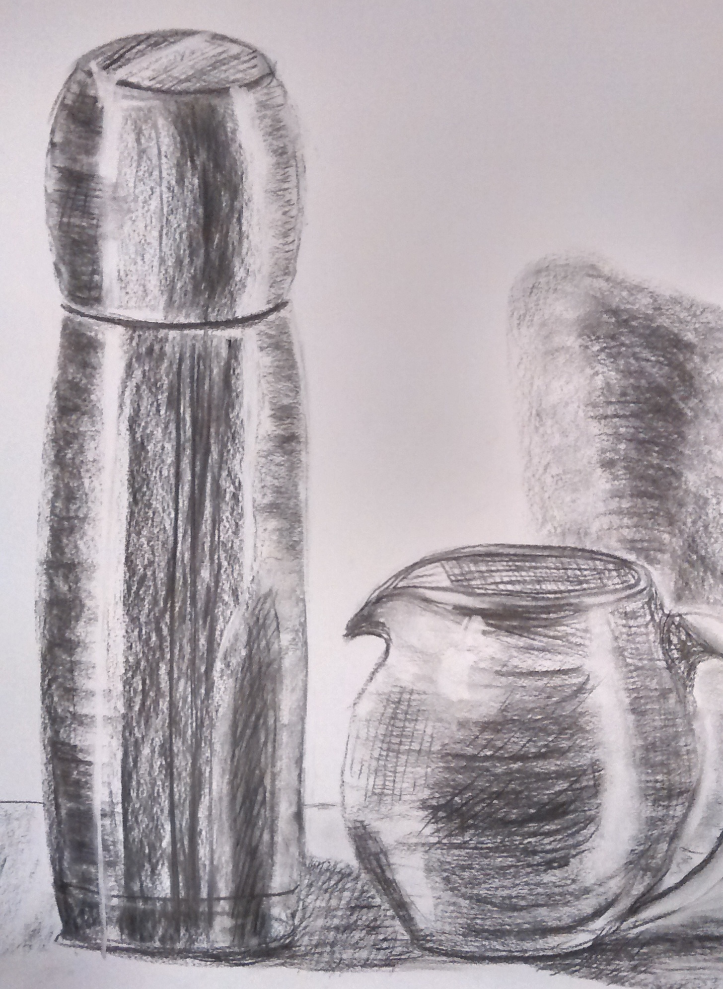
Exercise 1 – Groups of objects
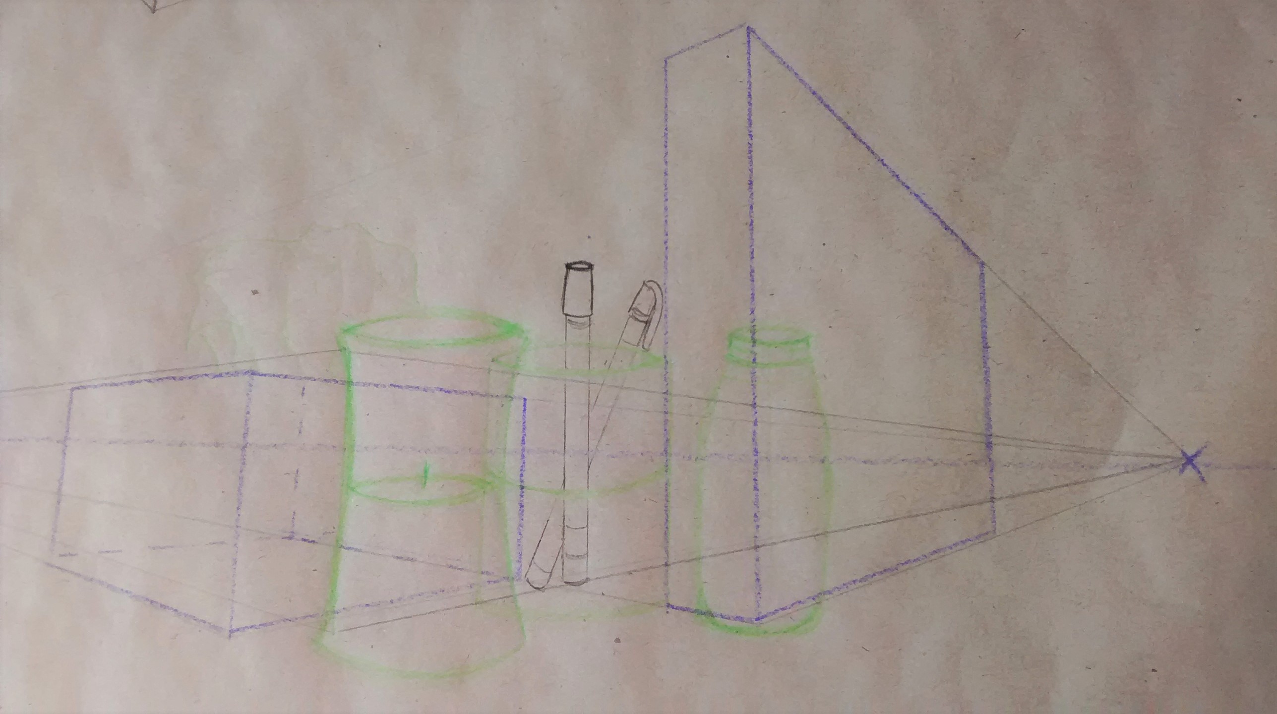
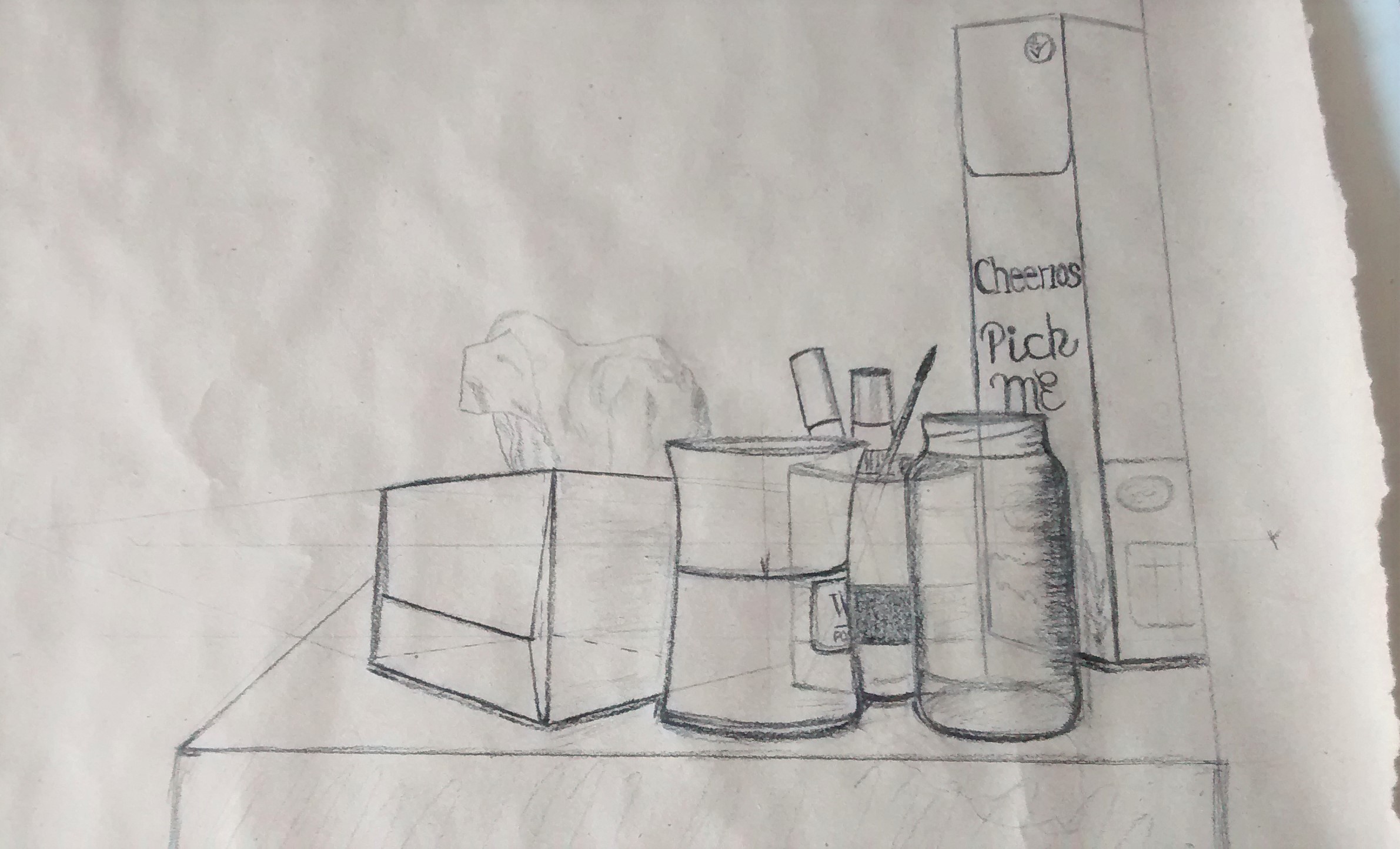
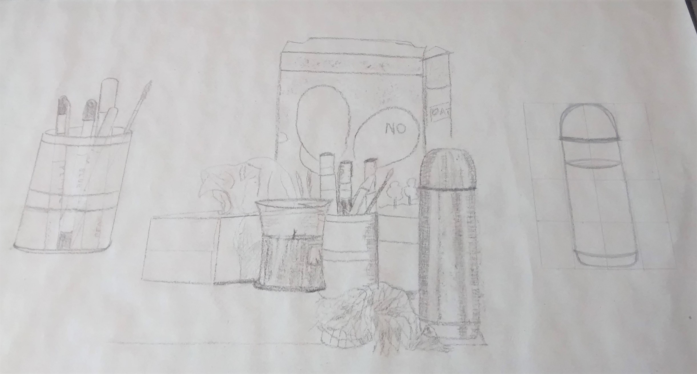
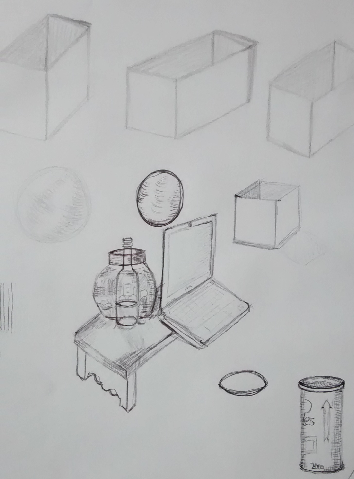
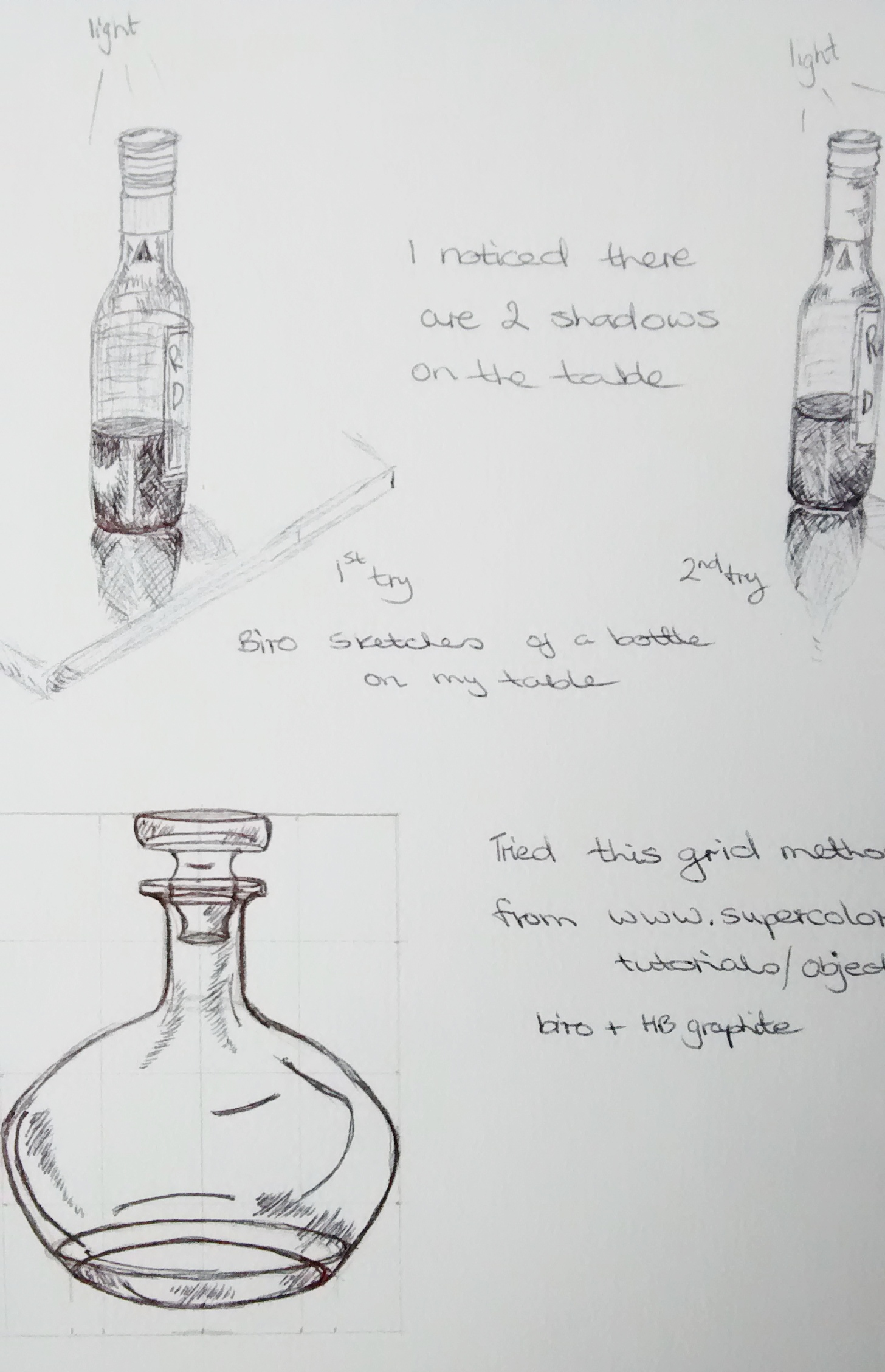

Notes
I found this exercise quite difficult to begin with and wasn’t sure whether start drawing the objects at the back first or ones at the front. I read several books and watched videos about perspective and how to make objects look 3 dimensional – http://www.drawsh.com/fabric + How to draw fabric folds tutorial- youtube
The top left exercise was drawn in biro which I really liked and felt I could control the movement and detail.
The bottom right was the final drawing for exercise 1, I chose objects that were familiar and had a selection of shapes. I used brown paper and a charcoal pencil. We were asked to imagine seeing through the forms to the space inside , this helped me to focus closely on the drawing and try to connect the objects to each other.
Exercise 2 Observing shadow using blocks of tone
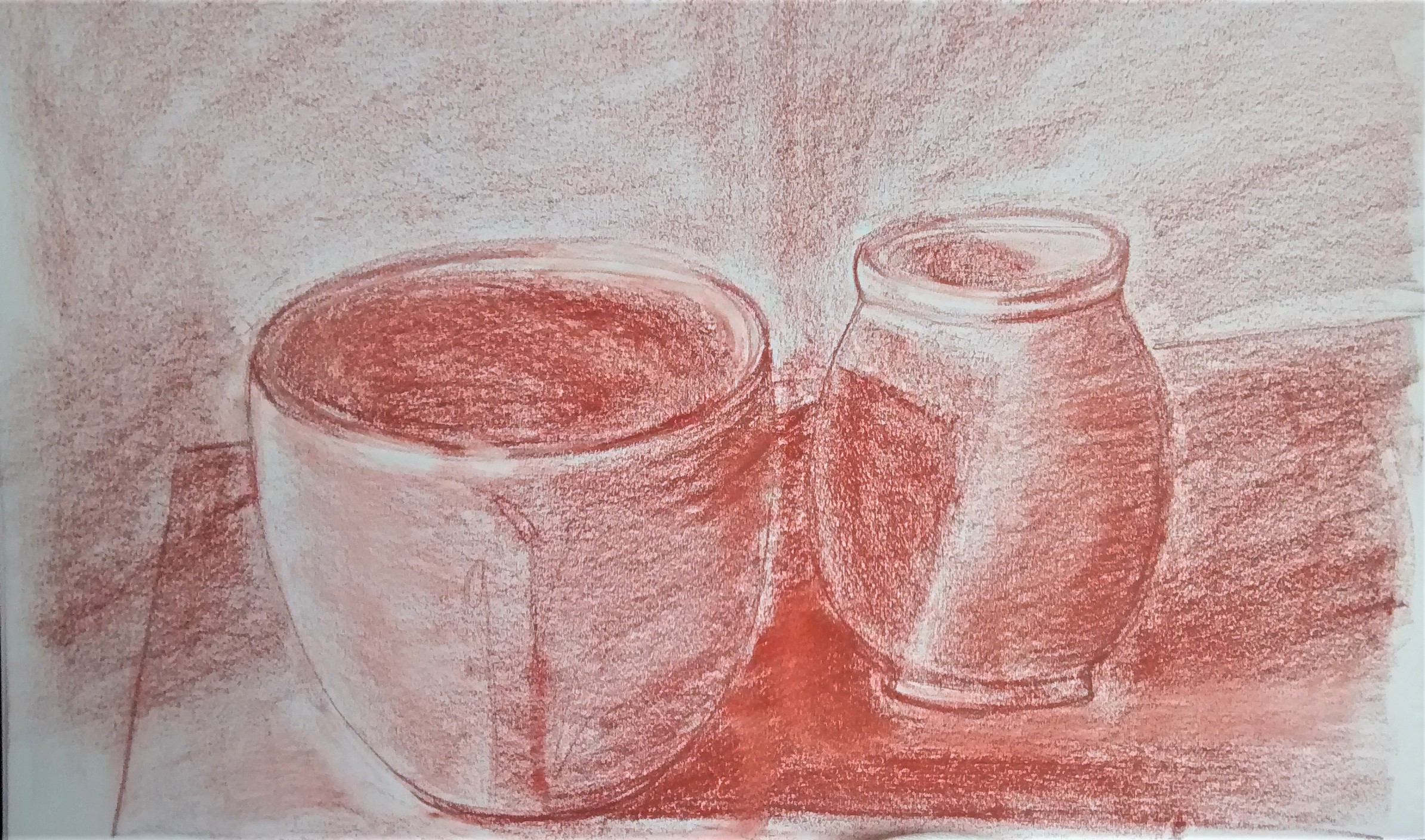
Exercise 3 Creating shadow using lines and marks
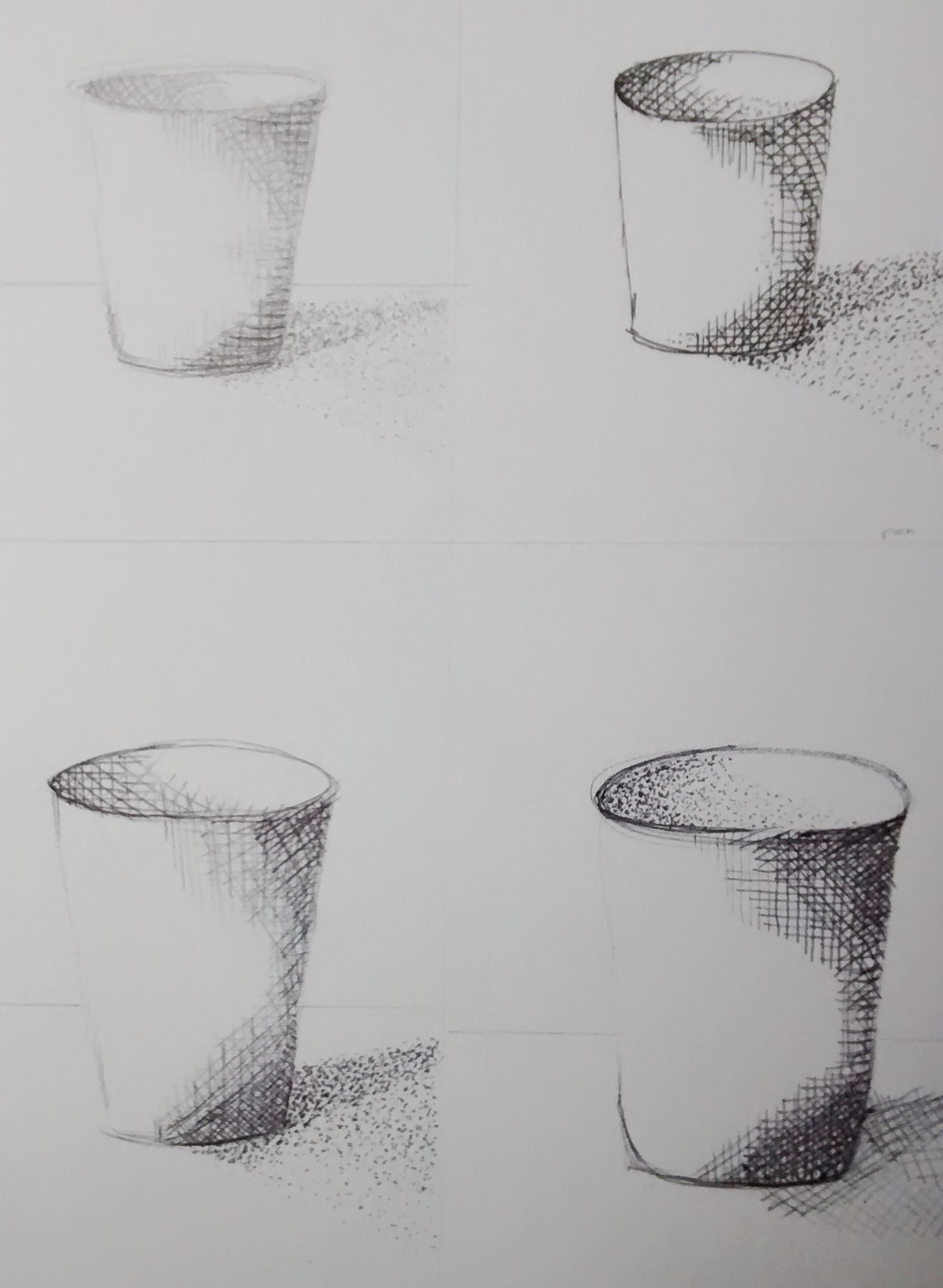

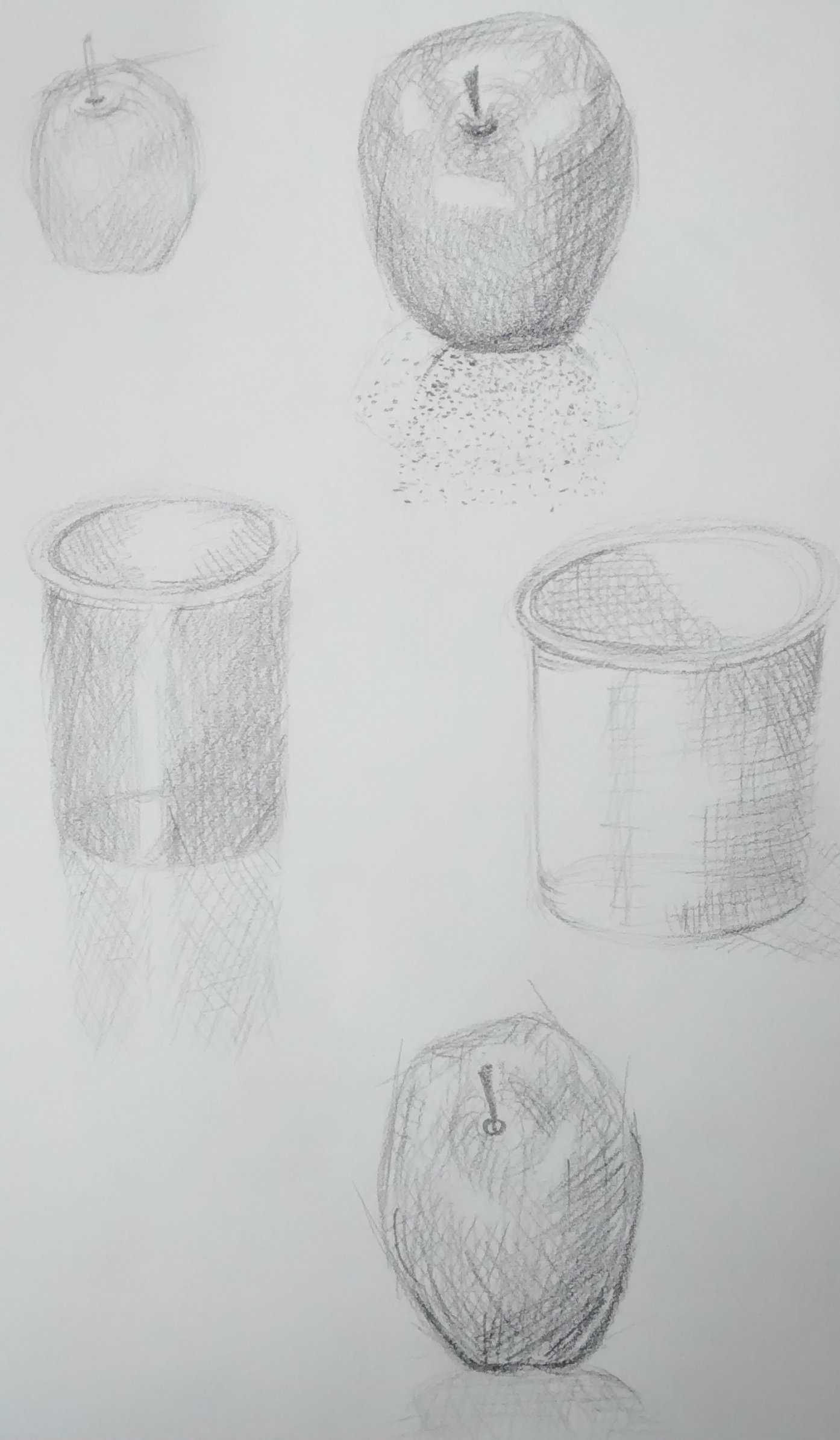
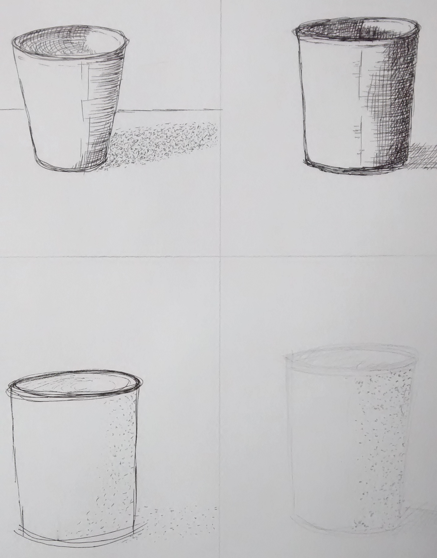

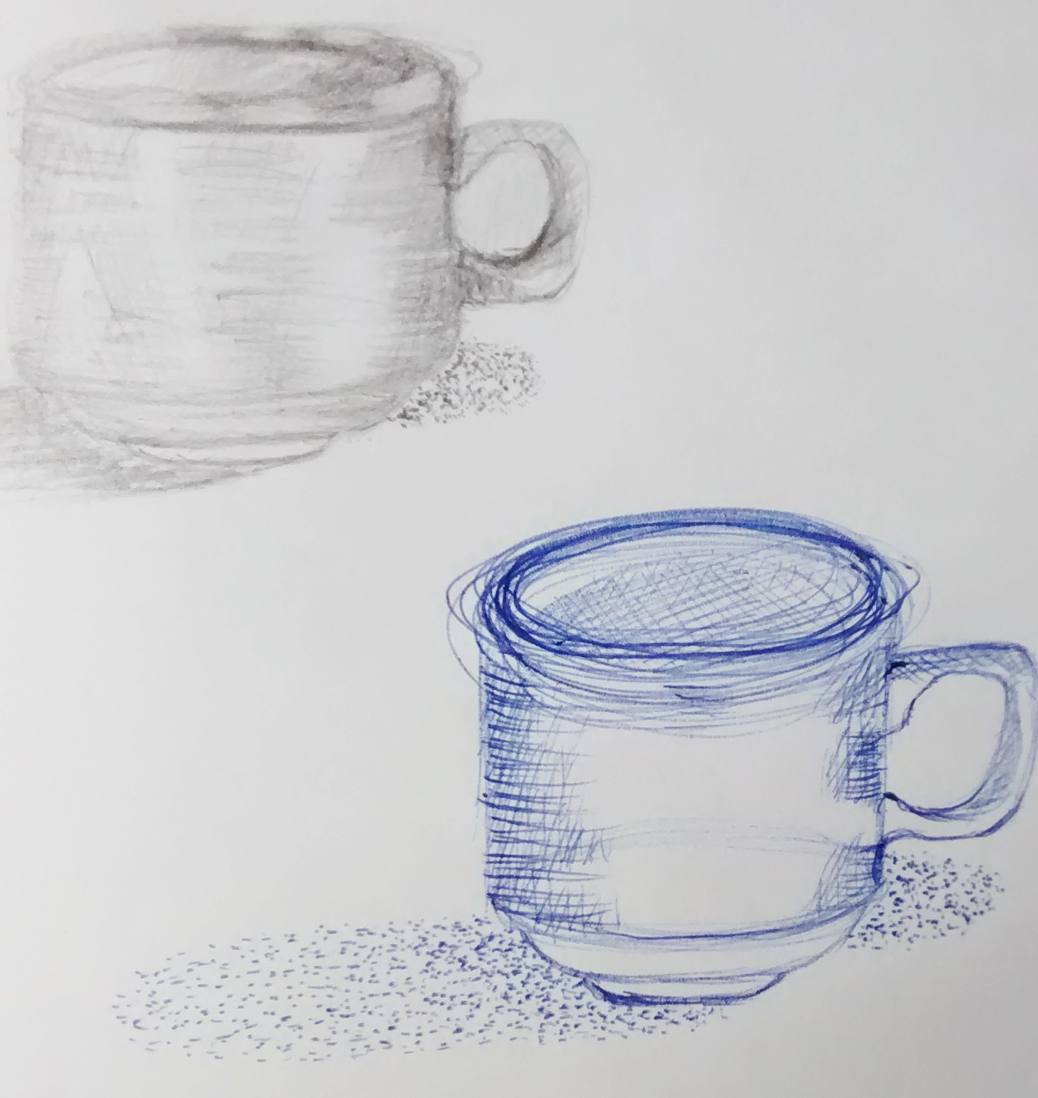
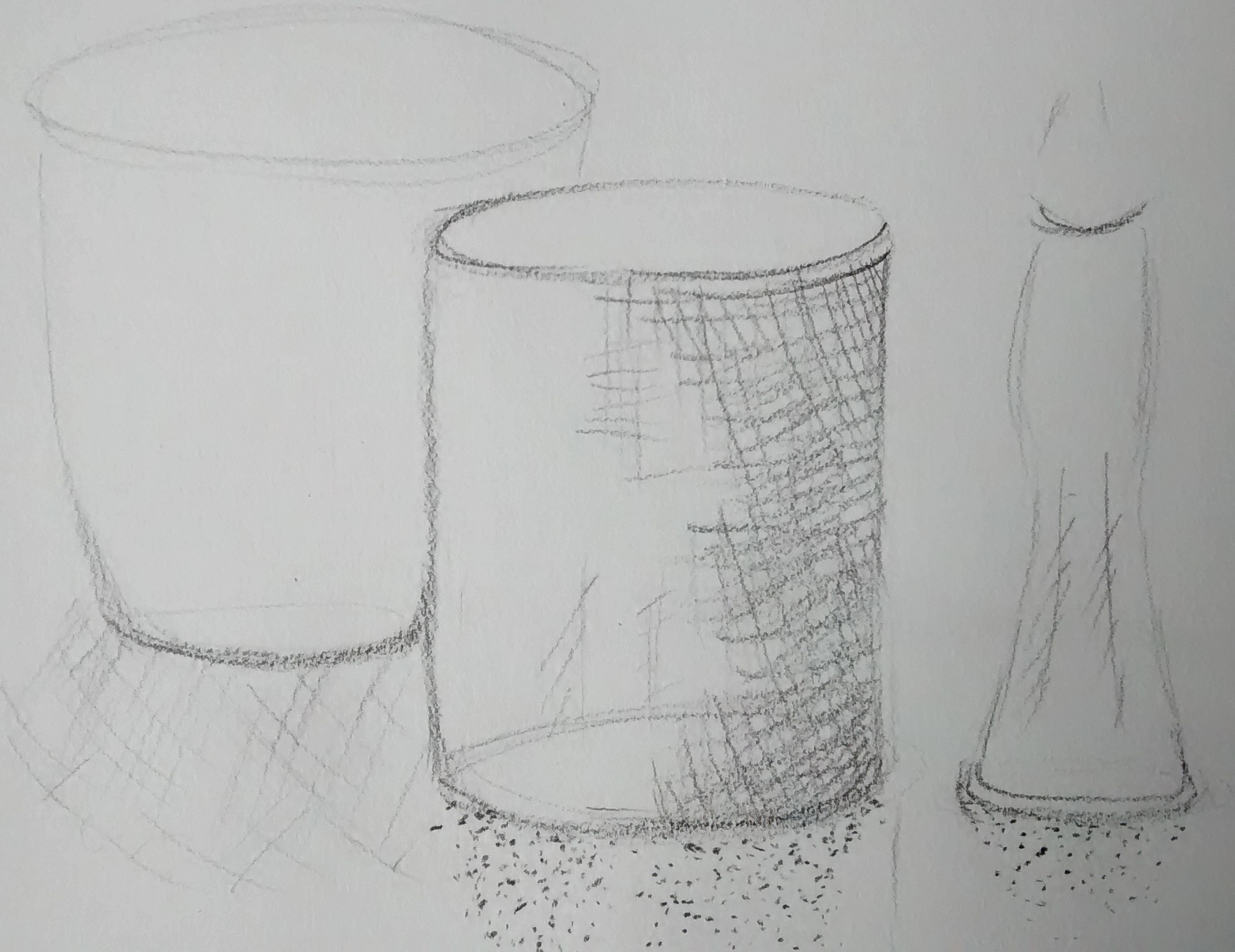
Notes for exercises 2 and 3

Research
Looking at the work of Odilon Redon ( Bertrand – Jean ) a French artist born in Bordeaux in 1840 ( https://www.wikiart.org/en/odilon-redon ) until he was in his fifties he worked almost exclusively in black and white—in lithographs and charcoal drawings. ( A Dictionary of Modern and Contemporary Art Ian Chilvers + John Glaves – Smith (3 ed.) )
‘His pastel drawings have been linked to the writing of Poe, Baudelaire and Mallarme, all connected conceptually to Surrealism…’ ( Betty Edwards,1999:243 )
Below is a work that Redon created which shows a lot of expression of dark and light using charcoal, and the picture opens the viewers mind to ask – ”what atmosphere is being depicted here?” The tone of an artwork is important in giving feeling and depth, also in telling a story and creating an atmosphere, thus transporting the viewer to another place in their mind.
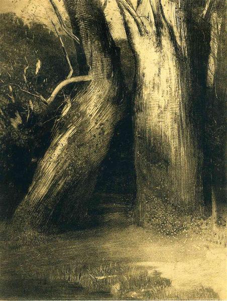
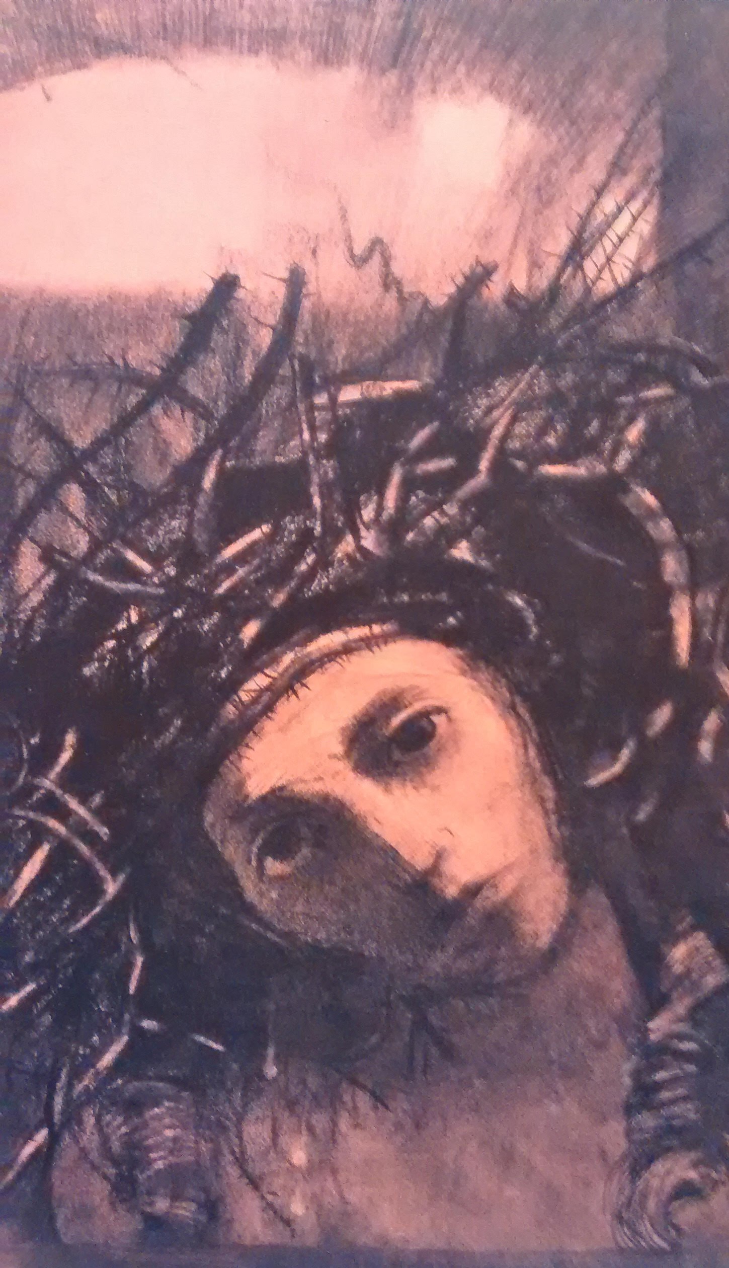
In the drawing above, Redon used charcoal, black pastel, black crayon, stumping, erasing and incising on buff paper. – Head of Christ 1895 The British museum- Master Drawings close-up – Julian Brooks. The dark charcoal tones evokes a melancholy feeling, in contrast to the light tones on the face and in the background – conveying a sense of expectation and hopefulness.
Exercise 4 Shadows and reflected light
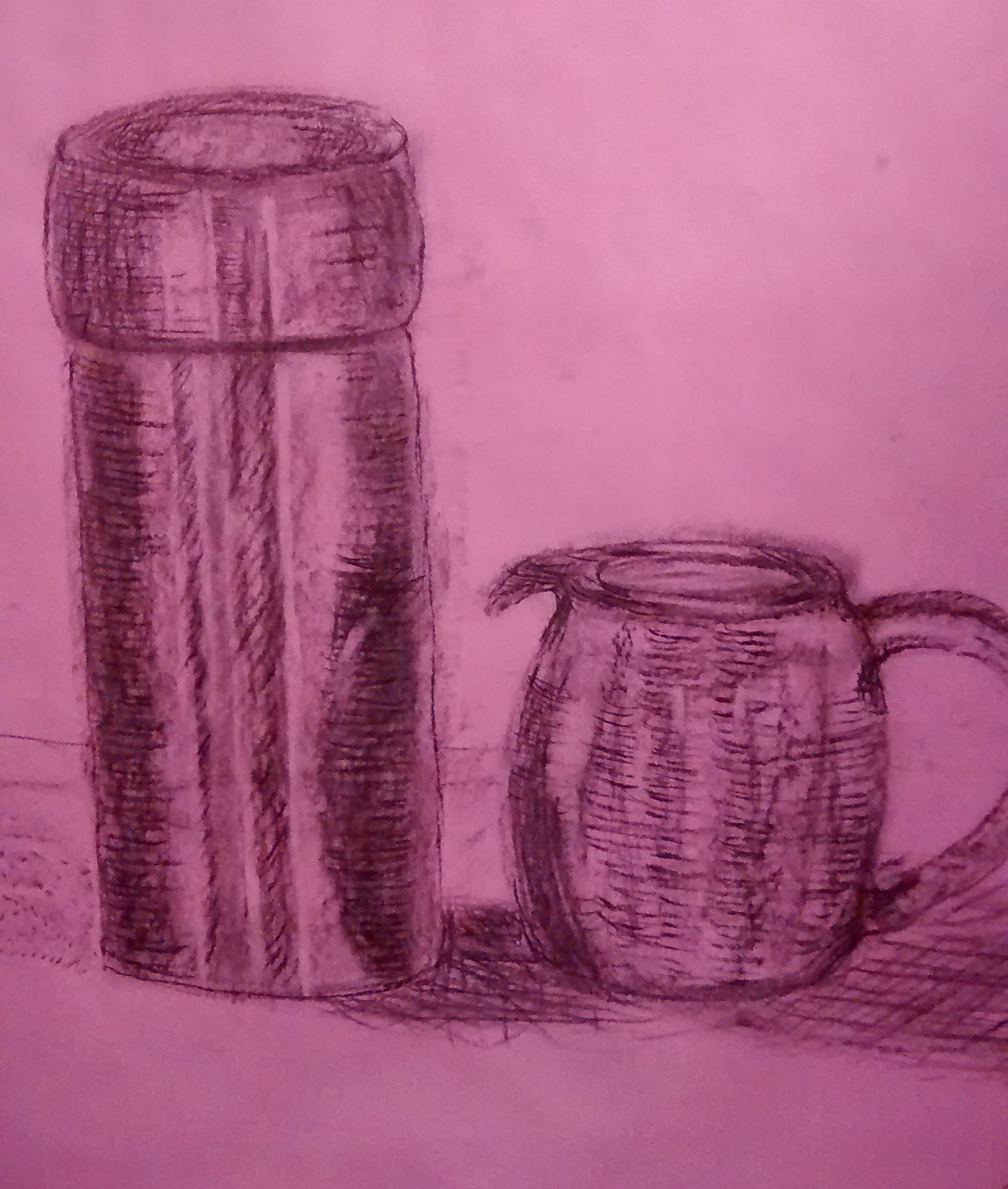
I used charcoal and experimented with the pink paper first to see if it enhanced the shadows but I prefer the white paper for this exercise ( which is actually what we were asked to use ). We get more of a feel of the light and reflection with the black against the white and the lightest tone lifted with a putty rubber.
